
Details
Details
- Reviewers
ndavis GB_2 - Group Reviewers
Breeze - Commits
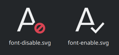
- R266:010c34f0e7c5: Add enablefont and disablefont icon for kfontinst KCM
Diff Detail
Diff Detail
- Repository
- R266 Breeze Icons
- Branch
- master
- Lint
No Linters Available - Unit
No Unit Test Coverage - Build Status
Buildable 16537 Build 16555: arc lint + arc unit
Comment Actions
Please use a more hierarchical name, e.g. "font-enable" and "font-disable", to match the other font icons we have such as "font-size-up" and "font-face"
Comment Actions
Oof, all of the font icons that contain an 'A' need to be cleaned up someday. The 'A's aren't even 16px tall in the 22px icons and the line thickness and alignment is all over the place. I guess that's something for another patch. For now, we should maintain consistency with the existing font icons.

Comment Actions
I just noticed that the "No" symbol is backwards. Once you fix that and the hardcoded colors, this patch will be ready to land.
| icons-dark/actions/16/font-disable.svg | ||
|---|---|---|
| 11 | Hardcoded color | |
| icons-dark/actions/22/font-disable.svg | ||
| 10 | Hardcoded color | |
| icons/actions/16/font-disable.svg | ||
| 11 | Hardcoded color | |
| icons/actions/22/font-disable.svg | ||
| 10 | Hardcoded color | |
Comment Actions
FWIW, both should be black/white. Disabling is not a destructive action like removing.
Comment Actions
We use red for disabling as well. Perhaps we need to work on the HIG a bit. One of the problems with only using black and white is that the emblems become harder to notice.
Comment Actions
I just followed the email icons' color: check mark is black/white, disable mark is red.

This comment was removed by GB_2.
This comment was removed by GB_2.
Comment Actions
I was asked to remove the hard code color like: fill="currentColor" and fill="#da4453". But I see other icons have something like style="fill:currentColor". Can anyone tell me correct way of applying colors?
Comment Actions
I still feel like I'd prefer the checkmark to be green. I also feel like I understand the argument that red isn't the best color to use for disabling something since it isn't destructive. Maybe we should use the orange color for that?
Definitely need clarification in the HIG.