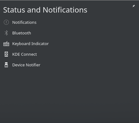
- Remove the left margin.
- Change '&' to "and".
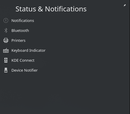
Before:
After:
| broulik | |
| mart |
| VDG | |
| Plasma |
Before:
After:
Open System Tray.
| Lint Skipped |
| Unit Tests Skipped |
I think the zero left margin looks odd, it should at least align with the icons. Also, this was originally done so it doesn't shift around as you switch between applets and the list.
for it to be perfect looking, i think it should either be aligned to the left of the icons, or to the left of the text items
Just my 2Cents
I think the zero left margin looks odd, it should at least align with the icons.
i think it should either be aligned to the left of the icons, or to the left of the text items
I agree to both of you, but the title "Make Status and Notification popup consistent with others" is right. As it is now it fit perfect with the others when you click through your list of status bar icons. So with your suggestion should the others modified too.
The only thing I would like to see is that the applet is not hidden when you click on it while some other was shown (1). But that's out of the scope from this patch.
(1) To clarify, assume always nothing is shown:
In general, this patch makes it better. However, I feel that all the items are simply too close to the left edge. Can you add some padding or margin to the left? Maybe something like 5 px?
| applets/systemtray/package/contents/ui/ExpandedRepresentation.qml | ||
|---|---|---|
| 98 | Please don't use hard coded margins, use smallSpacing instead. | |
Two more cents.
I feel that all the items are simply too close to the left edge.
I agree but currently fit the look with all other applets (at least have there, Volume/Clipboard/Bluetooth). Perhaps could that changed somehow globally?