Improve emblem contrast, legibility and consistency
ClosedPublic

Authored by ndavis on Oct 25 2018, 1:13 AM.

Details

Summary

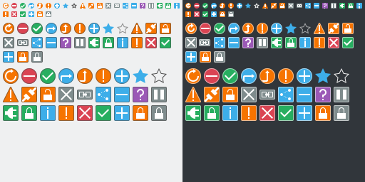
Added outlines to 16 and 22 px icons for better contrast
Improved the legibility of 8px icons
Added new 8, 16 and 22 px versions of existing emblems
Improved the consistency of emblem icons
Added background to inside of emblem-symbolic-link for better contrast

BUG: 399356
BUG: 399357
BUG: 399968
FIXED-IN: 5.52

Test Plan

Diff Detail

Repository
R266 Breeze Icons
Branch
emblem-outlines (branched from master)
Lint
No Linters Available
Unit
No Unit Test Coverage
Build Status
Buildable 4303
Build 4321: arc lint + arc unit
There are a very large number of changes, so older changes are hidden. Show Older Changes
Restricted Application added a project: Frameworks. · View Herald TranscriptOct 25 2018, 1:13 AM
Restricted Application added a subscriber: kde-frameworks-devel. · View Herald Transcript
ndavis requested review of this revision.Oct 25 2018, 1:13 AM
ndavis edited the summary of this revision. (Show Details)Oct 25 2018, 1:15 AM
ndavis edited the test plan for this revision. (Show Details)

Wow, these are truly excellent. I think you've done an amazing job!

One thing I'd like to discuss is whether or not we want the emblem-remove icon to be red. This color is typically reserved for destructive actions and error conditions, and the emblem as far as I can tell is only used in Dolphin--where its usage denotes something that is neither destructive nor an error. Users might be worried that clicking on it will actually remove the item! I wonder if a the Icon Orange color might be more suitable. What do you think?

Another thing is the emblem-symbolic-link icon. It's the only common-ish one that doesn't follow the pattern of having a colored background with a border, which might muddy the design language you've chosen (which I love). Also, I don't think the filled-in background really works:

Just throwing out some discussion points, but those are pretty minor and overall this is already a big improvement IMHO.


Since this fixes all three bugs, you can replace

https://bugs.kde.org/show_bug.cgi?id=399356
https://bugs.kde.org/show_bug.cgi?id=399357
https://bugs.kde.org/show_bug.cgi?id=399968

with

BUG: 399356
BUG: 399357
BUG: 399968
FIXED-IN: 5.52

Unfortunately, the patch does not apply cleanly, and I don't think it's your fault:

arc patch D16421

[...]

Checking patch icons/emblems/22/emblem-pause.svg...
Checking patch icons/emblems/22/emblem-mounted.svg...
Checking patch dev/null => icons/emblems/22/emblem-locked.svg...
error: dev/null: does not exist in index
Checking patch icons/emblems/22/emblem-information.svg...
Checking patch icons/emblems/22/emblem-important.svg...
Checking patch dev/null => icons/emblems/22/emblem-favorite.svg...
error: dev/null: does not exist in index
Checking patch icons/emblems/22/emblem-error.svg...
Checking patch icons/emblems/22/emblem-encrypted-unlocked.svg...
[...]
Checking patch icons-dark/emblems/22/emblem-mounted.svg...
Checking patch dev/null => icons-dark/emblems/22/emblem-locked.svg...
error: dev/null: does not exist in index
Checking patch icons-dark/emblems/22/emblem-information.svg...
Checking patch icons-dark/emblems/22/emblem-important.svg...
Checking patch dev/null => icons-dark/emblems/22/emblem-favorite.svg...
error: dev/null: does not exist in index
Checking patch icons-dark/emblems/22/emblem-error.svg...
Checking patch icons-dark/emblems/22/emblem-encrypted-unlocked.svg...

What's going on here is that some symlinks are being replaced with new files, and other files are being replaced with symlinks. arc doesn't seem too happy about this. @bcooksley or anyone else from Sysadmin, any idea what to do here?

Wow, these are truly excellent. I think you've done an amazing job!

Thanks!

One thing I'd like to discuss is whether or not we want the emblem-remove icon to be red. This color is typically reserved for destructive actions and error conditions, and the emblem as far as I can tell is only used in Dolphin--where its usage denotes something that is neither destructive nor an error. Users might be worried that clicking on it will actually remove the item! I wonder if a the Icon Orange color might be more suitable. What do you think?

I agree with you, but I also don't like the look of orange. It's just not a color that I would expect. I would be OK with making emblem-added and emblem-remove grey like the reporter (Tyson Tan) from bug#399968 asked for, but I don't know if that would work well for programs besides Dolphin.
Here's what orange would look like:

Another thing is the emblem-symbolic-link icon. It's the only common-ish one that doesn't follow the pattern of having a colored background with a border, which might muddy the design language you've chosen (which I love).

You're right, but I also like how the chain link looks. How is this?

Also, I don't think the filled-in background really works:

That's fair and after using it for a little while, it's actually pretty bad with the dark theme. I just saw D16307, so it seems to be unnecessary anyway.

Since this fixes all three bugs, you can replace

https://bugs.kde.org/show_bug.cgi?id=399356
https://bugs.kde.org/show_bug.cgi?id=399357
https://bugs.kde.org/show_bug.cgi?id=399968

with

BUG: 399356
BUG: 399357
BUG: 399968
FIXED-IN: 5.52

You mean I should change the summary to say that?

I agree with you, but I also don't like the look of orange. It's just not a color that I would expect. I would be OK with making emblem-added and emblem-remove grey like the reporter (Tyson Tan) from bug#399968 asked for, but I don't know if that would work well for programs besides Dolphin.
Here's what orange would look like:

Yeah I understand. I'm not the hugest fan of the orange either, and now that I think about it, semantically it's not really accurate either since that color is for warning or unusual states. Maybe it should just be blue like emblem-added is?

Another thing is the emblem-symbolic-link icon. It's the only common-ish one that doesn't follow the pattern of having a colored background with a border, which might muddy the design language you've chosen (which I love).

You're right, but I also like how the chain link looks. How is this?

With that, it doesn't look so much like a chain link anymore because the two sides of it are so close together. Could we basically use the existing chain link shape but put it within a background? Maybe it doesn't even need to be square; it could be rectangular, or even pill-shaped.

Since this fixes all three bugs, you can replace

https://bugs.kde.org/show_bug.cgi?id=399356
https://bugs.kde.org/show_bug.cgi?id=399357
https://bugs.kde.org/show_bug.cgi?id=399968

with

BUG: 399356
BUG: 399357
BUG: 399968
FIXED-IN: 5.52

You mean I should change the summary to say that?

Exactly!

ndavis edited the summary of this revision. (Show Details)Oct 25 2018, 2:47 AM

Yeah I understand. I'm not the hugest fan of the orange either, and now that I think about it, semantically it's not really accurate either since that color is for warning or unusual states. Maybe it should just be blue like emblem-added is?

Here's how that looks:

Another thing is the emblem-symbolic-link icon. It's the only common-ish one that doesn't follow the pattern of having a colored background with a border, which might muddy the design language you've chosen (which I love).

You're right, but I also like how the chain link looks. How is this?

With that, it doesn't look so much like a chain link anymore because the two sides of it are so close together. Could we basically use the existing chain link shape but put it within a background? Maybe it doesn't even need to be square; it could be rectangular, or even pill-shaped.

The problem with changing emblem-symbolic-link to have a background is that it doesn't shrink down very well. You have to distort it to make it fit at all and retain the same look. At 8px, it's simply impossible to make the middle section of the chain without needing to use up the entire horizontal width.
Here's another attempt:

Here's how that looks:

Looks good to me!

Here's another attempt:

I see what you mean. I think it looks great at the two larger sizes bug agree that the smaller one isn't as good. However, it's still an improvement over the status quo:

At that small a size, it's currently illegible. So this is at least no worse.

ndavis updated this revision to Diff 44201.Oct 25 2018, 8:11 AM

Change emblem-remove color to Plasma Blue, Change style of emblem-symbolic-link

Here are what the changes look like:

8px symlink emblem, 16px emblem-remove:


Pretty crowded.

16px symlink emblem, 16px emblem-remove:


Still pretty crowded

22px symlink emblem, 22px emblem-remove:


It's OK I guess.

bruns added a subscriber: bruns.Oct 25 2018, 12:34 PM

Can you try the following:

  • Make the center link solid and narower (e.g. 2px height for the 16px one)
  • Reduce the height of the right and left links

Can you try the following:

  • Make the center link solid and narower (e.g. 2px height for the 16px one)
  • Reduce the height of the right and left links

Like this?


Also, here is the 22px version adjusted to have a similar shape to your suggested 16px version.

bruns added a comment.Oct 25 2018, 1:47 PM

Can you try the following:

  • Make the center link solid and narower (e.g. 2px height for the 16px one)
  • Reduce the height of the right and left links

Like this?

I think this looks much better. Although, the link emblem should be positioned somewhat lower, centered relative to the checkmark emblem.

Also, here is the 22px version adjusted to have a similar shape to your suggested 16px version.

Also better, but can you also try to make the center link full solid?

bruns added a comment.Oct 25 2018, 1:48 PM

BTW, +1 for all the icons!


+1, those are excellent. I agree that the rectangle should be vertically centered on the same line as the other emblems. You can probably do this by giving the the link emblem's file the same dimensions as other emblems, but positioning the actual emblem itself vertically centered inside it. Also +1 to seeing if making the center link solid would look better for the larger sizes too.

Can you try the following:

  • Make the center link solid and narower (e.g. 2px height for the 16px one)
  • Reduce the height of the right and left links

Like this?

I think this looks much better. Although, the link emblem should be positioned somewhat lower, centered relative to the checkmark emblem.

I agree, but that's an issue with how the icon is displayed, not the icon itself. If I make the icon background take up the whole canvas, it will still be significantly off.

Also, here is the 22px version adjusted to have a similar shape to your suggested 16px version.

Also better, but can you also try to make the center link full solid?

Here is how that looks:

ndavis added a comment.EditedOct 25 2018, 1:57 PM

+1, those are excellent. I agree that the rectangle should be vertically centered on the same line as the other emblems. You can probably do this by giving the the link emblem's file the same dimensions as other emblems, but positioning the actual emblem itself vertically centered inside it. Also +1 to seeing if making the center link solid would look better for the larger sizes too.

That is actually how it currently is. Dolphin or whatever is responsible for displaying the emblems just posisions the symlink emblem in a different way from the other emblems.

ndavis updated this revision to Diff 44210.Oct 25 2018, 2:00 PM

Change style of emblem-symbolic-link

Good! How about making the center link a tiny bit thinner? I'll look into the code in KIconLoader that positions the emblems to see why it's not getting centered.

bruns added a comment.Oct 25 2018, 2:02 PM

Also, here is the 22px version adjusted to have a similar shape to your suggested 16px version.

Also better, but can you also try to make the center link full solid?

Here is how that looks:

The center link looks slightly too heavy, but imho still better. Might be possible to shave off 1/2 pixel from the link top/bottom. As its a solid area, it should not make it too fuzzy.

The center link looks slightly too heavy, but imho still better. Might be possible to shave off 1/2 pixel from the link top/bottom. As its a solid area, it should not make it too fuzzy.

Here is how that looks:

ndavis updated this revision to Diff 44211.Oct 25 2018, 2:13 PM

Change style of emblem-symbolic-link at 22px

Now that I stare at the summary graphics again, the white question mark looks a bit wispy and insubstantial at the 16px and 22px sizes. Do you agree? Other than that, everything looks pretty much perfect to me.

JFYI, I dug through KIconLoader today and couldn't find anything that explicitly or implicitly trims the bounds of loaded images that could account for the link emblem not having its original bounds respected and results in it being drawn too high. Either I missed the part that does this (which is quite possible), or it's some implicit thing in the SVG image itself (which is also possible, since I know nothing about SVG images), or it's something else entirely.

bruns added a comment.Oct 25 2018, 6:35 PM

JFYI, I dug through KIconLoader today and couldn't find anything that explicitly or implicitly trims the bounds of loaded images that could account for the link emblem not having its original bounds respected and results in it being drawn too high. Either I missed the part that does this (which is quite possible), or it's some implicit thing in the SVG image itself (which is also possible, since I know nothing about SVG images), or it's something else entirely.

You could try to convert the emblem to PNG and see if it is aligned correctly.

Now that I stare at the summary graphics again, the white question mark looks a bit wispy and insubstantial at the 16px and 22px sizes. Do you agree? Other than that, everything looks pretty much perfect to me.

How is this?

JFYI, I dug through KIconLoader today and couldn't find anything that explicitly or implicitly trims the bounds of loaded images that could account for the link emblem not having its original bounds respected and results in it being drawn too high. Either I missed the part that does this (which is quite possible), or it's some implicit thing in the SVG image itself (which is also possible, since I know nothing about SVG images), or it's something else entirely.

It's not that the symlink emblem gets trimmed, it's just normally off. In this image, I changed the background of the symlink emblem to take up the whole canvas and it's 2 pixels farther in than the vcs-normal emblem.

How is this?

Much better! That looks great.

It's not that the symlink emblem gets trimmed, it's just normally off.

That's really weird. I don't see any code that's looking for this specific emblem and drawing it in a different position. Does this problem still happen after you delete your icon cache? (rm ~/.cache/icon-cache.kcache)

Does this problem still happen after you delete your icon cache? (rm ~/.cache/icon-cache.kcache)

Yes.

ndavis updated this revision to Diff 44230.Oct 26 2018, 2:55 AM

Make emblem-question symbol thicker

Now that I stare at the summary graphics again, the white question mark looks a bit wispy and insubstantial at the 16px and 22px sizes. Do you agree? Other than that, everything looks pretty much perfect to me.

How is this?

Much better (weight matches), but I don't like the sharp corner in the center to much. Can you try using the question mark from "Noto Sans"?

ndavis added a comment.EditedOct 26 2018, 10:59 AM

Now that I stare at the summary graphics again, the white question mark looks a bit wispy and insubstantial at the 16px and 22px sizes. Do you agree? Other than that, everything looks pretty much perfect to me.

How is this?

Much better (weight matches), but I don't like the sharp corner in the center to much. Can you try using the question mark from "Noto Sans"?

I could, but then I'm running into this issue: T9898

I made that task when I was trying to come up with a more legible style for emblem-question. I chose this style for consistency, but there is already a consistency problem.

ndavis updated this revision to Diff 44248.Oct 26 2018, 11:19 AM

Widen the circular portion of 16/22 px emblem-question icons

Slight change to make the 16 and 22 px icons look more like the 8px icon:

I could, but then I'm running into this issue: T9898

I made that task when I was trying to come up with a more legible style for emblem-question. I chose this style for consistency, but there is already a consistency problem.

Fair point.
The used fonts seem to be (for the question marks):

  • Noto Sans or Droid Sans, but rectangular dot?
  • 2x homegrown
  • 2x Nimbus Sans Bold
  • Oxygen Sans
ndavis added a comment.EditedOct 26 2018, 11:36 AM

I could, but then I'm running into this issue: T9898

I made that task when I was trying to come up with a more legible style for emblem-question. I chose this style for consistency, but there is already a consistency problem.

Fair point.
The used fonts seem to be (for the question marks):

  • Noto Sans or Droid Sans, but rectangular dot?
  • 2x homegrown
  • 2x Nimbus Sans Bold
  • Oxygen Sans

The other issue with using a font based question mark is I also have to use that for the 8px icon if I want consistency.

Is a 6pt Noto Sans question mark legible enough?

normal 6pt Noto Sans

Bold 6pt Noto Sans

drawn

The other issue with using a font based question mark is I also have to use that for the 8px icon if I want consistency.

There is nothing wrong with using the font outline as a starting point and tweaking it for pixel grid alignment manually.

Is a 6pt Noto Sans question mark legible enough?

normal 6pt Noto Sans

Bold 6pt Noto Sans

I think the bold one is.

drawn

The hand drawn is actually 7px high ...

ndavis added a comment.EditedOct 26 2018, 12:13 PM

The other issue with using a font based question mark is I also have to use that for the 8px icon if I want consistency.

There is nothing wrong with using the font outline as a starting point and tweaking it for pixel grid alignment manually.

Is a 6pt Noto Sans question mark legible enough?

normal 6pt Noto Sans

Bold 6pt Noto Sans

I think the bold one is.

drawn

The hand drawn is actually 7px high ...

Yeah, I cheated on the drawn one because I'd have to come up with a brand new style to make it fit in a 6px area. I don't have a problem with coming up with a new style, but that would only be adding to the consistency problem. I've also made the exclaimation marks and 'i's of the 8px emblems 7px high to improve the ratio of dot to body.

bruns added a comment.Oct 26 2018, 7:39 PM

JFYI, I dug through KIconLoader today and couldn't find anything that explicitly or implicitly trims the bounds of loaded images that could account for the link emblem not having its original bounds respected and results in it being drawn too high. Either I missed the part that does this (which is quite possible), or it's some implicit thing in the SVG image itself (which is also possible, since I know nothing about SVG images), or it's something else entirely.

Tried to reproduce it here, but for me the bottom-right emblem just renders fine here:

Tried to reproduce it here, but for me the bottom-right emblem just renders fine here:

I wish I could test but I have not gotten the patch to apply so far. Did arc apply D16421 work for you, or did you have to apply it by hand?

bruns added a comment.Oct 26 2018, 8:42 PM

I wish I could test but I have not gotten the patch to apply so far. Did arc apply D16421 work for you, or did you have to apply it by hand?

No, I just copied a few of the icons manually into my installation.

Neither arc patch nor downloading the raw diff and applying it with patch -p1 works.

After manual application, the alignment is perfect for me too. So that's not a blocker; must be some local issye on your end, @ndavis. I think we're really close (or ready?) to being able to land this! @bruns, are your comments about the question mark a blocker, or are you satisfied?

I've pinged #syadmin about being unable to apply the patch; hopefully they can help us out!

bruns added a comment.EditedOct 26 2018, 11:36 PM

After manual application, the alignment is perfect for me too. So that's not a blocker; must be some local issye on your end, @ndavis. I think we're really close (or ready?) to being able to land this! @bruns, are your comments about the question mark a blocker, or are you satisfied?

Overall its a big improvement already, any small polishing can be done in a followup, if needed. So no blocker here - but see below ...

I've pinged #syadmin about being unable to apply the patch; hopefully they can help us out!

@ndavis - can you upload the git format-patch -1 output somewhere (temporary)?

Tried to reproduce it here, but for me the bottom-right emblem just renders fine here:

There may also be a conceptual issue here - previously, the emblem-locked which is used for unaccessible (e.g. root owned) files was a lock with orange background, now it is green. For locked encrypted files green may be suitable, for unacessible files not so much.

@ndavis - can you upload the git format-patch -1 output somewhere (temporary)?

https://hastebin.com/egepiwurab.diff

There may also be a conceptual issue here - previously, the emblem-locked which is used for unaccessible (e.g. root owned) files was a lock with orange background, now it is green. For locked encrypted files green may be suitable, for unacessible files not so much.

You're right. Perhaps we should introduce some new emblems?

Some ideas:

emblem-select (emblem-added sounds like it should be used for things that were successfully added)
emblem-deselect (in some contexts, emblem-remove would be destructive)
emblem-encrypted-locked (to match the existing emblem-encrypted-unlocked, Papirus has this)
emblem-readonly (Papirus has this)

Here's a list of emblems from the Papirus theme: https://hastebin.com/asuquwoyap.css
I'm not saying we should use all of these, but we can use that list to pick compatible names and having icons that match the context is a good thing.

There may also be a conceptual issue here - previously, the emblem-locked which is used for unaccessible (e.g. root owned) files was a lock with orange background, now it is green. For locked encrypted files green may be suitable, for unacessible files not so much.

That's true. Probably we need a new emblem emblem-readonly that can be used for read-only files and directories. It's always been kind of an abuse of the iconography to re-use the lock for this. Only now as we're better defining the visuals of the lock emblem does it become really obvious.

Something just occurred to me: Why do we use emblems as if they were action buttons in Dolphin? Would it be so bad if Dolphin used list-add and list-remove instead of emblem-added and emblem-remove?

Something just occurred to me: Why do we use emblems as if they were action buttons in Dolphin? Would it be so bad if Dolphin used list-add and list-remove instead of emblem-added and emblem-remove?

I had the same thought today. Perhaps we should have them look like checkboxes: when you hover over the icon, you see an empty checkbox, and when you click on it, it becomes a checked checkbox. This would be more semantically correct and also re-use people's existing familiarity with the concept of checkboxes. If we do this, I'd also like to see the checked checkbox remain visible when the icon is selected. This is how item selection is typically handled on mobile operating systems as well, and it's nice and clear.

This would all require some additional changes in Dolphin and Folder view, of course.

This would all require some additional changes in Dolphin and Folder view, of course.

So should I change emblem-added and emblem-remove back to their original colors? It wouldn't be any worse than it currently is for Dolphin before any changes are applied to it.

This would all require some additional changes in Dolphin and Folder view, of course.

So should I change emblem-added and emblem-remove back to their original colors? It wouldn't be any worse than it currently is for Dolphin before any changes are applied to it.

Well, we should discuss that first. :)

An LXR search reveals that all users of these emblem use them in the same way. We have two options for how we want to change things:

  • Use new iconography (such as my proposed checkmark) for emblem-added and emblem-remove
  • Create new emblems for this and then over time change our apps to use them. This seems less desirable since then emblem-added and emblem-remove will then just be unused, and also it requires code changes to those apps.

So if we want to further improve these emblems, my vote is for changing the existing icons rather than making new ones.

This would all require some additional changes in Dolphin and Folder view, of course.

So should I change emblem-added and emblem-remove back to their original colors? It wouldn't be any worse than it currently is for Dolphin before any changes are applied to it.

Well, we should discuss that first. :)

An LXR search reveals that all users of these emblem use them in the same way. We have two options for how we want to change things:

  • Use new iconography (such as my proposed checkmark) for emblem-added and emblem-remove
  • Create new emblems for this and then over time change our apps to use them. This seems less desirable since then emblem-added and emblem-remove will then just be unused, and also it requires code changes to those apps.

    So if we want to further improve these emblems, my vote is for changing the existing icons rather than making new ones.

So keep the blue color for now?

Something that I plan to do in the future is re-do the package management icons and I was hoping to reuse emblem-added and emblem-removed for that. Currently, the package management icons are action icons, but they are hard to read and they blur the line between action and state the way they are used, which is why I'm planning to make them emblems instead.

ndavis updated this revision to Diff 44304.Oct 27 2018, 2:43 PM

Improve arrow visibility on vcs emblems
Add emblem-encrypted-locked
Change emblem-locked back to orange

Thanks for the updates. I know it's a PITA, but would you mind updating the image in the Summary section?

ndavis updated this revision to Diff 44308.Oct 27 2018, 2:47 PM

Add dark versions of previous change

ndavis updated this revision to Diff 44313.Oct 27 2018, 4:00 PM

Add 16 and 22 px versions of previous change

ndavis edited the test plan for this revision. (Show Details)Oct 27 2018, 4:01 PM

Thanks for the updates. I know it's a PITA, but would you mind updating the image in the Summary section?

Done.

ndavis edited the test plan for this revision. (Show Details)Oct 27 2018, 4:04 PM
ndavis updated this revision to Diff 44410.EditedOct 29 2018, 9:32 AM

Add emblem-readonly
It's the grey lock

ndavis edited the test plan for this revision. (Show Details)Oct 29 2018, 9:46 AM
ngraham accepted this revision.Oct 29 2018, 12:59 PM

Looks fantastic. Fabulous work.

This revision is now accepted and ready to land.Oct 29 2018, 12:59 PM
ngraham closed this revision.Oct 29 2018, 1:19 PM

mmm, sorry. I saw this today and I just took a minute to understand it. How does this looks consistent with the theme, or even nice (really sorry)? Please teach me.
Thank you.

Looks great to me! I guess it really is true that aesthetics are subjective. :)

But it wasn't just about that. Check out the list of bugs this patch fixed. This was not just because we though ti looked prettier but also because the old emblems were much buggier.