We currently use a few different styles for text characters in icons:
- Straight lines and circular segments aligned with the grid (the most common)
- Oxygen font
- A font kind of similar to Roboto Slab
- Fonts I don't recognize
In no particular order, here are some examples:
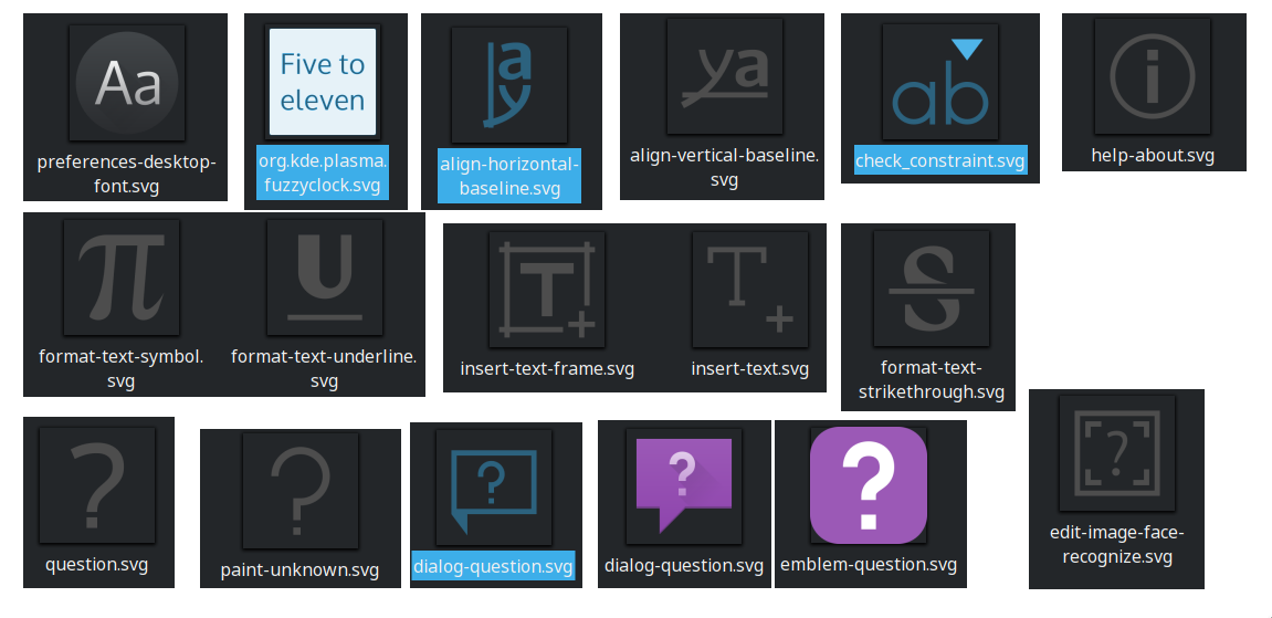
This is a problem because it makes it difficult to decide how to design icons that use text characters. I'm not experienced with typography and I don't know exactly what styles we should use.
At the least, we definitely should keep the first style because it shows up well on the small monochrome icons and it doesn't require much work to make. It would also be a lot of work to replace. It's not easy to use for the 8px emblem icons though because that style works better if you have more room to work with. It would be nice if it was clearly defined.
I look forward to reading your ideas.