Drag handle to reorder items in a ListView
ClosedPublic

Authored by mart on May 18 2018, 11:42 AM.

Details

Summary

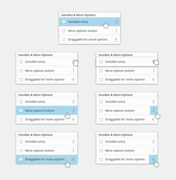
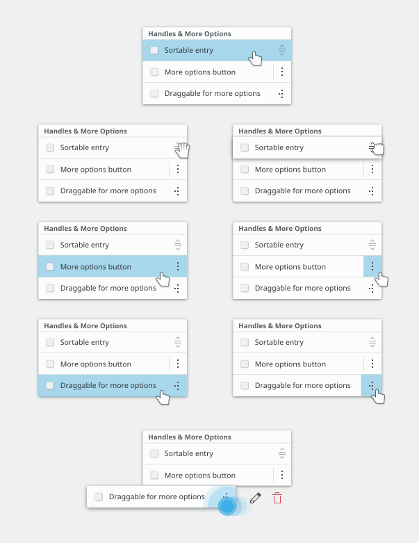
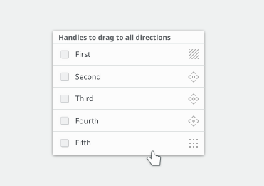
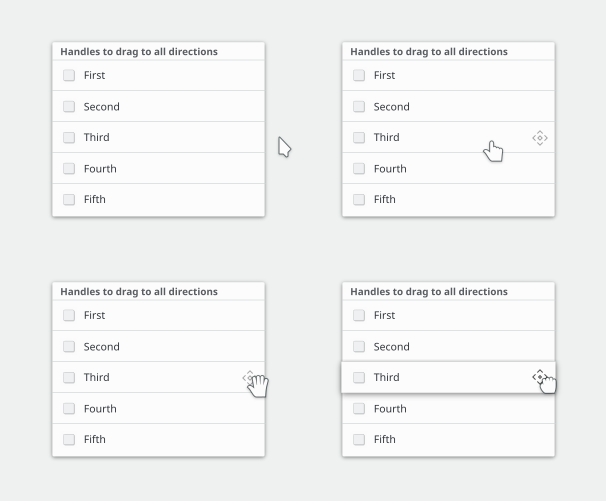
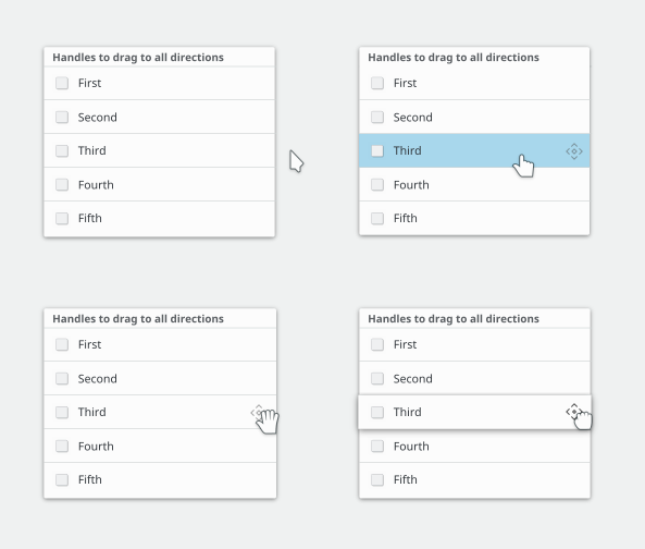
A component to be inserted in list items of any kind, when used in ListViews
when the user wishes to be able to reorder items by drag.

The handle must be used in a list item which is not directly
the view's delegate, but its main child. the main delegate will act
as empty space placeholder.
It is recomended to use the DelegateRecycler component for this purpose

Test Plan

used in the list view gallery page

Diff Detail

Repository
R169 Kirigami
Lint
Automatic diff as part of commit; lint not applicable.
Unit
Automatic diff as part of commit; unit tests not applicable.
mart created this revision.May 18 2018, 11:42 AM
Restricted Application added a project: Kirigami. · View Herald TranscriptMay 18 2018, 11:42 AM
Restricted Application added a subscriber: plasma-devel. · View Herald Transcript
mart requested review of this revision.May 18 2018, 11:42 AM
mart added a comment.May 18 2018, 11:46 AM

in action
https://youtu.be/vQUnOpwV9xU

note that the red square icon is a placeholder, new breeze icons are needed for that

zzag added a subscriber: zzag.May 18 2018, 11:50 AM
zzag added inline comments.
src/kirigamiplugin.cpp
172

Is the minor version correct?

mart updated this revision to Diff 34425.May 18 2018, 11:51 AM
  • proper version
This revision was not accepted when it landed; it landed in state Needs Review.May 18 2018, 11:52 AM
Closed by commit R169:5ba11c3b9efe: proper version (authored by mart). · Explain Why
This revision was automatically updated to reflect the committed changes.
mart marked an inline comment as done.May 18 2018, 11:52 AM
mart reopened this revision.May 18 2018, 12:09 PM
mart updated this revision to Diff 34430.May 18 2018, 12:10 PM

all files

mart added a comment.May 18 2018, 12:32 PM

Possible handles (to resume that old discussion)

How about the version like that, but with fewer dots? I thought those looked really, really good.

abetts added a subscriber: abetts.May 18 2018, 2:47 PM

I think with this image we are trying to convey too much. Users in general, will understand that if you have a consistent imagery to represent drag, they will come to recognize it and use it however the system allows them to use it. Because of that, the arrows are extra. Not necessary. Because the system will determine the drag direction and the user will understand how to use them. Instead, we have to focus on the center image first and convey drag that way. Plus, on mobile for example, this is generally not used. People don't use arrows to represent drag direction. Instead, they just try to represent drag. I think we can use that idea.

We agree that dots are used to represent touch or "draggable" control

Another thought is that we also want to be a bit different, maybe not too different, than what other platforms do. We have tried a few ideas on this. What about these ones:

Regardless of what icon we choose, for a drag handle, I think it has to be a very light gray. We previously had a 4x3 dot grid, but because it was black, it looked very heavy and when a bunch of them were all lined up vertically, the net effect was sort of weird.

Personally, My favorite was a small number of dots with Henrik's idea:

Especially the two right-most ones. If rendered in light gray, I think those could look great.

I really like the vertical drag icon here! Not so sure about the horizontal swipe icon though.

Regardless of what icon we choose, for a drag handle, I think it has to be a very light gray. We previously had a 4x3 dot grid, but because it was black, it looked very heavy and when a bunch of them were all lined up vertically, the net effect was sort of weird.

+1

I think the mouse cursor should be:

  • drag-open-hand for first one
  • clickable-finger (like for links) for second and third ones
mart added a comment.May 18 2018, 3:47 PM

I think the mouse cursor should be:

  • drag-open-hand for first one
  • clickable-finger (like for links) for second and third ones

to me all 3 are quite good!

the first if we drop the directionality can become just a 9 dots matrix?

IMHO the up-and-down arrows do a much better job of communicating "drag me!" than a 9 dot grid does.

mart added a comment.May 18 2018, 3:54 PM

IMHO the up-and-down arrows do a much better job of communicating "drag me!" than a 9 dot grid does.

good point, so so far my favourite are the options by alex

alex-l added a comment.EditedMay 18 2018, 4:09 PM

Cursors and hover:

Edit: added touch input for draggable entry:

I tried with arrows too, but I think the fifth one looks better... my second choice is the third one.

alex-l added a comment.EditedMay 19 2018, 12:09 PM

Possible interactions on hover (I used the third one and the fourth one when dragging):

Edit: I forgot the color change on hover

mart added a comment.May 21 2018, 1:20 PM

I tried with arrows too, but I think the fifth one looks better... my second choice is the third one.

i like the 5th more as well, tough the 2nd may be better if there will be the just horizontal or just vertical one, so all would have the same style

mart updated this revision to Diff 35107.May 29 2018, 12:37 PM
  • proper version
  • use handle icon
This revision was not accepted when it landed; it landed in state Needs Review.May 29 2018, 12:38 PM
This revision was automatically updated to reflect the committed changes.