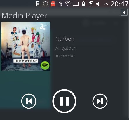
The play/pause status of the system tray icon appears inverse to the play/pause button in the
plasmoid. This patch unifies the behaviour, which is common across various media players.
Details
Details
Diff Detail
Diff Detail
- Repository
- R120 Plasma Workspace
- Branch
- swapicons
- Lint
No Linters Available - Unit
No Unit Test Coverage
Comment Actions
A patch like this comes up time and again. The tray icon indicates the current playback state whereas the button changes to the one displayed.
which is common across various media players.
Please provide some evidence on that
Comment Actions
That might be a sign that it's unintuitive and confusing for a lot of our users. Perhaps we should reconsider.
Comment Actions
We are currently discussing the matter in the VDG Telegram room, but I'll mention that so far, sentiments are overwhelmingly in favor of the patch.
Comment Actions
Can you show me examples of how this is "common across various media players"? Amarok does the same as media controller does. And why this particular status indicator should behave differently from any other indicator next to it?
Following your reasoning the volume indicator should show a "mute" icon, the network a "disconnect" icon and Bluetooth an "unpair" icon just because the action in the popup doesn't match the status icon.
Comment Actions
That might be a sign that it's unintuitive and confusing for a lot of our users. Perhaps we should reconsider.
I agree there's a problem. We have the same icon meaning two different things and there's no visual clues to infer from context.
But I'm far from convinced by the solution.
Plasma volume is interesting:
The behaviour of the system tray shows state. It shows a speaker when the speakers are on.
(which is what we do here. This patch is the equivalent to us showing mute when the speakers are on)
The buttons next to the sliders to toggle mute show the current state, not the intended state
(equivalent to us showing the play button on the popup controls when we're actively playing.. the inverse of this patch.)
In the KCM / settings; the mute button shows the mute icon constantly and is a toggle button.
(so plasma pa is inconsistent with itself, and thus not the best place to draw conclusions from :/)
I'd like to see new ideas, I'm very reluctant to just inverse the meaning of a prominent icon that our userbase are now familiar with, it'll confuse everyone who's been using it for the past N years.
Comment Actions
This is a gnome extension:
http://www.omgubuntu.co.uk/wp-content/uploads/2016/09/music-control-gnome-extensions.jpg
They have the state and action icons matching as we do. It's clearly playing, and the tray icon shows a play icon, big action button shows pause.
*but* they're not re-using the same icon in both cases, which I think is interesting.
Comment Actions
*but* they're not re-using the same icon in both cases, which I think is interesting.
I think that's the key. If we can use different icons for the state and the action, the complaints may just vanish.

Comment Actions
Someone in the VDG room suggested the following (or something like it) for the "currently playing something" icon: http://www.iconninja.com/files/407/146/323/note-audio-play-sound-listen-song-music-icon.svg
And when not playing, it could have a line through the note, or display the note using a very light color, or something like that. I think this approach could resolve the impasse.
Comment Actions
I wouldn't recognize a musical note as something "playing", it could be a video. Not very happy with that suggestion, either.
Comment Actions
@ngraham
Works for me.
(it should totally change to http://www.clker.com/cliparts/x/U/a/2/3/I/quarter-rest-black-no-stroke.svg when it's paused /s)
Is there a logic behind our current status icon (and the new icon) being in a circle? No other systray icon does that.
Comment Actions
No, it doesn't have to be in a circle, and now that I think about it, I would probably prefer that it isn't, to further reduce similarity to the icons used for controlling playback.
Comment Actions
We place this item in the system tray by default. This being a place were users expect to be able to at a glance get some quick info about things their system is doing. While media is playing the play icon is what most users would expect to see. I do agree that this needs its own icon and should not reusing the play and pause actions.
Showing that icon is fine if have a static icon, otherwise we should use some form of play and pause icons they are synonymous with the actions and using others will confuse alot more users.