This is largely done in Plasma 6 now!
Feed Advanced Search
Jan 11 2024
Jan 11 2024
ngraham closed T11661: Replace framed views with single-pixel separator lines, a subtask of T10891: Breeze theme evolution, as Resolved.
Nov 14 2023
Nov 14 2023
dikasp added a comment to T10891: Breeze theme evolution.
as a long fan KDE user, i would like to share my ideas and be a part of next evolution of KDE desktop.
Sep 25 2023
Sep 25 2023
felixernst added a comment to T11662: Improve visual appeal for KUrlNavigator when in Breadcrumbs mode.
Will it land in Plasma 6?
Sep 24 2023
Sep 24 2023
asarmett added a comment to T11662: Improve visual appeal for KUrlNavigator when in Breadcrumbs mode.

Sep 18 2023
Sep 18 2023
felixernst added a comment to T10891: Breeze theme evolution.
Big parts of it have already been implemented. Here is a screenshot that shows what Dolphin looked like when this task was started.
Sep 17 2023
Sep 17 2023
asarmett added a comment to T10891: Breeze theme evolution.
This looks amazing @ngraham !
Is it scheduled for implementation some time after Plasma 6? Like in Plasma 6.1 or whenever?
Is it being worked on?
Aug 4 2023
Aug 4 2023
Aug 1 2023
Aug 1 2023
ngraham closed T10413: Find a way to specify whether to use monochrome or color icons in applications as Resolved.
We have now settled on using the -symbolic suffix for Plasma 6 and beyond.
Nov 25 2022
Nov 25 2022
ngraham commandeered D25820: SimpleScreenRecorder icon added.
Nov 4 2022
Nov 4 2022
ngraham closed T12611: Make Breeze a framework and relocate all of its Plasma theme stuff (e.g. wallpaper) to a different repo still on the Plasma release schedule as Wontfix.
We've decided to keep it in the Plasma schedule. Instead, for Plasma 6, plasma-framework is going to be merged into plasma-workspace, which will automatically fix the issue described in https://bugs.kde.org/show_bug.cgi?id=345997.
Aug 2 2022
Aug 2 2022
rokejulianlockhart added a comment to T11153: Unify sidebar appearance.
This is obviously desirable, but I doubt that this is actually possible unless all of KDE's software switches to tree-views. I would love this, because it would provide one consistent method of navigation and would mean that all of KDE's software would reuse the same module for this important ability.
May 15 2022
May 15 2022
omeritzics added a comment to T13454: T13078 Application Menu Mock up.
Mar 19 2022
Mar 19 2022
gianlucapettinello added a comment to T10413: Find a way to specify whether to use monochrome or color icons in applications.
Mar 7 2022
Mar 7 2022
Feb 4 2022
Feb 4 2022
oops, we forgot to mark this one as resolved it seems
Jan 23 2022
Jan 23 2022
ngraham closed T11052: Accent Colors, Color Ramps and other improvements to theming., a subtask of T10891: Breeze theme evolution, as Resolved.
Nov 23 2021
Nov 23 2021
neckcracks added a comment to T10891: Breeze theme evolution.
One weird thing is that when hovering a buttons, the gradients is flipped vertically (or the gradient goes away, it's hard to tell).
Nov 12 2021
Nov 12 2021
view-barcode-qr should do the trick.
Nov 4 2021
Nov 4 2021
kvermette added a comment to T14968: Breeze Icons - Blue Ocean Update.
For posterity this is the first iteration of the builder tool, along with some of the initial output results, the initial places "cookbook", and the folder assets which have been prepped.
Oct 29 2021
Oct 29 2021
ngraham added a comment to T14968: Breeze Icons - Blue Ocean Update.
ngraham added a comment to T14968: Breeze Icons - Blue Ocean Update.
In general my plan is to keep app icons the same (but updated) unless the app maintainer/author requests a bigger change, which I think is a great time to accommodate those requests
Oct 28 2021
Oct 28 2021
kvermette added a comment to T14968: Breeze Icons - Blue Ocean Update.
The options thing isn't just for Breeze; other icon sets can provide completely different options for their own stuff. The big selling point, to me, is the idea that one icon theme can provide slight variations like the crease or multicolored place folders without resorting to maintaining entirely separate themes. This also clears a large workload from iconographers who can consolidate their work. If this wasn't a direction we could take, I'd probably be forcing the crease down your throats! :P
andreask added a comment to T14968: Breeze Icons - Blue Ocean Update.
places folders with the colors from the mimetypes.
andreask added a comment to T14968: Breeze Icons - Blue Ocean Update.
about the options idea
- Hide folder crease -> can be done with an separate breeze icon theme where you have the folders with creases. Everything else wasn't needed cause the fallback is breeze
- Standard folders use your accent colour -> no real issue cause the standard accent colour is the colour the folders use by default
- places folders use different colours -> we already have this eg. for desktop, encrypt, as I'd like to implement more specific places folders see https://bugs.kde.org/show_bug.cgi?id=443288
- places folders use different colours -> mimetype icons use also different colors to separate them easier
kvermette added a comment to T14968: Breeze Icons - Blue Ocean Update.
Oh yes, I understand it. The issue is that it's a big divergence from Breeze current, and this is just meant to be a refresh. That being said I *have* investigated the source for the SVG modification in the icon code, and I think there's an avenue to provide configurable icons.
andreask added a comment to T14968: Breeze Icons - Blue Ocean Update.
when you use the plasma accent color you have at the end folders in blue, green, ...
andreask added a comment to T14968: Breeze Icons - Blue Ocean Update.
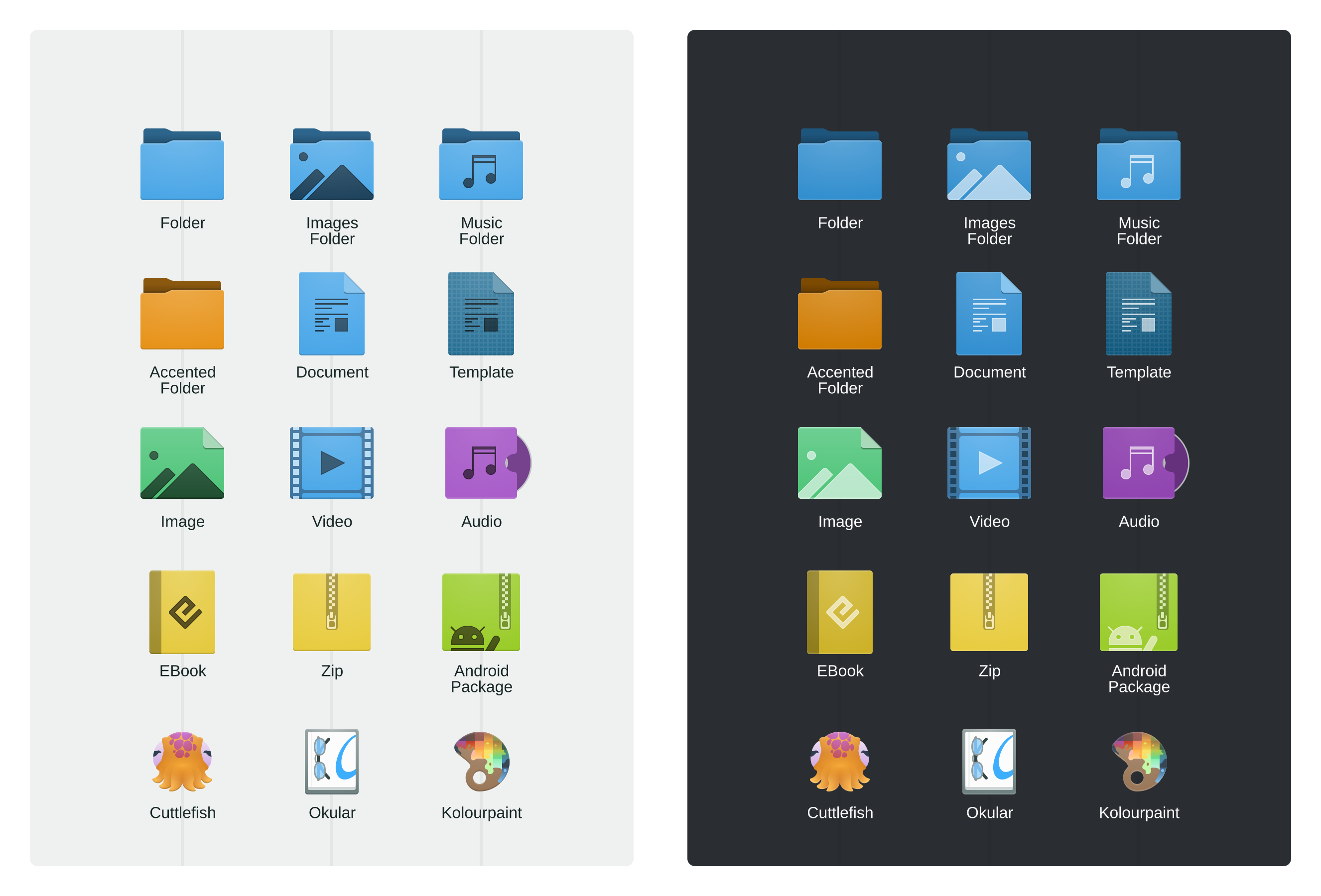
About colored folders I'm thinking on something like this. I know we can theme all the icons but have all folder's blue / pink / gray / ... is "cool" but from recognizion point of view different colors for different folders would be a recognizion benefit.
andreask added a comment to T14968: Breeze Icons - Blue Ocean Update.
A screenshot from index at the Maui framework. Done by Uri and his team.
kvermette added a comment to T14968: Breeze Icons - Blue Ocean Update.
On the crease, I'm going to remove it. It's a love-it-or-hate it addition, and the fact is people who *would* love won't know they're missing it, and people who hate it *would* see it. It's not a hill I'm goanna die on, and I don't like bikeshedding over a line.
ngraham added a comment to T14968: Breeze Icons - Blue Ocean Update.
I also just don't like the crease at all, sorry. :) It's just, not, well, crease-like. A real crease is a very subtle thing on a folder. It's practically invisible. I also wonder whether it still serves any value. Today a lot of people have probably never even seen a real manila folder.
andreask added a comment to T14968: Breeze Icons - Blue Ocean Update.
The benefit would be that dolphin didn't look that blueish.
andreask added a comment to T14968: Breeze Icons - Blue Ocean Update.
What I like is the use of colors for specific stuff. Like windows and als uri (at maui apps) did with image and audio folders.
andreask added a comment to T14968: Breeze Icons - Blue Ocean Update.
About the crease how would the folder icon look like with thumb previews? Cause at Music folder it didn't look like a benefit to have the crease.
kvermette added a comment to T14968: Breeze Icons - Blue Ocean Update.
For the folder it's meant to be a crease, and I must say it's been pretty divided been love-it-or-hate-it. I added it as a throwback to Oxygen while also using it to differentiate our basic folder design. The crease has become a little more abstract over the revisions, but that's not necessarily a bad thing. I'm personally becoming torn, because on one hand this is meant to be a refresh (I want to avoid excessive changes compared to current Breeze unless it's really warranted, or an existing icon breaks HIG) but on the other I think most folders look kinda bland. In terms of detail though we're going "a little more ornate than current" but otherwise the basic icons should feel mostly the same, and I'm trying very strongly to keep the basic silhouettes intact. I have a feeling it'll probably come down to a vote, but unless the crease wins by a good margin it'll go the way of the dodo because this is a refresh and it is a difference.
Oct 27 2021
Oct 27 2021
andreask added a comment to T14968: Breeze Icons - Blue Ocean Update.
I don't like the folder icon with this bottom horizontal element. Sorry but I don't know what it should mean.
kvermette added a comment to T14968: Breeze Icons - Blue Ocean Update.
I think I got most of everyone's feedback in, and I managed to increase the internal "standards" of the icons which should also help when the documentation can give more solid direction.
andreask added a comment to T14968: Breeze Icons - Blue Ocean Update.
About shadows: Our icon's are VERY complex with the colorScheme stuff, ... so if we can live without shadows, go for it. We have to think also for contributors how will submit an icon and not the 1.000 breeze icon.
andreask added a comment to T14968: Breeze Icons - Blue Ocean Update.
About monochrome icons we use now 1px line icons if you have a look at gnome and I think also other icon themes, and also at the proposal the symbols on the folders aren't 1px thin lines. As it's way easier to visible, I would prefer to go that way, but than we have to update ALL action icons (which is ok for me)
andreask added a comment to T14968: Breeze Icons - Blue Ocean Update.
I don't like the oxygen like folder layout. cause I don't know what the horizontal element at the bottom of the folders is for.
Oct 25 2021
Oct 25 2021
ngraham added a comment to T14968: Breeze Icons - Blue Ocean Update.
It's high time we updated the colorful icons, so +1 in general.
ognarb added a comment to T14968: Breeze Icons - Blue Ocean Update.
I like the idea of adding accent colors to some icons :) As for the design, I very much like the new forms but I'm a bit hesitant about the black/white shadows. It's a cool idea but I better wait for the few more icons to see how this could looks with other icons.
Oct 24 2021
Oct 24 2021
kvermette added a comment to T14968: Breeze Icons - Blue Ocean Update.
The black/white styling does look more awkward in the samples than in actual use. I think it's in part because these icons appear inconsistent when viewed beside each-other in their different modes, and the subtle shading/lighting plays also some tricks on your eyes as well. Kind of the reverse of that optical illusion with the cylinder on the checkerboard, in this case you think they ought to be the same colour, but they aren't. In practice (at least on my limited run of test icons on my own system) that effect isn't present.
cblack added a comment to T14968: Breeze Icons - Blue Ocean Update.
While the technical workflow improvements sound nice, I can't say I'm that big a fan of the proposed icon style. Something about the usage of black and white in this manner shown here just doesn't sit right with me, though I can specifically point out that it's low contrast with a lot of background areas and the bordering looks out of place compared to other elements which are generally unbordered.
Oct 18 2021
Oct 18 2021
ngraham added a comment to T13848: Cursor redesign.
Sounds like a great plan to me!
Oct 17 2021
Oct 17 2021
kvermette added a comment to T13848: Cursor redesign.
I know this is a bit of necromancy on this task, but it's becoming somewhat relevant with the exceptional design work from the Blue Ocean effort. Breeze has evolved significantly since the original graphics were created, and portions such as the spinners are quite behind the style of the desktop. I wouldn't go as far as to wholesale change the style, but we are due for the cursors to be adjusted slightly so they better fit the Breeze of 2022.
Oct 4 2021
Oct 4 2021
ngraham added a subtask for T10891: Breeze theme evolution: T14918: Make focus, selection, and hover effects consistent.
Aug 9 2021
Aug 9 2021
This was done in https://invent.kde.org/plasma/breeze/-/merge_requests/108!
ngraham closed T9460: Consider a more user-friendly SpinBox control, a subtask of T10891: Breeze theme evolution, as Resolved.
Jun 14 2021
Jun 14 2021
ngraham added a comment to T10891: Breeze theme evolution.
This is a behavior provided by the upstream QMenu component and it's not something we can override in any KDE code. You would need to report it to the Qt people.
piomiq added a comment to T10891: Breeze theme evolution.
Have you ever wonder about not disappearing popup menu after choosing option ?
Jun 9 2021
Jun 9 2021
ngraham added a comment to T10891: Breeze theme evolution.
Please report bugs/complaints/proposals for changes to the new widget style to https://invent.kde.org/plasma/breeze/-/issues/
endlesswaterfall added a comment to T10891: Breeze theme evolution.
One thing that it looks weird is the pressed state of buttons: they show a gradient effect, but the normal state doesn't have it (or it has, but it's really subtle). I think the button should have a very subtle dark background with a inner shadow.
Jun 8 2021
Jun 8 2021
We have many to choose from:
This should really just be a bug report on https://bugs.kde.org, if it's still relevant. :)
This should be a bug report on https://kde.org if it's still relevant. :) Not sure it is, since Rekonq is long unmaintained.
I'm not sure the raw size is actually a problem. You only have to download the whole repo once, and a KDE development environment in general is quite large and requires downloading a lot of data. If we split visual assets from code, they still need to live somewhere. Splitting the repo just means re-arranging the deck chairs, not actually fixing the annoyance of having to download a lot of data on a slow connection.
ngraham closed T12793: 'Classik' KDE1-like titlebar button icon style replacing Breeze's unorthodox 'Oxygen' style as Wontfix.
I don't think we're going to do this in Breeze itself, sorry. You're of course always welcome to use a different window decoration theme. :)
This has been more or less implemented in the form of the new GHNS dialog.
ngraham updated the task description for T10891: Breeze theme evolution.
With https://invent.kde.org/plasma/breeze/-/merge_requests/26 being merged, this is now done!
ngraham closed T13451: Combine the best aspects from the various Breeze style proposals (Final style: "Blue Ocean"), a subtask of T10891: Breeze theme evolution, as Resolved.
Jun 1 2021
Jun 1 2021
endlesswaterfall added a comment to T10278: System Settings Overhaul.
Also, I think that most common (generally speaking) settings should be at the top. For example "Connections" is at the middle. This also should be applied to submenus: in Workspace Behavior, Desktop Effects comes first than Virtual Desktops, which is a more common setting. I don't know if I should create a task for that, because it seems to fit more in bugs.kde.org: https://bugs.kde.org/show_bug.cgi?id=437966
May 28 2021
May 28 2021
mikeljohnson removed a subtask for T10891: Breeze theme evolution: T11132: Revisit Panel highlight effects .
mikeljohnson removed a subtask for T11124: Unify highlight effect style: T11132: Revisit Panel highlight effects .
mikeljohnson closed T14526: Improve Plasma's design, a subtask of T10891: Breeze theme evolution, as Resolved.
mikeljohnson removed a subtask for T10891: Breeze theme evolution: T12420: Redesign/tweak applications.
mikeljohnson removed a subtask for T14526: Improve Plasma's design: T12733: Improve the color of the default theme on Kubuntu.
mikeljohnson updated the task description for T10891: Breeze theme evolution.
mikeljohnson added a subtask for T14526: Improve Plasma's design: T12192: Redesign application launcher.
mikeljohnson removed a subtask for T10891: Breeze theme evolution: T12192: Redesign application launcher.
mikeljohnson removed a subtask for T10891: Breeze theme evolution: T13396: T13073 Task Manager Thumbnail mock ups.
mikeljohnson added a subtask for T14526: Improve Plasma's design: T11925: Breeze Desktop Theme Transparency.
mikeljohnson removed a subtask for T10891: Breeze theme evolution: T11925: Breeze Desktop Theme Transparency.
mikeljohnson removed a subtask for T10891: Breeze theme evolution: T10470: Improve the visuals of tray popups.
mikeljohnson added a subtask for T14526: Improve Plasma's design: T10470: Improve the visuals of tray popups.
mikeljohnson added a parent task for T14526: Improve Plasma's design: T10891: Breeze theme evolution.
mikeljohnson removed a parent task for T13690: Decide on an overall design approach: T10891: Breeze theme evolution.
mikeljohnson removed a subtask for T10891: Breeze theme evolution: T13690: Decide on an overall design approach.
mikeljohnson added a subtask for T10891: Breeze theme evolution: T12192: Redesign application launcher.
mikeljohnson added a subtask for T10891: Breeze theme evolution: T12412: Tweak KColorSchemeEditor layout.
mikeljohnson added a subtask for T10891: Breeze theme evolution: T8569: Redesign Policy Kit Authorization dialog.
mikeljohnson added a parent task for T13393: T13071 About Page and Window Mock Up: T10891: Breeze theme evolution.
mikeljohnson added a subtask for T10891: Breeze theme evolution: T13393: T13071 About Page and Window Mock Up.
mikeljohnson added a subtask for T10891: Breeze theme evolution: T13396: T13073 Task Manager Thumbnail mock ups.
mikeljohnson removed a parent task for T13393: T13071 About Page and Window Mock Up: T12420: Redesign/tweak applications.
mikeljohnson updated the task description for T10891: Breeze theme evolution.
mikeljohnson updated the task description for T10891: Breeze theme evolution.