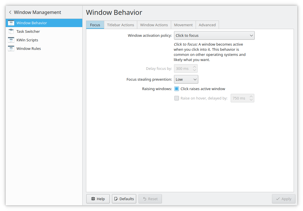
The style of tabs can be improved in Breeze, to make it obvious which tab is currently selected, as well as responding to the users current colorscheme. This could be apart of the breeze evolution.
Test Plan:
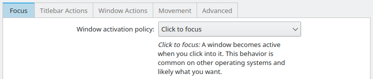
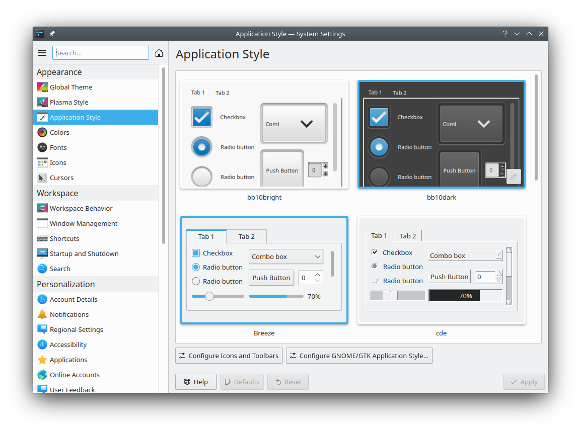
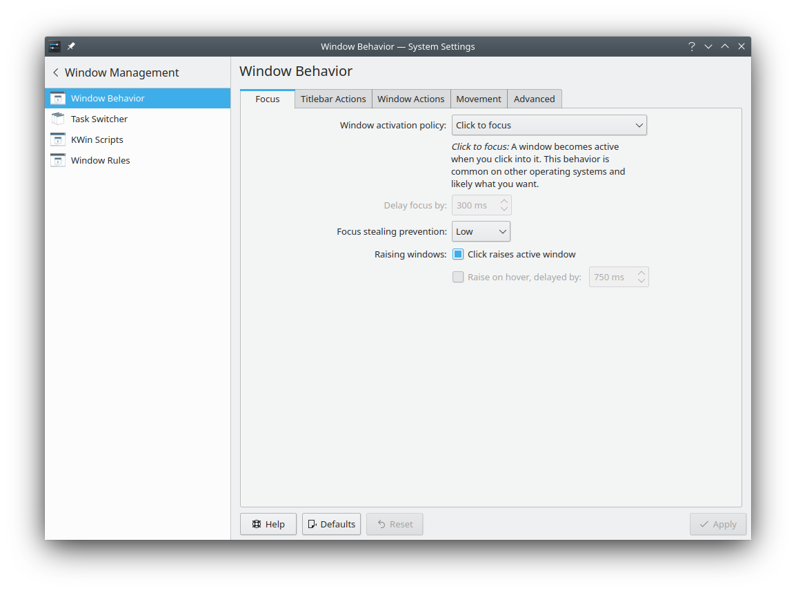
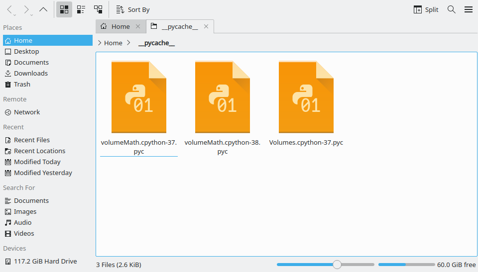
Before:
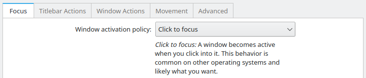
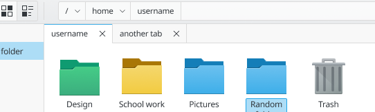
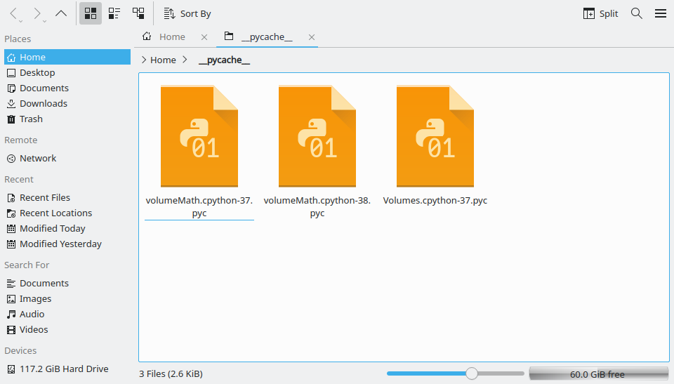
After:
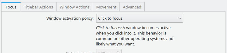
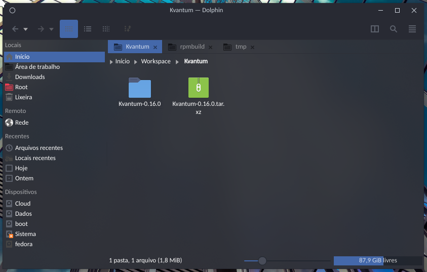
PS: I made the mockup with a stylesheet, so some of the other graphical elements may have come out unstyled, like the progressbar at the bottom.