Our tray popups have apparently not been touched up since Plasma 5.1.
They could use better spacing, margins and fixing of visual inconsistencies.
Copy-pasting a good analysis from u/centenary on Reddit:
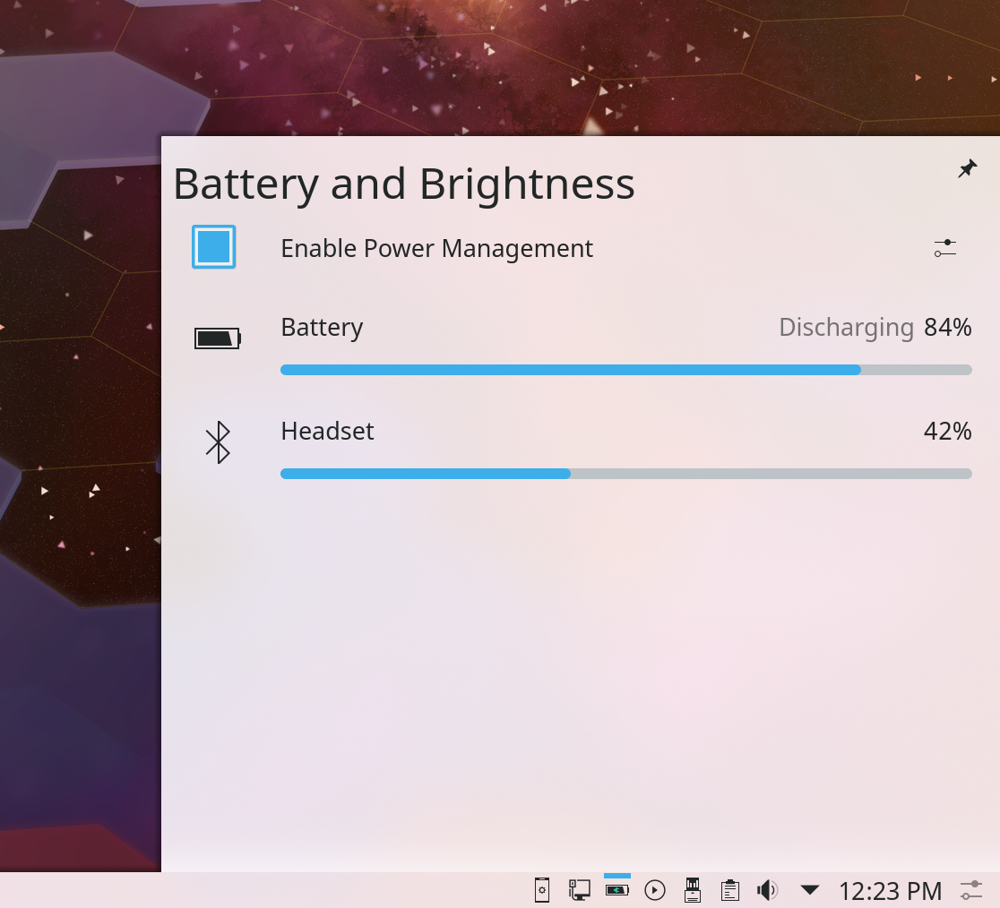
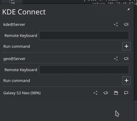
For example, looking at the "Battery and Brightness" here, in my opinion, the spacing of things could use work:
- The "Battery and Brightness" title is way closer to the left border than the top border. In my opinion, the two margins should be closer to equal, though I'm sure it looks fine to many people.
- The "Battery and Brightness" title is closer to the left than the top, while the pin icon on the right is closer to the top than the right. It actually makes the top look a little lopsided.
- The "Enable Power Management" toggle has almost the same spacing as the other items, making it blend in and making it less obvious that it is an interactive item. It would be easier to understand if there was some separation from the other items (e.g. if it was placed on the bottom)
- For each item in the list, the icon associated with each item is actually closer to the left border than the item itself. Given that the icons are meant to be associated with the items and not the left border, the icons should be moved closer to the items. The spacing should at least be equal if not closer to the items than the left border.
- The items in the list have almost the same right margin as the pin icon on the top. I think the right margin for the items in the list should be made larger to make it more obvious that those items are subcontents of the widget header.
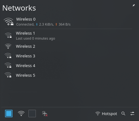
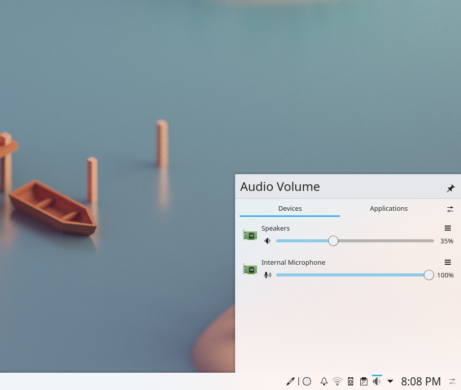
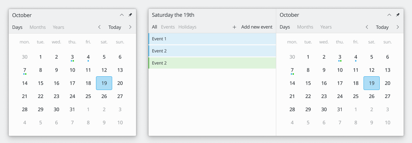
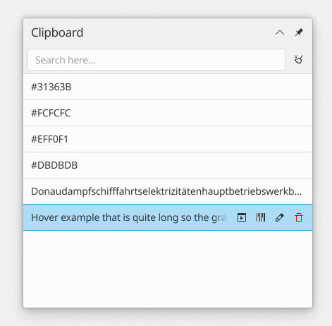
Example of a tray popup:
Mockups with headers
1x

2x F8113213
Mockups with footers
1x
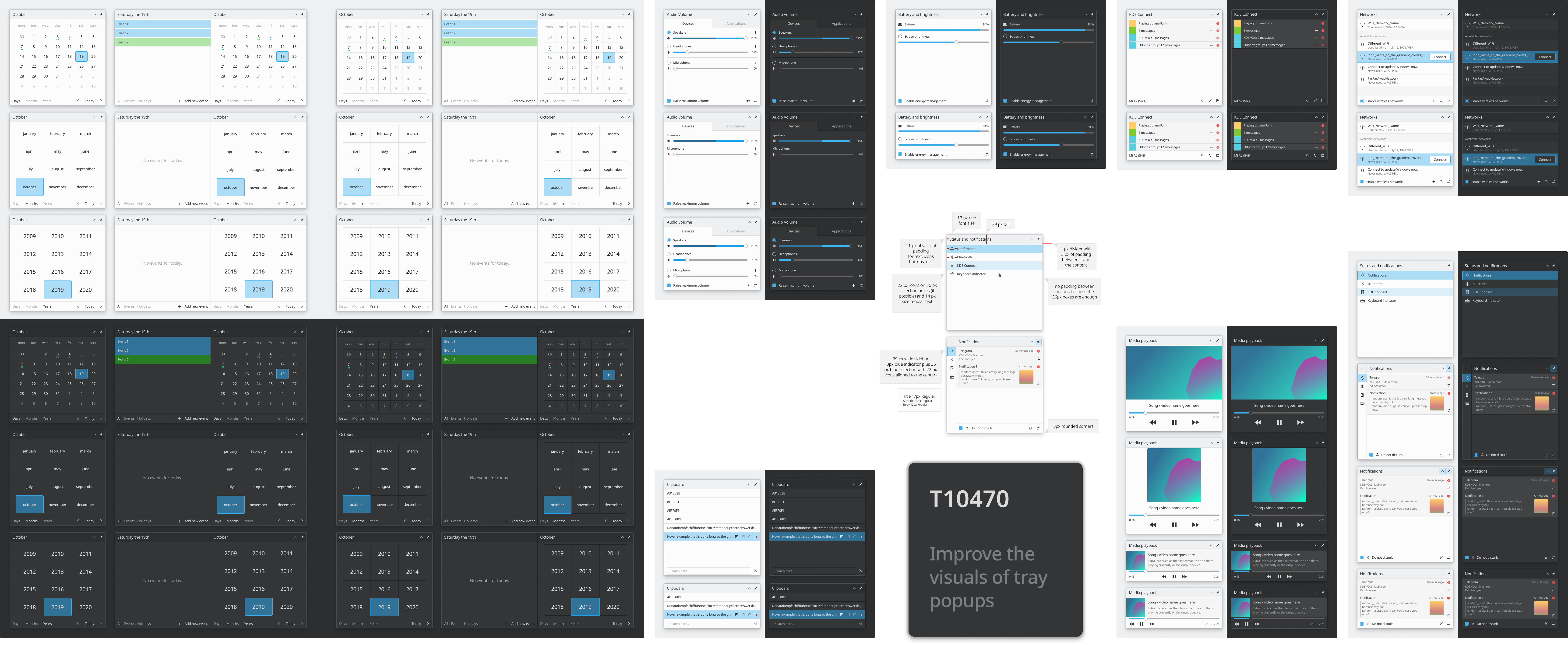
2x F7832286
svg


