T13071 About Page and Window Mock Up
Open, Needs TriagePublic

Description

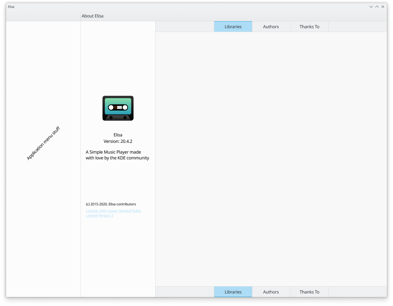
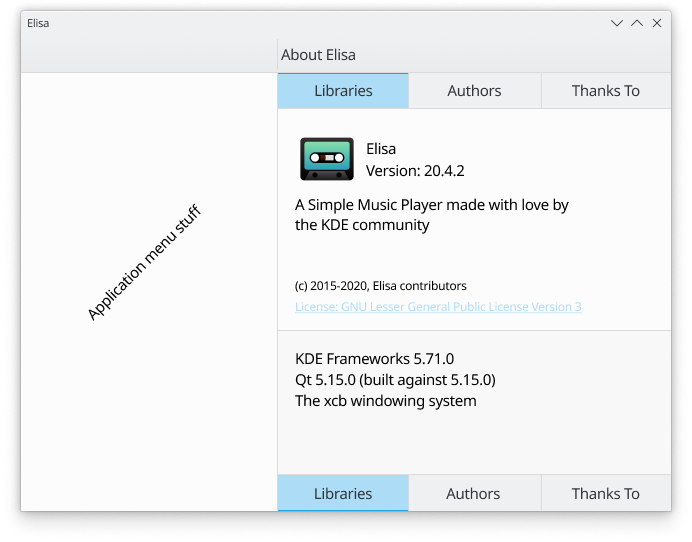
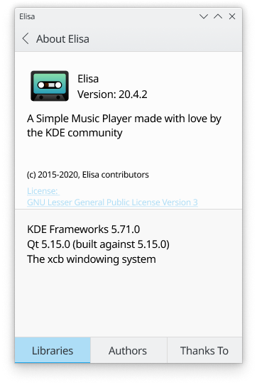
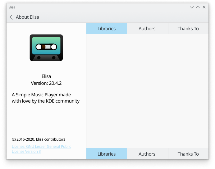
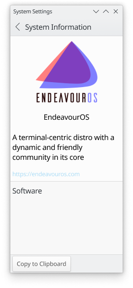
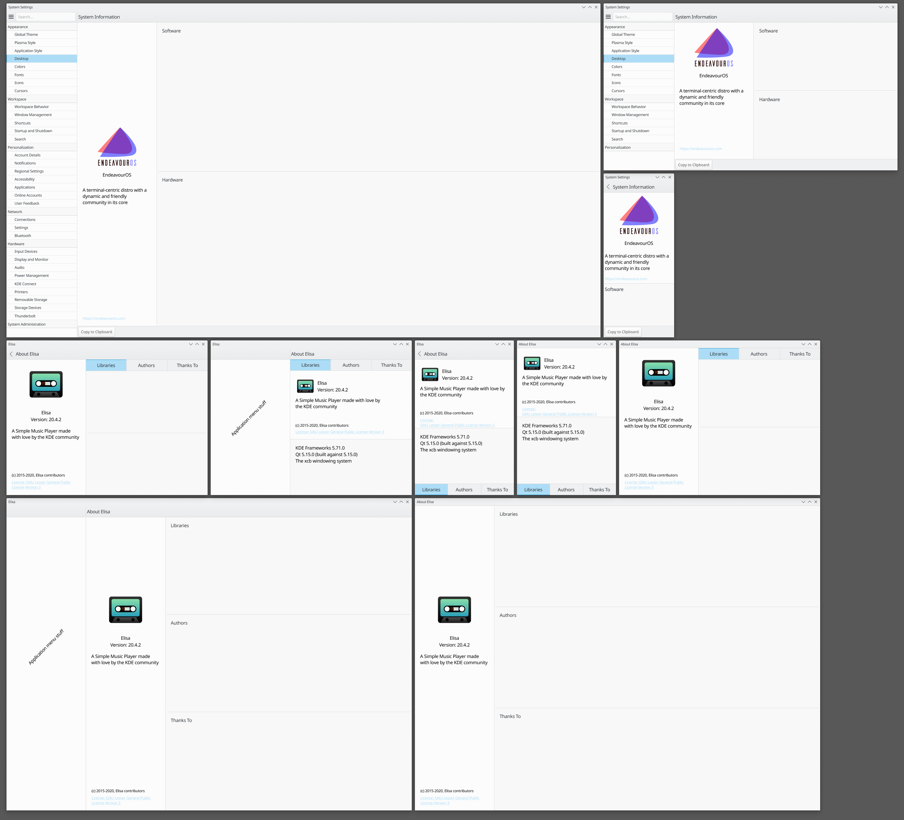
I'm using the information of Elisa as it's a great app that mixes legacy (about page) and kirigami (main ui). Also, come of the mock up pictures come with both a top and bottom tab bar, it's just so I don't have to make a single mock up for every variation. Tell me which one looks and feels more natural, my personally, I think bottom bars are more usable on small mobile screens but top mounted ones seem to be more full size desktop friendly.

Related Objects

StatusAssignedTask
OpenNone
OpenNone

Lovely!

Right now the biggest thing that's giving me a headache is setting the tab style and size, of which there are two, one that's around 36px in height (shown here) and the other that is 26px in height (shown in kdevelop mock-up). So you think i should keep these ones as is or use the slimmer ones here? I try to have two styles for some elements that might get interacted with in way too many ways. Btw, I'm not talking about the closable tabs with the close button as shown in the upper tab area of kdevelop and konsole, for that one I've only came up with this single style yet.

I just noticed with the existence of other toolbars around the page content it might make the addition of an extra bar, the tab bar, too space inefficient. As tab bars will be using the entire available space I need to update the initial mock ups above and find a solution for cohesiveness with other toolbars, especially if they have to be present in ever smaller displays like on a mobile.

Also, if there's little information in comparison with the display it's on the tabs could disappear and carry on as a fully scroll centered page (if there's any need to scroll btw).

Would it be ok if tabs moved down on mobile to be closer to hand placement and were kept on top for tablet and bigger displays?

Do we need tabs? Kirigami.AboutPage can get away with no tabs and the current KAboutDialog is sometimes very small...
The only thing is that old apps sometimes can have very long developer lists, but I would very much love to help with implementation aligning the widgets and Kirigami dialogs (maybe also KAboutPluginDialog?) when it's ready

Yeah, the more I go through mock ups and learn about proper space use and practicality the more I think my initial design is not good but not terrible.

What about something closer to this?

@davidre It's purely scroll oriented.

I was asking not in a navigational sense but more in a content organizing way. Single Page (current Kirigami.AboutPage) vs. multiple pages/tabs (KAboutDialog)

This is all meant to converge the interface of KAboutDialog and Kirigami.AboutPage so I need to mess with both navigational and content organization.

Yes and I was wondering if one page was maybe enough and not multiple like in the pictures in the top post

And truth be told, from initial to current mock up it hasn't changed much actually.

all those pictures are meant to show the same design throughout the legacy window (KAboutDialog) and newer page base (kirigami).

PhilipB added a comment.EditedJul 17 2020, 3:56 PM

How about these?

PhilipB added a comment.EditedJul 17 2020, 3:58 PM

It moves to a tabbed system whenever there's too much information for a pleasant scroll system. Clicking on a tab causes the information to pop up in a half display section and scrolling within that section makes it full display. Scrolling back up shows once again the background (the Distro or App intro).