User Details
- User Since
- Sep 28 2019, 9:35 AM (240 w, 1 d)
- Availability
- Available
Tue, Apr 23
Jun 19 2022
Apr 4 2022
Feb 4 2022
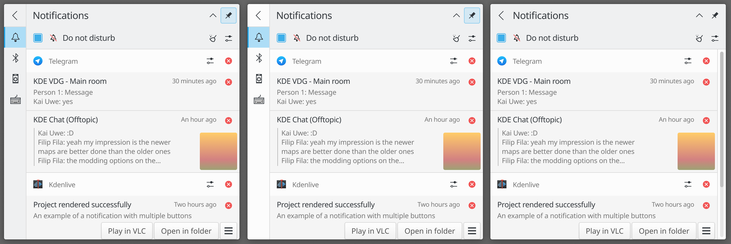
oops, we forgot to mark this one as resolved it seems
Jan 31 2022
Jan 24 2022
- Drawer background should be inverted like in the other apps.
Nov 15 2021
Oct 24 2021
Sep 17 2021
Jul 16 2021
Jul 11 2021
Jun 14 2021
May 25 2021

Feb 16 2021
| Crystalline: | 0 |
| Grand Canyon: | +1 |
| Vera: | +1 |
| Beach: | -2 |
| Altai: | +2 |
| Rainy Morning: | 0 |
| Slant: | 0 |
| Kay: | -1 |
| New Contest: | 0 |
Feb 15 2021
Oct 21 2020
Does this apply to the new Kirigami dividers? We're slowly removing lines in some places but now we're adding it between every list item on the sidebars so this feels like one step forward and two steps back lol
Oct 11 2020
These are from another task but I'm adding it here as a comment too since there are many differences from the one in the task and ocean
Oct 10 2020
Done.
Oct 9 2020
Oct 2 2020
I can replace it quite easily if you want but it might be a pita to implement with color mixing. Here's a quick edit with it:
- We want to make default buttons in Blue Ocean to look more distinctive by using the accent color for its background and maybe outline too.
By default you mean non-highlighted/selected?
- Blue Ocean 3.0
Sep 5 2020
Jul 31 2020
Jul 28 2020
I can try to reduce the overall padding a little bit if it's too much
Jul 27 2020
Jul 24 2020
I can modify the mockup I made on T12717#224840

if you want, based on what you'd like to see changed.
Jul 12 2020
Jun 13 2020
Jun 1 2020
Invent link in case it's useful for anyone: https://invent.kde.org/plasma/breeze/-/merge_requests/6
May 29 2020
May 15 2020
Changed folder-documents, folder-networks, folder-script, user-desktop.
May 14 2020
Everything should be good now, I think
Made 64x64 scalable again and tweaked the comments.
should line 495 "## Status" actually be removed?
Oops. Actually set 64x64 to fixed and remove MinSize and MaxSize
Fixed the issues from the comments
Include places/48
May 8 2020
May 7 2020
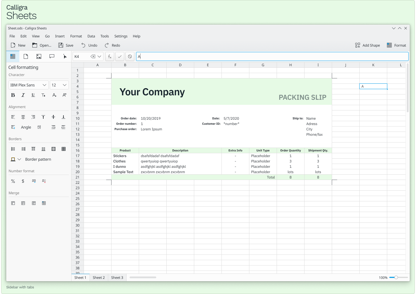
Should I also do Plan, Karbon or KEXI? And the new document dialog?
Calligra Sheets
May 6 2020
+1
I think it would still look fine with the 1px color line rounded at the top
Some more mockups:
Apr 28 2020
Apr 27 2020
I personally prefer the first one, and it's consistent with okular !156 from Invent and with T11579.
People from VDG seem to agree too
Apr 26 2020
Hey @abstractdevelop do you have a matrix or telegram account to talk about the design on the VDG room or via private messages? I'd rather not spam unfinished mockups here like I did on the system tray task.
Apr 25 2020
Apr 23 2020
Much better
I can try to design something if you want. Also, if a task is related to design it should probably have VDG as a tag too
(btw sorry for not seeing the email earlier, you can always ping me on telegram if I take too long to see a task/diff)
Looks good 👍 Should I accept as VDG or wait for @niccolove 's review?
Apr 22 2020
Use scour
Apr 21 2020
- Update icon style
Apr 20 2020
Apr 14 2020
Apr 12 2020
Yeah, what does it do? It seems like it uses both an icon and the first breadcrumb as a way to display a path, which is inconsistent with the current design. I feel like that's the only thing that is stopping this patch from getting accepted as VDG
Apr 8 2020
Apr 6 2020
The last one doesn't have a sidebar and goes back to the list after pressing the back button. It looks a bit cleaner but UX wise it's a bit worse too, having to click two times to do what currently only requires one. I prefer the first and second design but since that one was discussed in the VDG chat I didn't want to leave it there
Apr 5 2020
Some mockups:
manueljlin @ pm.me
I'll look into using arc for future patches, thanks :D
Apr 4 2020
Apr 3 2020
Mainly in context menus and small panels. On most apps it isn't really needed, but the LibreOffice icons use 1px lines everywhere and that tends to look quite blurry
I think it's a good idea to add more variations to breeze icons in general to make icons look sharp everywhere
Mar 30 2020
Nice! The mockups use the same opacity that the plasma style has (85%), the color (FCFCFC) and also the shadow of a panel (dock, notification bar) so it could work with other themes like desktop plasma would.
Mar 29 2020
yeah, there's no reason to create another one instead of just improving mycroft
Mar 26 2020
It looks really nice but that will make GTK apps a bit inconsistent :c