Unify highlight effect style
Open, NormalPublic

Description

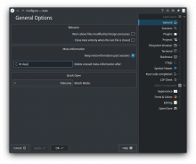
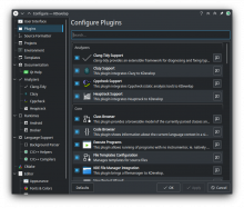
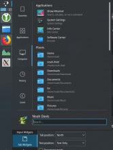
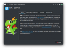
Currently our highlight effects are in somewhat of a stylistic discrepancy. We have:

  • EFFECT 1: Plain rectangles using highlight color

  • EFFECT 2: Rounded rectangles using highlight color for borders and highlight color at 30% opacity for the background

It wouldn't be desirable to have them be identical because some highlights span the full width of their UI element. We can bring them closer together, however. I would suggest we:

  • keep effect 2
  • modify effect 1 to have two variants:
    • one looking exactly like effect 2
    • the other one (used when filling width) could look like this:

The above would solve our issue with text legibility ; we could also finally use dark text (in the case of Breeze).

There are a very large number of changes, so older changes are hidden. Show Older Changes

Probably, yeah.

ndavis added a subscriber: ndavis.Jun 21 2019, 9:43 AM

Here's what I imagine context menus would look like with Effect 1:

Would probably be a good idea to look for all the irregular highlights that don't match either effect 1 or effect 2 and gather a list of them all here.
The few I know of are the highlights on the networks applet pointed out by @ngraham and the highlights on the task managers which resemble a vertical version of the filing width highlight @filipf mentioned.


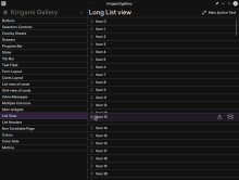
The highlights used in Kirigami (style=org.kde.desktop) are essentially effect 1 with variable transparency based on state.

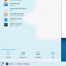
^ True, we also have these plain blue line style highlights used for windows in the task manager or tabs (Kickoff, audio applet...).

There is again a difference between the two implementations: the ones in the task manager get transparent highlight color on hover, while the ones used for tabs just don't. At the very least we should have the latter behave as the former, but some other ideas are welcome.

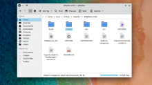
Here's an example of what Dolphin with revamped highlight effects might look like:

We could also somewhat tint the text color, although that's of course not necessary.

(Dolphin redesign courtesy of u/Luwx)

People are gonna flip once this Dolphin looks like that! That's like the nicest-looking file manager in existence lol.

I would like better text contrast over the highlight backgrounds though. It feels a little too gray to me. That's super minor nitpicking though; I'm sure it's a side effect of the visual effect used to create the mockup. :)

GB_2 added a subscriber: GB_2.Jun 21 2019, 9:31 PM

It would be nice to also have the highlight effect for the icon only task manager preview tooltip items, currently it is kind of weird by not having any hover feedback:

This is it on Windows 10 (with hover feedback):

davidre added a subscriber: davidre.EditedJun 22 2019, 2:25 PM

What about the systray? Quick hack:

ndavis added a comment.EditedJun 22 2019, 2:27 PM

I think adding highlights to panel widgets might be a good idea. Right now, the only indication that a panel widget might be clickable is that it gets slightly brighter, but that doesn't work with Breeze dark because the icons are already bright.

I think adding highlights to panel widgets might be a good idea. Right now, the only indication that a panel widget might be clickable is that it gets slightly brighter, but that doesn't work with Breeze dark because the icons are already bright.

+1. They're not consistent, either. Move your cursor over a panel and you'll see several different styles.

mglb added a subscriber: mglb.Jun 22 2019, 10:23 PM

Here's an example of what the full-width variant might look like:


The bold blue line is placed on the left (outer side) here, while in plasma task manager it is placed between the item and content (desktop), so it might be good idea to unify this. Another thing to consider is how it looks with a scrollbar and with a dock placed on window right side.

In T11124#189782, @mglb wrote:

Another thing to consider is how it looks with a scrollbar and with a dock placed on window right side.

Good point. It'll be harder to see with a left side vertical panel because of the panel shadow.

As soon as the official highlight effect(s) are defined, they need to be added to the HIG https://invent.kde.org/websites/hig-kde-org/issues/10

As soon as the official highlight effect(s) are defined, they need to be added to the HIG https://invent.kde.org/websites/hig-kde-org/issues/10

Will do.

@filipf What do you think we should do with comboboxes and toolbar buttons?

As soon as the official highlight effect(s) are defined, they need to be added to the HIG https://invent.kde.org/websites/hig-kde-org/issues/10

Will do.

@filipf What do you think we should do with comboboxes and toolbar buttons?

For tool buttons it might be nice to use the Kickoff effect (when pressed). When hovered over they can look the same as they do now = only show a border.

Comboboxes can remain as they are I think (at least when looking at QQC2 style, not QWidgets).

This comment was removed by hpereiradacosta.
ndavis added a comment.Jul 1 2019, 4:53 PM

For tool buttons it might be nice to use the Kickoff effect (when pressed). When hovered over they can look the same as they do now = only show a border.

This leads to inconsistent hovered and focused states though. Or perhaps the new highlight background with outline should be used to show where keyboard control is possible? That might not be obvious to users though.

Comboboxes can remain as they are I think (at least when looking at QQC2 style, not QWidgets).

I agree that ComboBoxes don't need to be changed much, besides the highlights on the menus that appear when you click on them.

ngraham assigned this task to ndavis.Jul 3 2019, 3:42 PM

Assigning to @ndavis given the awesome Breeze work he's doing in https://cgit.kde.org/breeze.git/log/?h=ndavis%2Fhighlight. :) I really can't wait until that's in!

I need some help coming up with a consistent way of showing a distinct difference between mouse hover, keyboard focus and the sunken state. Here's what I know about how different widget types use these.

There are 3 basic button states: Hover, Focus and Sunken.
Hover helps show what can be clicked with the mouse.
Focus indicates keyboard focus so that users know when buttons can be controlled with the keyboard.
Sunken helps the user know when their mouse clicks should cause something to happen.

Menus/Context Menus

Hover controls the Focus and there is no Sunken state, so these are easy.

Regular Buttons

Hover, Focus, Hover+Focus and Hover+Focus+Sunken are all possible states, so these are tricky.

Toolbar Buttons

These can have the Hover and Sunken states, but not the Focus state

For an average mouse, trackpad or touch screen user, a visual distinction between toolbar and regular buttons may not make much sense, but there is a real difference in how they function for keyboard users. Is a visual distinction necessary because of the difference for keyboard users? Is it necessary for reasons unrelated to keyboard control?

Menu Bar Buttons (e.g., File, Edit, View)

These function like Toolbar Buttons with menus.

Selected Items

These have Hover and Focus states that are independent of each other. Focus controls what is selected.

View Areas

These have an outline that turns bright blue when something in the area gets Focus, such as a selected item. When the area loses focus, the selected items inside can change to a different color.

  • For the record: toolbar buttons (or rather QToolButtons) can have focus too, when they are used outside of toolbars (and there are examples of such everywhere, for instance when you have an "open" button next to a text entry for selecting a file.

your enumeration did not mention

  • checkboxes and radiobuttons who also have hove/focus + the various selected states.
  • tabbar entries (hover, focus, selected)
  • toolboxes
  • view areas can have focus, (and hover) even if there is no selected item in there. This is why you need a distinct way to indicate focus and hover for them, e.g. the blue outline in breeze. (something that is missing from the current implementation of systemsetting)

you can have a semi-complete set of widgets to test their various states at once using "oxygen-demo5" (if not provided with your distro, it is compiles in the "oxygen" repository, which is as "easy" to compile as "breeze"

  • For the record: toolbar buttons (or rather QToolButtons) can have focus too, when they are used outside of toolbars (and there are examples of such everywhere, for instance when you have an "open" button next to a text entry for selecting a file.

Thanks, can you give me an example of an application where I can find this behavior? I can't find anything in the applications I have installed.

your enumeration did not mention

  • checkboxes and radiobuttons who also have hove/focus + the various selected states.
  • tabbar entries (hover, focus, selected)
  • toolboxes
  • view areas can have focus, (and hover) even if there is no selected item in there. This is why you need a distinct way to indicate focus and hover for them, e.g. the blue outline in breeze. (something that is missing from the current implementation of systemsetting)

Yeah, I figured I forgot some things.
I don't intend to change checkboxes in this project. That discussion is happening here: T10997
I don't currently plan to change tabs, although I kind of like the look of the Oxygen inactive tab highlights.
I'm not sure what to do with toolboxes. They're hardly ever used in KDE and 3rd party applications, so maybe I'll just leave them alone until someone else finds a reason to change them.

you can have a semi-complete set of widgets to test their various states at once using "oxygen-demo5" (if not provided with your distro, it is compiles in the "oxygen" repository, which is as "easy" to compile as "breeze"

Thanks for the tip about oxygen-demo5, that'll probably save a lot of time switching between apps and themes.

  • For the record: toolbar buttons (or rather QToolButtons) can have focus too, when they are used outside of toolbars (and there are examples of such everywhere, for instance when you have an "open" button next to a text entry for selecting a file.

Thanks, can you give me an example of an application where I can find this behavior? I can't find anything in the applications I have installed.

It's QML rather than QWidgets, but Elisa shows toolbutton highlights if you press the tab key enough.

...Which reminds me, these QStyle changes are going to need to be replicated in qqc2-desktop-style too. And maybe also Kirigami in some places.

...Which reminds me, these QStyle changes are going to need to be replicated in qqc2-desktop-style too. And maybe also Kirigami in some places.

Yeah, Marco mentioned that at the sprint.

Thanks, can you give me an example of an application where I can find this behavior? I can't find anything in the applications I have installed.

Some of the Buttons in Spectacle are Toolbuttons instead of Pushbuttons. Namely "Save" and "Copy to Clipboard"

Few words about colors (sorry if you know all about it already)

KF5 color palette has two distinct colors for the highlight scheme: KColorscheme::FocusColor and KColorSheme::HoverColor. The former is also the one used by QPalette::Highlight, for e.g. text selection. Using these, you could in principle implement the exact same rendering for mouse-over and focus, just picking the appropriate color.
When you have focus+hover, you have to decide which one takes precedence. For most widgets, (button, selection in lists for instance), hover takes precedence on focus, so that you can still track mouse-over over focused items.

Each of these two colors come in three flavor, depending of the QPalette::Colorgoup enum: active, inactive and disabled. So you should set these accordingly. For most buttons, the "active" state comes from the window->isActive. That's why a focused widgets in an inactive window has a slightly lighter color than in an active window. For view areas, on the other hand, the active state is usually decided on whether the view itself has focus or not. This is why selected items (or selected text) has a lighter color when the corresponding view does not have focus. This is in principle all handled "automagically"

Finally there is still the issue of the HighlightedText foreground color in the palette. It is chosen to have high contrast against the highligh (=focus) color background. This is why it is white in the default color scheme. You should not change this, if you do not want to break other widget themes, or break text selection. If you want to manually lighten the focus/highlight color, by adding some translucency, so that you do not have to change the text color, you must make sure to use the QPalette::Text or QPalette::WindowText role, rather than modifying the palette's HighlightedText role. For monochrome icons there is the extra complication that the QIcon::Selected state will by default use the HighlightedText role for its main color. So what you would then need is to use the QIcon::Normal state instead of ::Selected, everywhere you do not want this color change to happen.

I hope this helps.

Personal opinion follows.

In my personal opinion, the current breeze widget style highlight model is fine as it is, internally consistent, and consistent with the breeze visual goal. It is simple (in particular in lists and menus), it minimizes the use of frames, and is also consistent with text selection (something on which you have no handle). I also note that it is quite trendy, when comparing e.g. to highlight model of many web-based applications (slack, github, etc.), or to the other widget styles shipped by Qt.
To ensure consistency with plasma, rather than modifying the complex beast that is the widget style highlight model, I would have changed the plasma model instead. Simpler, both implementation-wise and visually wise.
My two cents.

zzag added a subscriber: zzag.Jul 15 2019, 12:40 PM
ndavis added a comment.EditedJul 15 2019, 12:40 PM

Thanks for the color overview. I'll avoid changing the highlighted text color in the colorscheme.

Personal opinion follows.

In my personal opinion, the current breeze widget style highlight model is fine as it is, internally consistent, and consistent with the breeze visual goal. It is simple (in particular in lists and menus), it minimizes the use of frames, and is also consistent with text selection (something on which you have no handle). I also note that it is quite trendy, when comparing e.g. to highlight model of many web-based applications (slack, github, etc.), or to the other widget styles shipped by Qt.
To ensure consistency with plasma, rather than modifying the complex beast that is the widget style highlight model, I would have changed the plasma model instead. Simpler, both implementation-wise and visually wise.
My two cents.

That's a fair point, but the current style does have rather poor contrast with light text. While dark text has significantly better contrast, I don't like the way it looks against Plasma Blue. The highlight color could be changed, which would be much easier than changing the highlight style, but that would affect everything that currently uses the highlight color, including icons.

it minimizes the use of frames, and is also consistent with text selection (something on which you have no handle).

Is minimizing the use of frames part of the design of Breeze? What do you mean when you say I have no handle on text selection? Is it impossible or not feasible (due to issues with text being complicated) to change the style of text selection?

To be clear, I don't think that every highlight needs a frame, but it is a rather nice looking mouse hover effect. Text selection might only require a different color to improve contrast.

Thanks for the color overview. I'll avoid changing the highlighted text color in the colorscheme.

Personal opinion follows.

In my personal opinion, the current breeze widget style highlight model is fine as it is, internally consistent, and consistent with the breeze visual goal. It is simple (in particular in lists and menus), it minimizes the use of frames, and is also consistent with text selection (something on which you have no handle). I also note that it is quite trendy, when comparing e.g. to highlight model of many web-based applications (slack, github, etc.), or to the other widget styles shipped by Qt.
To ensure consistency with plasma, rather than modifying the complex beast that is the widget style highlight model, I would have changed the plasma model instead. Simpler, both implementation-wise and visually wise.
My two cents.

That's a fair point, but the current style does have rather poor contrast with light text. While dark text has significantly better contrast, I don't like the way it looks against Plasma Blue. The highlight color could be changed, which would be much easier than changing the highlight style, but that would affect everything that currently uses the highlight color, including icons.

Thanks for the pointer to the contrast page. To me this points to a defect in the color scheme and begs for being fixed there first, disregarding actual changes to the style. This way you would fix all widget styles at once (and text selection), and not only breeze. Once this is addressed (which is the real issue apparently), changing the widget style highlight model should be a different (unrelated) discussion, focused e.g. on consistency.

it minimizes the use of frames, and is also consistent with text selection (something on which you have no handle).

Is minimizing the use of frames part of the design of Breeze?

yes and no. There was never any document to outline the design choices of the breeze widget style when it was designed (not by me). But the idea was to have a light, simple and consistent style. That went along with having as little frames as possible (around menus, or toolbars for instance), little gradients if any, lighter frames and shadows when anavoidable, etc. Again, nothing written, so this might just be my own interpretation of what was attempted at the time.

What do you mean when you say I have no handle on text selection? Is it impossible or not feasible (due to issues with text being complicated) to change the style of text selection?

Apart from the colors (that are from the palette), this is not handled by the QStyle. You have to go inside the actual widget.

To be clear, I don't think that every highlight needs a frame, but it is a rather nice looking mouse hover effect. Text selection might only require a different color to improve contrast.

See above. I agree. That should be the starting point, to fix the contrast issue, IMHO.

Can I change the selection background color and use the selection color for the background of highlights? Then the regular highlight color could be used mainly for line highlights and outlines.

Can I change the selection background color and use the selection color for the background of highlights? Then the regular highlight color could be used mainly for line highlights and outlines.

Probably yes. At least in kde color palette, text selection and focus color are two different entries. Now you just need to make sure that they are used consistently in the style. (of which I am not 100% sure).

Finally there is still the issue of the HighlightedText foreground color in the palette. It is chosen to have high contrast against the highligh (=focus) color background. This is why it is white in the default color scheme. You should not change this, if you do not want to break other widget themes, or break text selection. If you want to manually lighten the focus/highlight color, by adding some translucency, so that you do not have to change the text color, you must make sure to use the QPalette::Text or QPalette::WindowText role, rather than modifying the palette's HighlightedText role. For monochrome icons there is the extra complication that the QIcon::Selected state will by default use the HighlightedText role for its main color. So what you would then need is to use the QIcon::Normal state instead of ::Selected, everywhere you do not want this color change to happen.

Since I an no longer manually lightening the colors, it's fine to change the Selected Text color, right? Not changing it makes contrast worse for all widget themes when the Selection color is changed, as expected.

@hpereiradacosta I discovered a problem that must have existed since 2014.

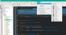
Functions like QColor focusColor( const QPalette& palette ) const that get their color from a KStatefulBrush don't update when an application like KDevelop changes its colorscheme. It seems like the system configuration is loaded at breezehelper.cpp:44 and it simply doesn't read the application's configuration. This causes problems like in the picture below where the background color of the menus should be green, but it uses Plasma Blue from the system's Breeze Dark colorscheme instead.

I'm not sure how to fix this.

mglb added a comment.Jul 25 2019, 6:35 PM

@ndavis Install event filter on qGuiApp, handle QEvent::ApplicationPaletteChange and call configurationChanged. Should work.

Hover/focus color change is not handled because there is QApplication::setPalette and QGuiApplication::setPalette. The former is used by KColorSchemeManager for changing color scheme and does not emit paletteChanged signal, which is used to detect the change in the style.

Thanks for the tip, @mglb. Could you explain that a bit more? I'm not very familiar with Qt, I've just been figuring out things as I go and following existing patterns in the code. I grepped for qGuiApp and I didn't see it anywhere in the code of the Breeze repo.

mglb added a comment.Jul 26 2019, 4:53 PM

qApp will work too (qGuiApp is qApp casted to its base class).

In Style class install (register) this as event filter: addEventFilter(qApp). qApp events will be received in Style::eventFilter(object, event), with object set to qApp. The case you're looking for is object == qApp and event->type() == QEvent::ApplicationPaletteChange.

The place where the mentioned signal is connected should be a good place to install event filter:
https://phabricator.kde.org/source/breeze/browse/ndavis%252Fhighlight/kstyle/breezestyle.cpp$201

In T11124#193084, @mglb wrote:

qApp will work too (qGuiApp is qApp casted to its base class).

In Style class install (register) this as event filter: addEventFilter(qApp). qApp events will be received in Style::eventFilter(object, event), with object set to qApp. The case you're looking for is object == qApp and event->type() == QEvent::ApplicationPaletteChange.

The place where the mentioned signal is connected should be a good place to install event filter:
https://phabricator.kde.org/source/breeze/browse/ndavis%252Fhighlight/kstyle/breezestyle.cpp$201

You mean like this?

breezestyle.cpp:200

#if !BREEZE_USE_KDE4
        connect(qApp, &QApplication::paletteChanged, this, &Style::configurationChanged);
        this->addEventFilter(qApp);
#endif


breezestyle.cpp:1023

bool Style::eventFilter( QObject *object, QEvent *event )
{

    if( auto dockWidget = qobject_cast<QDockWidget*>( object ) ) { return eventFilterDockWidget( dockWidget, event ); }
    else if( auto subWindow = qobject_cast<QMdiSubWindow*>( object ) ) { return eventFilterMdiSubWindow( subWindow, event ); }
    else if( object == qApp && event->type() == QEvent::ApplicationPaletteChange ) { configurationChanged(); }

It doesn't fix the problem, so I must be doing something wrong.

mglb added a comment.Jul 26 2019, 7:50 PM

Your code is right. I just checked and turns out this is not the only problem. In void Helper::loadConfig() You have to remove last argument (_config) from KStatefulBrush:

_viewFocusBrush = KStatefulBrush( KColorScheme::View, KColorScheme::FocusColor);
_viewHoverBrush = KStatefulBrush( KColorScheme::View, KColorScheme::HoverColor);
_viewNegativeTextBrush = KStatefulBrush( KColorScheme::View, KColorScheme::NegativeText);

This way KStatefulBrush uses a config loaded from a file path stored in application's property "KDE_COLOR_SCHEME_PATH" (or user default, if missing). The property is set by KColorSchemeManager.

In T11124#193005, @mglb wrote:

@ndavis Install event filter on qGuiApp, handle QEvent::ApplicationPaletteChange and call configurationChanged. Should work.

Hover/focus color change is not handled because there is QApplication::setPalette and QGuiApplication::setPalette. The former is used by KColorSchemeManager for changing color scheme and does not emit paletteChanged signal, which is used to detect the change in the style.

Mmm. Rather than installing event filter, which in some cases will be duplicated to the signal/slot handling, shouldn't we not fix the problem upstream, either in QApplication::setPalette, or in KColorShemeManager (which we own), to make sure that the paletteChanged signal is called ?
This way there would be only one code path in breeze, as well as in other styles (e.g. oxygen)

That seems to make sense. If we patch Qt, would people on rolling distros have to wait a long time to get the fix? If so, I think I'd rather patch KColorSchemeManager first so that we can roll out the fix in the next KF5 release. If it's a bug in Qt, we should probably patch it at some point, regardless of whether or not we also patch KColorSchemeManager.

mglb added a comment.Jul 27 2019, 2:54 AM
In T11124#193005, @mglb wrote:

Mmm. Rather than installing event filter, which in some cases will be duplicated to the signal/slot handling, shouldn't we not fix the problem upstream, either in QApplication::setPalette, or in KColorShemeManager (which we own), to make sure that the paletteChanged signal is called ?
This way there would be only one code path in breeze, as well as in other styles (e.g. oxygen)

The signal can be removed, as it is probably never used.

Turns out this is fixed in Qt 5.13: https://bugreports.qt.io/browse/QTBUG-71186.
Still, I think eventFilter should be used to support Qt < 5.13, at least for some time. The signal connection can be left here with ifdef for Qt 5.13 (and #else for eventFilter code to avoid double call) and mandatory comment.

In T11124#193089, @mglb wrote:

This way KStatefulBrush uses a config loaded from a file path stored in application's property "KDE_COLOR_SCHEME_PATH" (or user default, if missing). The property is set by KColorSchemeManager.

I found a problem here: An application started using a config from KDE_COLOR_SCHEME_PATH property since it changed its color scheme. Later, when system color scheme is changed, the application receives new palette and an change event. As the property is not removed, focus/hover colors are read from previously set scheme.

Just FYI, as it should be fixed in KColorSchemeManager/KStatefulBrush.

In T11124#193109, @mglb wrote:

The signal can be removed, as it is probably never used.

Turns out this is fixed in Qt 5.13: https://bugreports.qt.io/browse/QTBUG-71186.
Still, I think eventFilter should be used to support Qt < 5.13, at least for some time. The signal connection can be left here with ifdef for Qt 5.13 (and #else for eventFilter code to avoid double call) and mandatory comment.

Like this?

breezestyle.cpp:200

#if !BREEZE_USE_KDE4
#if QT_VERSION < 0x050D00 // Check if Qt version < 5.13
this->addEventFilter(qApp);
#else
connect(qApp, &QApplication::paletteChanged, this, &Style::configurationChanged);
#endif
#endif


breezestyle.cpp:1027

bool Style::eventFilter( QObject *object, QEvent *event )
{
// [ edited for conciseness ]
    #if QT_VERSION < 0x050D00 // Check if Qt version < 5.13
    else if( object == qApp && event->type() == QEvent::ApplicationPaletteChange ) { configurationChanged(); }
    #endif
In T11124#193089, @mglb wrote:

This way KStatefulBrush uses a config loaded from a file path stored in application's property "KDE_COLOR_SCHEME_PATH" (or user default, if missing). The property is set by KColorSchemeManager.

I found a problem here: An application started using a config from KDE_COLOR_SCHEME_PATH property since it changed its color scheme. Later, when system color scheme is changed, the application receives new palette and an change event. As the property is not removed, focus/hover colors are read from previously set scheme.

Just FYI, as it should be fixed in KColorSchemeManager/KStatefulBrush.

So KColorSchemeManager/KStatefulBrush needs to be fixed, but removing the _config arguments is still the right thing to do?

mglb added a comment.Jul 27 2019, 8:07 PM
In T11124#193109, @mglb wrote:

The signal can be removed, as it is probably never used.

Turns out this is fixed in Qt 5.13: https://bugreports.qt.io/browse/QTBUG-71186.
Still, I think eventFilter should be used to support Qt < 5.13, at least for some time. The signal connection can be left here with ifdef for Qt 5.13 (and #else for eventFilter code to avoid double call) and mandatory comment.

Like this?
...

Looks good.

In T11124#193089, @mglb wrote:

This way KStatefulBrush uses a config loaded from a file path stored in application's property "KDE_COLOR_SCHEME_PATH" (or user default, if missing). The property is set by KColorSchemeManager.

I found a problem here: An application started using a config from KDE_COLOR_SCHEME_PATH property since it changed its color scheme. Later, when system color scheme is changed, the application receives new palette and an change event. As the property is not removed, focus/hover colors are read from previously set scheme.

Just FYI, as it should be fixed in KColorSchemeManager/KStatefulBrush.

So KColorSchemeManager/KStatefulBrush needs to be fixed, but removing the _config arguments is still the right thing to do?

_config argument should be removed in KStatefulBrush. _config is always the system config, which is incorrect with a scheme set by application. KStatefulBrush without config argument uses either the system config or application config.

mglb added a comment.Aug 13 2019, 8:07 PM

List view/sidebar highlight: why the vertical bright line is on right (internal) side? Wouldn't it look better on left (outside)?

  • How does current version look with a scrollbar ("normal" and overlay like in system settings)?
  • Highlights on plasma panel [1] have the line on the panel edge, so having it also on window's edge could make it consistent.
  • With the line "outside" it could be possible to use this design with tabs
  • I see only one drawback - with panel placed on the left, the lines from panel and window could be mistaken for each other.

[1]


The launcher has the line above items (inside). I guess it is made to separate it from a list above (as there is no other separator).

There is a separator:

In T11124#195358, @mglb wrote:

List view/sidebar highlight: why the vertical bright line is on right (internal) side? Wouldn't it look better on left (outside)?

I initially used the inside because I didn't want the plasma panel shadow to make it hard to see with vertical left side panels. Another problem with outside highlights is that they can overlap with left aligned text. I've made it so that the highlights switch sides with RTL layouts, so the problem never occurs when using the inside edge.

  • How does current version look with a scrollbar ("normal" and overlay like in system settings)?

SySe doesn't support the new highlights yet. It's using too much QML specific styling. If they worked correctly, I would expect them to look similar to this:

Normal scrollbar:

  • Highlights on plasma panel [1] have the line on the panel edge, so having it also on window's edge could make it consistent.

I don't see how it's inconsistent. They all go towards the same direction.

  • With the line "outside" it could be possible to use this design with tabs

You can use the design with tabs either way. Outside: put tab highlights on the outside edges. Inside: put tab highlights on the inside edges. We already do the latter to some degree and Oxygen also did the latter. Firefox does the former.

Just thought I'd drop my own thoughts here. Personally, I've never been a fan of how Highlights have a different border and a background color. I think that it should just be a solid color for all cases (except perhaps for buttons and the bigger elements), just so we don't have multiple types of highlights.

I'd say effect #1 has the best contrast while avoiding it looking possibly washed out. It also looks simpler/not as distracting.

I think I'm going to continue using the outline/sideline+fainter background style. With simple solid highlights, there is a contrast issue where the highlight color either doesn't contrast well with the text or doesn't contrast well with the window background. With a strong highlight outline/sideline and weaker highlight background, we can have good text contrast and good window background contrast.

Just thought I'd drop my own thoughts here. Personally, I've never been a fan of how Highlights have a different border and a background color. I think that it should just be a solid color for all cases (except perhaps for buttons and the bigger elements), just so we don't have multiple types of highlights.

I'd say effect #1 has the best contrast while avoiding it looking possibly washed out. It also looks simpler/not as distracting.

While I'm not dismissing the possibility that the new style is more distracting, I don't understand what you mean by that. The new style draws more attention to the content surrounded by the outline or in the direction of the sideline.

alexde added a subscriber: alexde.Aug 16 2019, 7:52 PM

There's a white line, which contains a blue line under the "about" tab.

  1. Has that been changed recently, because under Plasma 5.16.4 it looks different:
  2. Is the white line necessary at all? When I now checked Breeze light, it found that the white line is there as well but hardly visible at all:

Personally, I would drop it, as having two lines or a bicolor line looks kind of wrong to me.

The white line is a visual bug, not an intended design element. :)

ndavis added a comment.EditedAug 16 2019, 8:09 PM

There's a white line, which contains a blue line under the "about" tab.

  1. Has that been changed recently, because under Plasma 5.16.4 it looks different:
  2. Is the white line necessary at all? When I now checked Breeze light, it found that the white line is there as well but hardly visible at all:


    Personally, I would drop it, as having two lines or a bicolor line looks kind of wrong to me.

I do intend to get rid of that white line. The lines being at different heights in your screenshot may be a high DPI issue, which I suppose further supports the idea that the white line is a bug.

onvitaik added a comment.EditedAug 16 2019, 8:22 PM

I think I'm going to continue using the outline/sideline+fainter background style. With simple solid highlights, there is a contrast issue where the highlight color either doesn't contrast well with the text or doesn't contrast well with the window background. With a strong highlight outline/sideline and weaker highlight background, we can have good text contrast and good window background contrast.

While I'm not dismissing the possibility that the new style is more distracting, I don't understand what you mean by that. The new style draws more attention to the content surrounded by the outline or in the direction of the sideline.

It's because the amount of things you end up looking at is increased. The new border color, the text, and the new background color - There's more stuff going on now. While it's true the highlight color doesn't contrast well with the window background, that isn't something to worry about much as long as the text stands out, since that's the most important information we're looking at. So a faint highlight - as long as the text is visible/readable - is fine.

mglb added a comment.Aug 17 2019, 4:26 PM
In T11124#195358, @mglb wrote:

List view/sidebar highlight: why the vertical bright line is on right (internal) side? Wouldn't it look better on left (outside)?

I initially used the inside because I didn't want the plasma panel shadow to make it hard to see with vertical left side panels.

The line is used only in a sidebar, which is used mainly (or only?) in an application's configuration windows and system settings. I guess configuration windows are not maximized very often, so the shadow is not a problem.
System settings is probably maximized on smaller screens, but I don't think the shadow is a big problem - there is regular blue background as a main highlight indicator.

Another problem with outside highlights is that they can overlap with left aligned text. I've made it so that the highlights switch sides with RTL layouts, so the problem never occurs when using the inside edge.

The position/size of an item's contents is controlled by the style:

The code: https://invent.kde.org/snippets/391 (warning: not production-ready)

  • How does current version look with a scrollbar ("normal" and overlay like in system settings)?

SySe doesn't support the new highlights yet. It's using too much QML specific styling. If they worked correctly, I would expect them to look similar to this:

Normal scrollbar:

Next remark: the line looks a bit like scrollbar/scroll indicator (especially when someone is not familiar with breeze and its scrollbar margins)

  • With the line "outside" it could be possible to use this design with tabs

You can use the design with tabs either way. Outside: put tab highlights on the outside edges. Inside: put tab highlights on the inside edges. We already do the latter to some degree and Oxygen also did the latter. Firefox does the former.

Oxygen uses soft light, a bit different thing IMO.
I was thinking about tabs like these in firefox. Additional indicator (which would replace weird 1px lines we have now) could improve readability in some cases. E.g. Konsole users sometimes complain about active tab being not distinguishable enough.

Also: almost every design which uses side line indicator has it on the left. Side panels, cards, etc.

In T11124#195731, @mglb wrote:

The line is used only in a sidebar, which is used mainly (or only?) in an application's configuration windows and system settings. I guess configuration windows are not maximized very often, so the shadow is not a problem.
System settings is probably maximized on smaller screens, but I don't think the shadow is a big problem - there is regular blue background as a main highlight indicator.

Turns out my fears about visibility were unfounded:

The position/size of an item's contents is controlled by the style:

The code: https://invent.kde.org/snippets/391 (warning: not production-ready)

Good to know.

Next remark: the line looks a bit like scrollbar/scroll indicator (especially when someone is not familiar with breeze and its scrollbar margins)

Fair point.

Oxygen uses soft light, a bit different thing IMO.
I was thinking about tabs like these in firefox. Additional indicator (which would replace weird 1px lines we have now) could improve readability in some cases. E.g. Konsole users sometimes complain about active tab being not distinguishable enough.

Also: almost every design which uses side line indicator has it on the left. Side panels, cards, etc.

This is vaguely how Konsole tabs might looks with the highlight on the outside (based on Firefox design):

Part of my idea with the sidelines is that they should face the content that the button they're decorating leads to. That would be more difficult for things like menubars where the menu can appear above or below the button, but it seems like it should be possible.

Another alternative would be to drop the sidelines and stick to outlines with sides that vary based on position, because they can't work with non-KDE sidebars. At least, not without affecting anything that uses a QListView, since QListViews are often used as sidebars in 3rd party apps.

ndavis moved this task from Reported to VDG Discussion on the Goal: Consistency board.
ngraham moved this task from To Do to Work in Progress on the Plasma board.
PhilipB added a subscriber: PhilipB.EditedOct 13 2020, 1:33 AM

Based on Manuel's highlight effects and color scheme:

I am not entirely sure if the colors are up to his current mock ups but were until recently. This is actually a good design that works well on every element that can be highlighted, in my opinion.