Redesign Policy Kit Authorization dialog
Open, Needs TriagePublic

Description

As started in:

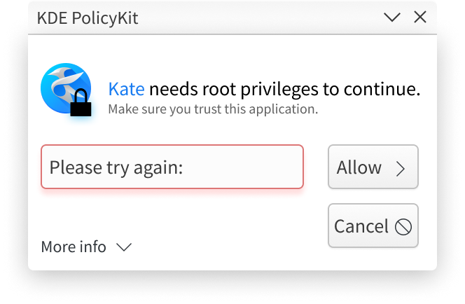
D12311: Align lock icon with bold message text; reduce overall size of dialog

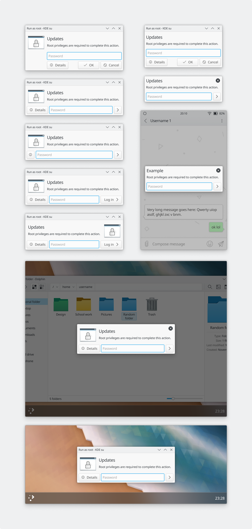
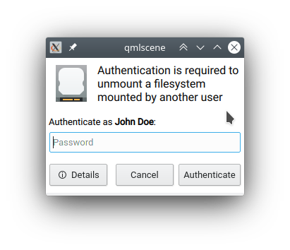
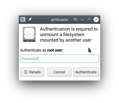
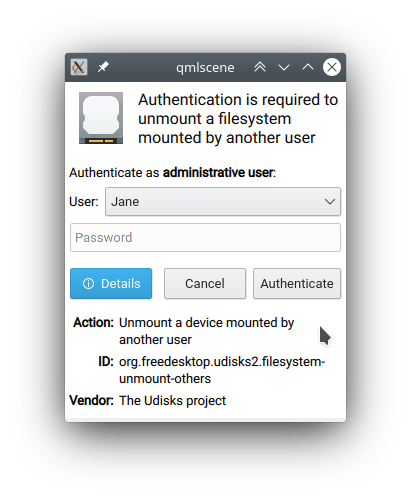
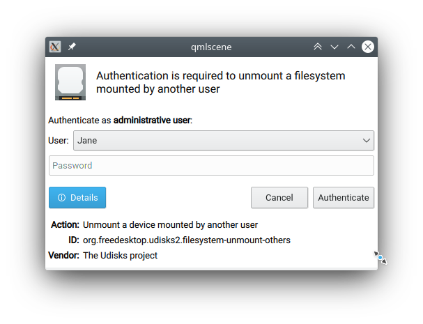
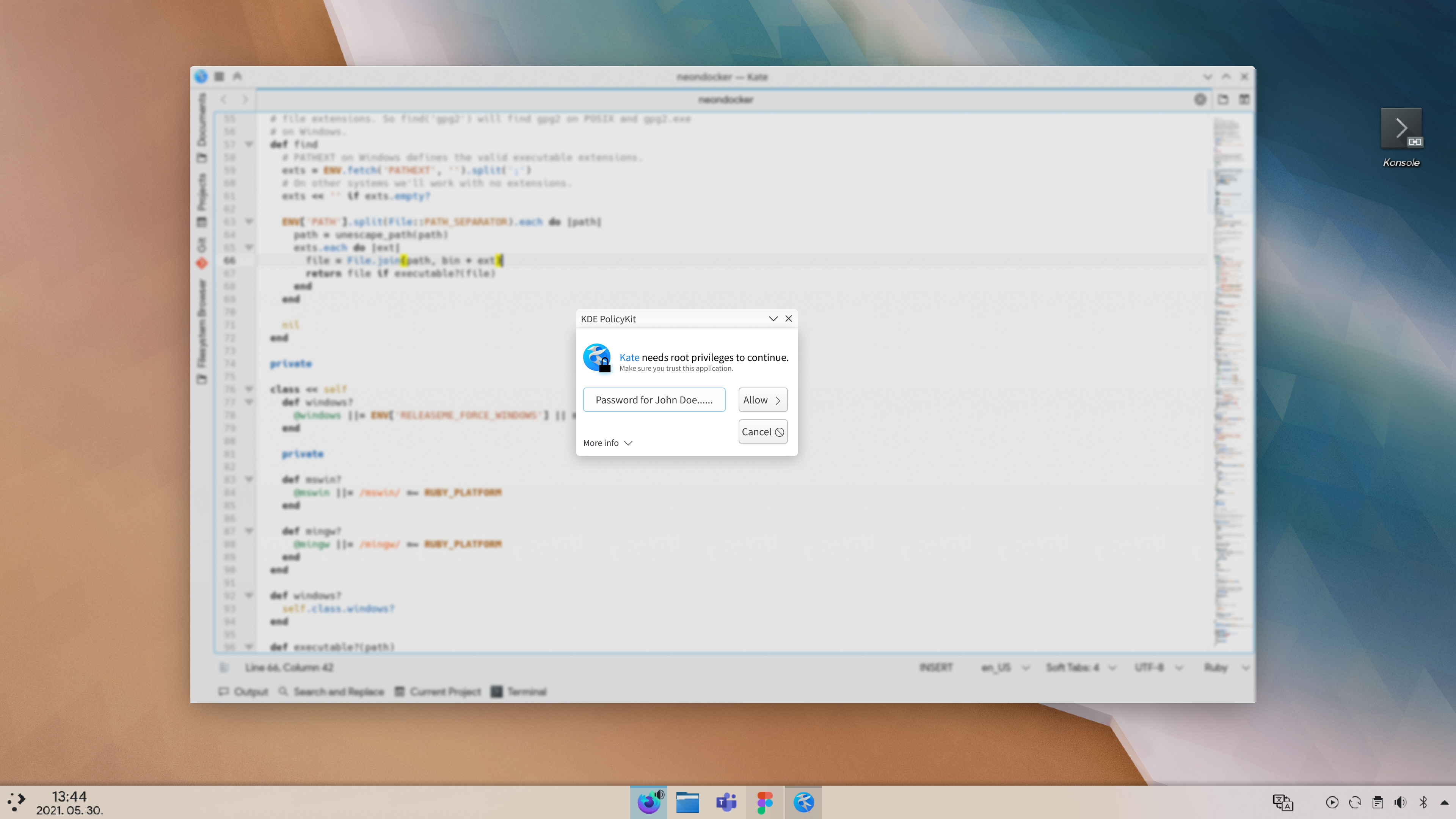
There's a lot of discussion about what elements to keep, remove, or change in the PolKit authorization dialog. Rather than let that Diff continue to grow exponentially, I'm creating this task to continue the discussion.

TODO:

sharvey created this task.Apr 22 2018, 12:15 AM

What to keep? What to eliminate? What to change? What CAN be changed?

I think that having the lock aligned to the rest of the text is great. I think there is probably too much space in this window. The window could be smaller.

@abetts - Nate has told me that there's a project in the works to redesign and standardize the entire collection of dialog boxes.

Part of the reason the dialog is so large is the hidden K(something) in the middle that basically says "bad password". The space is reserved for it, but it's only made visible when the password fails. There's a similar hidden widget to choose a different user (only appears when your system has more than one user). So the space is reserved but "empty", making the dialog look too large.

I think there's a better way to do it, but I'm waiting to see how the other dialog redesigns turn out.

Hmm, I think maybe I confused you, @sharvey. I was referring to this project, and I was wondering why you seemed to have abandoned it! ;-)

Hmm, I think maybe I confused you, @sharvey. I was referring to this project, and I was wondering why you seemed to have abandoned it! ;-)

Indeed you did confuse me! I think a is called for.

I'll get back to work on it shortly.

sharvey added a comment.EditedSep 25 2018, 9:29 PM

Ping.

Anyone have any suggestions?

I've got an easy one... lose the red bar that appears in the middle of the dialog (since it messes with the layout). Replace it with a simple, modal popup with the red (X) icon that says "Incorrect Password". It occupies no space when not needed, it's modal so you can't move on without dismissing it, and it gets the message across simply and clearly.

There was quite a bit of debate in D12311 when I first touched this (now it appears I own it.)

But I'm open to other ideas. There were some strong opinions about wording for the bottom details pane - any opinions on the rest of it?

bruns updated the task description. (Show Details)Sep 25 2018, 9:33 PM
apol added a subscriber: apol.Sep 25 2018, 10:52 PM

I don't really have clear feedback on how it should look like but big +1 for looking into it!

One thing I know that bothers me a bit is how detached the dialog looks from the application that triggers it. Finding ways to do that better would be ace, maybe integrating it better with the window or even the shell?

Also this dialog at the moment looks really painful on Plasma Mobile for obvious reasons, I guess. Maybe thinking about what it should look like on the phone can give us hints about what we want.

If we just want to just give the current dialog a revamp, it could make sense to look at elementaryOS's pantheon.

Technically, the fact that working on the dialog at all has been so troublesome makes me thing it would be a good candidate for porting to QML.

On the desktop, a pop-up window is pretty normal, so I don't think that's necessarily a big problem, though I agree on mobile it's rather horrific. I agree that we could look at what other platforms do for inspiration. Here are some examples from other desktop platforms:

Windows:

On GNOME, password dialogs are system-modal and darken the whole screen when they become visible:

On macOS, the password request dialog isoften (but not always) integrated into the window in the form of pop-down sheet:

In what will undoubtedly be a huge surprise to everyone, I'm rather partial to the macOS style. :-)

cfeck added a subscriber: cfeck.Dec 20 2018, 4:50 PM
GB_2 added a subscriber: GB_2.Apr 15 2019, 8:43 PM

What about something like this?

GB_2 added a comment.Mar 14 2020, 9:46 AM

I love the second last picture that shows the the desktop (without the dialog title bar).

Not gonna lie I prefer the last picture over the second last, but these dialog designs definitely look great.

Maybe this is also a great time to explore making the password box shake on an incorrect password?

Both are great! I'll prefer the titlebar version too simply for consistency's sake (though the CSD version is quite sexy). Shaking on incorrect password would be quite elegant as well.

We don't do that shaking anywhere else afaik. If it's something we like to do we should try to move verything in the direction.

Please don't oversimplify the dialog by picking a single action in a single scenario ...

  • PK allows to configure e.g. groups of administrative users, the current dialog has a user selection box in this case. Just "Root" does not cut it.
  • The first line is the gut of the dialog. It is the action which should be authorized. It may be significantly longer than "Example" or "Update", but it is the important part.

...At the same time, there's no need to show unnecessary information. For example when you're the only admin user, the combobox of admin users is not shown, which is presumably what the mockups are also showing.

bruns added a comment.Mar 15 2020, 4:38 PM
Auth as selfAuth as rootAuth as admin + details

bruns added a comment.Mar 15 2020, 4:40 PM

run as 'qmlscene pk.ui.qml'

Mode can be toggled by clicking on the icon.

GB_2 added a comment.EditedApr 19 2020, 9:07 PM

What do you think about this as a compromise?

(Alternate Version)

No matter what, I really like using an arrow to the right of the password field instead of an OK button. We do this on the lock and login screens and it's been very well received. I think it would be good to increase internal consistency by moving towards that everywhere for password fields rather than away from it.

If you're using an authentication method that doesn't require a password (fingerprint, smart card, etc), then we can show the OK button.

GB_2 added a comment.Apr 19 2020, 10:38 PM

No matter what, I really like using an arrow to the right of the password field instead of an OK button. We do this on the lock and login screens and it's been very well received. I think it would be good to increase internal consistency by moving towards that everywhere for password fields rather than away from it.

If you're using an authentication method that doesn't require a password (fingerprint, smart card, etc), then we can show the OK button.

Right, we should keep it consistent. We could also replace the "Details" button with this neat widget if it would be available as a QML component: http://blog.davidedmundson.co.uk/blog/my-new-widget-in-frameworks/

Yeah, sounds like a good Kirigami addition. :)

I like the inline password, though I have a small concern - grey on white is low contrast, what about persons with bad eyesight?

Regarding "right arrow" vs Ok/Cancel, on the login screen there is no cancel. One can select a different user, but there is just "forward". With the polkit dialog, of course one can press escape to cancel, but is this discoverable enough?

In T8569#227195, @bruns wrote:

I like the inline password, though I have a small concern - grey on white is low contrast, what about persons with bad eyesight?

We should probably fix that in our mockup toolkit. The actual looks of the widgets and icons itself isn't a part of this task and isn't scheduled to change AFAIK.

Regarding "right arrow" vs Ok/Cancel, on the login screen there is no cancel. One can select a different user, but there is just "forward". With the polkit dialog, of course one can press escape to cancel, but is this discoverable enough?

I had the same thought. Of course the window itself has a close button, but yeah, it might be nice to have a cancel button too for explicitness's sake. If we do this, it kind of messed up the elegance of the design though.

bruns added a comment.Apr 25 2020, 1:35 PM
In T8569#227195, @bruns wrote:

I like the inline password, though I have a small concern - grey on white is low contrast, what about persons with bad eyesight?

We should probably fix that in our mockup toolkit. The actual looks of the widgets and icons itself isn't a part of this task and isn't scheduled to change AFAIK.

Things which "should be done" are unfortunately often just forgotten after. As soon as a UI is changed to use some different widget, or relies on a specific aspect (its no longer just "Password", but "Password for John Doe", i.e. "John Doe" has to be clearly readable), there should be a dependency on the UI element update.

PhilipB added a subscriber: PhilipB.EditedJul 12 2020, 3:38 AM

The bottom 4 are my latest mock ups. I quite enjoy them but I think they're too dumbed down or don't fit Breeze Evolved very well.

Is there any way we could incorporate a prompt for a fingerprint here?

Most likely yes but not for a long time, basic work on fingerprint support and initial gui is being worked on still.

...By @EspiDev, in fact. :)

:)
I've been investigating how to improve the experience with fingerprint on Plasma. So far the actual enrolling of fingerprints in the settings is now close to completion: https://invent.kde.org/plasma/plasma-desktop/-/merge_requests/149

The polkit agent is probably next on my list to jump into. I was thinking that it may be worth pushing for the qml port as well in order to have a better design for prompting the user (currently it doesn't seem like it acknowledges fprint at all?)

There are also some technical aspects that need some work, as right now it is not possible to prompt for both password and fingerprint at the same time, but that'd go into another task.

endlesswaterfall added a subscriber: endlesswaterfall.

Sorry, I closed the task by mistake. I did the opposite way :/

endlesswaterfall added a comment.EditedMay 26 2021, 10:57 PM

I'm going to post here what I posted on my duplicate:

  • Ditch the name "Policy1 KDE Agent" or move it to the "additional details" section, because is a too technical term. An inexperienced user might not understand what this means;
  • The second sentence seems to be repetitive. The whole text could be updated to something more simple, like "Authentication is required to apply changes".
  • The password field could be vertically aligned.

Other ideas:

Show the user picture and the username it already appears when there is another user

  • Show the name of the window which triggered the authentication dialog, to make clearer where it came from. For example, when applying changes in Muon, it shows "org.kubuntu.qaptworker3.commitchanges" instead of "Muon Package Manager".
  • Thinking about the text, instead of an affirmative sentence, this dialog could show a question, because an affirmative sentence seems to be implying that the user must at all times to accept it. Windows UAC screen have a question instead of an affirmation:

  • Make the password to have an embedded label, like the one seem in SDDM, which supports the view password function (eye icon) (that was already spoken)
  • Dim the screen when authentication privileges is required (by making the screen darker, it would indicate to the user that the action is critical and it would help to rethink the decision, if needed):

apol added a comment.May 29 2021, 11:28 PM

Would it maybe make sense to style it into Plasma rather than like an application?

In practice, it's 100% a plasma component, on any other DE you'll have the native dialog and it makes sense the concept of "Your system needs authentication" rather than "a window coming from space wants your password".

In T8569#257072, @apol wrote:

Would it maybe make sense to style it into Plasma rather than like an application?

In practice, it's 100% a plasma component, on any other DE you'll have the native dialog and it makes sense the concept of "Your system needs authentication" rather than "a window coming from space wants your password".

I agree. Here's GNOME authentication screen that follows your idea:

here is another option, which would be easy to understand for me:

endlesswaterfall removed a subscriber: endlesswaterfall.EditedJun 1 2021, 7:00 PM

here is another option, which would be easy to understand for me:

Looks great

  • I think the allow and cancel should be at the bottom (the allow at the left, the cancel, at the right), because this is a standard in these types of dialogs. The "more info" could be located below the password field.
  • The "please try again" inside the password field would be inconsistent with other KDE apps which display a semi-transparent red banner to warn the user about something critical thing. The "try again" thing could be suggested by shaking the password field to the left and to the right, rapidly, as already suggested in this thread.

No matter what, I really like using an arrow to the right of the password field instead of an OK button.

Wouldn't this bring an inconsistent with other parts of the system which has "ok" and "cancel buttons" (like save dialogs, for example)?

No matter what, I really like using an arrow to the right of the password field instead of an OK button.

Wouldn't this bring an inconsistent with other parts of the system which has "ok" and "cancel buttons" (like save dialogs, for example)?

I think the "continue" icon fits much better here that it could be worth a little bit of inconsistency.

"The "please try again" inside the password field would be inconsistent with other KDE apps which display a semi-transparent red banner to warn the user about something critical thing. The "try again" thing could be suggested by shaking the password field to the left and to the right, rapidly, as already suggested in this thread."

  • I agree, the shake would better.

I think the allow and cancel should be at the bottom (the allow at the left, the cancel, at the right), because this is a standard in these types of dialogs. The "more info" could be located below the password field.

(at least for me) this visual hierarchy of the dialog (allow with arrow next to the password or cancel-no password) would be the easiest to use and understand; maybe it would make sense to have the already quite unique/not application-part dialog be a little different.

My favourite of "http://phabricator.kde.org/file/data/6whyyim5gmlkquf4loar/PHID-FILE-wwndftrzby5fixz2nswm/export.png" is the top-right version, because the current presence of iconography is without necessity or benefit, and because removal of it is important for phone-screens because they are primarily vertical and small. Retainment of the title-bar is necsssary not merely because otherwise it may appear to be fake, but additionally because removal of it would be detrimental to consistency, which although is eternally important, is currently especially important: "http://phabricator.kde.org/T11093".