User Details
- User Since
- Jul 16 2015, 6:57 PM (461 w, 2 d)
- Availability
- Available
May 8 2022
Nov 4 2021
For posterity this is the first iteration of the builder tool, along with some of the initial output results, the initial places "cookbook", and the folder assets which have been prepped.
Oct 28 2021
The options thing isn't just for Breeze; other icon sets can provide completely different options for their own stuff. The big selling point, to me, is the idea that one icon theme can provide slight variations like the crease or multicolored place folders without resorting to maintaining entirely separate themes. This also clears a large workload from iconographers who can consolidate their work. If this wasn't a direction we could take, I'd probably be forcing the crease down your throats! :P
Oh yes, I understand it. The issue is that it's a big divergence from Breeze current, and this is just meant to be a refresh. That being said I *have* investigated the source for the SVG modification in the icon code, and I think there's an avenue to provide configurable icons.
On the crease, I'm going to remove it. It's a love-it-or-hate it addition, and the fact is people who *would* love won't know they're missing it, and people who hate it *would* see it. It's not a hill I'm goanna die on, and I don't like bikeshedding over a line.
For the folder it's meant to be a crease, and I must say it's been pretty divided been love-it-or-hate-it. I added it as a throwback to Oxygen while also using it to differentiate our basic folder design. The crease has become a little more abstract over the revisions, but that's not necessarily a bad thing. I'm personally becoming torn, because on one hand this is meant to be a refresh (I want to avoid excessive changes compared to current Breeze unless it's really warranted, or an existing icon breaks HIG) but on the other I think most folders look kinda bland. In terms of detail though we're going "a little more ornate than current" but otherwise the basic icons should feel mostly the same, and I'm trying very strongly to keep the basic silhouettes intact. I have a feeling it'll probably come down to a vote, but unless the crease wins by a good margin it'll go the way of the dodo because this is a refresh and it is a difference.
Oct 27 2021
I think I got most of everyone's feedback in, and I managed to increase the internal "standards" of the icons which should also help when the documentation can give more solid direction.
Oct 24 2021
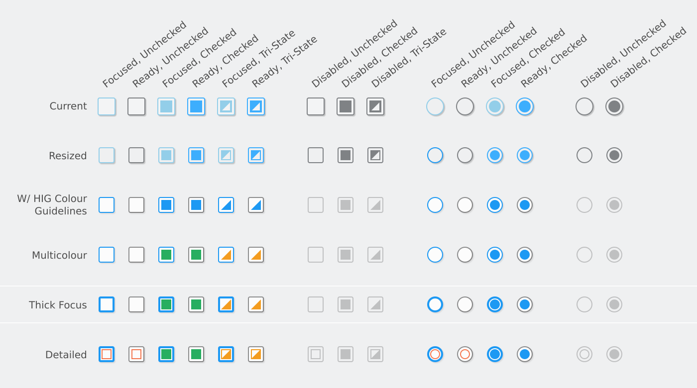
The black/white styling does look more awkward in the samples than in actual use. I think it's in part because these icons appear inconsistent when viewed beside each-other in their different modes, and the subtle shading/lighting plays also some tricks on your eyes as well. Kind of the reverse of that optical illusion with the cylinder on the checkerboard, in this case you think they ought to be the same colour, but they aren't. In practice (at least on my limited run of test icons on my own system) that effect isn't present.
Oct 17 2021
I know this is a bit of necromancy on this task, but it's becoming somewhat relevant with the exceptional design work from the Blue Ocean effort. Breeze has evolved significantly since the original graphics were created, and portions such as the spinners are quite behind the style of the desktop. I wouldn't go as far as to wholesale change the style, but we are due for the cursors to be adjusted slightly so they better fit the Breeze of 2022.
Jul 25 2018
Apr 20 2018
Dec 19 2017
Dec 7 2017
Nov 30 2017
Nov 28 2017
Nov 16 2017
Nov 14 2017
Oct 19 2017
There are now forks for ocs-cdn and ocs-webserver containing the private key patches.
Oct 18 2017
Oct 16 2017
Aug 18 2017
Aug 17 2017
Jun 21 2017
May 12 2017
We're moving to Wordpress, so this is lower on priority as we'll switch to Drupal 7 later for the few websites we have running on Drupal. I'm also starting a "migration program" for any website willing to switch to Wordpress, where I will dedicate some time to port their content (if reasonable) and write a small amount of customization software to enable the change.
May 7 2017
Apr 24 2017
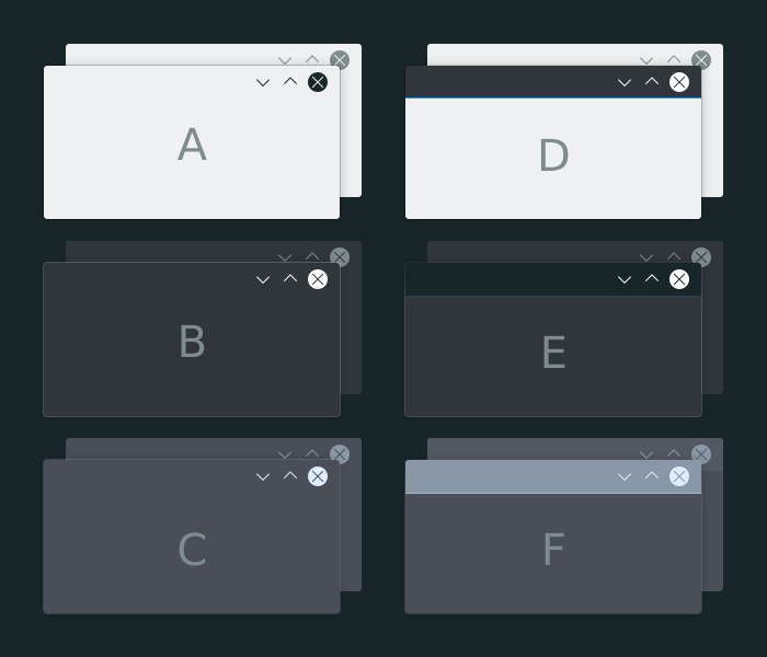
The movement clearly shows that the window will resize better than a strict fade. +1!
Apr 4 2017
Mar 29 2017
My only concern is that many windows with the Breeze style have very little colour, some (like Kate) might not see the effect be distinguishable at all. Should we perhaps consider using an overlay colour selected from the colour scheme which we know will stand out? E.g. Tint the window contents the "Negative" (usually red) colour?
Mar 12 2017
With the homepages done and focus on the Drupal theme, I'm breakign thsi task down into smaller parts. Hope I've done so correctly.
Feb 6 2017
Feb 4 2017
Feb 1 2017
Dec 13 2016
Sep 6 2016
Aug 19 2016
Jun 29 2016
There's two main reasons;
Jun 28 2016
I imagine we'll probably have the old designs hanging around for the next decade unless someone decides to pay for a couple full-time developers to actually overhaul the whole thing... Some people are also still converting things to Neverland. So, yeah, lets put the new stuff in a directory as they'll be co-existing for the foreseeable future.
Jun 27 2016
Jun 23 2016
I have a contributor account. I'll hold off on creating repos for now though, they aren't as important; it was more of a convenience thing for demonstrating redesigned pages/areas.
Ohoooo, sorry I was not timely at all in replying at all. I haven't actively used Phabricator yet, I'll ensure I get into the habit. But! I am here because things are moving, and now I need to start getting some things online;
Apr 13 2016
Feb 8 2016
Jan 12 2016
Dec 28 2015
Aug 17 2015
More variants based of feedback from Andrew;
Design variants
Target renders showing 2 methods; first method is a solid outline based on button colour, second method fades the top of the outline to ~20% opacity. Use method one for "solid" windows (left), method 2 for separated windo titles (right):
Ah, I'm not on 5.4 yet, but that looks like all the correct stuff.