Details
Details
- Reviewers
cblack ngraham - Group Reviewers
VDG - Commits
- R266:659e184c49d7: Add network-wireless-hotspot icon
R266:e878fe30d557: GIT_SILENT Upgrade KF5 version to 5.68.0.
Diff Detail
Diff Detail
- Repository
- R266 Breeze Icons
- Branch
- arcpatch-D26595 (branched from master)
- Lint
No Linters Available - Unit
No Unit Test Coverage - Build Status
Buildable 23393 Build 23411: arc lint + arc unit
Comment Actions
Hmm, at normal size, the 8, 16, and 22px versions look too busy to me.:
For the 16 and 22px versions, maybe reduce the number of waves and increase the spacing between them. And do we even need an 8px version?
Comment Actions
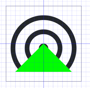

I kind of agree.
For the 16 and 22px versions, maybe reduce the number of waves and increase the spacing between them. And do we even need an 8px version?
We don't need an 8px version.
@cblack, if we did need an 8px version, you'd have to edit index.theme and define the 8px device icons folder.
One trick I learned from looking at the wifi icon is that you don't have to perfectly center the lines and the cut. If you offset them in a consistent way, you can get the spacing you want and the lines will still look fine.
Here are edited versions of the 16 and 22px icons with a couple variations each:
In the 16px version, I used a 14px outer circle, lowered it by 1px and cut it with a right triangle.
In the 22px version, I cut it the same way, but only to give the triangle bottom variant a bit more space. It's not needed if you use the antenna variant.
I think the radio waves around the 32px version should be 1px thick.
Comment Actions
@ndavis do you want to take over this revision? You have a better sense of what this icon should be than I do.