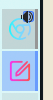
When vertical or Icon-only task manager, shrink click area 10% and
indicator 30%.
This allows moving it closer to the corner, away from the center,
to avoid accidental audio muting.
BUG: 416553
FIXED-IN: 5.19.0
| hein | |
| ngraham |
| VDG | |
| Plasma |
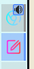
When vertical or Icon-only task manager, shrink click area 10% and
indicator 30%.
This allows moving it closer to the corner, away from the center,
to avoid accidental audio muting.
BUG: 416553
FIXED-IN: 5.19.0
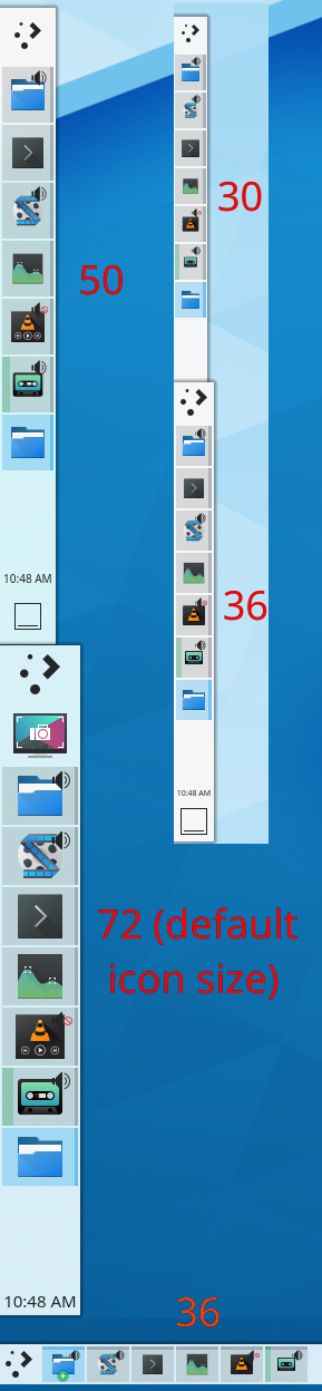
With patch
| Automatic diff as part of commit; lint not applicable. |
| Automatic diff as part of commit; unit tests not applicable. |
Could not pinpoint a specific size to disable mute function. If it is still a problem with this patch, maybe need to disable it for 5.18, and add a config option in the next release.
I was working on a patch to improve things here and it was almost identical to this one. I think this is a good fix. Tested on an IOTM as well as a regular task manager on all four screen edges with various panel thicknesses and I did not find any regressions, and it did seem better to me.
Let's make sure we hear from some of the other people who I recall had voiced concerns about the indicator getting in the way: @Fuchs, @broulik, @cblack, @filipf @ndavis
I will rebase on this patch and make icon aware of the orientation.
Otherwise highlight area will overlap with the blue-bar on top when horizontal.
Looks good to me, thank you very much for the work :-)
Sidesnotes that I mentioned in the group, just so they are documented here:
Increase right margins by 1.2 when need, to avoid highlight area been drawn out of the frame.
Various little changes.
Never going to be correct. Sometimes the highlight touches the edges, other times have big margins. The aim was to avoid getting out of the svg frame.
These changes focus even more on the breeze theme.
Sweet theme has some issues.
Yeah, it won't be perfect for everything, but I think it's better than what we have right now and fixes the bug.
Is everyone okay with this?
Well I tested this with several themes and it looks just fine on all of them except Sweet. A Plasma person should have a look at the code, but visually and usability-wise this is pretty good.
Landing on master to be safe, but if Plasma people take a look later and like what they see, we can backport this to the stable branch.