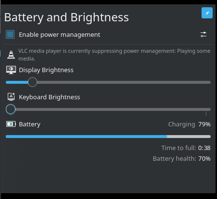
Decrease icons size and place in row with their labels.
Main area can scroll now (only batteries could scroll).
For 'Enable power management' checkbox, fix tooltip and switch
area (tooltip was only on text, and switch was on full width).
Add a separation line under PM checkbox.
Don't show suppression messages if PM is disabled.
Remove battery details tooltip (had no extra info).
Align battery details to the right, and use opacity for label.
Details
Details
- Reviewers
davidedmundson manueljlin - Group Reviewers
Plasma VDG - Maniphest Tasks
- T10470: Improve the visuals of tray popups
Diff Detail
Diff Detail
- Repository
- R120 Plasma Workspace
- Branch
- b3 (branched from master)
- Lint
No Linters Available - Unit
No Unit Test Coverage - Build Status
Buildable 21594 Build 21612: arc lint + arc unit
There are a very large number of changes, so older changes are hidden. Show Older Changes
Comment Actions
I will not touch Tooltip in BatteryItem.qml, has a bug with Grid and uses Flow instead. That made very difficult to fix the tooltip and details.
R120:d12521b149fa7766fbbeb9957bde14b4a6278928
Comment Actions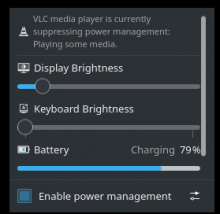
Can someone, confirm if it looks okay with the new scrollbars changes?
I believe scroolbars should look good, but didn't test the new scrollbars. I use stable builds, where it touches the scrollbar.

Can someone, confirm if it looks okay with the new scrollbars changes?
Comment Actions
Nice!
Couple of UI comments:
- The icons are now blurry, presumably because the plasma theme doesn't supply versions for the size you're using. I would recommend increasing the size until you find a size that the Plasma theme has icons for
- This is a pre-existing issue, but the alignment and consistency for text subtitles is poor: We might want to consider right-aligning everything and using the same font size and opacity. Thoughts, @manueljlin?
Comment Actions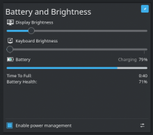
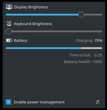
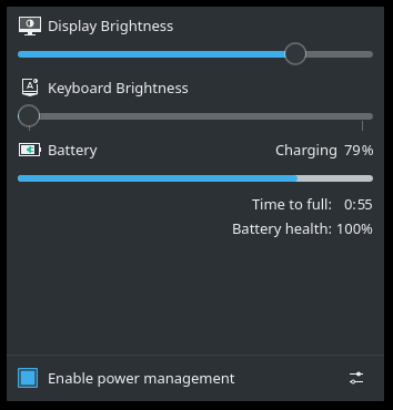
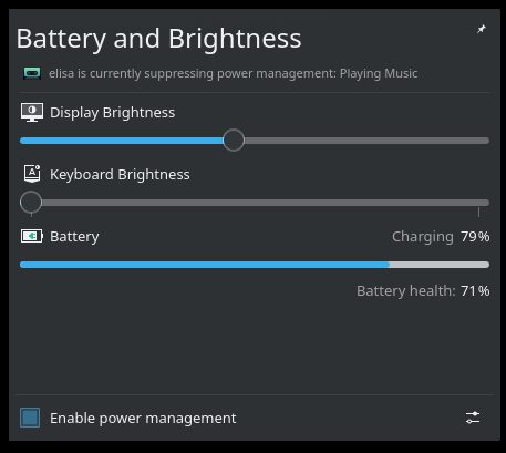
Opacity and size test.
About the text subtitles
If this bug has been fixed from then. I could probably made the changes.
Edit: Maybe there is an other hack that I haven't thought about, but I just can't change the alignment with the flow layout.

Opacity and size test.
Comment Actions
An other interesting idea from apol D26735#597158 was to use checkbox, when a keyboard has only 1 setting for brightness like mine, as an on/off switch.
But haven't found a way to fit it visually.
Comment Actions
Is there anything stopping a port away from the FlowLayout and using a GridLayout, or even just using one Rowlayout per row, all stuck in a ColumnLayout?
Comment Actions
First line in the commit message above Workaround a crash in GridLayout when using a Repeater. But was 5 years ago, don't know if this has been fixed, or how to reproduce for testing.
Rowlayout in ColumnLayout should be fine, instead of repeater. I will look into it.
Comment Actions

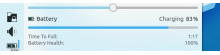
Removed battery tooltip (had no extra info).
Changed details view.
Would be better without colon and without grid arrangement?
opacity: 0.6
opacity:1
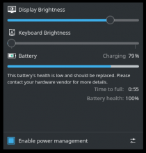
Current patch: split opacity
(warning message was forced for screenshot only)

Comment Actions
Few of my initial comments do not seem to be addressed yet.
| applets/batterymonitor/package/contents/ui/BatteryItem.qml | ||
|---|---|---|
| 64–69 | You can't do that. That'll change the column size, which will change our text bounding box which will change our paintedWidth. A loop. | |
| applets/batterymonitor/package/contents/ui/BatteryItem.qml | ||
|---|---|---|
| 64–69 | That's been in there ever since the initial release 2013. | |
| applets/batterymonitor/package/contents/ui/BatteryItem.qml | ||
|---|---|---|
| 64–69 | Well that explains "// GridLayout crashes with a Repeater in it somehow" | |
Comment Actions
I marked 3 comments as done that had forgotten, as I removed the old tooltip code.
If there is something else, please be more specific. I can not see a better way to address any of your comments.
| applets/batterymonitor/package/contents/ui/BatteryItem.qml | ||
|---|---|---|
| 64–69 | No, it does not. Those two comments were in the same commit, to avoid the GridLayout crash. | |
| applets/batterymonitor/package/contents/ui/PopupDialog.qml | ||
|---|---|---|
| 76 | The icon is a bit small:  | |
Comment Actions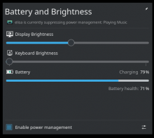
Fix inhibition icon size.
Elisa icon will always look small. But now is the correct size.
| applets/batterymonitor/package/contents/ui/BatteryItem.qml | ||
|---|---|---|
| 48 | width used inside a layout | |
| 57 | width/height used inside a layout | |
| 83 | here | |
| applets/batterymonitor/package/contents/ui/PopupDialog.qml | ||
| 147 | and here | |
| applets/batterymonitor/package/contents/ui/PowerManagementItem.qml | ||
| 34 | and here and you shouldn't need to be using chidrenRect.width anchors.fill: parent that's a loop | |
Comment Actions
Remove as much as I could width and height settings.
Removed loader. Moved instead flow in place.
Comment Actions
After some effort, I reached in these conclusions:
1.Is not that big of a problem to specify width in a layout. The big problem is specifying preferredWidth and height in the same item. Breaks the dimensions, this is what got me confused.
2.Item set as property, does not get managed by layout.
There are still some width set in places. That do not respond to preferredWidth, minimumWidth or maximumWidth.
| applets/batterymonitor/package/contents/ui/BatteryItem.qml | ||
|---|---|---|
| 114 | This does not react to preferredWidth, minimumWidth or maximumWidth. Is it really managed by Layout? | |
| applets/batterymonitor/package/contents/ui/BatteryItem.qml | ||
|---|---|---|
| 114 | It's not Flow isn't a layout. | |
Comment Actions
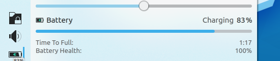
Might be better to be aligned to the left since it looks similar now to the battery percentage, but aside from that it's great! Also, sorry for replying late :P
Comment Actions
No need to worry. The flip of the toolbar is was a small proportion of the patch, most of the time I try to solve other problems. And in the end of the line was a team decision.
Comment Actions
Unfortunately I won't be able to continue with this patch about battery applet.
Feel free to use/modify if you want.