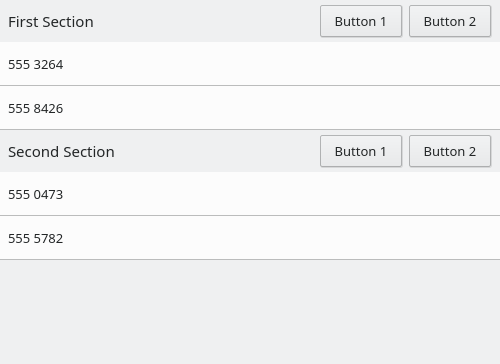
Adds a standard ListSectionHeader component to make ListView section headers look coherent.
| mart | |
| ngraham |
| Kirigami | |
| VDG |
Adds a standard ListSectionHeader component to make ListView section headers look coherent.
Run the example with qmlscene:
| No Linters Available |
| No Unit Test Coverage |
| Buildable 14909 | |
| Build 14927: arc lint + arc unit |
| src/controls/ListSection.qml | ||
|---|---|---|
| 29 | I just copied it from the other list items :-) | |
I think just the word section is more accurate, because that's what the property that it will be used in is called and header could mean only a heading label.
Hmm, that's not how I interpreted it. This component isn't a whole section, as its name implies; it's just the thing that goes above a section (i.e. a header)
Yeah, I don't know which I should choose and why, I just copied it from the other list items.
The numbers need to match. I think you want 2.10 (the current version appears to be 2.9, but this QML versioning stuff is pretty confusing to me).
Thanks! We definitely need @mart's input on the right implementation of these details. But visually it looks great to me in System Settings (working on patches for the current users of these section headers), and but +1 on the concept of course.
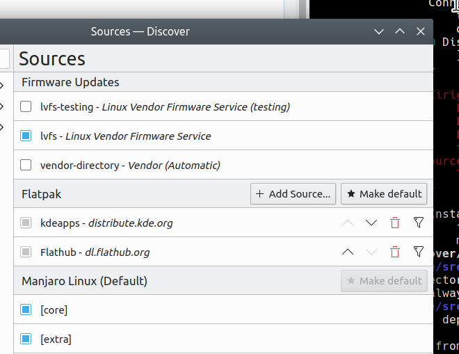
Idea: add a RowLayout inside the contentItem and put the Heading in there, then expose a property called like "CustomItems" that allows the implementation to add additional items to that RowLayout. This would let us port Discover's sources page headers, which currently have custom controls in them:
| src/controls/ListSectionHeader.qml | ||
|---|---|---|
| 92 ↗ | (On Diff #63444) | This is a no-go hack: property alias customItems: innerLayout.data
contentItem: RowLayout {
id: rowLayout
RowLayout {
id: innerLayout
}or, i would prefer even more, to just ditch that extra property completely: default property alias _contents: rowLayout.data
contentItem: RowLayout { id: rowLayout .... so one just does ListSectionHeader {
Button {....}
}and just works(tm) |
Hmm, if software making use of this needs to manually add a label, that seems to defeat part of the point of using a standard component.
The label in the example was just supposed to show that any controls can be added. Sorry for the confusion, I'll remove it.
After living with this for a bit, I feel like maybe the following UI changes might be good to make the effect a bit more subtle: