Refresh web design after sprint discussion
Closed, ResolvedPublic

Description

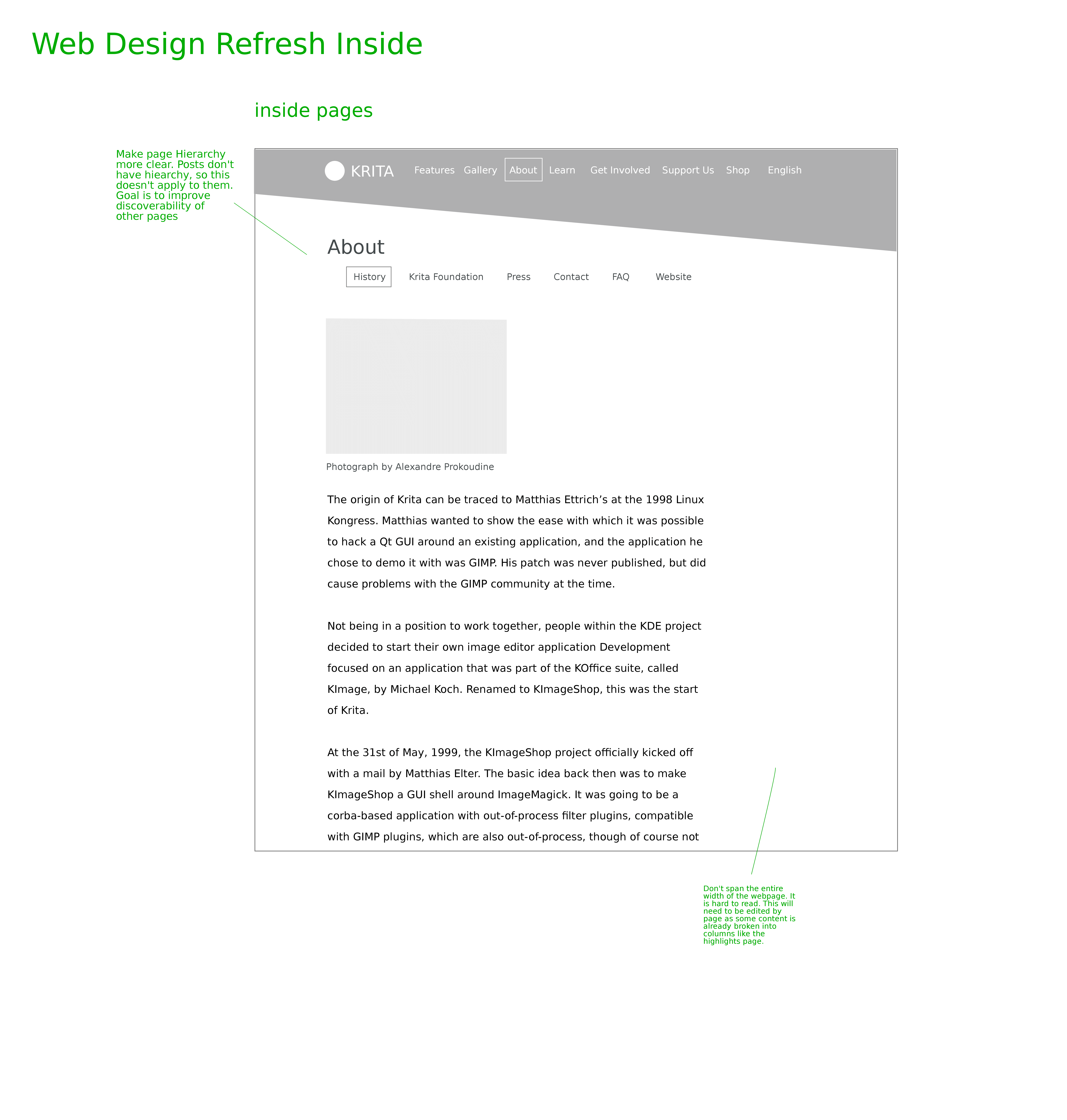
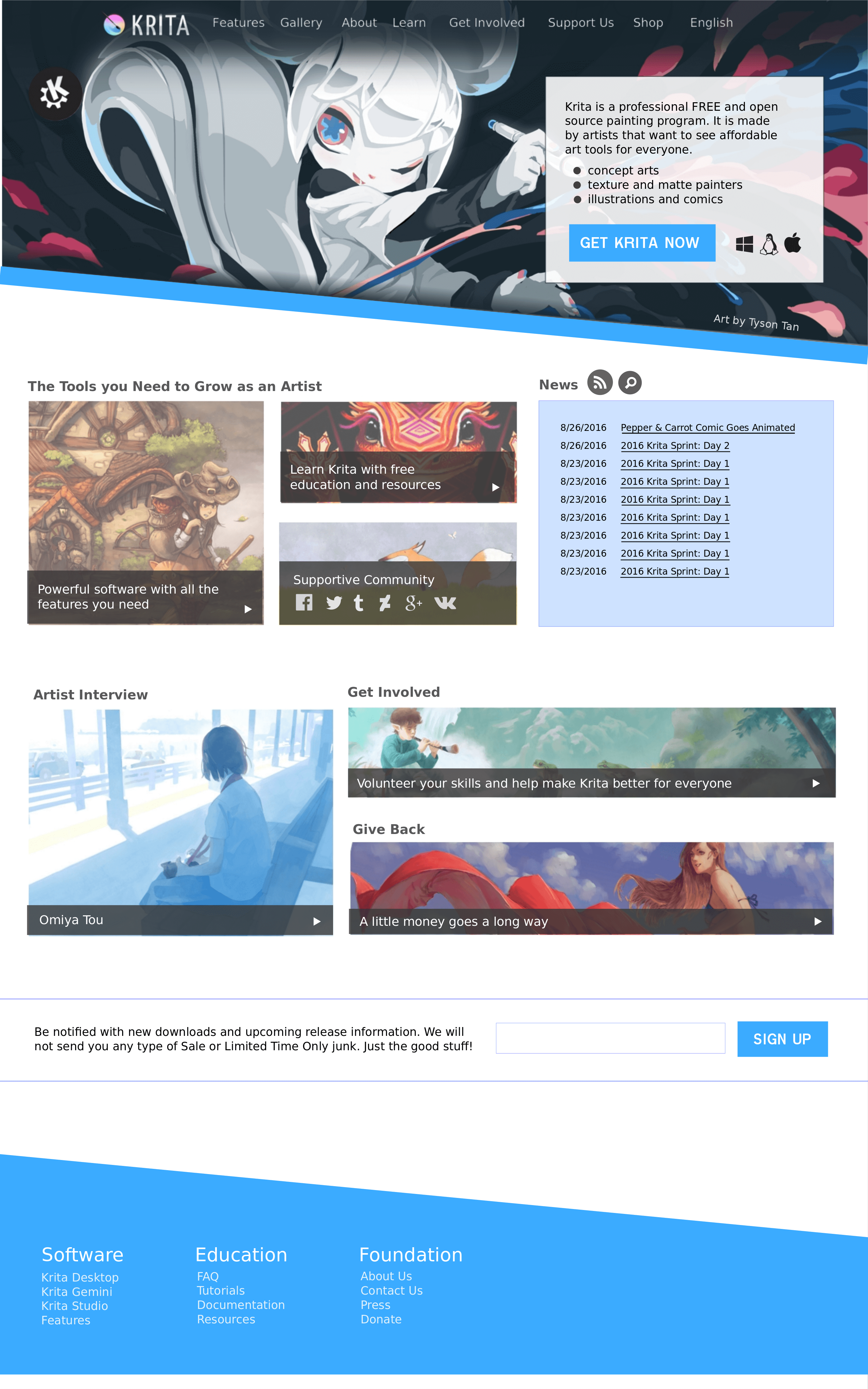
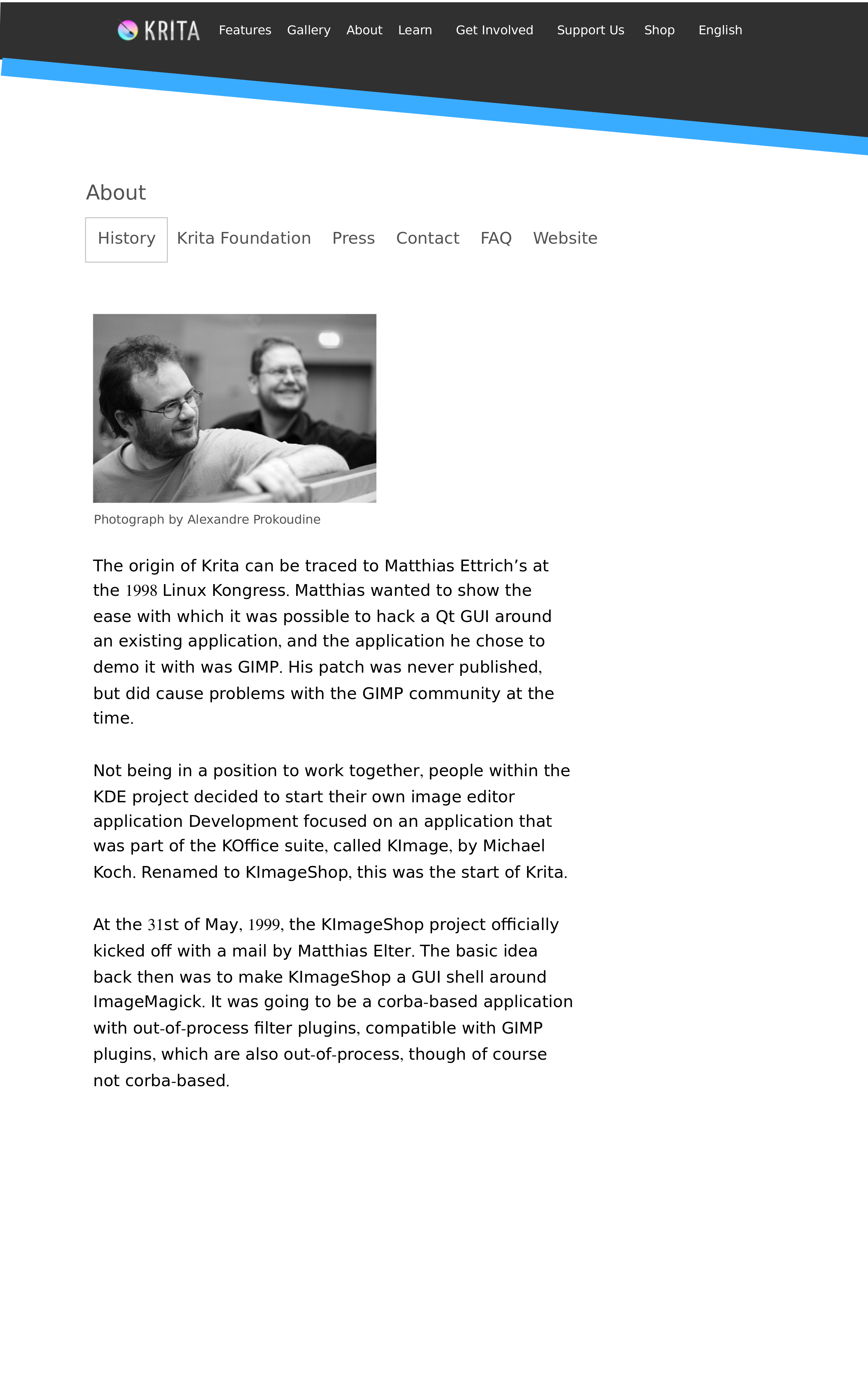
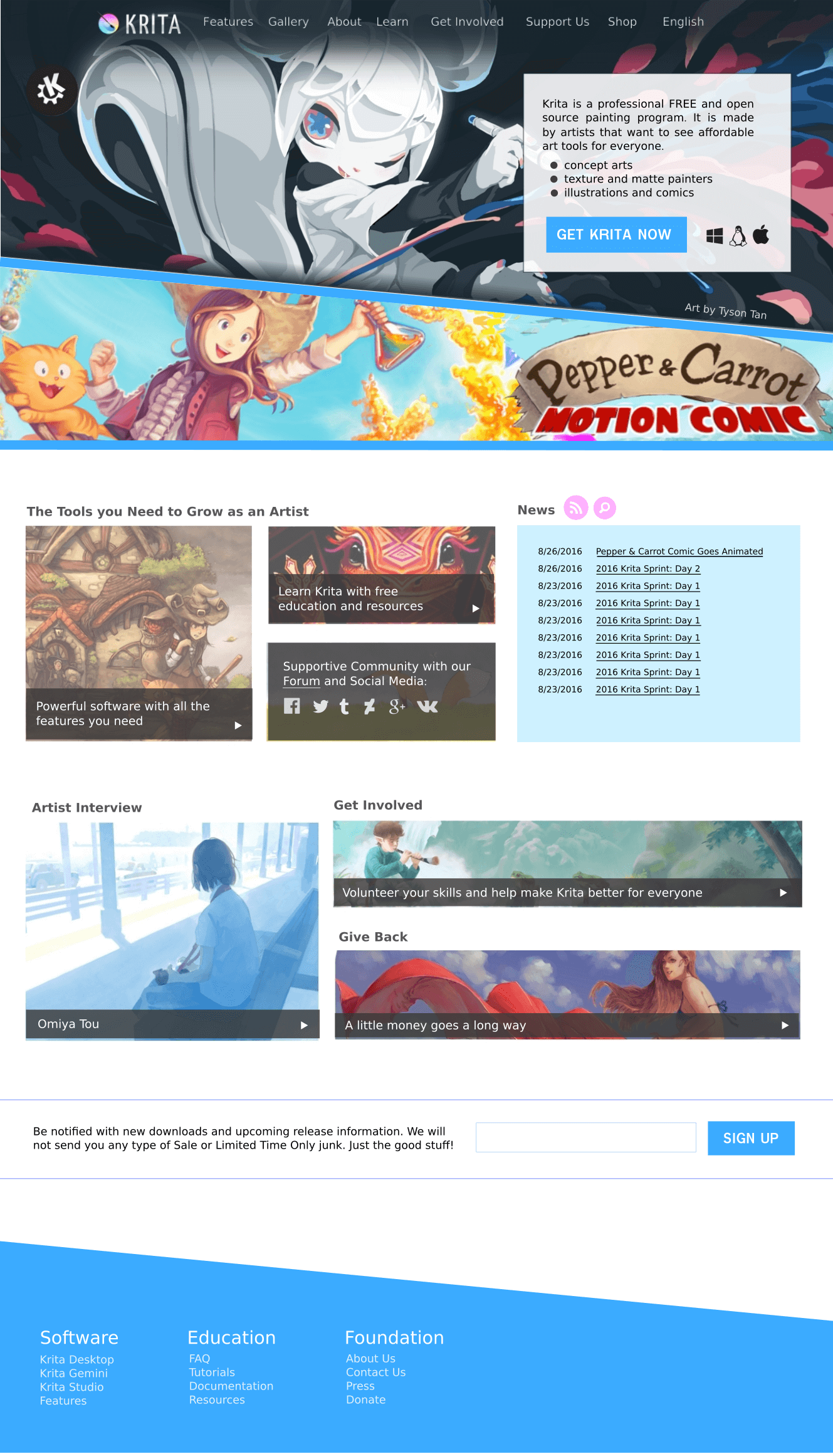
One of the discussion topics that came up when I visited the blender institute, and at the sprint, was some ways we can improve the website a bit .These were the points of concern for people:

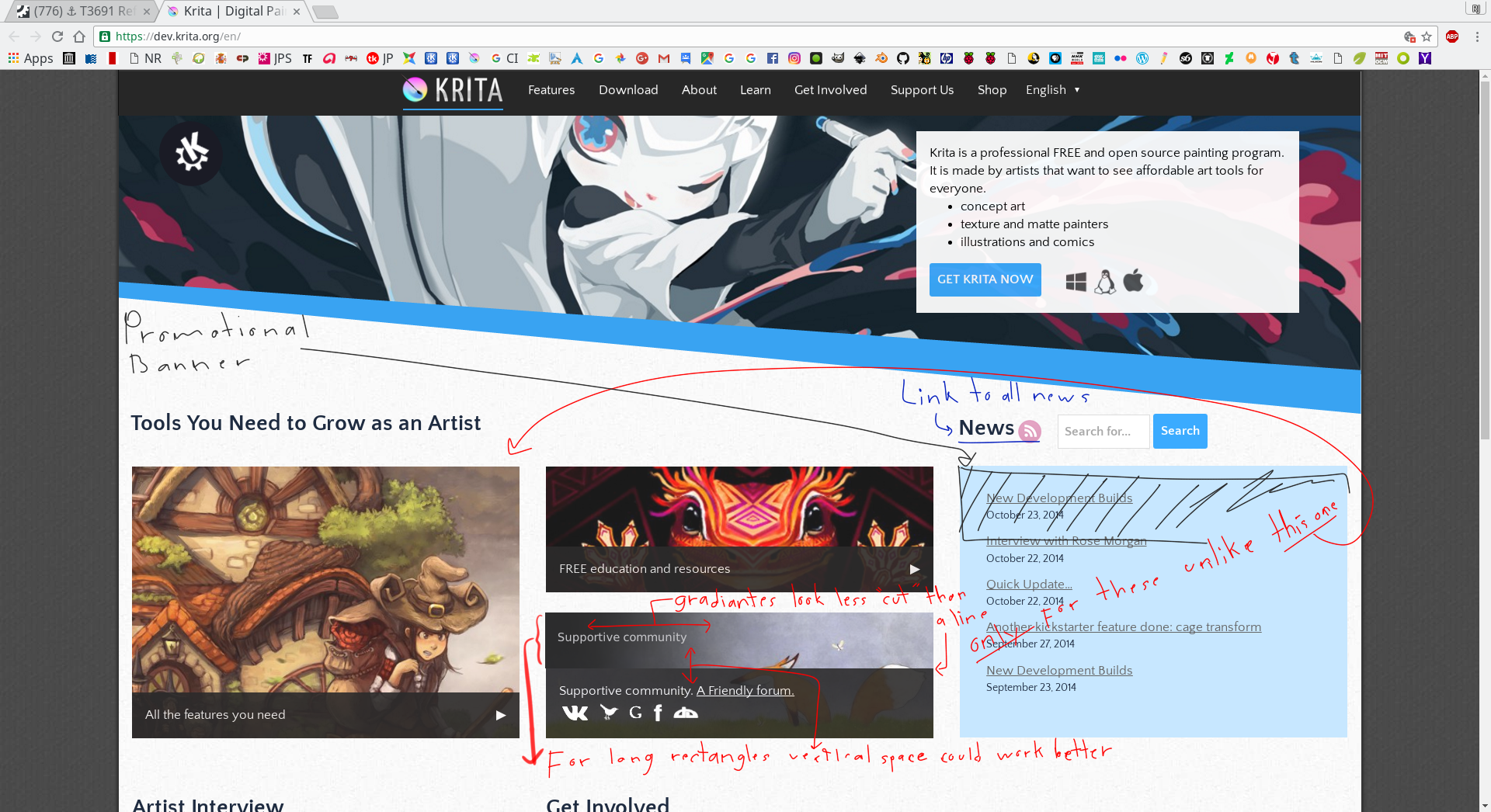
  1. Website doesn't push the concept of "professional" very much
  2. News is taking up too much space and gets lost at the bottom.
  3. Call out social media more as it is important
  4. Clicking on images on homepage doesn't take you to the correct image, but the gallery
  5. Refresh artwork
  6. Make the gallery area more prominent so people see what Krita can do.
scottpetrovic claimed this task.
scottpetrovic added a comment.EditedSep 9 2016, 12:59 AM

Based off those comments this was an idea I had to rearrange things. The top area has quite a bit of artwork, so maybe it is getting to be too much work to keep all of that updated. I am simplifying it to just have one hero image which will probably be the splash image for the application.

I also think it might be neat to tout that we support all OSs (soon). I removed the black background of the navigation as I thought it might be a little cleaner.

I also think the black tagline and the "what is krita" is a bit too much the same. I combined them to simplify the message.

The idea by the "the tools you need to grow as an artist" area is that an application needs those three elements for people to feel they have the resources they need. A great application alone is not good enough. All of the elements combined is what makes Krita so great...that was the idea.

The main thing with page two and the inside pages is how the page titles are shown. it is a bit confusing the way it has the area, followed by the tabs, followed by the page title. This design simplifies it a bit. As always all feedback welcome!

Deevad added a subscriber: Deevad.Sep 9 2016, 4:57 PM

I spent a little more time and made some prettier versions of the wireframes. I made some tweaks to existing text and created some new text. I still need to think about better ways to incorporate artwork in the inside pages, especially the high traffic pages like the history page. Those ideas might be coming a little later.

Let me know your thoughts

Nim added a subscriber: Nim.Sep 12 2016, 11:05 PM

I like it a lot! :)

It looks fine, but I do miss the pink a little. Making everything blue only makes it a bit too cool.

@woltherav maybe we can add a splash of pink in there.

I have also heard for a few different people questioning the banner that goes above the navigation like we currently have with the Pepper and Carrot motion comic. The concern is that putting it above the site navigation makes the site a bit more awkward to use. Not sure what we could do different. Maybe we could put that in another side bar, or possible also put it below the post and page content before the footer. Other solutions welcome.

I think it would be nice to have a link to the krita forum somewhere too. In the community section, perhaps?

I think it would be nice to have a link to the krita forum somewhere too. In the community section, perhaps?

I second that!

I did a few things...

  1. Updated the community section with a link to the forum
  2. added a bit of pink to the homepage
  3. added an idea how we can do the full width banners
  4. added a potential image we can add to pages. The image isn't distorted, but just cropped a bit different.
  5. post text is justified. It might make it a little cleaner now that we have angle stuff going on

I heard a couple comments that the promotional banner thing isn't working so well on the homepage. The concern was that it takes away a lot of the power of the main image. The banner will be on every other page and post, so we might not need it on the homepge. Most people don't just stay on the homepage, so it probably wouldn't be that big of a deal to leave it off of that page.

In general I haven't been hearing that many comments, so I will take that as acceptance. I can still take comments, but I can start updating the theme on the development site.

I got a nice chunk of the site done. Here is what I have so far.

https://dev.krita.org/en/

I still need to figure out how to get the global banner done on the inside pages, but everything else should be mostly there.

scottpetrovic added a comment.EditedOct 1 2016, 3:28 PM

alright everything is updated. I got the inside banners working as well.

Before we launch, it would be nice to get updated PO files for the translations.

I updated them to include the new strings. There is about 15 new strings to translate, so it shouldn't take too long. If anything isn't translated, it will fall back to English.

Scott, I am going to check the po file either this evening or tomorrow, when are you planing to launch the new site? There is a few things I need to fix based on the feedback I got from the forums, unfortunately all my new volunteers kind of disappear for the time been, thus I will only manage to do the main page for now, and try to fix things once is the new site is running.

-On another note, for colors, if you have the blue, the pink/magenta, may be a tiny bit of yellow in there will keep the "color theme" of Krita's icon.
-Also the main menu at the top has a translucent bar while the rest of the page change to the new background color, have you try to do that bar with the same background color, I wonder how it will look and if will keep the uniformity while changing from the homepage to the rest.

Just a couple of ideas there. All in all is looking very neat. Kudos!

For volunteers, I had a feeling that was mostly going to happen with people dropping out. The fact that we have 'something' up right now in another language is better than having nothing. I am hoping as more Spanish people begin to use it, more translators will slowly surface. Thank you so much for everything you have done so far.

I will try to get the website update pushed out this week sometime. I need one more translation, but it should technically be ready after that.

For the color scheme of Krita branding, we are currently using, white, black, blue, and the accent color is pink. We don't use yellow at all currently. If we do color scheme update, that might be a different discussion.

For your point about the bar, I think the inside page needs to be darker to make it more consistent like you are asking about. The grey is a bit too light. I updated it and think it looks better now.

Finished:

got it thanks. I will let this sit for a couple of days and see if there are any show stoppers left. I made a few tweaks after playing around with different languages. If we do other global changes in the future, I might see about getting the database to be updated in dev so it is closer to production. It is getting a bit out of sync and hard to test some things now that we have more languages.

If I don't hear anything, I will push it out mid-week sometime.

I did a few things...

  1. Updated the community section with a link to the forum
  2. added a bit of pink to the homepage
  3. added an idea how we can do the full width banners
  4. added a potential image we can add to pages. The image isn't distorted, but just cropped a bit different.
  5. post text is justified. It might make it a little cleaner now that we have angle stuff going on

As I said before, I think the page is ready to go, if any thing here it is "visually" what I was referring to, plus a couple of ideas that came to my mind as I see the page:

About the promotional banner, you mention that it doesn't needs to be on the home page since is going to be everywhere else, yet if you still feel that it may fit some where how about within the "news" frame, just a tiny banner on the top, I think it could fit there since is kind of a news too.

About the news title, I am not sure if is going to be static, but it could be a link to the all the news including archived ones, (including the interviews). which in turn may need a single page only for news feeds and not sure if that is just too much of a work to do.

This image is a mock ups of what I meant with the main menu background color, not sure if it works but it may keep uniformity with the rest of the site, maybe?

We were talking about the frames for the "resources and community links" and how in my humble opinion the images behind look "cut", is a tiny bit of a visual distraction, I saw in your pictures (of the comment I am quoting) that you had at some point a "Gradient background" for the main menu, I was thinking that the gradient could be use for those frames I just mentioned, using a bit more of a vertical space than horizontal, I did place some notes and a gradient little square in the following picture.

One last note, the link highlight on the community logos is the same color as the logos themselves, I think the logos should become darker or go back to their original colors once highlighted for them not to "disappear".

This are just some thoughts about little details, yet once again, looking very good and exited to present your work to the audience.

these are actually some great ideas @rjquiralta I incorporated some of them into the design and pushed it out.

You can see the result on krita.org now. I need to think about the top main navigation, but that is pretty minor in the grand scheme things.

Thanks everyone for your feedback. I think the result we have right now communicates a lot better what we want to say about Krita.

Scott, I just noticed this, but why did you make the background Kiki a jpeg?

I know you habitually make everything into a jpeg, but an image like that only looks good in png or gif, jpeg just doesn't work with sharp borders, it only works well if there's a lot of gradients. I don't think it's a good sign if our website's main banner has jpeg artefacts in it. It reflects rather poorly on us as people who know their image editing.

tl;dr: @Deevad 's artwork: jpg == A-okay! Tyson Tan's artwork, and gui design mockups: jpg == No-No.

scottpetrovic closed this task as Resolved.Oct 9 2016, 1:30 AM

closing this ticket. any further changes can get a new ticket.