Most consumer screens can only show a limited amount of colour, this we generally refer to as the sRGB space. Wide gamut editing is about editing values in larger spaces of colour(such as Adobe RGB or the ACES colour space) and emulating how that looks on the screen.
Currently, Krita’s architecture has all the bells and whistles for wide-gamut editing. Two big items are missing: Softproofing and a good internal colour selector dialogue for selecting colours that are outside of the sRGB colour space.
Softproofing:
Softproofing is a method where we use our colour management library to emulate how the colours would look in a different colour space. It is primarily used for showing CMYK prints. Technically, this is already possible, but it is inconvenient: While by transforming an image to a different colour space we get an idea of how it would look, this operation is 1) destructive, and 2) doesn’t allow for so called ‘out-of-gamut’ warnings. These latter are odd coloured overlays to show where the transformation is clipping bright colours, which is useful feedback to an artist working for print.

((Above: softproofing in Digikam, which also uses LCMS. The bright cyan colour represents the colours that are outside of the CMYK gamut given)
LCMS thankfully offers functionality for softproofing. What needs to be done is extend the current display colour correction to use this functionality, and to make a nice user interface for it.
The prime reason why this is important for Krita to have is because Artists need to be able to draw with Krita giving feedback of how the image would look in a CMYK space. However, drawing your image in a CMYK colour space is typically a bad idea, because the irregularities of any given CMYK profile doesn’t make for good colour maths, and thus less pretty mixtures. Furthermore, an image made in a wide gamut RGB space would be easier to convert to multiple CMYK profiles, while a CMYK profile is unique for the printer and paper it was made for. Thus, the best solution for artist’s needing such feedback is to allow this soft proofing emulation of colours
Internal Colour Selector:
All of Krita’s existing selector docker are ways of selecting colour, so they represent a visualisation for the artist. Furthermore, they are all plugins. Which means that for filters, fill layers, and many other areas of Krita which don’t have direct access to these colours, we use the default Qt colour picker, which is limited to sRGB. This is extremely limiting and a bit disappointing for those hoping to use these filters for wide-gamut editing.
This project is quite a bit bigger than soft proofing. Even if we only limit ourselves to making the simplest selector possible, there’s still conversion between values, as well as integrating the screen colour picker, as well as dealing with other useful features that the existing qt selector tool has, such as:
- Colour picking from screen (colour managed)
- Colour picking from a different Krita window should be colour managed
- Hex code conversion
- Numerical input(that can handle HDR values)
- Palettes
Left-over time:
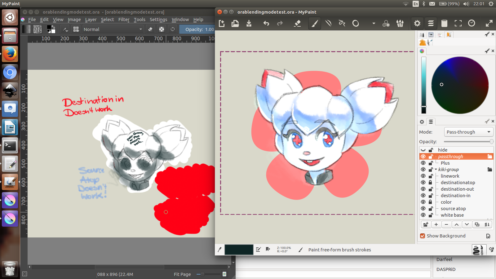
Further I would like to work on improving open raster file format support if time allows me. The main thing that needs to happen here is that two blending modes need to be added to Krita, and Krita needs to save and load these.
- ‘Destination/Source out’ needs to be mapped to erase.(This is badly named in mypaint)
- ‘Destination in’ is new and is a sort of inverse XOR mode.
- Pass-through mode needs to be loaded and saved.
- ‘Destination atop’ needs to be mapped to alpha-inheritance.
- ‘Source atop’ is new and functions as an inverse alpha-inheritance.
Furthermore, we could really improve other minor areas like the background colour and pattern loading.
Timeline:
Week 1:
Figure out how to use LCMS’s functionality to do soft-proofing.
Week 1-2:
Make User-interface so that users can control toggles and the like.
Merge if possible.
Week 3-4:
Start on new selector widget. First focus is getting one that can select based on channels inside the colour space.
Then add the numerical input.
Investigate alternative colour models.
Investigate hex-code conversion
Place into gui.
Week 5-6:
Add palettes.
Port onscreen colour picker in it’s most basic form
Work further on making the onscreen colour picker to be colour managed.
Merge?
Week 7-8:
Work on bugs.
Work on Openraster support if time permits.