This is a task to refresh the design and content a bit on krita.org. Krita has grown and changed in a number of ways the past few years.. The website can probably be updated a bit to reflect some of these changes. This is a bit of a brainstorming task, so any ideas are welcome as well.
These are a few ideas/issues I was thinking
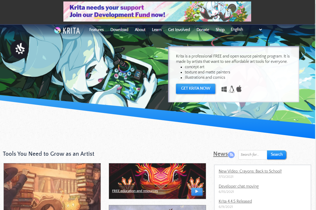
- With the new funding site, we need to integrate it better with krita.org so it is not just a banner on the top
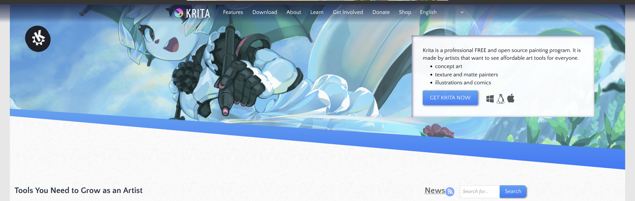
- the homepage is a bit crammed right now with all the sections. We probably need to give more room for each thing and also highlight a few features
- decide what we might want to do with the shop long term
- decide what we might want to do with the artist interviews. We haven't done any in a while
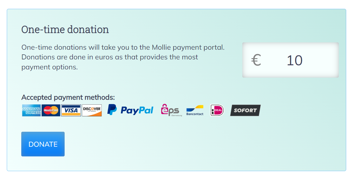
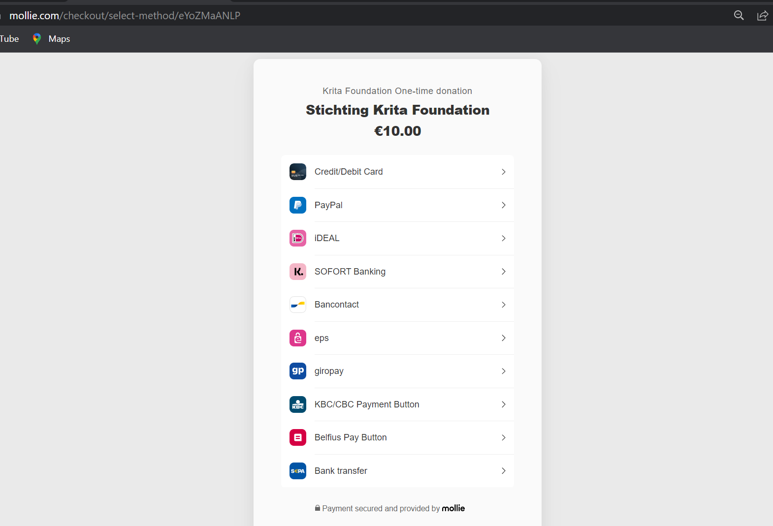
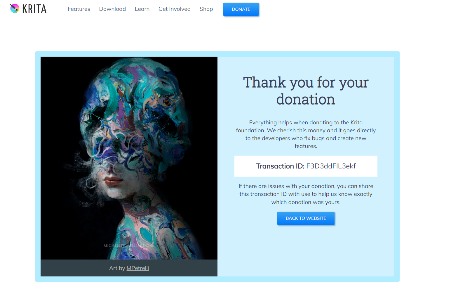
- do a better job at how we communicate donations. Right now the page defaults to going to the one-time donations...then only goes to the funding site if you click the "monthly donations" option
- maybe see if we can consolidate some of the sections on the About area. We have so many...https://krita.org/en/about/history/
- show more artwork through various sections
- potentially add ALT tags to images for better SEO - https://invent.kde.org/websites/krita-org-theme/-/merge_requests/3
Any other issues or ideas to improve it would be great. If there are other websites that do neat things, people can also mention those.
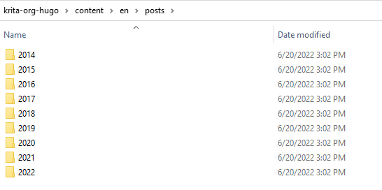
I saw another topic of potentially moving all, or some of krita.org to use something else that isn't WordPress. If we move off WordPress, we will need to list the various benefits WordPress provides, and see how another static site generator like Hugo will be able to manage things