While KMail by default does not look quite so bad I see also here room for some minor improvements.
Base:
While KMail by default does not look quite so bad I see also here room for some minor improvements.
Base:
Good idea to have the button, but maybe it should be placed in the header area instead of the body of the message for security reasons (so that it cannot be spoofed by a malicious HTML message).
Looks great! I especially love the time to read, and also the html/plain-text identifier! :)
could we perhaps have both showing at the proposed location? i.e. size, reading time (e.g. 35Kb, 1mins to read)
Is there a reason why kmail doesn't have message size showing in the top message section, or is it simply for asthetic reasons?
Going off on a slight tangent here, but how will the reading time be calculated? let's imagine the following scenario:
I write an email to someone using kmail, and kmail determines the reading time for the addressee to be 1 min. The other participant responds to my original email and their answer is determined to be 1.5 mins of reading time. Will the calculation in my kmail mailbox be 1mins + 1.5 mins = 2.5 mins, or will be reading time simply be 1.5 mins - as I already know the content on my original message?
Hope that I'm making some kind of sense!!
KMail can show the message size in the message list already now, you can completely customize the data displayed in View->Message List->Theme - in case of the revamping, this customizability should not be lost. Also, the way the code is written now, it should be possible to even implement the proposed change alongside the existing one (same goes for the message view as well) - maybe just without the "upcoming event" information. So not really revamp, but evolution, with a fallback for users who would prefer the "old" look :-)
Showing the time to read in the message list would require KMail knowing the contents of the email before opening it, which is not always the case - think maildir or online IMAP, when only headers are stored locally and the entire email is downloaded on demand when you actually open the email.
@dvratil - Thanks for pointing out the View->Message List-> Theme option, I didn't know that such an option existed, and agree it shouldn't be lost. I wonder therefore, if it's rather about trying to help make these options more user-accessible. Ie end-user education related, coupled with more clarity at the UI end?
I think it would still be great to show the reading time, even if it only shows after the full message has been downloaded. But as mentioned previously, how will it be calculated?
@gjditchfield - i think reviewing how the reply-to, and reply-all options currently work, would be useful.
btw, I'm new here so I hope that no one minds me chipping in my thoughts? :-)
I'm not convinced that trying to show a reading time is that useful. Estimating this will need to take so much into account - it seems easy to divide the length of the message by the user's personal reading speed, but getting an accurate estimate will also depend on the amount of original (non-quoted and non-signature) text, the variation in reading speed between individual messages (junk can be dismissed with just a glance, a party invite may just be skimmed for a date/time, while a technical discussion will have to be read in detail, etc) that an estimate algorithm would need to be trained on a great number of messages before getting anywhere near a realistic result. If the time shown bears no relation to reality then the user will learn to ignore it and there is no point in showing it.
I never thought I would get such a bunch of feedback, wow :-D
@gjditchfield: I am no expert regarding this topic. I could make the box point upwards but even when such an email would contain something to imitate those box it would appear twice wouldn't it ? One generated from kmail as header + separator to the body of the email and one from the email itself as so it should be a warning to the user?
As I am no developer I cannot say anything to the "Reply all" topic but for me, it would make sense to show it separately, maybe only when the mail has more than one recipient ?
@jamesth: I would say it should only count the latest email and nut all emails before from the same conversation. But this is only my opinion.
As @dvratil pointed out already you can customize the layout and displayed column in kmail all to your liking I just took the screenshot from the website and modified it a bit.
@marten: It was just a small addition I find could be useful to some people. I saw such an information now one some blogs and/or on some newspaper portals online and quite liked it. I agree with you that this could be rocket science to get a really correct number but my experience is, if a piece of news told me I would need 5 minutes to read it, it took me also 5 minutes in the end :)
All: Thanks for your great feedback.
@mmustac - i'm glad that you found the feedback useful! :)
what are people's thoughts/ideas re: @gjditchfield suggestion of having 'reply' and 'reply all' buttons on the email screen, please? Personally I'm in favour, I think it makes it easier for the user, and it's more obvious as to who you're replying to in the email. Should the 'reply all' button only appear if the email has more than 1 recipient, as per @mmustac suggestion above?
This is a security warning, it deserves a more visible color (the "load external references" dialog became red'ish recently for the same reason
@cgiboudeaux as currently phrased, it is not a security warning. Nobody except experts and email app developers know that "this is an HTML email" means "this could be dangerous or compromise your privacy". If you want it to be a security warning, you need to include that information in the text somehow.
Bugzilla has a number of wishlist requests for a tabbed view; see https://bugs.kde.org/show_bug.cgi?id=117808. I was surprised to find out that KMail already has one! I'd bet I'm not alone. It is accessed through View →Message List → Create New Tab, which is somewhat obscure. Could a new design make the feature's existence more obvious?
I tried to look how hard it would be to implement the HTML/plain text switcher like in the mockup and the biggest issue is that there is a good reason why it's not already in the HTML view but outside of it. It would theoretically be possible for an HTML mail to put some content on top of the mail metadata and hide/falsify some information. The message is then used as a warning to the user that this might happens. This is an issue in KMail because the meta-information is contained in the web view.
Thinking a bit more about the issue, I'm honestly not sure how much the current bar really helps. If a carefully crafted mail could falsify some information from the header, I'm not sure how big the message helps since it's displayed on most emails and the user will learn to intuitively ignore it. One thing we could already do is hide this bar for plain text emails, that would already help a bit but it's still would be most certainly ignored in most cases by the users. This also goes hand to hand with the fact that telling a user that an email is HTML won't explain why it can in a very few cases be dangerous. A tooltip with some explanation might be helpful, but I'm not sure it's a real solution.
Ideally we wouldn't need to put the metainfo in the webview but outside but that was probably also done for good reasons (e.g embedding mails inside mails) :( Not sure what is the best way to move forward with that
My suggestion would be to put the HTML/plain text switcher in the header, next to the other metadata. This could be done by for example showing a small list of possible MIME types, similar to the expanded sidebar in Claws Mail (but obviously a lot friendlier).
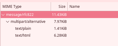
Of course a simple toggle would also work great, especially with the other changes in the mockup which would mean there is less space available in this section.
I like this very much ;) It's a nice way to have the html/plain text switch