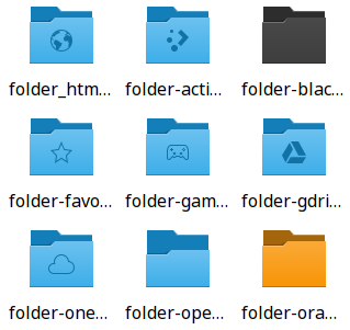
Add icons for folders used for games
Details
- Reviewers
ngraham andreyorst - Group Reviewers
VDG - Commits
- R266:8761b763eacd: Added a set of Game Folder icons
Diff Detail
- Repository
- R266 Breeze Icons
- Lint
Automatic diff as part of commit; lint not applicable. - Unit
Automatic diff as part of commit; unit tests not applicable.
Nice job on the 64 px icons! However, I noticed that the 16 and 22 px icons use a different style and are blurry. Perhaps you should try making the styles more similar to the 64 px style and see if you can move, resize or remove any details that don't line up with pixels.
Oh gosh, how did we miss this? Yikes, I'm very sorry about that.
@andreyorst, if you're still around, we can review this patch and land it once necessary changes are made. If not, maybe @ndavis should commandeer this revision and finish it up.
Now that I think about it, you can probably commandeer it and finish it up now, and once it's ready we can land it with @andreyorst's authorship information. Does that sound okay?
Sure, but I saw this diff posted on Reddit here: https://old.reddit.com/r/linux/comments/9vaq3x/kde_plasma_5143_bugfix_release_for_november_with/e9b06iv/
There's a decent chance he'll answer soon and I don't want to take over his project without giving him a chance to reply.
All right, let's wait then. You wanna keep an eye on this and make sure it doesn't get lost again?
Sure. Is there anything special I have to do to commandeer it if he doesn't reply? Like an Arcanist or Git command or something?
If you do need to, you click on the Add Action... button that's above the comment text box and choose "Commandeer Revision"
Anyway, I agree, let's wait for @andreyorst for a bit.
@andreyorst, if you're still around, we can review this patch and land it once necessary changes are made.
Yeah, I'm here! I'd like to make desired changes myself.
Nice job on the 64 px icons! However, I noticed that the 16 and 22 px icons use a different style and are blurry. Perhaps you should try making the styles more similar to the 64 px style and see if you can move, resize or remove any details that don't line up with pixels.
So the reason behind this was, that with outline style for 16 and 22 px icons all elements like buttons were too small and looked really bad. I've tried lot of variants and decided to go for filled icon in the same way how it is done for network-server icon, which is using (sort of) outline for 64 px and solid for 22 px. However (the ticket is quite old) I've changed this somewhere during this year, and currently in my system all icons are using filled icons, since I feel that this fits more with original style of applications-games icon (and most of game controllers are black too). I'll submit updated patch this evening.
I noticed that the 16 and 22 px icons use a different style and are blurry
What screen resolution do you have? Rightnow it looks fine on my system with 1920x1080 screen. I'll check it at work with 2k screen and scaling turned off.
Fair enough. I'll be waiting. By the way, the monochrome icons don't have to be the exact same style as the color icons.
I noticed that the 16 and 22 px icons use a different style and are blurry
What screen resolution do you have? Rightnow it looks fine on my system with 1920x1080 screen. I'll check it at work with 2k screen and scaling turned off.
I also have 1920x1080 screen, but it shouldn't matter as long as we're both at 1x scaling. You don't see how blurry it is compared to the other icons in your screenshot?
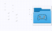
Let me show you the issue up close. You see how it doesn't line up well with the grid? 1 grid square = 1 pixel.
Ah, that's much better. The buttons and D-pad are much easier to see. Try making the sides straight since the angle is pretty small for that size already. Kind of like this:
Here's the SVG of that example icon if you want it. I made the shapes with rectangles, circles, Path->Union (Ctrl++) and Path->Difference (Ctrl+-). BTW, I'm not saying you have to do it just like the example, it's still your project.
Edit: added grid, guides and uncombined the buttons in the example
Try making the buttons somewhat larger. A 1px circle ends up as light gray square.
| icons-dark/places/16/folder-games.svg | ||
|---|---|---|
| 94 | Remove all these leftover rects .. | |
TBH, I kind of prefer the sloped-side version to the proposed straight-side version. It looks a bit too much like a Pac-Man ghost to me!
I think that's perfectly fine. If they were larger, they would completely dominate the icon and the design of the icon would be have to be completely changed to match. With large buttons, a SNES style controller would have to be used.
- made controll buttons 1.2px instead of 1px. Now 16 and 22 px icons will have slope somewhat between proposed variants. Looks crisp enough on my setup
Phabricator unfortunately doesn't offer SVG previews, so posting new screenshots every time you update the diff is appreciated. :)
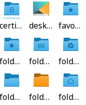
Also, if you don't already know about it, let me introduce you to the Cuttlefish tool. You can generally find it by searching for "Cuttlefish" in Discover. If not, it usually a part of the plasma-sdk package. It's an icon visualization app that really makes this workflow a breeze. Here's a screenshot of what I can use it to see:
Don't worry about the fact that the smallest size is visual mush; that's the 8px version which in practice won't be used for a folder icon. But there is a real problem the small line-art representations don't change their color properly in the dark version:
There's a CSS stylesheet you have to add to it to make this happen. @ndavis can help with this.
Phabricator unfortunately doesn't offer SVG previews, so posting new screenshots every time you update the diff is appreciated. :)
Got it.
You can generally find it by searching for "Cuttlefish" in Discover.
I've had so bad times of getting rid of Cuttlefish on my system because there was no package with the similar name. I'll install it though. What's a Discover anyways? Do I need it to make icons?
But there is a real problem the small line-art representations don't change their color properly in the dark version
I've thought that that's why we have separate breeze and breeze-dark icons. I don't know how to make it dynamic in Inkscape. Is there's any guide for this?
If you prefer to use a CLi package manager, the package name is generally plasma-sdk or something like that.
What's a Discover anyways? Do I need it to make icons?
Discover is KDE's software center/app store. Discover makes it really easy to find, install, and remove apps, like Cuttlefish.
But there is a real problem the small line-art representations don't change their color properly in the dark version
I've thought that that's why we have separate breeze and breeze-dark icons. I don't know how to make it dynamic in Inkscape. Is there's any guide for this?
@ndavis can help with this, but yeah, we really need to add this information to https://hig.kde.org/style/icon.html. Noah, since you know how to do that, would you mind submitting a HIG patch to add it to the Icons page? Thanks!
It's a PITA, but to do that right now, you actually need to open up the SVG in a text editor and add the code. It's not that hard, but it can be tedious if you don't automate it or at least use Search and Replace in Kate. It's also not easy to read the code unless you use an SVG optimizer with an option to make the code pretty. Usually, I run my icons through svgo --pretty -i some-icon.svg or SVG Cleaner (package is usually called svgcleaner) with these settings:
Running your SVGs through an SVG optimizer is usually a good thing to do anyway since it can reduce the size of your SVGs by 80-90%. Inkscape adds a lot of extra data that is useful for editing SVGs, but not for displaying them. Sometimes SVG optimizers can also help you get past Inkscape bugs.
As an example of how to do this, I'll use the gray 16px folder-games icon. After running it through SVG Cleaner with those settings, I get this:
<svg height="16" viewBox="0 0 4.2333332 4.2333332" width="16" xmlns="http://www.w3.org/2000/svg">
    <g transform="translate(0 -292.76667)">
        <path d="m1.1805708 293.95728c-.370925 0-.48656874.31093-.48656874.69452l-.0258849.87107c-.004302.0179-.00662.0365-.006668.055 0 .12786.10022258.23152.22386419.23152.0665226-.00006.12955622-.0309.17204192-.0838l.000195.00082.3223646-.38322c.021422.002.043196.003.065159.003.045396-.00003.090088-.007.1341281-.0159.037136.0803.1155004.13147.2015729.13163.1236387-.00001.2238648-.10366.223864-.23152h.22405513c-.0000008.12786.1002253.23151.223864.23152.086073-.00016.1644372-.0513.2015731-.13163.044039.009.088732.0158.1341279.0159.022028 0 .043866-.00099.06535-.003l.3221738.38322.0001951-.00082c.042481.053.1055194.0837.172042.0838.1236417 0 .2238642-.10366.2238642-.23152-.0000537-.0185-.00238-.0369-.00667-.055l-.025883-.87107c0-.38359-.1156431-.69452-.4865687-.69452h-.8240645-.2240549z" fill="none" stroke="#4d4d4d" stroke-linecap="round" stroke-linejoin="round" stroke-width=".264565"/>
        <path d="m10.5 5.9003906a.60000006.60000006 0 0 0 -.5996094.5996094.60000006.60000006 0 0 0 .5996094.5996094.60000006.60000006 0 0 0 .599609-.5996094.60000006.60000006 0 0 0 -.599609-.5996094zm-5.5.0996094v1h-1v1h1v1h1v-1h1v-1h-1v-1zm4.5.9003906a.60000006.60000006 0 0 0 -.5996094.5996094.60000006.60000006 0 0 0 .5996094.5996094.60000006.60000006 0 0 0 .599609-.5996094.60000006.60000006 0 0 0 -.599609-.5996094zm2 0a.59999983.59999983 0 0 0 -.599609.5996094.59999983.59999983 0 0 0 .599609.5996094.59999983.59999983 0 0 0 .599609-.5996094.59999983.59999983 0 0 0 -.599609-.5996094zm-1 1a.60000006.60000006 0 0 0 -.5996094.5996094.60000006.60000006 0 0 0 .5996094.5996094.60000006.60000006 0 0 0 .599609-.5996094.60000006.60000006 0 0 0 -.599609-.5996094zm-3.5.7011719a.60000006.60000006 0 0 0 -.5996094.5996094.60000006.60000006 0 0 0 .5996094.5996093.60000006.60000006 0 0 0 .5996094-.5996093.60000006.60000006 0 0 0 -.5996094-.5996094zm2 0a.59999983.59999983 0 0 0 -.5996094.5996094.59999983.59999983 0 0 0 .5996094.5996093.59999983.59999983 0 0 0 .5996094-.5996093.59999983.59999983 0 0 0 -.5996094-.5996094z" fill="#4d4d4d" transform="matrix(.26458333 0 0 .26458333 0 292.76667)"/>
    </g>
</svg>
First, add the style sheet just under line 1:
<style type="text/css" id="current-color-scheme">
    .ColorScheme-Text {
        color:#4d4d4d;
    }
</style>
Second, add the ColorScheme class. In this case, I'll add it to the existing group (<g></g> makes a group) so that it affects everything in the group:
<g transform="translate(0 -292.76667)" class="ColorScheme-Text">
Third, change all of the colors to "currentColor":
Use stroke="currentColor" for strokes and fill="currentColor" for shapes.
In the end, I get this:
<svg height="16" viewBox="0 0 4.2333332 4.2333332" width="16" xmlns="http://www.w3.org/2000/svg">
    <style type="text/css" id="current-color-scheme">
        .ColorScheme-Text {
            color:#4d4d4d;
        }
    </style>
    <g transform="translate(0 -292.76667)" class="ColorScheme-Text">
        <path d="m1.1805708 293.95728c-.370925 0-.48656874.31093-.48656874.69452l-.0258849.87107c-.004302.0179-.00662.0365-.006668.055 0 .12786.10022258.23152.22386419.23152.0665226-.00006.12955622-.0309.17204192-.0838l.000195.00082.3223646-.38322c.021422.002.043196.003.065159.003.045396-.00003.090088-.007.1341281-.0159.037136.0803.1155004.13147.2015729.13163.1236387-.00001.2238648-.10366.223864-.23152h.22405513c-.0000008.12786.1002253.23151.223864.23152.086073-.00016.1644372-.0513.2015731-.13163.044039.009.088732.0158.1341279.0159.022028 0 .043866-.00099.06535-.003l.3221738.38322.0001951-.00082c.042481.053.1055194.0837.172042.0838.1236417 0 .2238642-.10366.2238642-.23152-.0000537-.0185-.00238-.0369-.00667-.055l-.025883-.87107c0-.38359-.1156431-.69452-.4865687-.69452h-.8240645-.2240549z" fill="none" stroke="currentColor" stroke-linecap="round" stroke-linejoin="round" stroke-width=".264565"/>
        <path d="m10.5 5.9003906a.60000006.60000006 0 0 0 -.5996094.5996094.60000006.60000006 0 0 0 .5996094.5996094.60000006.60000006 0 0 0 .599609-.5996094.60000006.60000006 0 0 0 -.599609-.5996094zm-5.5.0996094v1h-1v1h1v1h1v-1h1v-1h-1v-1zm4.5.9003906a.60000006.60000006 0 0 0 -.5996094.5996094.60000006.60000006 0 0 0 .5996094.5996094.60000006.60000006 0 0 0 .599609-.5996094.60000006.60000006 0 0 0 -.599609-.5996094zm2 0a.59999983.59999983 0 0 0 -.599609.5996094.59999983.59999983 0 0 0 .599609.5996094.59999983.59999983 0 0 0 .599609-.5996094.59999983.59999983 0 0 0 -.599609-.5996094zm-1 1a.60000006.60000006 0 0 0 -.5996094.5996094.60000006.60000006 0 0 0 .5996094.5996094.60000006.60000006 0 0 0 .599609-.5996094.60000006.60000006 0 0 0 -.599609-.5996094zm-3.5.7011719a.60000006.60000006 0 0 0 -.5996094.5996094.60000006.60000006 0 0 0 .5996094.5996093.60000006.60000006 0 0 0 .5996094-.5996093.60000006.60000006 0 0 0 -.5996094-.5996094zm2 0a.59999983.59999983 0 0 0 -.5996094.5996094.59999983.59999983 0 0 0 .5996094.5996093.59999983.59999983 0 0 0 .5996094-.5996093.59999983.59999983 0 0 0 -.5996094-.5996094z" fill="currentColor" transform="matrix(.26458333 0 0 .26458333 0 292.76667)"/>
    </g>
</svg>
For the breeze-dark icons, just change #4d4d4d in the stylesheet to #f2f2f2.
You don't need to do any of the stylesheet stuff for color icons, including the 32 and 64 px folder-games icons, but you should still run them through an SVG optimizer to save space. Also, Inkscape adds all the extra junk back every time you save a change in inkscape, so you'll have to make sure you use the SVG optimizer again if you make a change in inkscape. You should generally add the stylesheet support last so that you don't keep doing the same thing over and over.
It's actually already in the HIG, kind of, but it's not obvious. A rewrite would help a lot.
For more technical details of how to use colors in icons see this blog post
It links to http://notmart.org/blog/2016/05/icon-colors/
Now for some feedback about the latest changes to the icons:
Much better! The area around the joysticks could use some cleaning up though. At 100% size, it's not possible to see the joysticks. My suggestion would be to remove the joysticks, but keep the bumps that would hold the joysticks. Like so:
I would suggest converting the stroke to a path since sometimes strokes get distorted by some SVG viewers, but I tried it myself and it completely butchered your icon. Why? Who knows. Maybe we shouldn't worry too much about it for now and if it becomes an issue, I can fix it later.
I noticed a bunch of 0 width rectangles off to the left in your 32px icon. Those need to be removed. One way to do that is select all (Ctrl+a), deselect the elements you want to keep (Shift+left click) and press Delete.
Lastly, make sure the 16, 22, 32 and 64 px icons are all using the same style. The original 64px style looked good, but it did not scale down very well. The new style for the smaller icons should scale up easily. In general, I find it easier to create a consistent design if I start with the smallest icon I need to make.
Currently working on this. :) The icons page is not nearly focused enough right now. Too stream-of-consciousness and there's a lot of not-very-useful fluff. I should have a HIG patch ready later today or tomorrow.
I've thought I'd be able to do this by weekend, but things became too complicated and time consuming. I mean, I had time for this a year ago, but not now. TBH my system already has those icons and some others, and it works fine for me, so I really don't want to mess with those SVG-optimizers, dynamic colors, that involve patching files after every edit, etc. I'll appreciate if someone finish this, but I've realized that I have neither time nor will, to do this.
Thanks for the status update, Andrey. I'm sorry we didn't notice this last year! Noah, would you like to commandeer this and finish it up?
I've done my best to clean up the icons while trying to preserve the new style that the original author created.
The controller symbols on the 32 and 64 icons are IMHO too small, the 22px symbol fits on the 32px folder easily.
Looks great!
Before you land the patch, please give Andrey attribution, since he did the bulk of the original work. Sadly we can't have joint authorship. :(
Do this:
git commit --amend author="Andrey Orst <andreyorst@gmail.com>"
arc land
For the 32px icon, it's actually about the same size of other 32px folder icons.
Same with the 64px icon, but I supposed it could be slightly larger.
That git command doesn't work for me.
╰ git commit --amend author="Andrey Orst <andreyorst@gmail.com>" error: pathspec 'author=Andrey Orst <andreyorst@gmail.com>' did not match any file(s) known to git
But it doesn't matter because doing a regualr git commit --amend told me he was still the author.
[arcpatch-D8912 c046e686] Added a set of Game Folder icons
 Author: Andrey Orst <andreyorst@gmail.com>
Ah my bad, author would have needed a -- before it: git commit --amend --author="Andrey Orst <andreyorst@gmail.com>"
@bruns Do you still want me to change the 32 and 64 px icons? If not, I will land the patch.
Actually, I think I will increase the size of the 64px icon. It's much nicer now and a bit closer to the original.
Can you show both variants (with 16px symbol and 22px symbol) for the 32px folder side by side, preferably also with one/some of the other folder icons? I think it will look better, as the controller is quite narrow and detailed.
@bruns the 22px icon seems a little big compared to the other symbols used by 32px places icons, but the existing symbol is slightly small.
