Show dialog to ask when closing when more than tab open
AbandonedPublic

Authored by aacid on Sep 6 2017, 9:18 PM.

Details

Summary

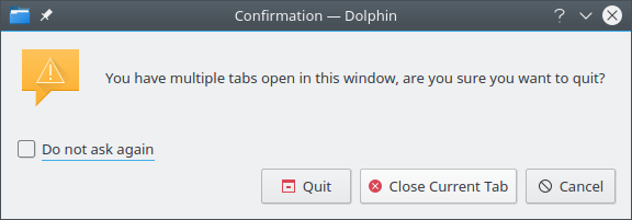
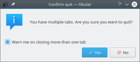
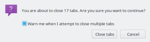
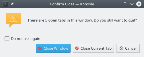
The checkbox is checked and says "Warn me on closing more than one tab",
for that reason we can't use the default KMessageBox::questionYesNo since
there the checkbox is always not checked and it's when checked that you enable it

Inspired by code from torham zed torhamzed@yahoo.com at review request 126406

Diff Detail

Repository
R223 Okular
Branch
master
Lint
No Linters Available
Unit
No Unit Test Coverage
aacid created this revision.Sep 6 2017, 9:18 PM
Restricted Application added a project: Okular. · View Herald TranscriptSep 6 2017, 9:18 PM
Restricted Application added a subscriber: Okular. · View Herald Transcript
rkflx added a subscriber: rkflx.Sep 8 2017, 10:25 PM

Thanks for picking up old reviewboard requests. I like the feature in general, it is standard in a lot of applications today.

But to make it easier to use, users should not relearn the UI they are already familiar with. This is what Dolphin currently provides vs. the patch:

Besides the relearning aspect, I find the dialog in Dolphin preferable because of the following properties:

  • Explicit actions on the buttons instead of ambiguous Yes/No which requires reading of the explanation.
  • Slightly better wording ("you have...open in this window" vs. "you have tabs.").
  • Warning icon instead of information icon.
  • Standard do-not-ask-again message instead of custom message (also, "when closing more than one tab" does not correspond directly to the "quit" action the user initiated and thus might be confusing, as you cannot close e.g. 4 out of 5 tabs).
  • Third button with the correct action for those of us hitting Ctrl+Q while we meant Ctrl+W.
  • (Okular's dialog title is better, though.)

Thus, I would prefer something akin to the Dolphin dialog being implemented in Okular.

Lastly, Dolphin has a way to reset the warning status in the settings, is there any way to reset it in Okular too?

aacid added a comment.Sep 9 2017, 4:35 PM
In D7714#144118, @rkflx wrote:

Thanks for picking up old reviewboard requests.

It's what being the defacto maitainer means

I like the feature in general, it is standard in a lot of applications today.

But to make it easier to use, users should not relearn the UI they are already familiar with. This is what Dolphin currently provides vs. the patch:

Besides the relearning aspect, I find the dialog in Dolphin preferable because of the following properties:

  • Explicit actions on the buttons instead of ambiguous Yes/No which requires reading of the explanation.

What part of "Are you sure you want to quit" Yes/No you find ambiguous?

  • Slightly better wording ("you have...open in this window" vs. "you have tabs.").

This has nothing to do with "this window", it's about the application itself being closed.

  • Warning icon instead of information icon.

Why is warning better? IMO Warning is for "you better pay attention answering here because if not something will be very wrong", nothing will happen if you answer wrong that question, worse case scenario you have to reopen some files.

  • Standard do-not-ask-again message instead of custom message (also, "when closing more than one tab" does not correspond directly to the "quit" action the user initiated and thus might be confusing, as you cannot close e.g. 4 out of 5 tabs).

Do not ask again is not what you want. Because if you say "No" and "Do not ask again" suddently you're fucked and you can't quit. That's why firefox wording that i copied is much better

  • Third button with the correct action for those of us hitting Ctrl+Q while we meant Ctrl+W.

You press esc and then Ctrl+W ;)

  • (Okular's dialog title is better, though.)

    Thus, I would prefer something akin to the Dolphin dialog being implemented in Okular.

Sorry i don't see any major benefit in Dolphin's dialog.

Lastly, Dolphin has a way to reset the warning status in the settings, is there any way to reset it in Okular too?

No, but that doesn't have anything to do with this, we have multiple "don't ask me again" already, so this can't be a blocker. You're welcome to implement that.

rkflx added a subscriber: colomar.Sep 9 2017, 5:57 PM

What part of "Are you sure you want to quit" Yes/No you find ambiguous?

KDE's HIG says

Label command buttons with an imperative verb.

and also

Use descriptive button labels instead of standard Yes/No or OK/Cancel buttons. For example, if the user must choose to continue or stop an action, provide the buttons "Continue" and "Cancel".

and IIRC there was even a time when a lot of KDE dialogs were converted from Yes/No style to a more action oriented style.

This has nothing to do with "this window", it's about the application itself being closed.

Try opening multiple Okular windows with tabs and quit. Only one window (from the perspective of the user) will be closed.

Why is warning better?

The "i" in the icon stands for "information", but in reality you are asking the user to pick between two buttons (the "warning" icons signals "attention, decide between two things!" with the imperative literally depicted by "!") Of course, a question mark would also work (maybe even better).

That's why firefox wording that i copied is much better

Fair enough. It would be a nice touch if you could also change it in Dolphin then, though.

that doesn't have anything to do with this, we have multiple "don't ask me again" already, so this can't be a blocker.

I thought it was a relevant question, so I brought it up. I'm sorry you feel attacked.


For the rest, let's see if @colomar has any tips.

aacid added a comment.Sep 12 2017, 8:38 PM
In D7714#144296, @rkflx wrote:

What part of "Are you sure you want to quit" Yes/No you find ambiguous?

KDE's HIG says

Label command buttons with an imperative verb.

and also

Use descriptive button labels instead of standard Yes/No or OK/Cancel buttons. For example, if the user must choose to continue or stop an action, provide the buttons "Continue" and "Cancel".

and IIRC there was even a time when a lot of KDE dialogs were converted from Yes/No style to a more action oriented style.

So how would you name them, since you're the one blocking on wording, you may as well suggest those names ;)

This has nothing to do with "this window", it's about the application itself being closed.

Try opening multiple Okular windows with tabs and quit. Only one window (from the perspective of the user) will be closed.

Ok, since you're better at the wording, please suggest a full wording for the dialog.

Why is warning better?

The "i" in the icon stands for "information", but in reality you are asking the user to pick between two buttons (the "warning" icons signals "attention, decide between two things!" with the imperative literally depicted by "!") Of course, a question mark would also work (maybe even better).

I still disagree with Warning, I'll change it to Question once you give me the correct wordings for the other items.

That's why firefox wording that i copied is much better

Fair enough. It would be a nice touch if you could also change it in Dolphin then, though.

I'm not going to fix Dolphin *right now*. I may create a new feature for KMessageDialog that allows for people to use different wording instead of "Don't ask me again", and maybe then port Dolphin to it, but that's separate from this feature.

that doesn't have anything to do with this, we have multiple "don't ask me again" already, so this can't be a blocker.

I thought it was a relevant question, so I brought it up. I'm sorry you feel attacked.

What part of "you can't block this feature on an already existing problem" you think means i feel attacked?

Why don't we simply copy the Firefox dialog?
Firefox has a big userbase and with the default settings, the vast majority of users will see this dialog at some point. Therefore if their wording was problematic, it's very likely someone would have flamed them for it.
So I'd consider their dialog "real-world tested".

It has explicitly named buttons (Close Tabs and Cancel), it uses the question icon, it has clear wording. If it's difficult to determine the number of open tabs at this point, just using "multiple" instead would be okay as well. The situation is the same. No need to reinvent the wheel here.

rkflx added a comment.Sep 13 2017, 9:38 PM

For reference, here is Konsole (which other KDE apps with tabs did I miss?):

[...]
No need to reinvent the wheel here.

Thanks Thomas, this is really helpful. With your and Albert's input in mind, here is what a good dialog would look like for me:

  • Window title: "Confirm Close — <app name>"
  • Icon: question mark
  • Message: "You are about to close a window with <n> tabs. Are you sure you want to continue?"
  • Checkbox: "Warn me when I attempt to close a window with multiple tabs" (should be aligned horizontally below text like in Firefox)
  • Buttons: "Close Window" and "Cancel"

Some remarks:

  • I guess Firefox chose "Close tabs", because the dialog is also used for protecting the "Close other tabs" function. I prefer "Close Window", as in the end there is no empty shell with 0 tabs left.
  • "Close" instead of "Quit", because the action closes only one window and does not actually also quit all other windows
  • Only two buttons, because "Close tab" should normally be triggered by other means
  • "Do not ask again" does not make sense for "Cancel"

In the end, we should care about good usability applied consistently within KDE (and probably compatible with Firefox to a certain extent).

While I can understand you want to get this patch off of your list quickly, Albert, I would actually suggest to find a consensus between Okular's, Dolphin's and Konsole's developers first (could imply help with the implementation, too). I appreciate your offer to improve KMessageDialog.

If you agree, I can open a task on the KDE Applications workboard with the conclusions from here, and notify everyone affected (more focussed than a mailinglist, and better mockup capabilities).

Ok, so i will abandon this and we won't ever get a fix.

Because that's what's going to happen, but sure, let's do perfection instead of good enough.

ngraham added a subscriber: ngraham.

I'm willing to commandeer this patch and work with folks to do the wording change. Do you approve, Albert?

So for the record, I agree with folks that our "are you sure you want to close all these tabs" dialogs could stand for a bit of usability polishing.

However, that's a larger task--one that I am willing to spearhead, but nonetheless outside the scope of this particular patch. So for now, I would like to re-work the patch to match Dolphin and Konsole, so that we at least achieve a measure of consistency across KDE apps. After that, we will start the process of improving these dialogs' usability, and once we have some agreement on what the final form should look like, we will change them all at once to preserve consistency.

With this approach, we do the work in two discrete phases, with less risk of getting nothing at all because of bikeshedding that prevents the initial patch from ever getting committed--which is what Albert is rightly worried about.

Does that sound like a plan?

rkflx added a comment.Sep 16 2017, 2:26 PM
In D7714#145952, @aacid wrote:

Ok, so i will abandon this and we won't ever get a fix.

Because that's what's going to happen, but sure, let's do perfection instead of good enough.

I'll interpret that as a "no" to my question whether you would agree to open a a shared task. That's fine with me, we can work on Okular first and do a second round afterwards (harder, though). No need to abandon anything. (But I am also disappointed that we just assume there will be bikeshedding with the Dolphin and Konsole developers, without even trying to reach out to them.)

Just for the record: Please don't feel blocked by my comments (I'm not even set as a reviewer, neither did I set the status to "Changes Requested"). Maybe I just misunderstood why you posted this as a review request in the first place.

I would like to re-work the patch to match Dolphin and Konsole

That was kind of my original suggestion: just copy what Dolphin already has. As you can read above, Albert isn't too fond of that.

Albert: Assuming we'll work on Okular only first, please indicate what style of dialog we should go ahead with:

  • as implemented in the original patch
  • as suggested in D7714#145582 as per your request for better wording
  • as shown in the screenshot of Dolphin
  • none/other
aacid added a comment.Sep 16 2017, 4:33 PM

I'm willing to commandeer this patch and work with folks to do the wording change. Do you approve, Albert?

As far as I understand Henrik is against this patch going in unless Dolphin and Konsole are also fixed at the same time, a wording change is not going to help there.

aacid added a comment.Sep 16 2017, 4:34 PM

So for the record, I agree with folks that our "are you sure you want to close all these tabs" dialogs could stand for a bit of usability polishing.

However, that's a larger task--one that I am willing to spearhead, but nonetheless outside the scope of this particular patch. So for now, I would like to re-work the patch to match Dolphin and Konsole, so that we at least achieve a measure of consistency across KDE apps. After that, we will start the process of improving these dialogs' usability, and once we have some agreement on what the final form should look like, we will change them all at once to preserve consistency.

With this approach, we do the work in two discrete phases, with less risk of getting nothing at all because of bikeshedding that prevents the initial patch from ever getting committed--which is what Albert is rightly worried about.

Does that sound like a plan?

I thought we had established my patch (minus wording) was better than Dolphin/Konsole?

aacid added a comment.Sep 16 2017, 4:37 PM
In D7714#146282, @rkflx wrote:
In D7714#145952, @aacid wrote:

Ok, so i will abandon this and we won't ever get a fix.

Because that's what's going to happen, but sure, let's do perfection instead of good enough.

I'll interpret that as a "no" to my question whether you would agree to open a a shared task. That's fine with me, we can work on Okular first and do a second round afterwards (harder, though). No need to abandon anything. (But I am also disappointed that we just assume there will be bikeshedding with the Dolphin and Konsole developers, without even trying to reach out to them.)

I don't disagree on you wanting to make the world better, i disagree on you wanting to block an improvement because you want to fix everything at once instead of doing minor incremental fixes.

Just for the record: Please don't feel blocked by my comments (I'm not even set as a reviewer, neither did I set the status to "Changes Requested"). Maybe I just misunderstood why you posted this as a review request in the first place.

I would like to re-work the patch to match Dolphin and Konsole

That was kind of my original suggestion: just copy what Dolphin already has. As you can read above, Albert isn't too fond of that.

Albert: Assuming we'll work on Okular only first, please indicate what style of dialog we should go ahead with:

  • as implemented in the original patch
  • as suggested in D7714#145582 as per your request for better wording
  • as shown in the screenshot of Dolphin
  • none/other

I guess option two, though i'm not sure i totally agree with all your points there either.

That's great, now code can be written.

To track progress (but not to discuss with other application developers as requested, at least for now) I opened T7022. Any help is welcome, please add your name if you start working on an item and/or possibly a review request number.

aacid added a comment.Sep 17 2017, 9:49 PM

I'm going to commit this since it seems Henrik has a plan for the bigger thing.

aacid planned changes to this revision.Sep 17 2017, 9:51 PM
aacid requested review of this revision.
aacid abandoned this revision.