[ToolButtonStyle] Use pure colors and no frame as background in flat mode
AbandonedPublic

Authored by romangg on Feb 25 2017, 11:19 PM.

Details

Reviewers
mart
Group Reviewers
Plasma
Summary

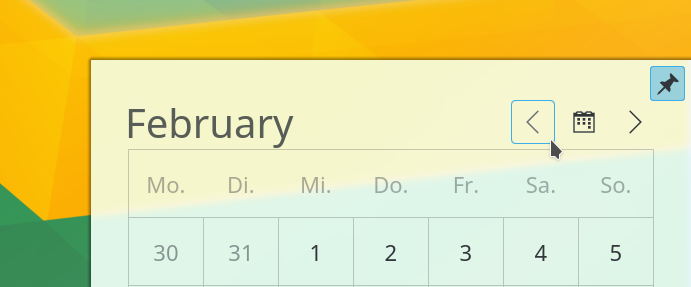
The ToolButton has a rather odd looking style, which often conflicts with its placement and other lines in an applications: It shows the normal Button frame, when hovered. For example take a look at the calendar:


It doesn't fit the overall design and coders often srew up the borders, which are in the upper example not aligned with the other lines and even overlap with the pin highlight. In comparision with the simplified background colors:

The highlight color for the background fits together with the other elements much better and the misalignment is less noticeable because of the rounded edges. That there is no overlap anymore is only lucky though.

If you look closely the pin in the top right corner of the calendar is a (checkable) ToolButton as well and has a stronger checked color after the patch. I would say it's a matter of taste, but we could soften this by reducing the opacity also in pressed/checked mode (when hovered it's already at 0.25%) in any case or only if it is a checkable ToolButton .

Diff Detail

Repository
R242 Plasma Framework (Library)
Lint
Lint Skipped
Unit
Unit Tests Skipped
romangg created this revision.Feb 25 2017, 11:19 PM
Restricted Application added a project: Frameworks. · View Herald TranscriptFeb 25 2017, 11:19 PM
Restricted Application added a subscriber: Frameworks. · View Herald Transcript

Hello Roman,
I disagree that the current toolbutton design "doesn't fit the overall design". It is (to me at least) consistent with the widget style (in e.g. toolbars), and all the other "squarish" elements of breeze.

On the contrary, I would find the new design, with its large rounding radius, inconsistent with the rest, since (unless i am mistaken) such a large radius is used nowhere else, either in the widget or the qml style.
So that would be a -1, sorry.
That does not mean that the calendar plasmoid should not be fixed, to prevent the items overlap.

I agree with Hugo. I also never liked the faint blue press effect of buttons that was introduced in the Breeze revamp in 5.5 to begin with, having that as normal state now is a no-go for me.

Also, you can't just randomly change the behavior of ToolButtonStyle, instead, if we were to do this, the Breeze Plasma style should be adjusted, introducing a dedicated widget and/or new hints if needed, instead of the button component.

romangg added a comment.EditedFeb 26 2017, 1:14 PM

I see where you're coming from. You're right, that the rounded edges don't fit so well to other Plasma element. So I would try to find another design, because I still think the current ToolButton is ugly. Let me make it more clear, what I dislike about the current (flat) ToolButton design: It just takes the Button design for its hover/clicked state. This looks weird, because painting a whole button is not a small hint for the user that he can interact with the element but looks more like a completely new independent button suddenly being created.

Besides that, did you notice that we have two different ToolButton designs in our Frameworks? The above one for QML in Plasma Frameworks and one for QWidgets in KToolBar. Take a look at Dolphin for example:

Would you support the idea of using the KToolBar ToolButton design for the QML ToolButton aswell? It looks way better in my opinion and it would make the use of tool buttons more consistent.

In D4797#90068, @subdiff wrote:

This looks weird, because painting a whole button is not a small hint for the user that he can interact with the element but looks more like a completely new independent button suddenly being created.

As a user (but old user, ok), I never thought about this. It is just the button raising when it is possible to activate it.

Hi Roman,

Would you support the idea of using the KToolBar ToolButton design for the QML ToolButton aswell? It looks way better in my opinion and it would make the use of tool buttons more consistent.

Yes, I would support this. It would be more consistent with QWidget.

Would you support the idea of using the KToolBar ToolButton design for the QML ToolButton aswell?

Good idea.

romangg updated this revision to Diff 11853.Feb 26 2017, 2:44 PM

Replicate the design of QToolButton (used for example in the tool bars of System Settings and Dolphin).

+ 1 for me. Looks good!

Design looks ok but still you can't change ToolButtonStyle, instead, the Breeze Plasma theme needs to be changed.

romangg added a comment.EditedFeb 26 2017, 5:02 PM

Design looks ok but still you can't change ToolButtonStyle, instead, the Breeze Plasma theme needs to be changed.

Sorry, I didn't quite get it the last time you mentioned it. I think I understand it now. You mean it will make other themes look like Breeze, when we insert the code in ToolButtonStyle, correct? But in this case take a look at the current ToolButtonStyle code: It takes ButtonStyle's svg frame directly and uses it for its hovered/pressed state. So changing only the theme would mean to change the svg of ButtonStyle, which is not desirable.

Also I tested it now with the Oxygen and United themes, and QToolButton has still the same flat frame line in highlight color around it when hovered like in Breeze, so it seems to be independent of the theme in QToolButton as well. In the Oxygen case it is though different looking in the pressed and checked state. Here it has a "depth" effect to it (or it's only the frame line getting bigger). Not sure how we can replicate that.

Also I tested it now with the Oxygen and United themes, and QToolButton has still the same flat frame line in highlight color around it in when hovered like in Breeze, so it seems to be independent of the theme in QToolButton as well. In the Oxygen case it is though different looking in the pressed and checked state. Here it has a "depth" effect to it (or it's only the frame line getting bigger). Not sure how we can replicate that.

Speaking for the widgets only (QToolButton), the fact that mouse-over looks similar (and, if you look closely, not identical in fact) is just a coincidence.
This is handled by the widget style and is not hard coded
Check with fusion style for instance (namely: dolphin -style fusion)

for the QML side of things I have no idea.

So changing only the theme would mean to change the svg of ButtonStyle, which is not desirable.

Then we need to introduce new elements in widgets/button.svg or a new widget/toolbutton.svg for ToolButton which is used and falls back to the old behavior if not present (to not break compat with other themes). QToolButton is QtWidgets which has nothing to do with QML or Plasma styles.

mart added a subscriber: mart.Feb 27 2017, 2:34 PM
In D4797#90142, @subdiff wrote:

Design looks ok but still you can't change ToolButtonStyle, instead, the Breeze Plasma theme needs to be changed.

Sorry, I didn't quite get it the last time you mentioned it. I think I understand it now. You mean it will make other themes look like Breeze, when we insert the code in ToolButtonStyle, correct? But in this case take a look at the current ToolButtonStyle code: It takes ButtonStyle's svg frame directly and uses it for its hovered/pressed state. So changing only the theme would mean to change the svg of ButtonStyle, which is not desirable.

Also I tested it now with the Oxygen and United themes, and QToolButton has still the same flat frame line in highlight color around it when hovered like in Breeze, so it seems to be independent of the theme in QToolButton as well. In the Oxygen case it is though different looking in the pressed and checked state. Here it has a "depth" effect to it (or it's only the frame line getting bigger). Not sure how we can replicate that.

It needs to have new svg theme elements (and fallback to the currently used prefixes if not found) would be like toolbutton-hover and toolbutton-ressed prefixes in the button svg (i think for the pressed one is fine to keep it simple and keep the normal pressed button tough)

mart requested changes to this revision.Feb 27 2017, 2:41 PM

in general, this gives me the idea that it may be a good idea to try to expand framesvgitem api to have things like

FrameSvgItem {
    prefix: ["toolbutton-normal", "normal"]
}
This revision now requires changes to proceed.Feb 27 2017, 2:41 PM
mart added a comment.Feb 27 2017, 2:44 PM

So changing only the theme would mean to change the svg of ButtonStyle, which is not desirable.

Then we need to introduce new elements in widgets/button.svg or a new widget/toolbutton.svg for ToolButton which is used and falls back to the old behavior if not present (to not break compat with other themes). QToolButton is QtWidgets which has nothing to do with QML or Plasma styles.

having a new svg would make it easier for fallback (would fallback to breeze toolbutton for old themes) even tough i like the idea of keeping a single svg instead and trying to give some fallback api to framesvgitem

romangg abandoned this revision.Feb 27 2017, 6:02 PM

Not anymore relevant thanks to D4827.