I'm symlinking preferences-desktop-mouse and kmousetool to input-mouse for now. The original mouse icons weren't very pixel aligned anyway.
BUG: 406453
| saligari | |
| ngraham |
| VDG |
I'm symlinking preferences-desktop-mouse and kmousetool to input-mouse for now. The original mouse icons weren't very pixel aligned anyway.
BUG: 406453
input-mouse:


input-mouse:


| No Linters Available |
| No Unit Test Coverage |
| Buildable 26001 | |
| Build 26019: arc lint + arc unit |
Running svgcleaner on this icon turns it from a 7.3 KiB monstrosity to 1.6 KiB beauty. However I don't know how to update this patch :(.
The existing icon is something like 7.9KiB but this one is doesn't have that much detail, it shouldn't be such a big file.
Things I like:
Things I don't like:
Regarding SVG optimization, the main point of it these days is to make the code easier to read, not to get the smallest size possible. Use the settings on this page for your SVG optimizer: https://community.kde.org/Guidelines_and_HOWTOs/Icon_Workflow_Tips
Dang it! I did it to another proposal as well before I read this comment. Will look into it.
I will look how to add perspective and correct the margins!

Awesome, that's much nicer.
I think it needs the outline.border to extend up to the top, or else the top of the icon starts to blend in with the default window color:
erm, that was kind of intentional, I'll give it a go but I'm not sure about a border extending up to the top
Hmm, the old icon also has the virtue of looking more like genuine computer mice: it resembles the logi(tech) & copycat style of mouse design quite well in a stylised sort of way. It's got the side buttons, the smooth/fast scrolling thing and managed to capture the ergonomic mouse shape. It's also got colour accents.
The new one is rather more abstract while at the same time somehow not looking like any "real" mouse would, in particular in its outline: it misses all the traits of mouse design that would make it more ergonomic or smaller. Maybe this is just me but the overall width to height ratio makes it seem that the closest "real" mice are quite dated as well.

This may be deliberate, but if you complain about it being boring you might want to mimic existing mice design a bit closer. For example: why not ditch white (which is also a trait of many elderly/ancient mice) and go with a different colour (bright colours are quite popular for laptop mice).
One thing I find really striking about the new icon is how closely it resembles stress balls:

I kinda like that... :)
Yes, I agree that the mouse should have fairly realistic and modern proportions. My favorite icons in Breeze are the ones that look pretty realistic while still maintaining the soft gradients and shadows.
Maybe this is just me but the overall width to height ratio makes it seem that the closest "real" mice are quite dated as well.
I don't understand what you mean with this, do you think it should be slimmer? I kind of followed the old one in this, even if it doesn't seem like it. Right now its ratio is ~0,67 while microsoft's standard old mouse is kind of close to that (but has a different shape)
I don't think an icon for its place needs side buttons, fast scrolling buttons etc. Being kind of abstract, simple and out of the way I think is a plus in its case.
The ergonomic mouse shape/ especially existing icon's left side is really cool, but unfortunately I don't have the skills to make something like this (I hardly know how to use inkscape). I think it takes a lot of skill to be able to create something realistic but also manage to strike a balance and I don't even have a little skill.
Added a better border, it does look better like this.
preview:

One thing I find really striking about the new icon is how closely it resembles stress balls:
I've never heard of stress balls lol! The microsoft mouse from wikipedia page is what my parents have in the house (and what first comes to mind when I think of a mouse)
Right but that shape makes quite a bit of difference here -- especially since real mouse design is *all about* shape. You'll also note that the actual mouse you took for inspiration has a much more pronounced "hump" (as many modern mice do).
I don't think an icon for its place needs side buttons, fast scrolling buttons etc. Being kind of abstract, simple and out of the way I think is a plus in its case.
That is your artistic choice to make. :)
The ergonomic mouse shape/ especially existing icon's left side is really cool, but unfortunately I don't have the skills to make something like this (I hardly know how to use inkscape). I think it takes a lot of skill to be able to create something realistic but also manage to strike a balance and I don't even have a little skill.
Rght, I wouldn't have much of a clue either on how to make *any* icon. (It's just a lot easier to criticise than it is to create...) If on the other hand you really like the old mouse icon as well but just want it to work better for dark themes then another option might be to recolour the old icon to get better contrast out of it against the dark background.
If on the other hand you really like the old mouse icon as well but just want it to work better for dark themes then another option might be to recolour the old icon to get better contrast out of it against the dark background.
I tried modifying the existing icon but the results were horrible. I gave up on modifying and made this really simple one. Turns out modifying something sounds easier than it is. Or maybe that's because I don't really know how to use inkscape
¯\_ (ツ) _/¯
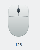
FWIW all the mice in my house have this exact shape, but they're black, not gray. So I don't think the shape is too old-fashioned per se. It's the gray color that's anacrhonistic part, since it's a very 90s/early 2000s color and modern mice tend to be black:
However that dark color causes visibility problems that this new icon is fixing. Maybe you could use the same color that's used in the joystick/gaming controller icon? That's sort of dark enough to connote darkness while not being darn enough to cause visibility issues.
Changed the icon, with ndavis' help, so that it better fits its 64px place.
I also tried joystick's/input gaming colors but didn't like it much, here's a comparison in 64px:

Hmm yeah, that gray color is probably too dark. Also a color that dark likely wouldn't need an outline as it would be visible on both light and dark backgrounds.
The new one looks very oldschool. Some ideas how to improve that:
Well, one thing you'll also note is that modern mice tend to be narrower (and/or have a twist in the shape and/or have a slight inwards curve towards the middle (top and bottom are wider than the middle part).
Bruns's comment about right-handed mice (gradient) is due to the quite asymmetrical shape many modern mice use for ergonomic reasons (RSI).
here's a picture:

edit: I can't say I'm super happy with this (I actually like my previous icon more) and I'm kind of running out of steam, if anyone wants to pick it up or only has some minor change in mind maybe I could do it.
Bruns's comment about right-handed mice (gradient) is due to the quite asymmetrical shape many modern mice use for ergonomic reasons (RSI).
No, even for a ball bottom right is darkest. Shapes should be drawn as if there were a light at the top left, i.e. with a shadow at the bottom right.

That's much better! I think I'd use a slightly darker shade of gray though. Not much, just a bit.
LGTM now! While you're at it, could you create a 32px version and replace icons/preferences/32/preferences-desktop-mouse.svg?
My search on the internet told me LGTM stands for looks good to me.
I added a 32px with 3px margin
It's a bit off center and I'd prefer if lines were more aligned with pixels. That way the icon doesn't change in how it looks when you scale it up. You may need to lighten the colors of your lines to maintain the original appearance.
You see what I'm seeing? Do you know how to enable a grid with 1px spacing?

This has some tips: https://community.kde.org/Guidelines_and_HOWTOs/Icon_Workflow_Tips
Do check out the Inkscape manual as well. It's actually useful and not very difficult to read through.
Oh the shame! I had forgotten to center it (and I do know how to)!
One thing I don't know is: since I centered it and used the guidelines my 1px line centered sits on a 0,5 to 0,5 line. I don't know if that's bad or how to change it.
Hope it's ok.
Cleaned up the paths a bit since I noticed I had made a horrible union.
Not including a preview since I don't think anything's actually different from my last revision visually
That means you need to widen it to 2px. It's between pixels, so it's 2px thick when you look at it at the normal size anyway.


+1, very nice.
icons/preferences/32/preferences-desktop-mouse.svg still shows the old one from an earlier version of this patch.

