
Details
Details
Diff Detail
Diff Detail
- Repository
- R266 Breeze Icons
- Lint
Automatic diff as part of commit; lint not applicable. - Unit
Automatic diff as part of commit; unit tests not applicable.
Comment Actions
If we do this, then won't the category icons look different from the actual emoji icons when using a font where the emojis look different?
Comment Actions


Hi @ngraham , the main idea is to make the left panel use only Breeze icons.
Reference design in Telegram Desktop:
In WhatsApp:

In this way we can choose what the icon look like.
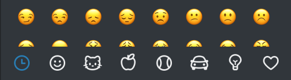
Current implementation renders the first emoji in the category. You can see the "Objects" category is a "Muted" emoji. And the "Symbols" icon is an "ATM" emoji. They don't fit the category very well.
Comment Actions
It seems like there are two goals here:
- Use monochrome icons
- Be able to choose which icon is shown in the sidebar.
I don't have strong opinions about #1, but I agree that #2 is useful. However do we have to use breeze icons for this? Couldn't we adjust the code to choose a specific emoji rather than always using the first one in the grid view?
Comment Actions
I don't have strong opinions about #1. regarding #2 I'd say that if we want to decide what to show there, we can just as well show icons from the icon theme.
Also I wonder if it will be any easy to implement since categories are coming from ibus and the category name comes translated.
Comment Actions
D27915 is for the change. The ibus dict comes with untranslated categories name. The category names may change. But it seems the dict hasn't been updated that often.
Comment Actions
Ah, you are right. Well then +1 from my end overall.
I'd say it brings control over the UX so it makes sense.
Comment Actions
I think I'll want to update some of these icons in the future, particularly the animal icon since that's using another project's mascot. Still, I don't think it'll be a problem since the TeX lion doesn't seem to have an official icon logo.