Hello guys,
the intro page of the system settings bothered me because it looks kind of outdated.
So I've desided to redesign it. Because this is my first contribution containing a little bit more than just "adding icons", there will be probably some issues with my code / design
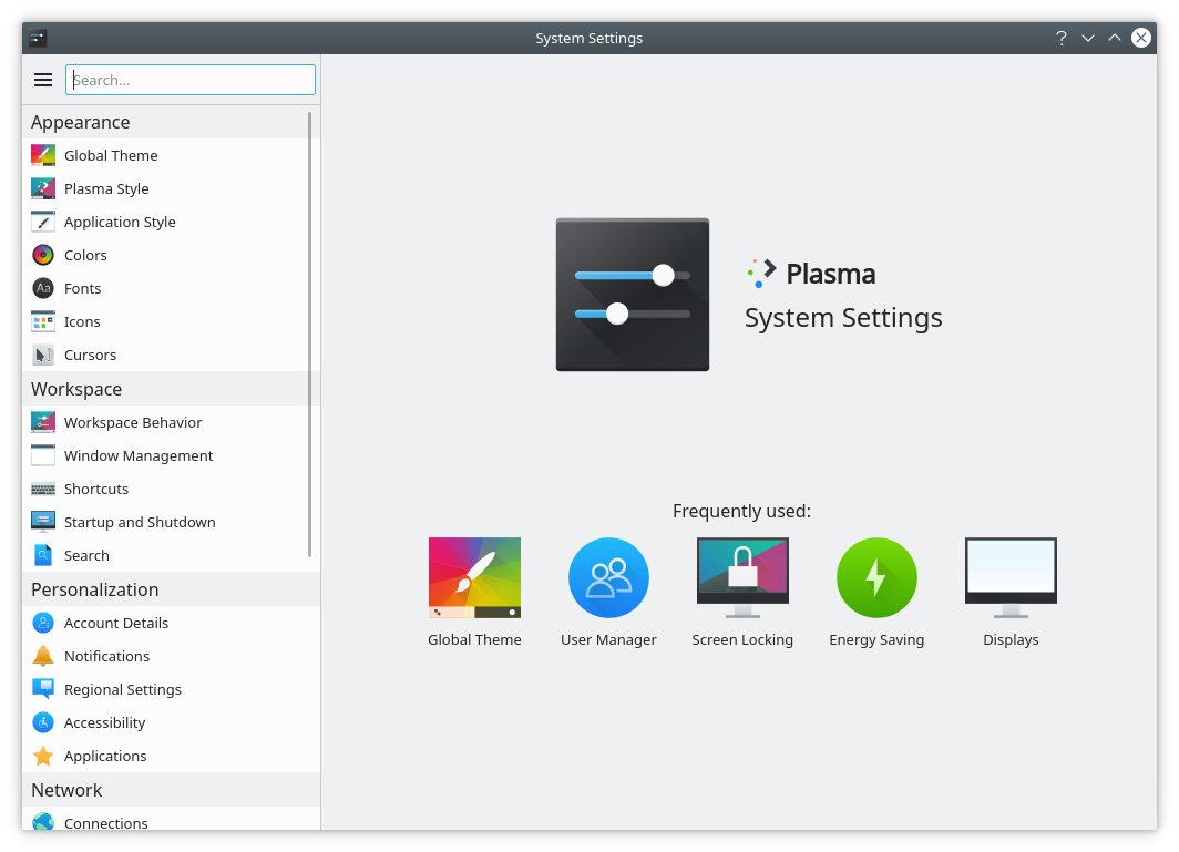
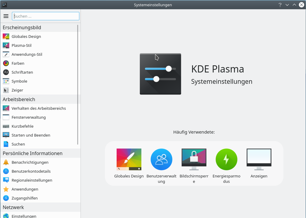
Old:

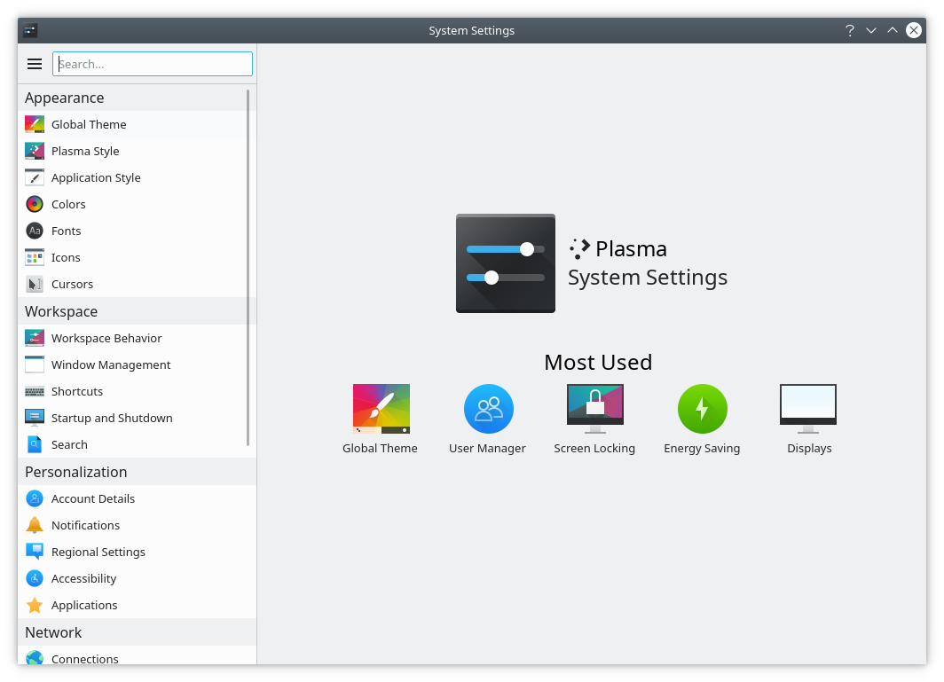
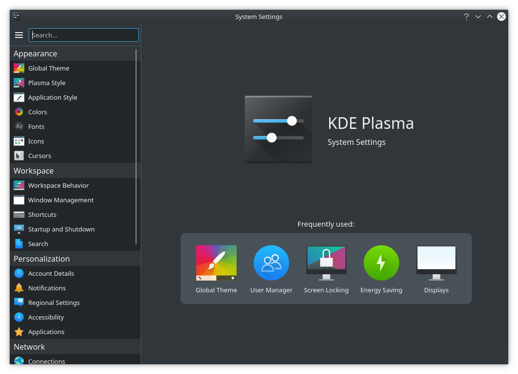
New:
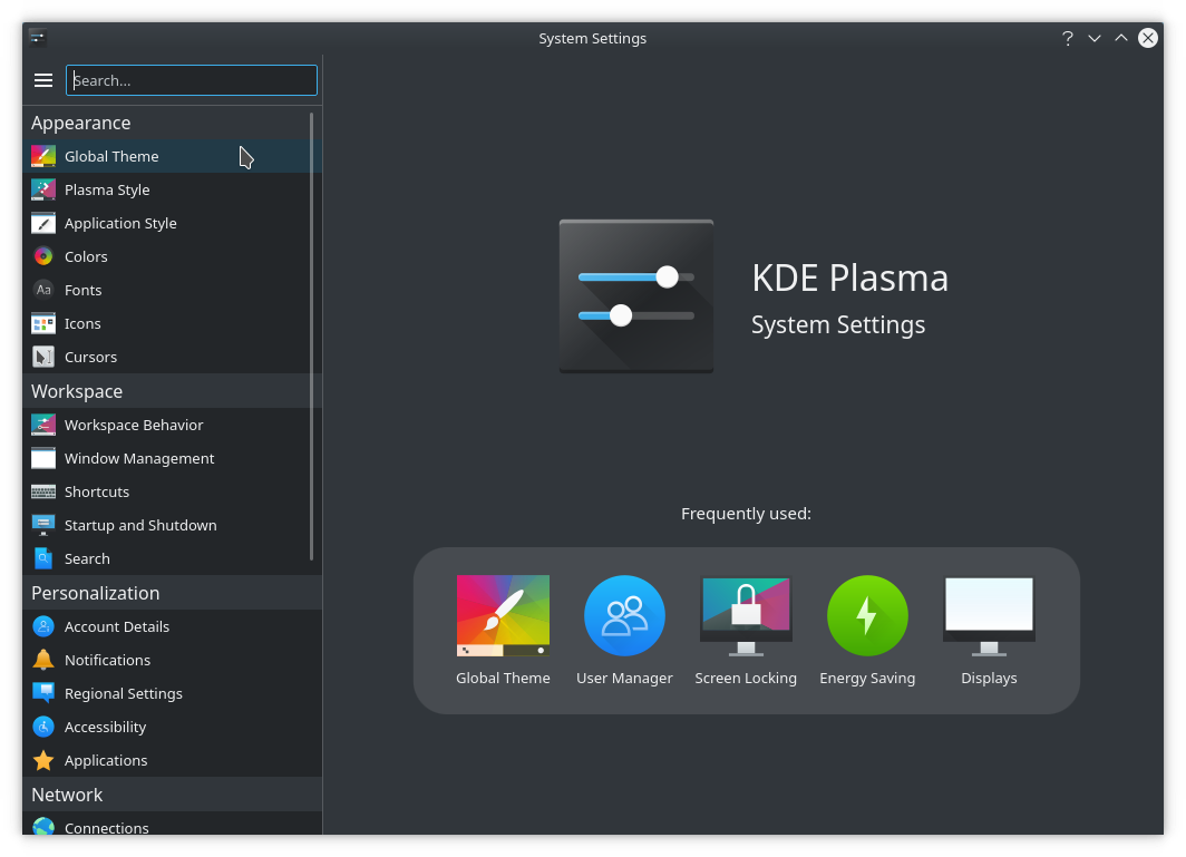
Dark Theme:
Other Language:
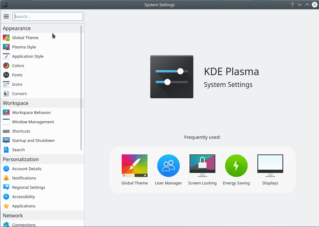
Update "less rounded corners":
Update "with plasma logo and without light rectangle":