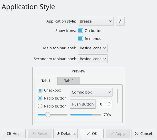
Apply the KDE HIG, merge the two tabs into one page and make the KCM look better.
| rooty | |
| ngraham |
| Plasma | |
| VDG |
Apply the KDE HIG, merge the two tabs into one page and make the KCM look better.
Open the Application Style KCM.
| No Linters Available |
| No Unit Test Coverage |
| Buildable 9509 | |
| Build 9527: arc lint + arc unit |
Is that "Application style" combobox long enough to accommodate longer strings like "MS Windows 9x"?
Check if configure button should be enabled after clicking "Defaults" and rename "cbStyle" to "comboStyle"
For some reason I couldn't get it to work, I'll just leave it how it is now, I think it looks fine.
Is there any way that we can make the preview window have more right and left margins? When presented like this, it seems like it is actually another module that users interact with.
Please consider abbreviating the labels:
One more concern: Why are there two seemingly unrelated radio buttons in the preview? Wouldn't just one button be enough?
| kcms/style/kcmstyle.cpp | ||
|---|---|---|
| 174 ↗ | (On Diff #53635) | "the application style" isn't an example of "user interface elements" so the sentence does not make sense. This would be better: "This module allows you to modify the visual appearance of applications' user interface elements" |