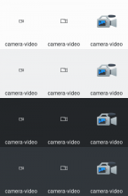
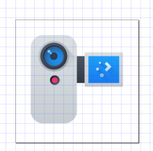
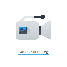
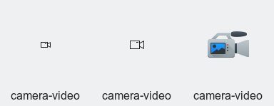
This patch adds 16px, 22px and 64px video camera icons. Requested by @hein.
Details
Diff Detail
- Repository
- R266 Breeze Icons
- Branch
- video-camera-icon (branched from master)
- Lint
No Linters Available - Unit
No Unit Test Coverage - Build Status
Buildable 8275 Build 8293: arc lint + arc unit
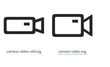
Hmm, TBH I think this needs work. The monochrome version feels too long to me; I think shorter and more square would be better. And the color version feels too plain and boxy.
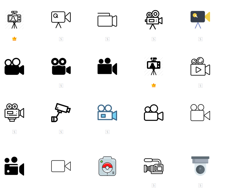
Maybe take inspiration from some of the ones that show up here? https://www.flaticon.com/search?word=video%20camera
The bnw version may stand to benefit from reels or an increase in height. I like this one
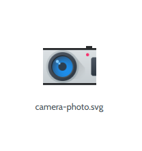
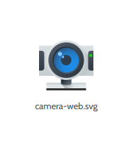
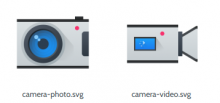
I don't think the color version being boxy can be helped, see camera-photo.svg and camera-web.svg
I think the monochrome version is fine.
For the colorful version, I suggest making the screen much bigger if that side isn't going to be filled with more buttons or the like.
Also the partial outlines only on the top and bottom feel weird to me. I know these are present in camera-photo as well, so perhaps that should also be changed. I just think it would look nicer if the border went all the way around the camera body and across the front of the lens as well.
Breeze monochrome icons are primarily made of ellipses and rectangles with sharp corners. We generally don't use rounded rectangles unless we have a good reason to.
I just thought it looked nicer with rounded corners. Do you want me to change them back to regular rectangles?
For the color icon:
Avoid using the plasma logo unnecessarily. In existing device icons that use it (I want to move away from using it), it's usually placed where a brand logo would go on a real product.
Just so I can have an idea about how your design works, could you explain why you chose to use certain parts?
- The top and bottom outlines
- The blue patch on the side
Yes. The roundness won't be very visible anyway. If you think it doesn't look nice with sharp edges, usually adding some extra details or circular/partially circular bit helps. For instance, you could add a curved handle to the top. Your icon looks like a camcorder and lots of those have handles. I'd suggest seeing how the lens of your monochrome camcorder icon looks filled in. The small diagonal lines are rather faint.
- The top and bottom outlines
- The blue patch on the side
Because of camera-photo.svg, and I also really like Plasma Blue. I'm open to suggestions, mockups, anything that would look better than the current 64 px icon.
I'd suggest seeing how the lens of your monochrome camcorder icon looks filled in. The small diagonal lines are rather faint.
I'd rather make the lines/outlines thicker than fill in the lens hood. This was actually discussed on Telegram - video cameras' bodies and hoods are almost always the same color.
Interestingly, most cameras with alternating colors go for black in the middle and grey on the top and bottom. https://upload.wikimedia.org/wikipedia/commons/5/5a/Canon_FT_alvesgaspar_new.jpg
I'd suggest seeing how the lens of your monochrome camcorder icon looks filled in. The small diagonal lines are rather faint.
I'd rather make the lines/outlines thicker than fill in the lens hood. This was actually discussed on Telegram - video cameras' bodies and hoods are almost always the same color.
Yeah, that's generally true, although here's a classic exception: https://upload.wikimedia.org/wikipedia/commons/3/30/RCA_VHS_shoulder-mount_Camcorder.jpg
https://commons.wikimedia.org/wiki/File:Icons8_flat_camcorder.svg
Can we use this one it's so pretty?
I think I like it more than the first style. It's certainly more similar to the existing camera icon style.
Should it be a head on view? Or should it be a side view? People also complain about it not having film reels - I don't think it needs reels but... we do still use the floppy disk icon for save (even today) so...
Head on if you're going to use this style. Side if you're going to use the first style.
People also complain about it not having film reels - I don't think it needs reels but... we do still use the floppy disk icon for save (even today) so...
Why would film reels go on a modern style camera?... If you do an old style camera, do a side view.
Why would film reels go on a modern style camera?... If you do an old style camera, do a side view.
That was my point exactly ...
I like the head-on camcorder style, but there's the risk that it's less recognizable than the "classic" style of video recorder icon that's used pretty much everywhere. If we go with the head-on style, it needs to be perfect.
Oh and I agree with @ndavis: let's not put the Plasma logo all over the place in new icons. This thing has nothing to do with Plasma; it's inappropriate branding.
To add to this, this type of camcorder was a design trend that pretty much stopped a few years ago as smartphone cameras got better. This means this style will probably become less recognizable in the future. Also it looks completely different than your 16px and 22px icons.
I would suggest adding a handle with the integrated microphone to the "classic" video camera design.
What do you mean by perfect though?
Inappropriate? I don't know about that. Also, I really like the logo.
Be it head on or side view, there's probably going to be some sort of display, and the logo seems preferable to inserting a generic landscape (boring).
I'd consider putting an image of a film reel on the display though (instead of on top of the camera haha).
While it is true that it'll become less recognizable, it's really hard to look at a camcorder head on and not see a camera lens.
It's different from my 16 px and 22 px icons, but that's hardly a problem, I can always change those to accommodate the 64 px version.
But I have the feeling you want me to do the opposite -
Yeah in general I think using some permutation of the "classic" design presents less risk since it's much more recognizable.
It's not that the Plasma logo is bad, it's that it doesn't make sense to put it everywhere; doing so dilutes its branding power in fact. Also, it doesn't make sense to put it on icons that have nothing to do with Plasma.
It's not that the Plasma logo is bad, it's that it doesn't make sense to put it everywhere; doing so dilutes its branding power in fact. Also, it doesn't make sense to put it on icons that have nothing to do with Plasma.
Sure. But I see a big blue display and ... I just can't help myself hahahaha
I don't know... I've been mulling this over for the last couple of days and... I'm not sold on the side view, because any variant of a side view will look broadly different from the other camera icons we already have (probably because it's harder to flatten a side view and get away with it the way you can with a head-on view ?).
For example,
We'd basically have to redo all of them.
So I've decided to change just the 16/22 px icons to make them head-on - it looks a lot better when you take the camera-photo icon into consideration:
Doesn't that logic also apply to a head-on-view icon for a video camera? It's not re-using the familiarity people generally have with the very common side-view video camera icons. A search on flaticon turns up the following, for example:
I don't know. Using a head-on view might make the icon more consistent with the rest of Plasma (not what people generally use and are familiar with).
Using an icon with the video camera in profile will require us to either break consistency with the other camera icons or change the other icons to accommodate the new video camera icon.
Most searches turn up this
but at the same time turn up something along the lines of
If you're okay with the inconsistency, I can do a side view. But there definitely is an inconsistency.
It's perhaps not the most used video camera design, but I'm cool with this. I too wouldn't use the Plasma icon; it makes more sense to put some multimedia icon there.
I will admit that the current head-on view is more attractive than the previous side view version. :) But I still worry about recognizability. Here's what the icon will look like in Kamoso, for example:
Regardless, let's remove the plasma logo and replace it with the common mountain-and-sun scene from viewimage
Tongue in cheek :D
Which size are you talking about though? The monochrome ones or the color one?
P.S.
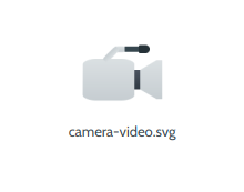
This is a rough draft of what a side view 64 px version would look like with a microphone on top (I can't stand film reels in icons, sorry...)
- Use a 64px design with a shotgun-type mic; use steeper angle for the lens on small versions
- Improve contrast by making the camera silver, add Breeze-style shadows to screen and buttons
@ngraham If you include this in TWIP&U, use this image since it's slightly sharper on the 64px icon. @trickyricky26's montage is screwing up even though he's using the same command as me.
Would it be possible to also add the lineart versions as -symbolic? In my new app I rely on Kirigami's icon recoloring feature and it only works with monochrome icons, so I rely on -symbolic to request them.
