This patch aims to add padding to the notification widget and fully remedy the issues that arise once it is applied.
Details
Details
- Reviewers
ngraham davidedmundson - Group Reviewers
VDG Plasma - Commits
- R120:6a625cd61d29: [Notifications] Add padding to notifications
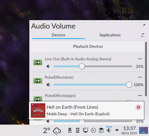
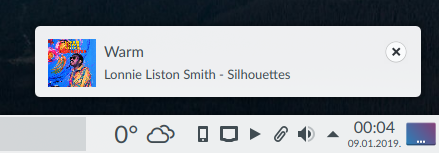
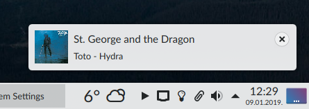
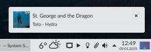
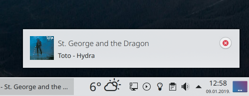
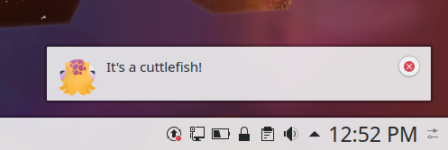
Before:

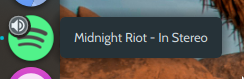
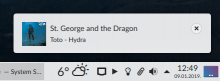
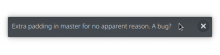
After:

(More padding, and margins as even as can be)
Diff Detail
Diff Detail
- Repository
- R120 Plasma Workspace
- Lint
Automatic diff as part of commit; lint not applicable. - Unit
Automatic diff as part of commit; unit tests not applicable.
There are a very large number of changes, so older changes are hidden. Show Older Changes
Comment Actions
Yeah...
- No matter what you pick here, it will look wrong in some cases. :( If you anchor the icon to the top left, it will look bad the moment there's a second line of text. But if you vertically center it, then it looks bad anytime the notification is tall. Judgment call I think, but personally I'm in favor of anchoring it to the top left.
Top left sounds good. I'm on the fence to be honest, but I thought to myself hey this is a problem for another diff anyway so why not take care of the padding first 😆
| applets/notifications/package/contents/ui/NotificationItem.qml | ||
|---|---|---|
| 175 | Is there any way around this? Because if it's not 0.75 then it's shifted too far down (uneven padding) | |
| applets/notifications/package/contents/ui/NotificationItem.qml | ||
|---|---|---|
| 175 |
If that's the case, adjust the other side, even adjust the window if you need to. | |
Comment Actions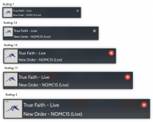
@davidedmundson Is there anything I can do to the code to get the icons to scale properly (proportionately)? This is a screenshot of master (not this patch):
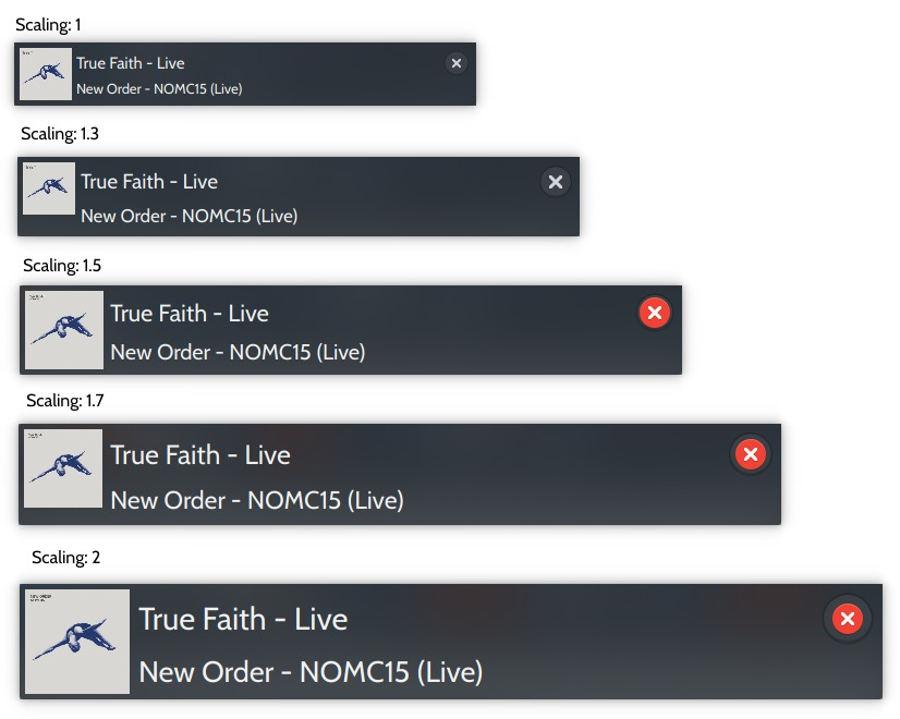
I've tried multiplying units.iconSizes.large by the scaling factor, and that works, but that's as ballpark a solution as they come, and hardly permanent...
| applets/notifications/package/contents/ui/NotificationItem.qml | ||
|---|---|---|
| 175 | Nate's right though, I should abandon the idea of totally even padding because it'll never hold up as you change fonts or scaling... then again it doesn't have to be perfect, right? Just close enough? | |
Comment Actions
How are you scaling plasma? Are you setting PLASMA_USE_QT_SCALING=1 to make sure it's really actually using the scale factor you set in the KScreen KCM?
Technically Plasma doesn't support fractional scale factors yet (see https://bugs.kde.org/show_bug.cgi?id=356446) so if the only bugs you have occur there, maybe we can live with that?
Comment Actions
How are you scaling plasma? Are you setting PLASMA_USE_QT_SCALING=1 to make sure it's really actually using the scale factor you set in the KScreen KCM?
You don't need to set that. Plasma does it's own thing with fonts, fonts will be changed regardless.
Technically Plasma doesn't support fractional scale factors yet
It kinda does because it does it's own thing with the fonts...unless you set that env var above.
Comment Actions
Hey guys, I feel silly asking this but I'm using a different computer right now - how do I get this computer's arcanist to lock onto and update this diff (instead of creating an entirely new diff...)?
Comment Actions
arc patch D17975 # Downloads the patch to a local branch
<change stuff>
arc diff --update D17975 # forces arc to update this diff instead of creating a new one, on the off chance that it would try to
Comment Actions
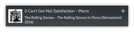
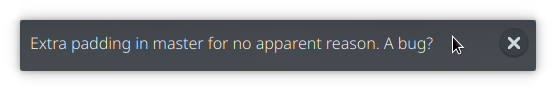
After:

I removed "0.75 * units.smallSpacing" because it's not an integer - the result is that the margins are slightly uneven, but considering they weren't ever entirely even, and the difference between the margins gets more pronounced with increasing font size (and scaling factor), but isn't noticeable, maybe it's a nonissue?
That being said, I've also added a line that raises the notification contents by units.smallSpacing if there is more than one line of text, to make the margins more even.
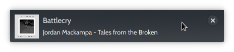
Before:
After:
Comment Actions
Could you update the images in the Summary section instead of posting new ones in comments? The visual history of the patch is not really important to preserve, and having the images on top always be current makes reviewing it much easier. Thanks!
Comment Actions
haha sure thing, can i just do the before and after then? no more stream of consciousness?
Comment Actions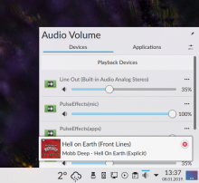
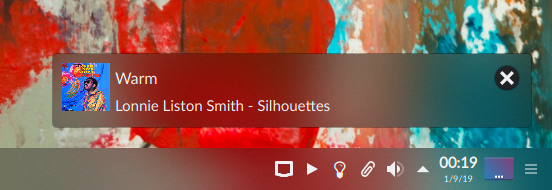
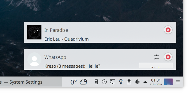
I have some concerns about this. Mostly it's about visual consistency and notifications having different padding than other plasmoids. Notice how there's currently more or less equal distance to the left of Audio Volume and to the left of the album cover icon?
Wouldn't it be better to somehow add padding globally?
Plus, some desktop themes already add padding, which would make their notifications look bad. Can you test with some other desktop themes?
Comment Actions
I would be in favor of more consistency wherever possible. However if we can't get that, I would still vote for having these changes applied to notifications rather than not have them because of inconsistencies elsewhere.
Comment Actions
+1. FWIW, adding padding globally is probably not possible because of how specific layouts are constructed. We'd need to do it on an individual basis.
| applets/notifications/package/contents/ui/NotificationItem.qml | ||
|---|---|---|
| 33 | Much better. Only part I don't understand, then ship it! from me. Assuming there's no icon For multiline
For one line we effectively get:
Why the 0.5? Surely that would be inconsistent? (In all your examples the icon is bigger so we don't see it) | |


Comment Actions
why every notification width is too wide
why its not resize depends on the content on it with some little padding or anything else
this empty space make the card bigger and ugler
Comment Actions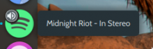
Adding padding everywhere might involve modifying every heading and every icon, that's just not what we want to do (you don't, for instance, want padding around system settings sidebar icons which might be a side effect of what you're suggesting)
Wouldn't it be better to somehow add padding globally?
Not really feasible because you don't necessarily want padding everywhere (for example, Adapta does this and i think it looks unsightly)
Adding padding everywhere might involve modifying every heading and every icon, that's just not what we want to do (you don't, for instance, want padding around system settings sidebar icons which might be a side effect of what you're suggesting)
If you limit yourself to only text/headings, then adding padding may make your GUI elements look disproportionate (the text gets padding, the icon doesn't and gets pushed up and to the left (provided the theme doesn't provide you with padding), which is what happened in some of my mockups)
Breaking other desktop themes is unfortunate, but our primary responsibility is in my opinion to Breeze - maybe we can find a way to modify Breeze to add more padding/cushioning, but then two problems arise:
(1) This would prevent the text from being shifted upward with a line count greater than 1 and cause even greater inconsistency in the margins (they would become very asymmetrical) - you could work around this but these workaround are probably going to be very inelegant
(1) These modifications would have to be implemented in Breeze Dark, Breeze LIght and possibly even Breath (the main theme Manjaro Linux uses), and any other theme that wants to follow suit
(3) This would also open up a couple of other very interesting questions - should other Plasma elements be modified, or should the widgets that call for them be modified? Should we rely on desktop themes to add padding to "Audio Volume" or "Status & Notifications"?
Comment Actions
It's a bit more than unfortunate. Similar things have happened recently e.g. with the new media player icons and with the network widget. This causes tangible annoyance among the user base. The best solution for Breeze should be the priority, yes, but not if there are solutions that work well for all parties involved. I'd much rather if there was some padding added in Breeze and then you only fix the wrong spacing to right of the notification. Even if that wouldn't work, I don't get the sense we've fully explored other solutions yet.
Comment Actions
So what's going on here? Other themes add more padding? If so, I don't see how that's something we can possibly account for, and that shouldn't affect our ability to improve our own stuff.
Comment Actions
There are other problems though besides the right margin of the icon. The heading can't be lifted to stop the icon from towering over it because the theme provides its own padding and, in essence, locks it into place.
In other words, the padding here varies depending on the amount of notification content, which I don't think is something a theme can account for.
Modifying Breeze to add padding would restrict its ability to manipulate the notification content fully.
We may be able to account for it, but our hands are tied here I'm afraid because of the technical difficulties of making the Breeze theme doing what I want the notifications to do in this patch (vary padding by notification content).
| applets/notifications/package/contents/ui/NotificationItem.qml | ||
|---|---|---|
| 33 | You're right! I never tested it with just the heading, There's an extra 0.5 * units.smallSpacing of padding there. But I needed that 0.5 units to provide even padding to notifications that are "Heading + One line of description". Is there any way I can put in a condition that if it's just a heading that it not put that 0.5 * units.smallSpacing there? | |
Comment Actions
Yes, as you can see in the pics it doesn't just add extra padding but may also result in worse symmetry before.
I'm simply saying we try to investigate if there might be a solution that improves our stuff, but doesn't regress other stuff.
People do use other themes and they do notice when things get messed up. Example of the last time this happened:
https://www.reddit.com/r/kde/comments/8rj3k7/wrong_media_player_icon_after_513_update/
https://www.reddit.com/r/ManjaroLinux/comments/90drav/media_player_tray_icon_missing_kde/
https://www.reddit.com/r/kde/comments/93thby/issues_with_the_new_media_player_icons/
https://forum.manjaro.org/t/manjaro-18-kde-media-player-no-panel-icon-using-breath-theme-set/64010
https://forum.manjaro.org/t/kde-breath-theme-missing-icons/51644
https://forum.manjaro.org/t/kde-media-player-indicator-slot-empty/64199
https://forum.manjaro.org/t/manjaro-18-kde-media-player-no-panel-icon-using-breath-theme-set/64010
https://forum.manjaro.org/t/smplayer-missing-tray-icon-in-kde-when-playing-movie/58021
I wouldn't want the attitude of "breaking other themes is unfortunate, but.." becoming a pattern because openness to customization is our main selling point.
Comment Actions
@davidedmundson I've tried using
implicitHeight: Math.max(appIconItem.valid || imageItem.nativeWidth > 0 ? units.iconSizes.large : 0, (mainLayout.height + ((bodyText.lineCount > 1) ? 0.5 : ((bodyText.lineCount == 0) ? 0 : 2) * units.smallSpacing))) // Add units.smallSpacing to correct for the topMargin of mainLayout according to number of lines
(I know, it looks ugly...) but it doesn't seem to do anything
Comment Actions
I wouldn't want the attitude of "breaking other themes is unfortunate, but.." becoming a pattern because openness to customization is our main selling point.
You've made your point. But allow me to flesh it out - it seems we've reached an impasse; in simple terms, you're either going to maintain the themes and restrict Plasma's growth or you're going to remedy the problems this widget has exhibited and step on a few toes.
You can, in fact, modify Breeze to add padding, sure. But if you do so, you can't move the notification text up (or around, if you should want to). I'm kind of belaboring the point here - that means you can't get padding that stretches and contracts naturally depending on how much notification content there is. (I never wanted just padding.)
You can also manipulate the notification icon to achieve the same effect that I achieved by lowering the value of topMargin of the notification heading. However even then, padding that's arrived at through theme manipulation is still always going to remain the same.
I am open to suggestions on how to resolve this deadlock.
Comment Actions
@filipf
The media player situation was very different. This won't break anything.
((bodyText.lineCount > 1) ? 0.5 : ((bodyText.lineCount == 0) ? 0 : 2) * units.smallSpacing)))
There's a logic error. I'll rewrite it so you can see it.
if (lineCount > 1) {
    return 0.5;
} else {
   if (lineCount == 0) {
      return 0;
   } else {
     return 2;
   }
}Comment Actions
BTW, if you want a neater solution: (though consider this optional)
At the moment you're moving mainLayout about and then doing maths on the window height to make sure we get the same padding underneath.
Instead, use Layout.topMargin on the titleBar and Layout.bottomMargin on the lowerPart.
Then QtLayouts can do all the hard work, and you're spreading this logic about to the relevant places next to where you want the padding.
(you'll have to bump "import QtQuick.Layouts 1.1" to 1.2)
Comment Actions
I love it. It's just that the icon doesn't seem to get the message :/ That's why I've been manipulating the height this entire time. I'd like to implement this but I don't know how to add padding to IconItem... (I can't think of anything to anchor it to - anchoring it to parent.bottom and adding a margin stretches the icon out / distorts it)
This works, but it looks messy:
implicitHeight: Math.max(appIconItem.valid || imageItem.nativeWidth > 0 ? units.iconSizes.large : 0, (mainLayout.height + ((bodyText.lineCount > 1) ? 1 : ((bottomPart.height == 0) ? 0 : 2) * units.smallSpacing))) // Add units.smallSpacing to correct for the topMargin of mainLayout according to number of lines
Comment Actions
We explicitly removed the padding in Plasma 5.9 to reduce popup sizes, this effectively reverts this decision…
Comment Actions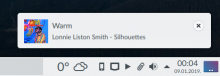
FWIW if I backport the spacings and margins prior to D3560 it works great for me. The symmetry around the icon is better than with this diff. (only NotificationItem.qml is modified)
This diff:
Old:
Comment Actions
And the result of D3560 were a slew of custom themes that added the padding back. The main justification was:
Sort of. This is basically what they looked like:

And the result of D3560 were a slew of custom themes that added the padding back. The main justification was:
Our notification popups are huge compared to other platforms
and that's just not the case. At least not anymore:


I grant that notifications without padding do save room. But it's really not that much room we're saving? Especially considering that a notification is something a user should be paying attention to.
As far as text on the buttons is concerned, I'm confident we can make it work and that the labels need not be too short or too long, or in other words, that this is an issue completely separate from the padding issue.
Comment Actions
Try rolling back NotificationPopup.qml too. They should look very similar to the ones in this patch. (The idea is that the notification in the second screenshot has padding only because arc-kde provides it.)
Comment Actions
Still better with the old values:


EDIT: With defaults yours look better, but basically because they're compensating for too much space below the icon

Comment Actions and
and

@broulik If the consensus should end up being that the notifications should stay "tight" (no padding), I'd very much prefer to add padding to the left and right of the icon (it's really stuck-on right now), and to push the notification icon down a bit if there's a bodyText.lineCount > 1 to prevent the icon from towering over the heading.
For example,

But I very much prefer the notifications with padding all around :D
Comment Actions
Change certain integers to decimals for more even padding; fix padding in heading-only notifications
Comment Actions
Hey @davidedmundson I know I'm a little late but should I use your suggestion instead? I just figured out a couple of minutes ago how to do it using Layout.bottomMargin (fixed the padding beneath the icon) :D The end result is the same though.
Thank you for accepting the patch!
Comment Actions
Provided there's an icon (usually a square, 48 x 48 px, album art for example) and one line of heading + one line of description, the padding above the icon and below the icon is the same (7 px with 1x scaling) if Noto Sans is used as the default font, which is basically perfect.

However, if another font is used, the amount of padding below the icon changes (Cabin - 5 px, Lato - 3 px etc.). It's because I've been using bottomPart or the implicitHeight to make the notification "taller" so as to give the icon padding.
There is one small problem with almost every version I've submitted so far. It manifests if a font other than Noto Sans is used.

Provided there's an icon (usually a square, 48 x 48 px, album art for example) and one line of heading + one line of description, the padding above the icon and below the icon is the same (7 px with 1x scaling) if Noto Sans is used as the default font, which is basically perfect.
However, if another font is used, the amount of padding below the icon changes (Cabin - 5 px, Lato - 3 px etc.). It's because I've been using bottomPart or the implicitHeight to make the notification "taller" so as to give the icon padding.
Is there a way to give the icon itself padding? I've been using anchors but there's nothing I can think of to anchor it to? If I anchor it to the notification text in any way, I can add a margin, sure, but it gets stretched out beyond belief if there's too much text.
Comment Actions
After playing around with the code (I'm still very new to this), I came up with this:
PlasmaCore.IconItem {
  id: appIconItem

  width: summaryLabel.height * 2 - 1.5 * units.smallSpacing
  height: (bodyText.lineCount > 1) ? (summaryLabel.height * 2 - 1.5 * units.smallSpacing) : (summaryLabel.height + bodyTextScrollArea.height + 0.5 * units.smallSpacing)
I've actually edited this post quite a number of times but I've managed to come up with this because it's the only thing that fends off the incessant binding loops that result from defining the icon width using the width of the bottom part (which is, in turn, I presume defined by the icon width etc.).
This isn't supposed to produce a perfect square and yet it often does?
And it works without binding loops (thank goodness!).
But it still seems a little crude?
Comment Actions
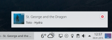
If I use notify-send to create a simple notification, it's unfortunately a regression compared to what we have right now. Checkout the uneven top and bottom padding on the icon.
Status quo:
With this patch:
Comment Actions

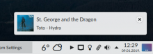
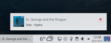
The plot thickens - another screenshot of master (not this patch)
I'm assuming this second one is because of the close button. This doesn't happen with this patch but I'm assuming I merely obscured the problem rather than solved it.
TLDR: Yup, but that's only the tip of the iceberg (of the problems that plague both master and this patch). Suffice it to say, neither master nor this patch scales properly with regard to font size or scaling factor, and both have problems with padding.
It's the problem I described two comments ago:
However, if another font is used, the amount of padding below the icon changes (Cabin - 5 px, Lato - 3 px etc.). It's because I've been using bottomPart or the implicitHeight to make the notification "taller" so as to give the icon padding.
Is there a way to give the icon itself padding? I've been using anchors but there's nothing I can think of to anchor it to? If I anchor it to the notification text in any way, I can add a margin, sure, but it gets stretched out beyond belief if there's too much text.
I've been using fonts to illustrate the problem but your screenshots do a better job.
In addition, changing the height of the icon results in several binding loops (gross), or in an icon that's not a square (album art), or the situation in your second screenshot. Hardly ideal.
I just don't know how to add bottom padding to the notification icon itself and have the height of the notification adapt accordingly.
P.S. This did, however, shed some light on things that have been bothering me about the current master.
Status quo:
Should this happen? There's no description yet there's an empty space. The icon doesn't resize accordingly. This is what happens in master with fonts >10pt and scaling that's a non-integer that's not a multiple of 0.5 (1.1, 1.2, 1.3 etc.), resulting in padding underneath the icon (not the notification text!) and none above. For example:

The plot thickens - another screenshot of master (not this patch)
I'm assuming this second one is because of the close button. This doesn't happen with this patch but I'm assuming I merely obscured the problem rather than solved it.
I'm at a loss as to how to resolve this. The padding problems result from:
- in master, because the icon is defined as "units.iconSizes.largeSpacing" without any regard for the user's font (or scaling factor actually, except when it's 1.5, 2, 2.5, 3)
- in this patch, because of the units.iconSizes.largeSpacing thing and my lack of proficiency in QML and inability to give the icon padding without manipulating either its height or that of the entire notification (doing the former results in several binding loops OR an icon that's distorted in size and isn't a square... doing the latter results in the problem depicted in your screenshots)
Comment Actions
^ Yes, it's important to note that additional (and unwanted) padding underneath the icon can happen with master, while this patch can add the same above the icon. From my layman's understanding, there is nothing solid and absolute values are based on.
Comment Actions
There are effectively two problems here:
- How do we get even padding around the icon itself without having to resort to manipulating the rest of the notification?
- How do we get the icon size to increase in proportion to increasing font size (and/or scaling factor) and, once bigger/smaller, how do we get it to stay that very same size regardless of how many lines of text there are? Is this an approach we should at all consider?
Comment Actions
Correct padding with just icon + heading + no text, make icon padding even for 10 pt sized fonts other than Noto Sans
Comment Actions
Is there a way to give the icon itself padding? I've been using anchors
Yes, but if you're padding the icon by moving it then you need to set the window height to
Math.max(sizeOfIcon, sizeOfText)
needs to be
Math.max(sizeOfIcon + 2*padding, sizeOfText)
in order to keep even padding.
How do we get the icon size to increase in proportion to increasing font size
See units.cpp in plasma-framework. It's complex. I don't think that's a relevant topic you need to go down
Comment Actions
How do we get the icon size to increase in proportion to increasing font size
See units.cpp in plasma-framework. It's complex. I don't think that's a relevant topic you need to go down
Yeah, also I'm not sure it's the right approach - icons might turn out to be HUGE...
I have an idea how to fix that.
Comment Actions
You have 4 possible states:
Icon is taller and text is one line
Icon is taller and text is multi-line
Text is taller and text is one line
Text is taller and text is multi-line
Changing font sizes is moving you between them, but that's just a side effect.
You seem to be trying different things and then testing them. From this ever lasting history that's not working.
Making margins match isn't a visual problem, it's a maths problem.
When I reviewed this last time, I didn't run it, I just did it all on paper. (genuinely, here's a photo https://home.davidedmundson.co.uk/index.php/s/W8ZtPMZNyBAXRZz)
Take a step back, do the calculations of the window height based on what things should be, and then it'll just work.
Comment Actions
You were right! Thank you so much, it was so much easier when I started thinking about it as a math problem rather than a design problem. I'm going to upload another diff, I hope this one stands up to scrutiny.
I apologize for the very long "implicitHeight" but it had to cover six different configurations:
- no icon + heading only
- no icon + heading + one line of body text
- no icon + heading + many lines of body text
- icon + heading only
- icon + heading + one line of body text
- icon + heading + many lines of body text.
Comment Actions
Use units.smallSpacing (integers) for padding consistently except when bodyText.lineCount > 1, tidy things up
Comment Actions
Thank you you guys! I used an alias tho (Pete Cho) on identity.kde.org, but i'd like to use my real name (Krešimir Čohar), is that possible?