BUG: 401646
Details
Details
Diff Detail
Diff Detail
- Repository
- R266 Breeze Icons
- Lint
Lint Skipped - Unit
Unit Tests Skipped
Comment Actions
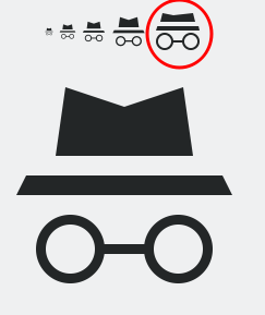
I like it! What do you think about making the bottom line of the hat a bit wider, so it's more clear that it's a hat?
Comment Actions

Very Chrome/-ium like :)

Maybe expanding the bottom line just a tad more would make it more obvious it's a private eye's hat? Right now it still looks a bit more like eyebrows to me.
Firefox's mask also maybe isn't a bad idea:

Comment Actions
Sure, I'll improve it!
I'll make the bottom line longer and the hat a bit smaller and higher.
Comment Actions
I would like if it was more aligned with the grid:
See how the top version is a bit more crisp?
This comment was removed by GB_2.
Comment Actions
How is that even possible? There is no 48 px size icon and the one you showed was and older version of the icon...
Comment Actions
Oh, thanks for reminding me about Cuttlefish...
I forgot about it, but now I don't need a QML for testing icons anymore :P
Comment Actions
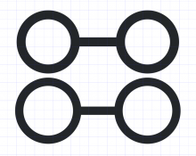
I noticed that the 24px version is now aligned to the grid, but the margins aren't correct. The 16 and 22px versions are still not aligned to the grid.
The correct margin size for 24px is 4px on each side, but left and right margins can be exceeded if necessary. The 24px size is really only for applications that require 24px icons, such as some GTK applications. Do you actually need to use this size? There is no issue with adding it as long as it's correct, but it is slightly more work for you.
Comment Actions
Change name to the more common "view-private" and add a symlink for the symbolic icon.
Comment Actions

Looks right. I might prefer a wider hat brim or a mask like @filipf suggested, but I'm not going to make that a requirement since it seems more like a matter of taste.
Here's roughly how it will look in Falkon:
Here it is with a wider brim on the hat:
This comment was removed by GB_2.
This comment was removed by GB_2.
Comment Actions
If view-private-symbolic is just a symlink to the regular icon, do we really need it?
Comment Actions
It's for compatibility, because other icons in Breeze and also other icon themes do it.
Comment Actions
I think the whole *-symbolic thing is a GNOME-ism. It's their way of specifying whether to use a color icon or a monochrome icon.
This comment was removed by ndavis.