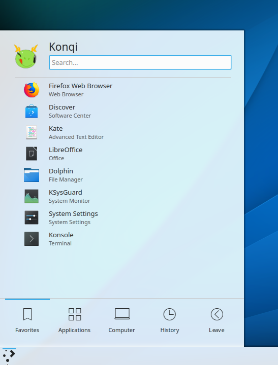
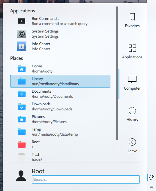
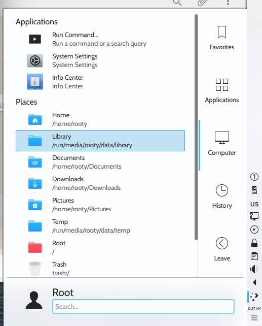
Leaner separators in Kickoff (less opaque/more see-through, narrower/shorter)
Details
Details
- Reviewers
ngraham romangg - Group Reviewers
VDG - Commits
- R119:dfce50030dd9: [Kickoff] Make Kickoff separators leaner (less opaque) and narrower (the length…
This patch would spruce up the much-needed separators in Kickoff that were discussed in D15011 and ultimately added in D15206. It would reduce the opacity of the separators by almost half and make the top separator (between the search field and the rest of the Kickoff menu) as long/wide as a highlighted menu item. This variant was actually put forward in D15011.
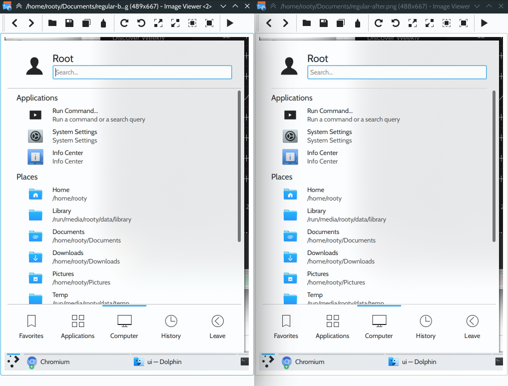
See the difference in the screenshots below:

Diff Detail
Diff Detail
- Repository
- R119 Plasma Desktop
- Branch
- kickoff-leaner-separators (branched from master)
- Lint
No Linters Available - Unit
No Unit Test Coverage - Build Status
Buildable 5044 Build 5062: arc lint + arc unit
Comment Actions
But now when the tab bar is on the top or bottom, the separators will have different widths, which doesn't look good. To be honest, I'm not sure what the actual problem is here.
FWIW make sure to test your changes with all four possible orientations.
Comment Actions
Regarding their opacity, they just stick out too much. The problem is that it looks like Kickoff consists of three different parts stitched together (unlike the various parts of System Settings, especially in Icon View, Dolphin etc. that seem to work better with 1 px elements that are more see-through and blend with each other). Darker themes make them stick out even more. Hence the proposed change in opacity.
Regarding the width, I just think they look better if they're flush with the highlighted portions of Kickoff (that are assigned a width different from that of the top separator).
Regarding their opacity, they just stick out too much. The problem is that it looks like Kickoff consists of three different parts stitched together (unlike the various parts of System Settings, especially in Icon View, Dolphin etc. that seem to work better with 1 px elements that are more see-through and blend with each other). Darker themes make them stick out even more. Hence the proposed change in opacity.
Comment Actions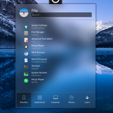
I didn't comment on the original patch, but I'd like to pitch in here. There are two issues/points of improvement for the original patch:
- The width of the separators does not correspond to any meaningful UI element -> they're almost drawn from edge to edge, but they're actually not; it makes the placement look a bit awkwad
Rooty's addressed the problem for the top separator by making it correspond to the width of the header -> this is more aesthetically pleasing
He hasn't addressed the bottom separator though, which should ideally be drawn from the *very* beginning of the first blue tab line to the *very* end of the last blue tab line (now the separator is a bit longer)
- The separators are still not subtle enough and present a visual problem for more transparent themes
For the most extreme example (with the Opal theme), see:

The separators stick out quite a bit and this may make theme developers unhappy so the proposed change in opacity could serve to remedy that.
Comment Actions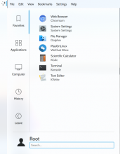

FWIW make sure to test your changes with all four possible orientations.
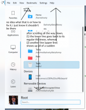
I actually figured out how to do that just before my latest edit, my bad. It seems to work sort of fine with the tabs on the left or the right, except for the lower separator (to the left/right of the tabs on the right or left, respectively) that seems to appear shorter than the length of the separator to the left/right of the tab bar before you start scrolling to the bottom.

I don't know if this was on purpose or if it's a bug, but the bottom separator becomes thicker to the left/right of the tab bar before/when you start flicking through the menus in the previous design (no opacity settings / width: root.width) before reaching the end (of a given menu)
Comment Actions
Are these problems because of your change or on current master as well? Are they something worth fixing in your opinion?
Otherwise visually would be a nice change. Current lines are too strong.
Comment Actions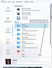
Are these problems because of your change or on current master as well? Are they something worth fixing in your opinion?
Otherwise visually would be a nice change. Current lines are too strong.
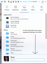
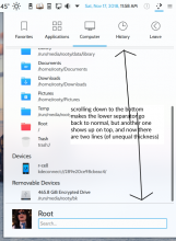
Actually, the bugs are already present in master, and using all four orientations leads to even more problems popping up (the screenshots are of master, without my patch):

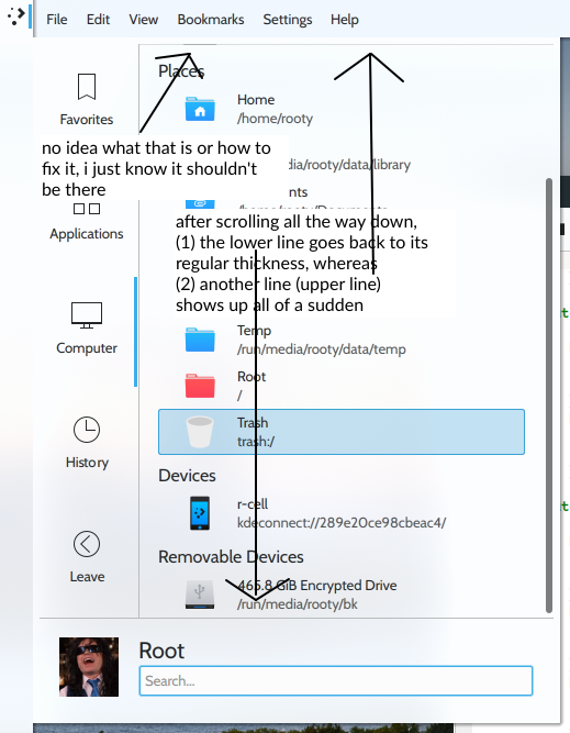


(I'm still trying to find out how to fix this, I'm new to all this sorry :D)
Comment Actions
 ,
,  ,
, 
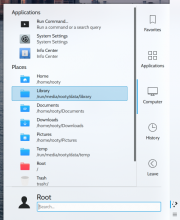
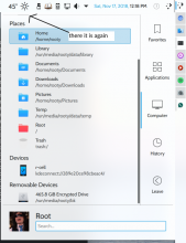
By the way, that last screenshot ("there it is again") in my previous post, turns out that that weird line (below the weather widget) was the lower border of the icon I'd scrolled past just above the header Places, so not a bug.
Okay so, it took me a while to figure out (total noob here I'm telling you) - the key was to add
frameVisible:false
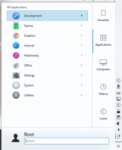
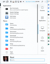
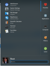
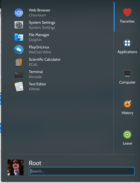
at line 60 of KickoffListView.qml. Then the extra (overlapping) separators are gone. Check it out:
By the way, that last screenshot ("there it is again") in my previous post, turns out that that weird line (below the weather widget) was the lower border of the icon I'd scrolled past just above the header Places, so not a bug.
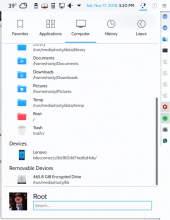
And as you can see, it works fine on top of my patch as well, no double separators (overlapping or otherwise). The separator between the username and the item list is a bit shorter than the one above/below the tab bar (it makes Kickoff look like it consists of different parts but also neatly blended together).
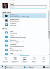
And last but not least,

Comment Actions
I could get behind reducing the opacity. Perhaps to 0.7 or 0.6. Removing the frame for the scroll area to get rid of the extra lines on the top or bottom when it's scrollable could also make sense now that these lines are a part of the design. But I'll need a bit of convincing to agree to making the lines have different widths.
Stepping back, the goal was to separate the three distinct elements from one another so that they actually look like three distinct elements. I wanted to move away from the "everything merges into everything else" look and towards a look that says "this is a structured thing with a header and a tab bar and a content area".
To a certain extent, this goal was compromised because I couldn't get the lines to touch the actual edge (any ideas how to do that, Plasma folks?).
But I feel like reducing the line length takes us in the opposite direction by making the header and the content view seem like a part of the same thing, with a superfluous line between them. The obvious next question is, "why do we need that line, can't we get rid of it?" and then we're back to where we started. All of this stems from not being confident enough in Kickoff's visual identity to confidently separate things IMHO.
Am I making any sense here?
Comment Actions
If we had a discussion on the level of the community on general approaches to design in the future, that would really allow for better orientation in changes like these.
It seems that excessive minimalism is something that is going to be overcome, but there is also no going back.
Fluidity in design, as often brought to life through means of transparency and blurring, is not going away and is popular with users. We should pay attention to the fact a probably non-negligible percentage of users actually likes making Plasma more fluid than in already is (and that said users sometimes have to resort to Kvantum to fully fulfill these desires). As an indicator of this, for instance, we can observe the designs utilized in top posts in r/unixporn:
https://www.reddit.com/r/unixporn/search?q=plasma&restrict_sr=on&include_over_18=on&sort=top&t=all
https://www.reddit.com/r/unixporn/search?q=kde&include_over_18=on&restrict_sr=on&sort=top
But it's not just the users; there's e.g. Microsoft Fluent Design and there's even a very fluid and interesting example in the Linux world.. This screenshot in particular can be really useful as an example of how to subtly create distinction in the UI.
Why is it important to reflect on this in this specific case?
Drawing prominent separators from edge to edge with the explicit goal of wanting to break up a potentially transparent UI into pieces is going against the aforementioned fluidity. As an illustration, the Opal theme from the previous screenshot stands to lose some of its visual appeal as a result. It's precisely the edge-to-edge placement that is a sure-shot way or breaking up the UI... we need to be really careful not to do go the old route of ridigly separating UI elements. Separators could nonetheless work if they're subtle and I believe they can still add structure, even if they're not drawn edge-to-edge.
Comment Actions
0.6 sounds good - it makes them stick out but not too much.

I'm not so sure myself anymore. Don't get me wrong, it looks fine with both separators of equal length and lowered opacity, but with that setup they make the transition from header to item list a lot less gradual / smooth (too much of a good thing). This also makes the scroll bar come unusually close to the upper separator. Also, the lines won't actually ever be of equal length with the tab bar on the left/right in either configuration:
Stepping back, the goal was to separate the three distinct elements from one another so that they actually look like three distinct elements. I wanted to move away from the "everything merges into everything else" look and towards a look that says "this is a structured thing with a header and a tab bar and a content area".
This provides for both the "partition" and the unity that Kickoff needs, without being too intrusive on either front.
To a certain extent, this goal was compromised because I couldn't get the lines to touch the actual edge (any ideas how to do that, Plasma folks?).
I wouldn't recommend this though, it'd still do well to look like a single widget.
But I feel like reducing the line length takes us in the opposite direction by making the header and the content view seem like a part of the same thing, with a superfluous line between them. The obvious next question is, "why do we need that line, can't we get rid of it?" and then we're back to where we started. All of this stems from not being confident enough in Kickoff's visual identity to confidently separate things IMHO.
Am I making any sense here?
What you're saying does make sense, but I'd hardly call the line superfluous (it provides for much needed structure). And the header and content view are in fact part of the same thing, the widget - except that this way they become discrete, working in tandem. That's why I said the separator idea was a good idea in the first place.
Comment Actions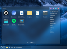
Eike's Simple Menu is a good example of separator use - the separator is subtle and doesn't fully break up the the plasmoid:

On top of that he made the search field unfocused by default, which can really help with transparent themes.
Comment Actions
Would someone take a look at the Simple Menu code to see if the unfocused search field code can be copied over directly to Kickoff (separate review though)?
Comment Actions

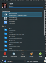
Should I open up a new differential @romangg? Does this look acceptable?
Long story short, no, it can't but I managed to splice together my own Header.qml using the older (no search field) and current master Header.qml:

Should I open up a new differential @romangg? Does this look acceptable?
There's still a few kinks to work out:
(1) Should it be left as "Type to search..." (so the user knows they can, in fact, type to search) or should it just be "Search..."
(2) There's a bug I haven't rooted out yet (no pun intended) that pops up when you open it up and press the tab key, it starts typing right after/next to Type to search...
But other than that it seems to work fine.
Comment Actions
Hey I'm new to all this sorry, what do I do now? Do I land it (can I even do that haha) or do we wait for the VDG/Plasma crew and their go-ahead ? :D
Comment Actions
I like it too
@ngraham or me can push the change for you. We just need your full name and an email address from you to cite you as author in the commit message.
Comment Actions
my real name is Krešimir Čohar, email address: kcohar@gmail.com
thanks you guys :D
i just realized i have a pseudonym on kde identity... i might have to fix that