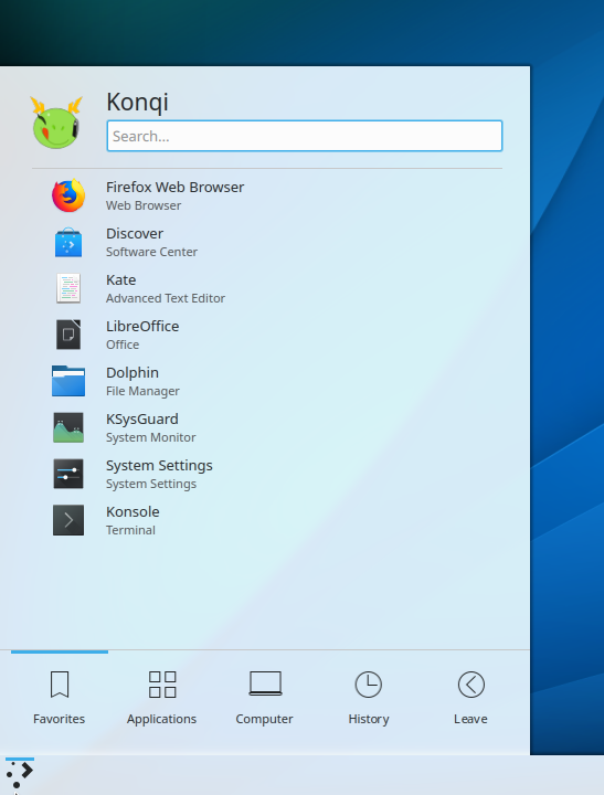
[Kickoff] Make Kickoff separators leaner (less opaque) and narrower (the length of a highlighted menu item)
Summary: Leaner separators in Kickoff (less opaque/more see-through, narrower/shorter)
Test Plan:
This patch would spruce up the much-needed separators in Kickoff that were discussed in D15011 and ultimately added in D15206. It would reduce the opacity of the separators by almost half and make the top separator (between the search field and the rest of the Kickoff menu) as long/wide as a highlighted menu item. This variant was actually put forward in D15011.
In D15011#314514, @ngraham wrote:Perhaps the white background and blinking cursor appear too attention-getting in comparison to the rest of Kickoff, which tries very hard to be flat and gray and avoid separators (e.g. between the different sections and the tab bar at the bottom or the header on top). I wonder if we wouldn't feel like the search field was so jarring if there were better differentiation between other elements. For example:
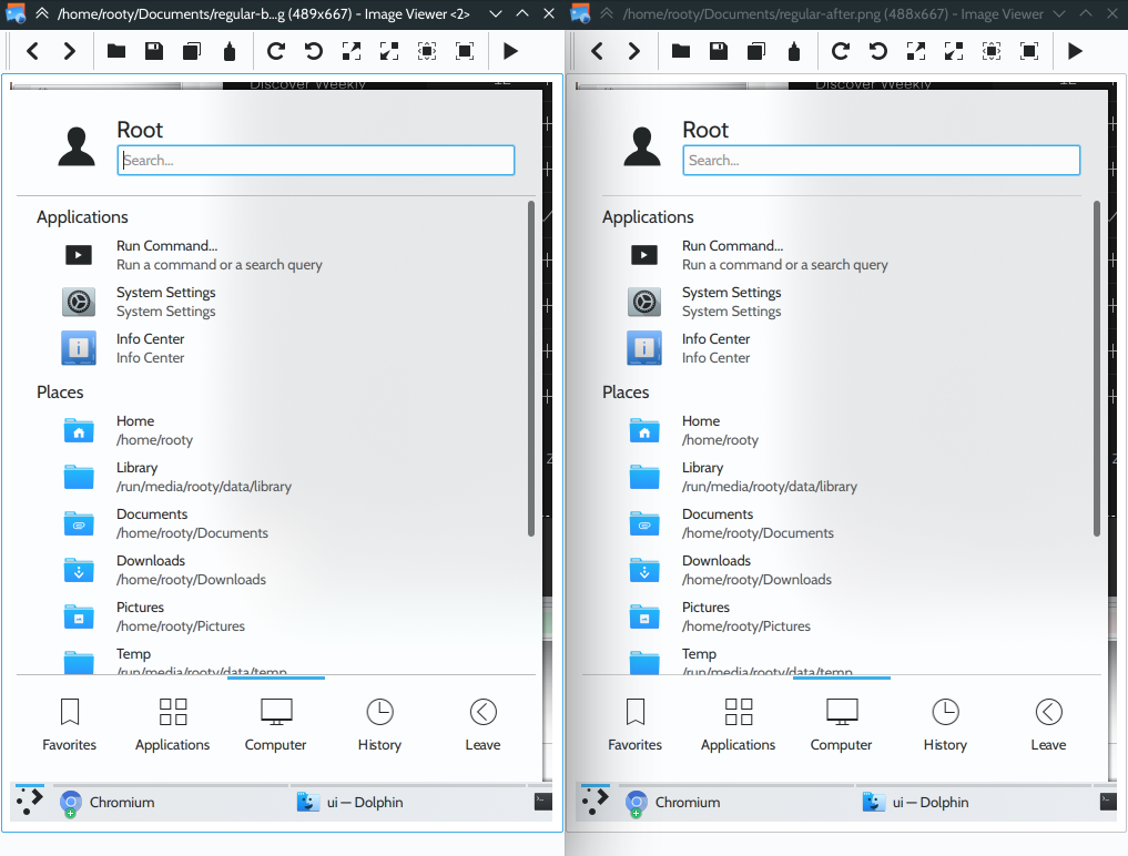
See the difference in the screenshots below:

Reviewers: ngraham, VDG, romangg
Reviewed By: ngraham, VDG, romangg
Subscribers: romangg, filipf, plasma-devel
Tags: Plasma
Differential Revision: https://phabricator.kde.org/D16937