Add new generic sorting icons; rename existing sorting icons
ClosedPublic

Authored by trickyricky26 on Nov 15 2018, 6:02 PM.

Details

Summary

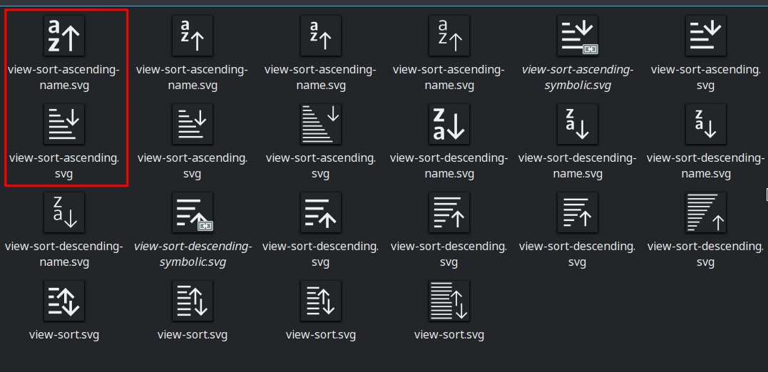
Add a generic sorting options icons as requested in D12337: Give the file dialogs a "Sort by" menu button on the toolbar as well as version with ascending and descending orders.

FEATURE: 393318

FIXED-IN: 5.53

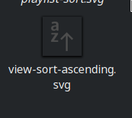
The existing view-sort-ascending and view-sort-descending have been renamed view-sort-ascending-name and view-sort-descending-name as they show alphabetic characters to depict alphabetic sorting. The symbolic link sort-name has been changed to point to view-sort-ascending-name (from view-sort-ascending).
Their fallback colors in the embedded stylesheets have been updated to use Shade Black and Cardboard White, respectively.

Test Plan

The new icons:

sizeview-sortview-sort-descendingview-sort-ascending
16px
22px and 24px
32px

Diff Detail

Repository
R266 Breeze Icons
Lint
Automatic diff as part of commit; lint not applicable.
Unit
Automatic diff as part of commit; unit tests not applicable.
trickyricky26 created this revision.Nov 15 2018, 6:02 PM
Restricted Application added a project: Frameworks. · View Herald TranscriptNov 15 2018, 6:02 PM
Restricted Application added a subscriber: kde-frameworks-devel. · View Herald Transcript
trickyricky26 requested review of this revision.Nov 15 2018, 6:02 PM
trickyricky26 edited the summary of this revision. (Show Details)Nov 15 2018, 6:06 PM
trickyricky26 edited the test plan for this revision. (Show Details)
trickyricky26 added reviewers: VDG, Breeze.
ndavis accepted this revision as: ndavis.EditedNov 15 2018, 6:13 PM
ndavis added subscribers: ngraham, ndavis.

It looks good to me, but since @ngraham reported bug #393318, I'd like his opinion as well. Also, put this at the bottom of your summary:

FIXED-IN: 5.53

What it does is say what version it will be fixed in when the patch gets landed.

This revision is now accepted and ready to land.Nov 15 2018, 6:13 PM

Generally that was what I was looking for, thanks! I wonder how it would look with a vertical line or two between the arrows, though. Might make the concept a bit clearer?

trickyricky26 edited the summary of this revision. (Show Details)Nov 15 2018, 6:37 PM

I do agree that the 22px version is clearer with two lines in between the arrows:

To fit this into the 16px was difficult, however:

I think the arrows are not clear enough at 100% scaling and the 2px gap in the middle looks awkward.

I think your original design looked the best. I don't think having lines extend to the area between the arrows makes the meaning significantly clearer.

I was imagining vertical lines, not horizontal. A bit more like this (WARNING: exceptionally crude mockup approaching)

I was imagining vertical lines, not horizontal. A bit more like this (WARNING: exceptionally crude mockup approaching)

You mean sort of like the arrow on view-sort-ascending but going both ways?

You mean sort of like the arrow on view-sort-ascending but going both ways?

Exactly!

trickyricky26 planned changes to this revision.EditedNov 15 2018, 8:26 PM

I have adjusted the arrows to fit the view-sort-ascending style:

22px
16px

In the next Revision update I will rename them to view-sort.
I think this looks a lot nicer. However, I also noticed these can easily be changed to show ascending / descending order:

22px
16px

Maybe the new ascending and descending icons could replace the existing view-sort-ascending and view-sort-descending, while the sorting icons with alphabetic characters would be renamed to view-sort-name-ascending and view-sort-name-descending, as they represent sorting by name rather than generic sorting.

I have adjusted the arrows to fit the view-sort-ascending style:

22px
16px

Very nice! I like these a lot.

However, I also noticed these can easily be changed to show ascending / descending order:

22px
16px

Maybe the new ascending and descending icons could replace the existing view-sort-ascending and view-sort-descending, while the sorting icons with alphabetic characters would be renamed to view-sort-name-ascending and view-sort-name-descending, as they represent sorting by name rather than generic sorting.

view-sort-ascending-name and view-sort-descending-name would be better for the name specific stuff. This way if our software is using view-sort-ascending-name and a user switches their theme to something that doesn't have view-sort-ascending-name, they will get view-sort-ascending instead.

trickyricky26 added a comment.EditedNov 15 2018, 8:41 PM

So should I include the renaming of the existing icons and adding of the ascending and descending versions of these new ones in this revision? That way applications that use view-sort-ascending for alphabetical order will have it replaced, but I guess that's okay since in that case the applications weren't using the icon properly in the first place.

The old view-sort-ascending and descending icons are also available in 24px and 32px. If I rename those as well for consistency, will I need to add the new ones as view-sort-ascending and descending? Otherwise applications using view-sort-ascending will not be able to display a fitting icon.

Also should I change the fallback colors of the old SVG's to Shade Black as per the upcoming HIG change?

So should I include the renaming of the existing icons and adding of the ascending and descending versions of these new ones in this revision? That way applications that use view-sort-ascending for alphabetical order will have it replaced, but I guess that's okay since in that case the applications weren't using the icon properly in the first place.

I don't see it hurting anything. I'd guess some apps are using it correctly and some aren't, but your new icons will still have a useful meaning that matches the situation.

The old view-sort-ascending and descending icons are also available in 24px and 32px. If I rename those as well for consistency, will I need to add the new ones as view-sort-ascending and descending? Otherwise applications using view-sort-ascending will not be able to display a fitting icon.

Yes, I would say you should also match sizes for the already existing icons. 24px is the same as 22px, but with slightly wider margins.

Also should I change the fallback colors of the old SVG's to Shade Black as per the upcoming HIG change?

I suppose so. It's hard to say because doing piecemeal changes to improve consistency also leads to more temporary inconsistency, but we have plenty of time before KF5.53.

+1 to everything @ndavis is saying. I love the new double-arrow versions! Those are just what I had in mind. :)

trickyricky26 edited the summary of this revision. (Show Details)Nov 16 2018, 12:16 PM
trickyricky26 added a comment.EditedNov 16 2018, 3:58 PM

I made all necessary versions of these icons:

sizeview-sortview-sort-ascendingview-sort-descending
16px
22px and 24px
32px

I wasn't quite sure if I should use 2px strokes in the 32px versions, so I used 1px for now as that is more consistent with the rest.
If there are no more suggestions, I will update this revision with these icons.

I wasn't quite sure if I should use 2px strokes in the 32px versions, so I used 1px for now as that is more consistent with the rest.
If there are no more suggestions, I will update this revision with these icons.

1px is correct. Looks good to me!

For the -descending versions, could we consider moving the arrows up so they don't obscure some of the horizontal lines? The effect is okay for the larger versions, but I think it doesn't work for the 16px version because the descending nature of the lines is lost.

This is how the set looks with the arrows above the lines in the descending versions:

sizeview-sortview-sort-ascendingview-sort-descending
16px
22px and 24px
32px

Even if the arrows are at the top instead of the bottom like the other two icons, which is a bit inconsistent, this change makes the direction of sorting clearer at 100% scaling, .

I prefer that version, thanks!

sizeview-sortview-sort-ascendingview-sort-descending
16px
22px and 24px
32px

I think this version looks best, as you said, the direction is clear enough with 22px and 32px icons and I prefer the consistency with the placement of the arrow.
The change is necessary for the 16px icon, though.

All right, let's go with that.

trickyricky26 edited the test plan for this revision. (Show Details)
  • Add new generic sorting icons, rename existing ordered sorting icons to -name scheme

(see updated revision description)

This revision is now accepted and ready to land.Nov 16 2018, 5:13 PM
trickyricky26 retitled this revision from Add a generic sorting options icon to Add new generic sorting icons and rename existing alphabetic sorting icons to -name scheme.Nov 16 2018, 5:19 PM
trickyricky26 edited the summary of this revision. (Show Details)
trickyricky26 edited the test plan for this revision. (Show Details)
  1. Aren't the names in reverse? view-sort-ascending shows a list in descending order
  2. In view-sort-descending the items are not even sorted. Not sure how i feel about that.
trickyricky26 planned changes to this revision.Nov 16 2018, 5:32 PM

@emateli

  1. You're absolutely right about that, don't know how I missed this. With the correct naming, should the arrows still point to the end with longer lines?
  2. They are sorted, but some lines were shortened to make room for the arrow so it could stay in the bottom right. Earlier I had a design with the arrows moved to the top in the ascending version (I have edited the comment to have correct naming):

This is how the set looks with the arrows above the lines in the ascending versions:

sizeview-sortview-sort-descendingview-sort-ascending
16px
22px and 24px
32px

Do you feel these are less confusing?

emateli added a comment.EditedNov 16 2018, 5:43 PM

@trickyricky26 I think we should stick to whatever conventions the KDE community has. I checked with Dolphin and the arrow goes up for descending and down for ascending, however the VDG makes these calls in the end.

cfeck added a subscriber: cfeck.Nov 16 2018, 5:49 PM

On lists that are sorted alphabetically A-Z (i.e. ascending), the first item is at the top, the last at the bottom. That's why user interfaces show an arrow pointing down; they show the direction of item "flow".

trickyricky26 added a comment.EditedNov 16 2018, 6:26 PM

So you're saying the direction of the arrows is consistent with the current way, and only the names for ascending and descending need to be switched, correct?

  • Fix naming of ascending and descending versions; make ascending versions less confusing; fix symlink sort-name

I have flipped the naming of the ascending and descending versions to be correct.
The arrow in the ascending versions is now always at the top and does not cut off lines.
The symbolic link sort-name was changed from view-sort-ascending to view-sort-ascending-name

This revision is now accepted and ready to land.Nov 16 2018, 8:08 PM
trickyricky26 edited the summary of this revision. (Show Details)Nov 16 2018, 8:10 PM
trickyricky26 edited the test plan for this revision. (Show Details)
  • Fix naming of ascending and descending versions; make ascending versions less confusing; fix symlink sort-name

    I have flipped the naming of the ascending and descending versions to be correct. The arrow in the ascending versions is now always at the top and does not cut off lines. The symbolic link sort-name was changed from view-sort-ascending to view-sort-ascending-name

I hate to have you going back and forth, but are you (and anyone who suggested you do this) sure that this is right?

I am sure that in ascending, the lines get longer further down (representing larger file sizes etc.). The thing I am not quite sure about is the direction of the arrows.

On lists that are sorted alphabetically A-Z (i.e. ascending), the first item is at the top, the last at the bottom. That's why user interfaces show an arrow pointing down; they show the direction of item "flow".

According to this, on ascending (alphabetically a-z) sorted lists, the arrows points downwards to indicate the flow.
If this is correct, the new icons show the correct arrow direction, while the existing alphabetical sorting icons have this backwards.
Perhaps they need to be changed in that regard, however I think this might be beyond the scope of this revision.

Looking around the internet, quite some icons have arrows always pointing downwards, regardless of the sorting direction; I think this is the worst solution as the arrow does not provide any meaning.
The La Capitaine icons have the same alphabetic icons as we do with the arrow pointing upwards in ascending versions; their generic sorting icons have the arrow pointing downwards in ascending versions.

I am sure that in ascending, the lines get longer further down (representing larger file sizes etc.). The thing I am not quite sure about is the direction of the arrows.

I would say make the direction of the arrows match the view-sort-*-name icons. This way existing users won't be confused.

trickyricky26 updated this revision to Diff 45667.EditedNov 17 2018, 2:07 PM
  • Switch arrow directions in ascending and descending variants

I do agree that makes more sense so I've changed it accordingly. Maybe this will finally be complete.

trickyricky26 edited the test plan for this revision. (Show Details)Nov 17 2018, 2:14 PM
ndavis accepted this revision.Nov 17 2018, 5:46 PM

Unless someone has a final request, I think this is ready to land.

ndavis added a comment.EditedNov 17 2018, 5:51 PM

See if yo can shorten the title down to 50 characters and if not that, see if you can get it down to below 80. It's good practice to keep the title fairly short. If you feel more detail needs to be added, you do that in the summary.

trickyricky26 retitled this revision from Add new generic sorting icons and rename existing alphabetic sorting icons to -name scheme to Add new generic sorting icons; rename existing sorting icons.Nov 17 2018, 5:55 PM

Great! That will work.

ndavis requested changes to this revision.Nov 17 2018, 6:08 PM

sort.svg uses the older version of your style. Make it a relative symlink to view-sort.svg.

This revision now requires changes to proceed.Nov 17 2018, 6:08 PM

That was not supposed to be there anymore after we changed the name. I'm going to remove sort.svg

  • Remove old sort.svg icons

The margins on the 32px icons are different from other 32px icons. The existing ones use a 4px margin on each side.

Ok I will change that, however the graphic on the Icons HIG Page (https://hig.kde.org/_images/Breeze-icon-design-5.png) says a inner size of 28px which means 2px margins on each size.
So that graphic should be updated, or if the 4px margins only apply to action icons, that should be clearly stated in the text.
I don't recall either of them being adressed in D16848: Revamp Icon Design and Emblem pages.

  • Change margins to 4px in 32px icons
trickyricky26 edited the test plan for this revision. (Show Details)Nov 17 2018, 7:52 PM

Ok I will change that, however the graphic on the Icons HIG Page (https://hig.kde.org/_images/Breeze-icon-design-5.png) says a inner size of 28px which means 2px margins on each size.
So that graphic should be updated, or if the 4px margins only apply to action icons, that should be clearly stated in the text.
I don't recall either of them being adressed in D16848: Revamp Icon Design and Emblem pages.

Yes, our HIG still needs more work. My advice is that when you notice a broad inconsistency between what the HIG says and what actually exists, look at icons similar to what you're making and copy what you can from those. The exception here is with the new icon colors because they will not have a noticable difference in existing KDE apps where the color is changed by the colorscheme anyway.

ndavis accepted this revision.Nov 17 2018, 8:29 PM

I will land this now. There's nothing left that needs to be done.

This revision is now accepted and ready to land.Nov 17 2018, 8:29 PM
This revision was automatically updated to reflect the committed changes.