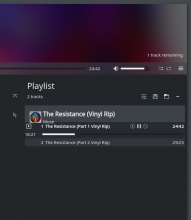
Implementing a progessbar in the PlaylistEntry.qml. See https://phabricator.kde.org/T7597
Details
- Reviewers
ngraham januz - Maniphest Tasks
- T7597: Add a progress bar under the current track in playlist
Diff Detail
- Repository
- R255 Elisa
- Branch
- master
- Lint
No Linters Available - Unit
No Unit Test Coverage - Build Status
Buildable 2206 Build 2224: arc lint + arc unit
Thanks for your work. Could you please include a screenshot ? This allows an easier review for the design part of your work.
Here is a screenshot:
Note: I have the same issue with the album cover with origin/master
It is working fine. Thanks for this work.
I have a few remarks. I would prefer a smaller progress bar without the handle and read-only. This would make it a nice way to visualize the currently playing track and at the same time the track progress.
What do you think ?
@januz, @astippich, @ngraham what do you think ?
I will have a look at the alignments also without your patch as it seems we have broken something here.
I also have mixed feelings about this since it somewhat duplicates the top bar. Just a very slim progress indicator beneath the title without the ability to seek would suffice. One could also think of making the complete background a progress bar, maybe with a light blue or gray color.
Other things I observed:
please add some margin to the left (or right for mirrored) for the "timeRemainingLabel" similar to the playing indicator.
On startup and when adding tracks via the e.g. replace and play button, the progress bar is not visible. It only becomes visible when you select a track in the playlist again.
@mgallien I noticed this issue before, I have a patch almost ready
| src/qml/PlayListEntry.qml | ||
|---|---|---|
| 638 | please remove the debug message :) | |
Sorry for the late reply.
I will look at some other implementations alternative. But after some reflection, the progess bar that I implemented too big and take too much place.
