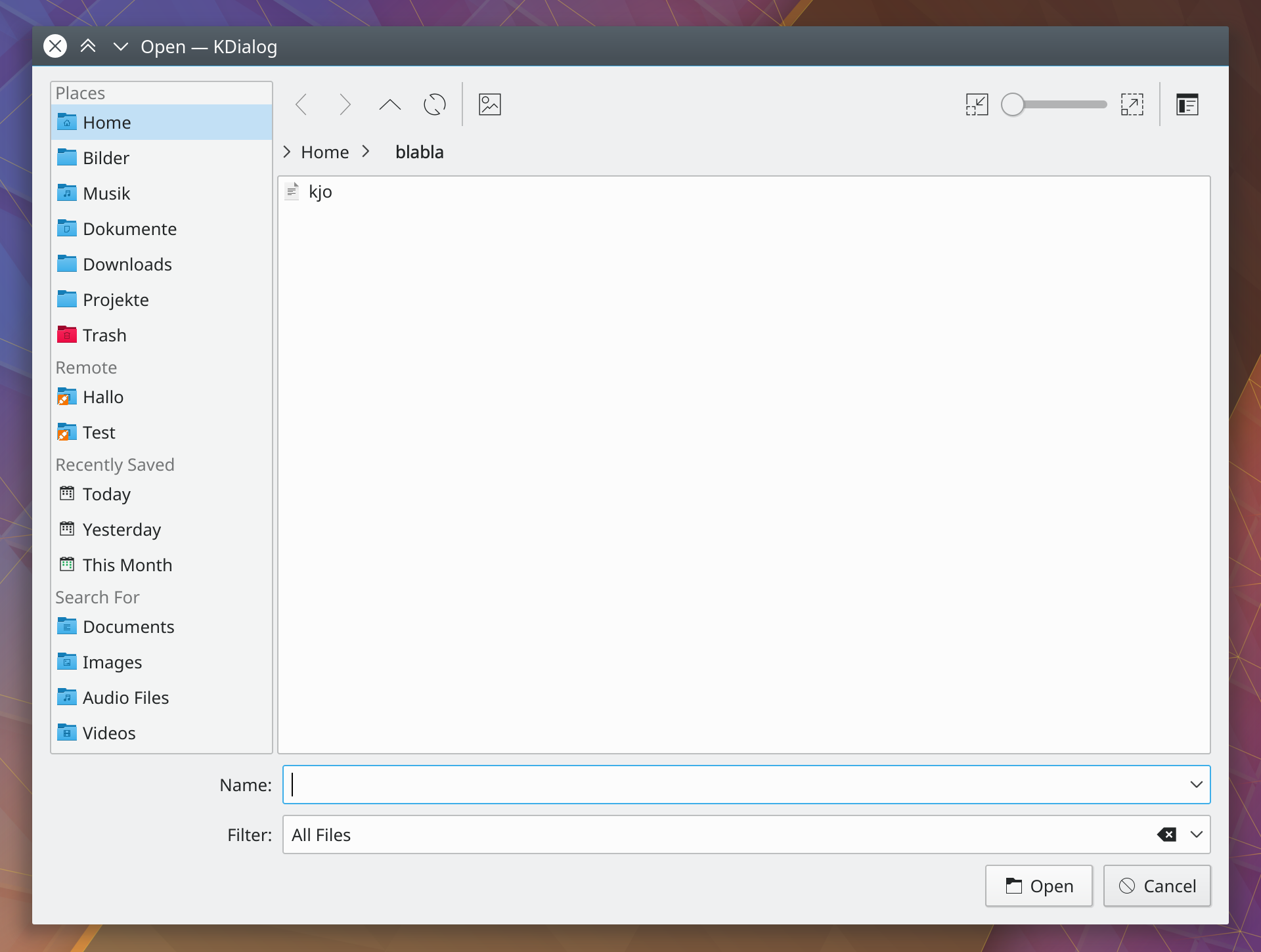
This avoids a double "Places" header and also gets rid of the superfluous frame around the widget, similar to Dolphin. It has never been possible to detach the dock from the window anyway.
The close button is also removed as a side-effect of this but should a user really want to hide it, this can still be done by pressing F9 or in the menu. Resizing the places list is still possible.
Details
Details
- Reviewers
ngraham mart - Group Reviewers
Plasma VDG Frameworks - Commits
- R241:a3e2b24b17ee: [KFileWidget] Hide places frame and header
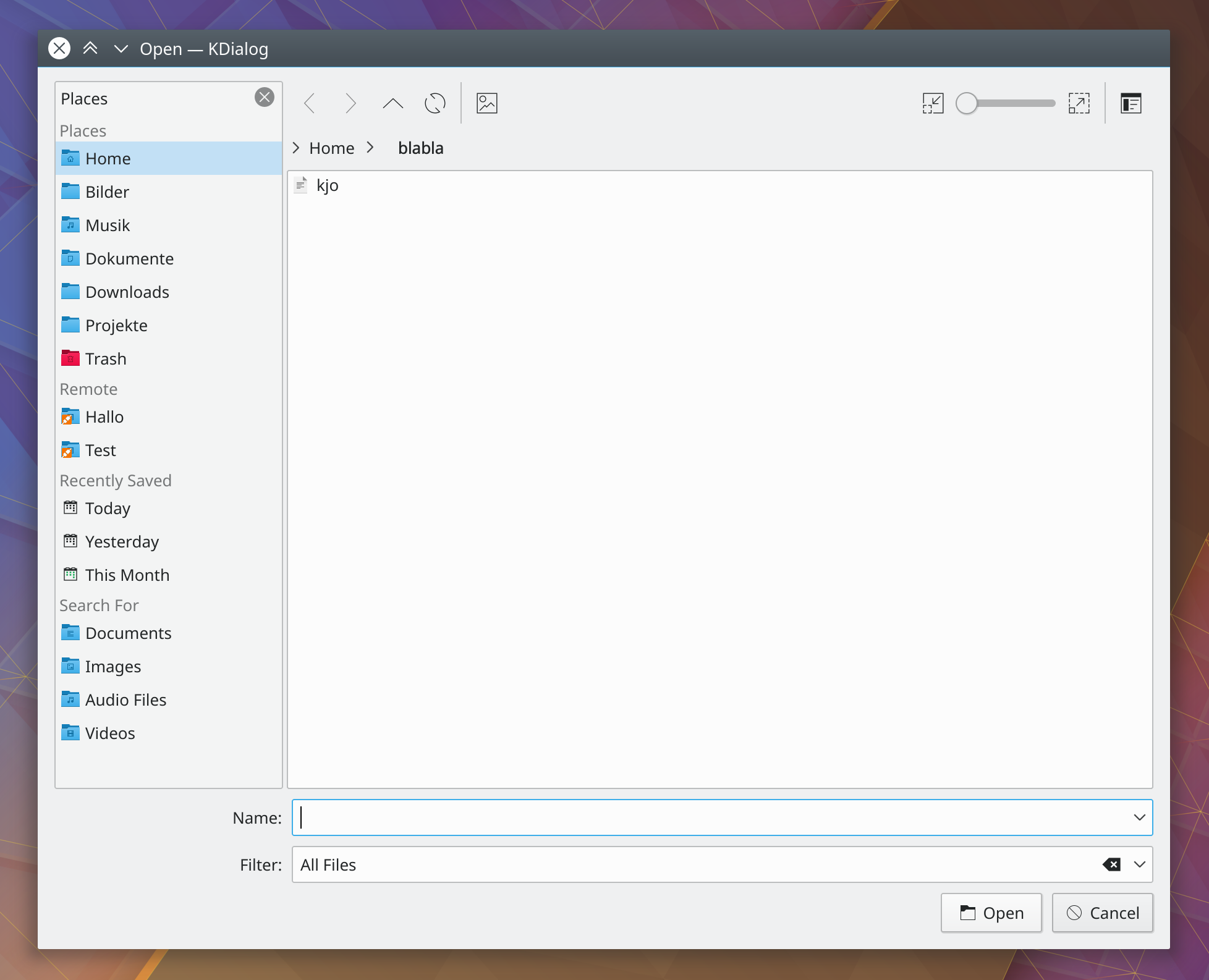
Before
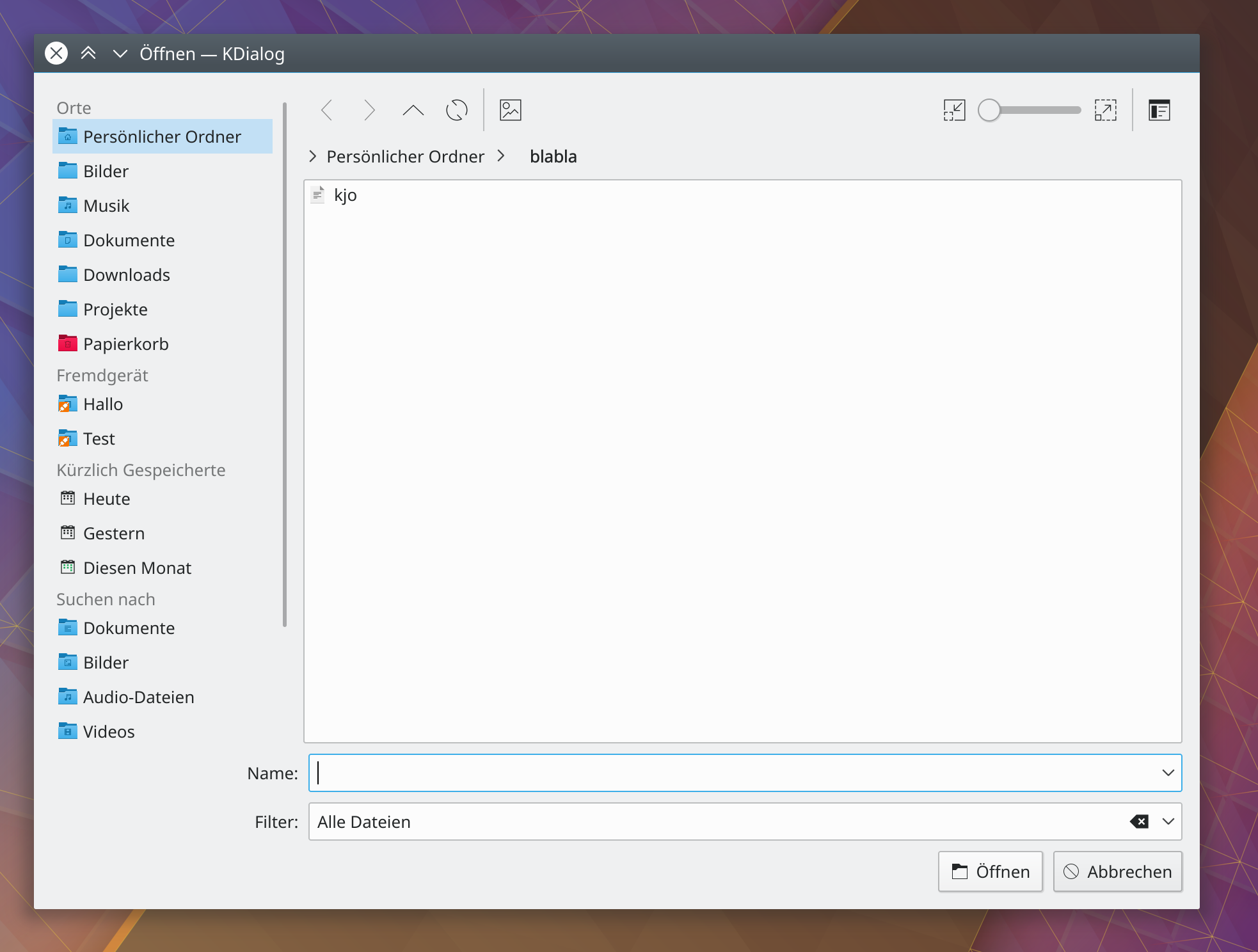
After
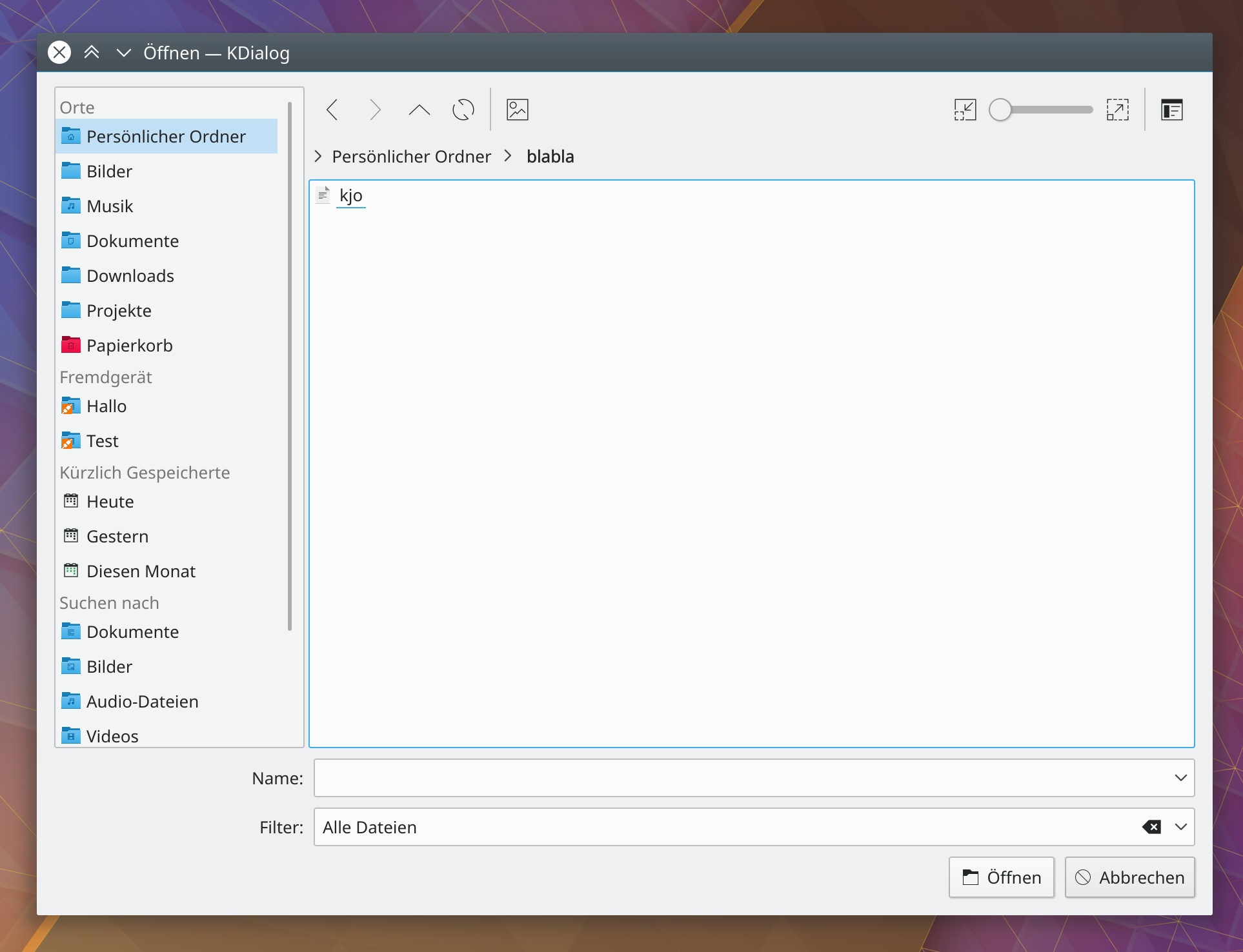
Breeze default
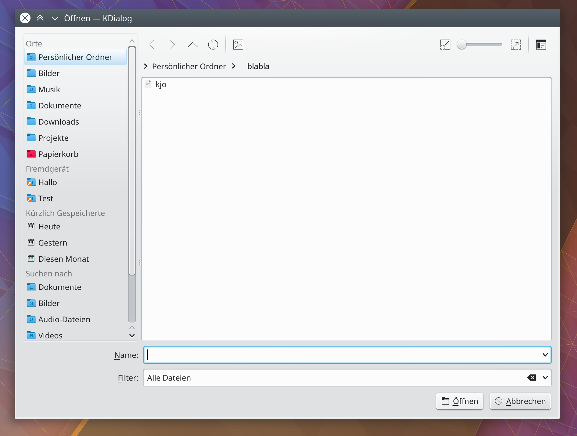
Breeze with borders enabled
Oxygen default
Diff Detail
Diff Detail
- Repository
- R241 KIO
- Lint
Lint Skipped - Unit
Unit Tests Skipped
Comment Actions
Shouldn't this be controlled by System Settings > Application Style > Widget Style > Breeze > Configure > Frames > Draw Frame around Dockable panels? Otherwise, people who check that setting will have a visible frame around the Places panel in Dolphin, but not in open/save file pickers, and will wonder why and file bugs about it.
Comment Actions
Shouldn't this be controlled by System Settings > Application Style > Widget Style > Breeze > Configure > Frames > Draw Frame around Dockable panels?
If that option is enabled you get a frame even with this patch. Otherwise, the default, is nice and clean.
Comment Actions
Why does it show the panel as if it were unlocked?
Your before image looks exactly like an unlocked frame in Dolphin.
Would it be possible to show it as if it were locked? That would solve all the issues with it, right?
Comment Actions
Would it be possible to show it as if it were locked? That would solve all the issues with it, right?
I don't get it. That "lock" feature is entirely a Dolphin invention. It does exactly what I do here:
void DolphinDockWidget::setLocked(bool lock)
{
    ...
        if (lock) {
            ...
            setTitleBarWidget(m_dockTitleBar);
            setFeatures(QDockWidget::NoDockWidgetFeatures);
with m_dockTitleBar being a custom widget for some added padding
Comment Actions
- Add custom widget for added spacing, fixes the items glued to the top when borders are enabled, see updated Test Plan for new screenshots
Comment Actions
Looks like i was looking at the wrong picture. I was looking at your after image and comparing that to the "locked" state in dolphin.
The image i was expecting is the one you call "crammed at the top" :)
Imho, the "crammed at the top" version looks best as the "after" one just has some weird empty room above the panel now. But feel free to use the one you think fits best.
A suggestion though if you do choose for the "after" version. Would it be possible to rearrange the layout then?
So:
- move the actions to the top, right above the panel.
- move the location bar next to the actions
I think that would look nice :)
| src/filewidgets/kfilewidget.cpp | ||
|---|---|---|
| 1351 | Does it really make sense that it's a dock if it can't be interacted with? | |
| src/filewidgets/kfilewidget.cpp | ||
|---|---|---|
| 1351 | I don't know. You can still resize the panel, I also wanted to keep the patch as unintrusive as possible. | |