This patch increases the font size of the username and action button labels for better readability.
Details
Details
- Reviewers
ngraham - Group Reviewers
VDG Plasma - Maniphest Tasks
- T10325: 5.16 Login screen improvements
- Commits
- R120:dd4176d1f669: [sddm-theme/lock screen] Adjust login screen and lock screen font sizes
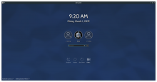
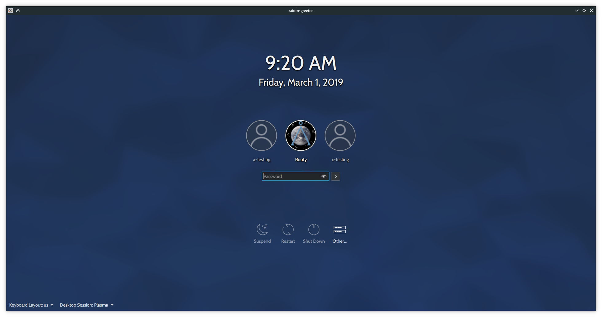
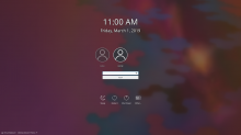
Before:

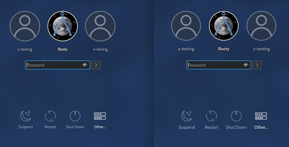
After:
For reference, level 4:

Diff Detail
Diff Detail
- Repository
- R120 Plasma Workspace
- Branch
- bump-up-label-fonts (branched from master)
- Lint
No Linters Available - Unit
No Unit Test Coverage - Build Status
Buildable 9016 Build 9034: arc lint + arc unit
Comment Actions
I'm hugely in favor of increasing the font size by using Headings here. The current tiny text is difficult to read and there is no advantage to using small text on something like a login or lock screen where the amount of text is very limited.
However, the avatar seems to get smaller as the text size is increased. Can you fix that?
Comment Actions
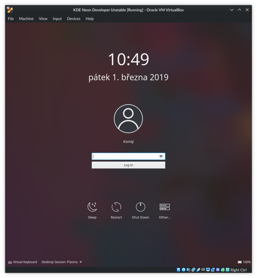
This is level 3:
Sorry about the long comment.
There's another problem that might be hard to appreciate with neon's default settings (Noto Sans, slight hinting etc.)
This is level 4:

This is level 3:
Level 4 just seems blurrier. Level 3's bigger (easier to make out) and the letters are sharper so I'm going to bump it up to level 3, let me know if it's too big.
P.S. For some reason, the fonts look bigger in sddm-greeter, in case you've been using that to test the fonts. They look fine on the login screen.
EDIT 2: In that screenshot I also raised the pointSize of the password text field to 11, which is something I'd like to implement here in this patch too (I used pointSize because I don't know how to convert a TextField to a Heading)
Comment Actions
From a technical point of view I'm not sure this is the ideal solution. It's not hardcoding font sizes, but is changing only 2 labels (to be headings when they're actually not headings) while the other ones remain 10pt.
The best solution would be if we had an option for configuring SDDM font sizes. At the very least we could adjust font size based on the screen resolution. Plasma people, what do you think?
If this ends up being the best we can do I would prefer to have level 4 just so there isn't a big discrepancy between label sizes.
Comment Actions
But I didn't mean to increase the font size of the clock, the keyboard or session buttons, just the username and action buttons (and maybe the username/password fields.
The best solution would be if we had an option for configuring SDDM font sizes. At the very least we could adjust font size based on the screen resolution. Plasma people, what do you think?
You could change the font DPI.
If this ends up being the best we can do I would prefer to have level 4 just so there isn't a big discrepancy between label sizes.
They come out small and blurry. Take a look at my previous comment.

Comment Actions
pointSize then, because the fonts are too hazy if you use level 4. Not to belabor the point but take a closer look at the screenshots I posted in my comments.
The neon defaults are a very niche case and they just cover up the problem and don't really solve it.
That being said, level 3 looks just fine in my opinion, even better than level 4.
Comment Actions
In any case, I'd like to have it like this:
- no shadows with blur
- username is 12pt (or level 3)
- action buttons are 11pt (or level 4)
- the tool buttons at the bottom are 10 pt
Comment Actions
But we'd have to use pointSize. Level 4 headings simply come out too blurry given different antialiasing settings.
Even though the shadows are pretty, I'm inclined to agree that no shadows might be a better fit.
- username is 12pt (or level 3)
Ditto.
- action buttons are 11pt (or level 4)
This sounds good to me, and it looks good

But we'd have to use pointSize. Level 4 headings simply come out too blurry given different antialiasing settings.
- the tool buttons at the bottom are 10 pt
Ditto.
Comment Actions
It's probably not the worst thing in the world if we use hardcoded font sizes here. We already do for the clock, and the login screen isn't able to read user-chosen font sizes anyway, so there's not much point in using a Heading, one of whose reasons for existance existence is to respect the user's font size. So if we use hardcoded sizes, then the login and lock screens will both be able to have the same font sizes for everything.
Comment Actions
Use pointSize, adjust username/password font sizes as well, adjust lock screen font sizes
Comment Actions
Wow, it's amazing how much better this makes both the lock and login screen look and feel. I love it!
Since this affects components on the Logout screen as well, we should probably also make the same size changes to the buttons and text present there in this patch.
Comment Actions
P.S. I know it's unrelated but shouldn't the logout screen say "Restart" (like the SDDM theme)? I just noticed it.
Also "Log out" (or uppercase?) instead of "Logout"?
Comment Actions
Yep (in another patch! :) ). And the same changes also need to be made for Kicker/Kickoff/Dash/etc., similar to how I did 360b565d8cab0818f03f773c2675f73a1d6a94d6