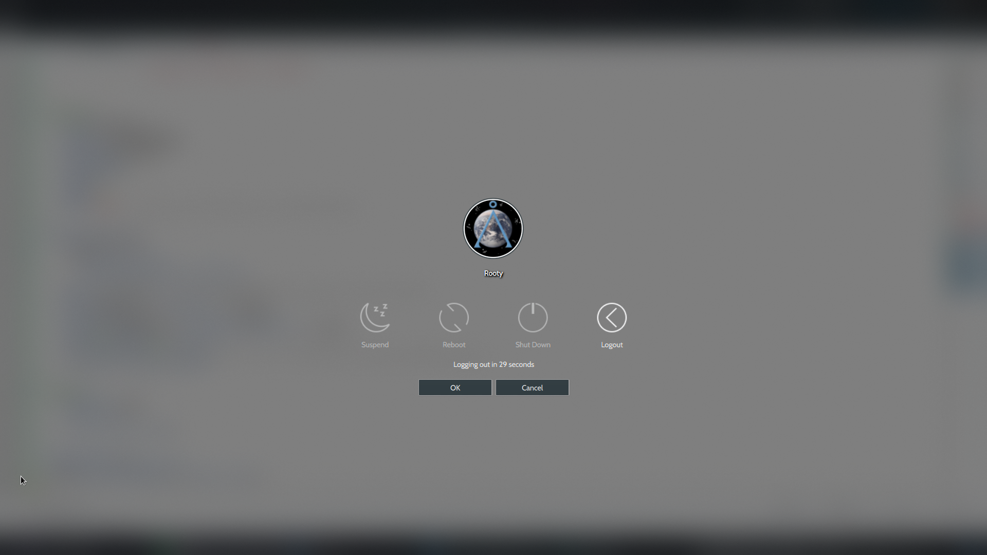
Action buttons - before:

after:
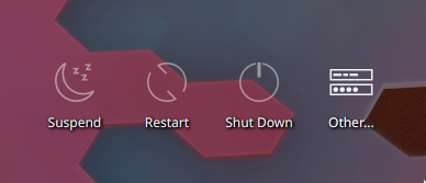
(The blur's been removed in in the screenshots in anticipation of the patch that will make the removal of the blur effect official.)
| No Linters Available |
| No Unit Test Coverage |
| Buildable 8902 | |
| Build 8920: arc lint + arc unit |
P.S. I haven't yet resolved this error:
[19:14:33.680] (WW) GREETER: file:///home/rooty/kde/temp/sddm-theme/components/ActionButton.qml:30: ReferenceError: GraphicsInfo is not defined
Will let Nate verify that the outline patch has been done well here, but otherwise looks good.
Wait but I haven't added outlines, just shadows... Should I add outlines for software rendering too?
Yep, needs an outline instead of a shadow when using software rendering, just like the other text with shadows.
Another thing is that in my previous attempt at this, I made the shadows optional, since there are places where ActionButtons are used that don't require any additional contrast for the text, such as on the logout screen. So it's best to omit them there. You can see how I did that in D16031, and it might be nice to do it here, too.
I'll add an outline sure
Another thing is that in my previous attempt at this, I made the shadows optional, since there are places where ActionButtons are used that don't require any additional contrast for the text, such as on the logout screen. So it's best to omit them there. You can see how I did that in D16031, and it might be nice to do it here, too.
Isn't that true of UserDelegate too though?
We could separate the files, use separate versions for the login screen and the lock screen. That's why I haven't pushed the clock/userdelegate patch yet
That's true, yeah. No need to create separate files, just add a public property in actionButton that's connected to the shadow/outline visibility.
property alias labelShadow: labelShadow.visible
And then on the login screen itself, you would set labelShadow: true for each ActionButton added there, and in the logout screen, you would set labelShadow: isLightColor ? false : true
What about adding the same shadow under icons? Otherwise it looks like a text floating above flat background.