BUG: 401652
FIXED-IN: 5.15.0
Details
Details
- Reviewers
hein ndavis - Group Reviewers
Plasma VDG - Commits
- R119:d75a37b58992: [Folder View] make file context menu consistent with Dolphin's
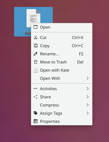
Before:
After:
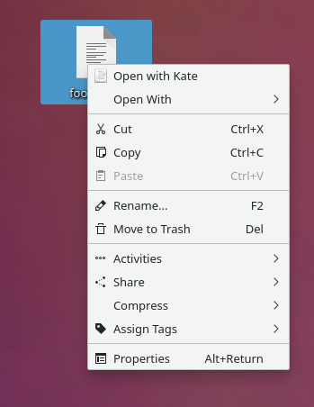
It matches Dolphin:
Diff Detail
Diff Detail
- Repository
- R119 Plasma Desktop
- Lint
Automatic diff as part of commit; lint not applicable. - Unit
Automatic diff as part of commit; unit tests not applicable.
Comment Actions
Also give the Properties action a shortcut, so now the menu is 100% identical with Dolphin's
Comment Actions
Can we patch Dolphin instead? I think the order there is pretty bad, with weird random dividers etc. (From the screenshots in the original user bug.) I prefer FV's.
Comment Actions
Hmm, I prefer the Dolphin one for the following reasons:
- Having the the "open with" item near the top makes sense because it's likely the most commonly used item
- Having the "open" items grouped together makes sense, since they're both similar actions, and all other platforms I'm familiar with have their context menu's "open" items on the top too
- The greater use of separators is an asset, not a drawback: separators provide structure and help the mind distinguish between logical groups. In particular having cut/copy/paste separated from other items makes sense.
- The current FV menu has bugs:
- The top item is Open, but it uses an inappropriate icon and is duplicated by another superior Open with [app name] item buried in the middle of the context menu.
- It doesn't show the Paste item unless there's something to paste. This is a HIG violation; we don't recommend modifying the visibility of inapplicable menu items; instead they should be disabled.
- The Properties item doesn't have a keyboard shortcut
But if you're not convinced, perhaps we could ask VDG which of the following they prefer:
Current Folder View menu:
Current Dolphin menu:
Comment Actions
I agree that Dolphin's menu makes more sense. If this turns out to be controversial, maybe the order should be easier to change, instead of having it hard coded...
Comment Actions
important is that "open with $default" and "open with..." are grouped together.
apart from that i don't have much preferences for one or the other
Comment Actions
+1 to making the menus the same.
To me, the folder view menu is the one with seemingly random dividers, and a lack of dividers. In the dolphin menu, I see a clear progression:
- Open section
- Clipboard section
- options that can affect other programs (missing files due to removal or name change)
- It can be argued that Cut would belong here and I don't think it would be bad if clipboard actions, rename and delete were in the same section.
- Another name for this section could be "File Operations" if the "Copy To" and "Move To" Commands were put here.
- Misc actions
- Better organization might be a good idea, but that's out of scope here
- Properties
- this option is always kind of special
Comment Actions
Since this is VDG-accepted and most of the comments seem to be slightly to strongly positive so far, if I don't get a formal Changes Requested status from someone in Plasma, I'll land on December 19th (or earlier if I get a formal Accept status instead).
Comment Actions
Alrighty, I'll go in with the majority opinion then. Consistency is certainly an improvement by itself. Go go go!