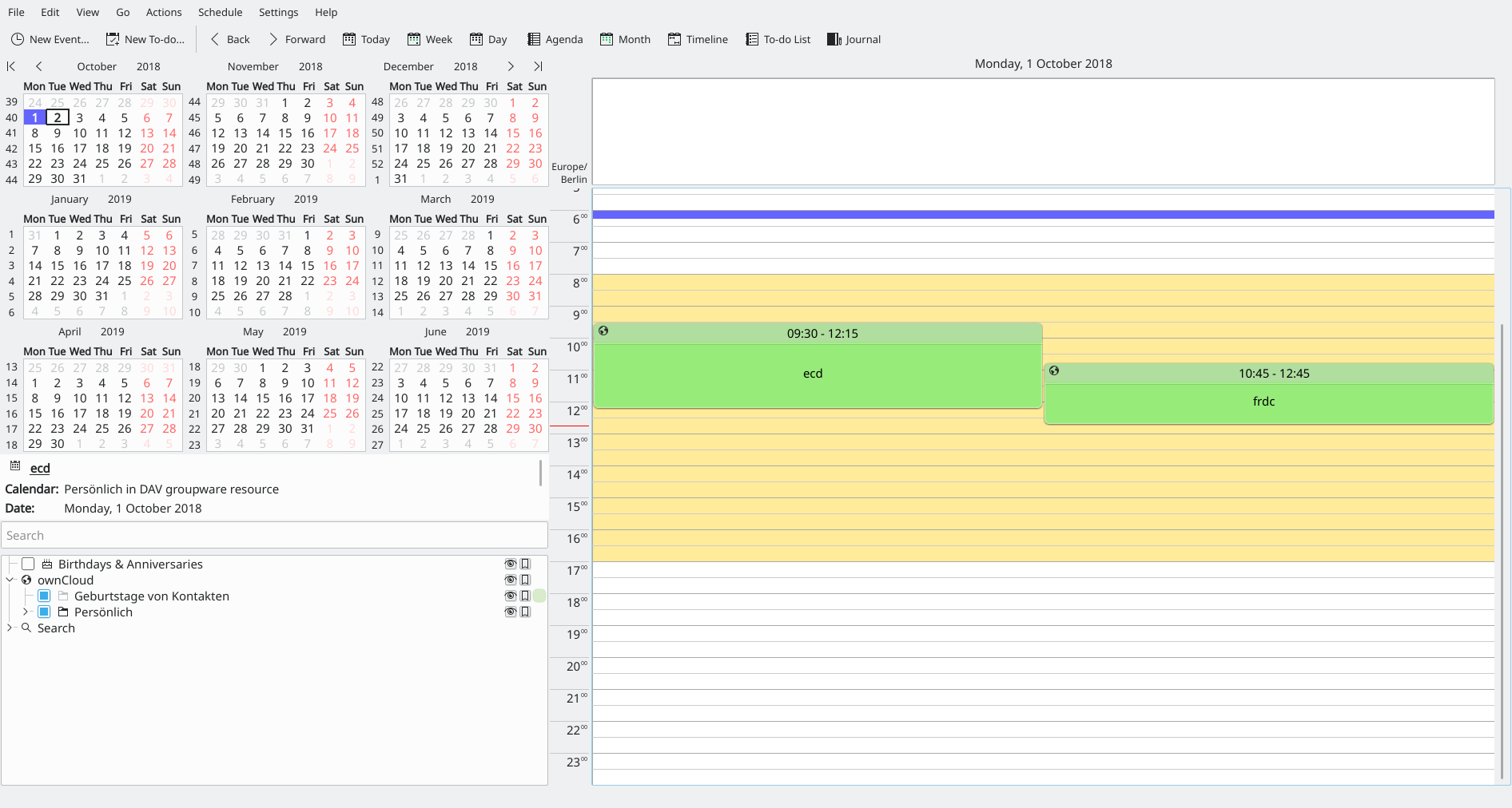
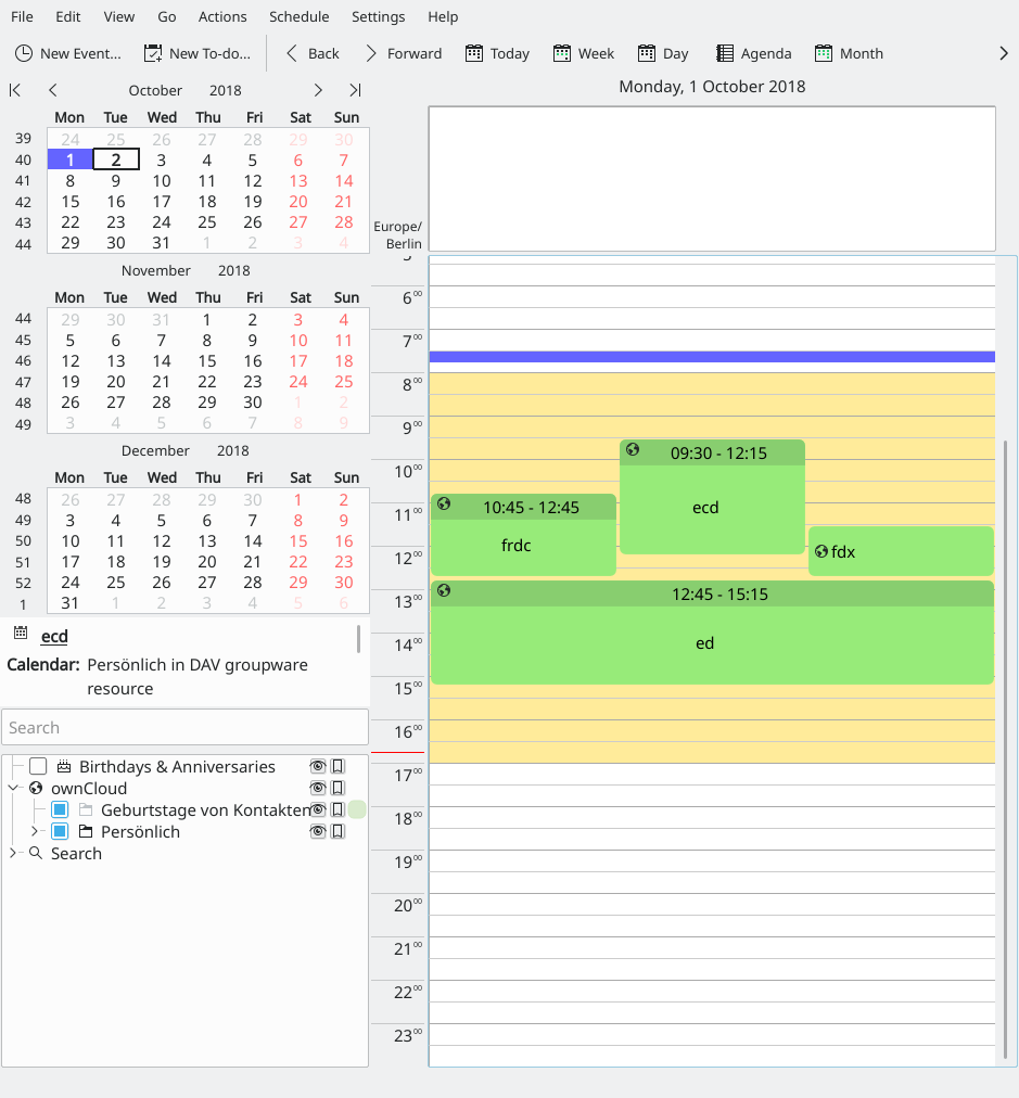
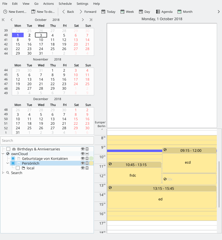
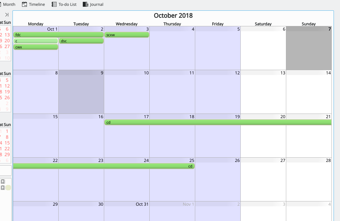
The different event views in KOrganizer look a bit dated, the painting code could use a bit of updating to make it look more modern.
Some ideas:
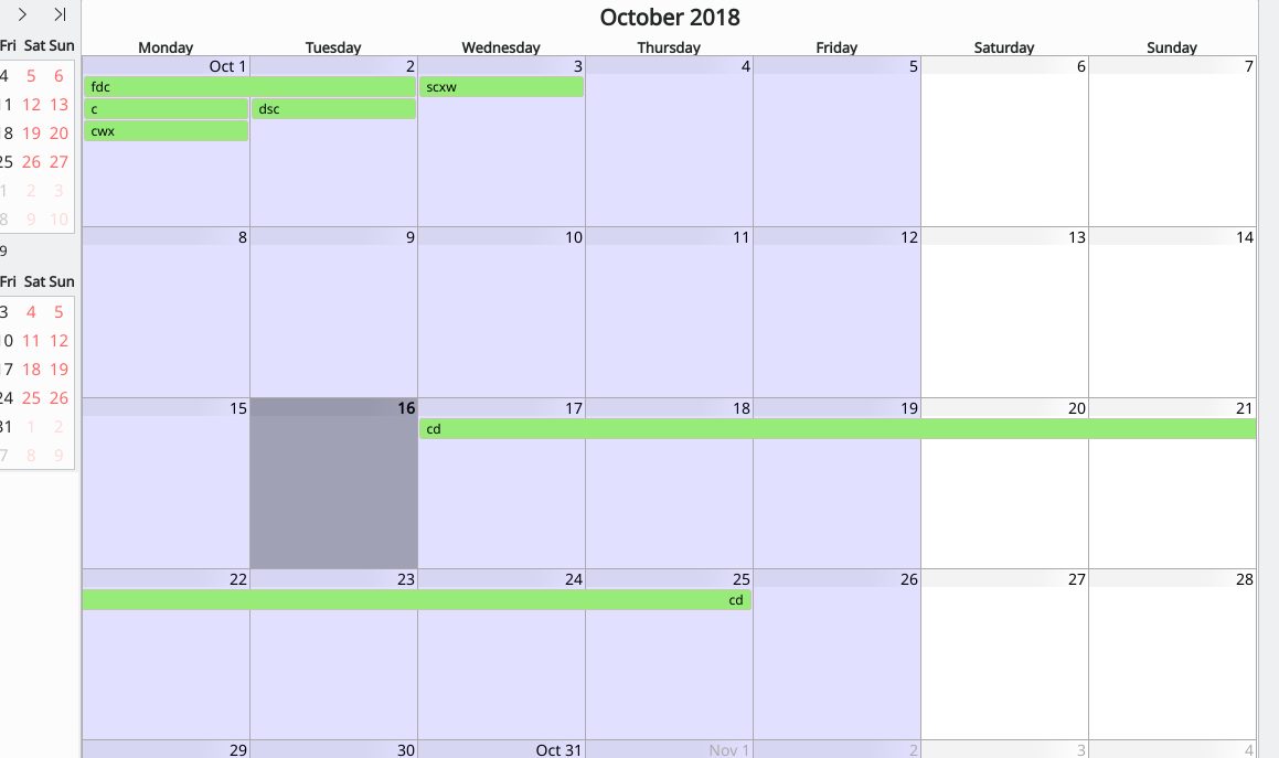
Month view
- use softer colors (the default green for events does not look very good, something softer, less intense color would be better)
make the events rectangular (remove the round corner, or notably reduce it) - this needs to be done carefully otherwise, it may not be easy to distinguish between multiple separate events and a single event spanning multiple days (there was some work done previously in D6368(D16013)
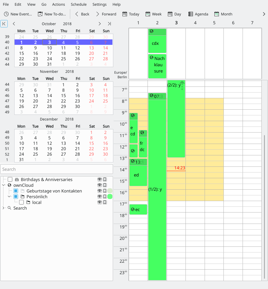
Agenda view
- make the day/hour lines less outstanding
remove the rounded corners from events like in month view(D15916)