Keeping UIs hamburger-free
Open, Needs TriagePublic

Tokens
"Love" token, awarded by mikeljohnson."Like" token, awarded by ognarb."Love" token, awarded by manueljlin."Like" token, awarded by aronkvh.
Assigned To
Authored By
cblack, Jul 11 2021

Description

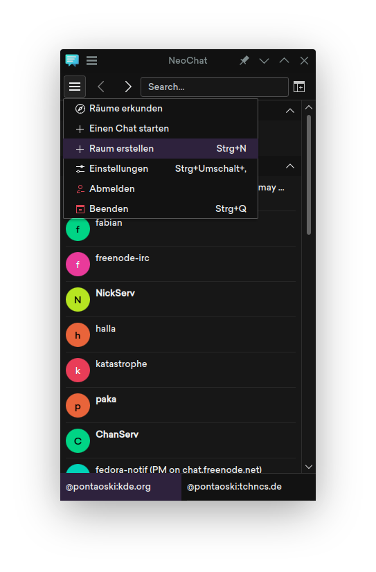
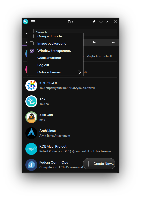
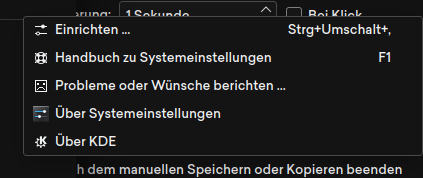
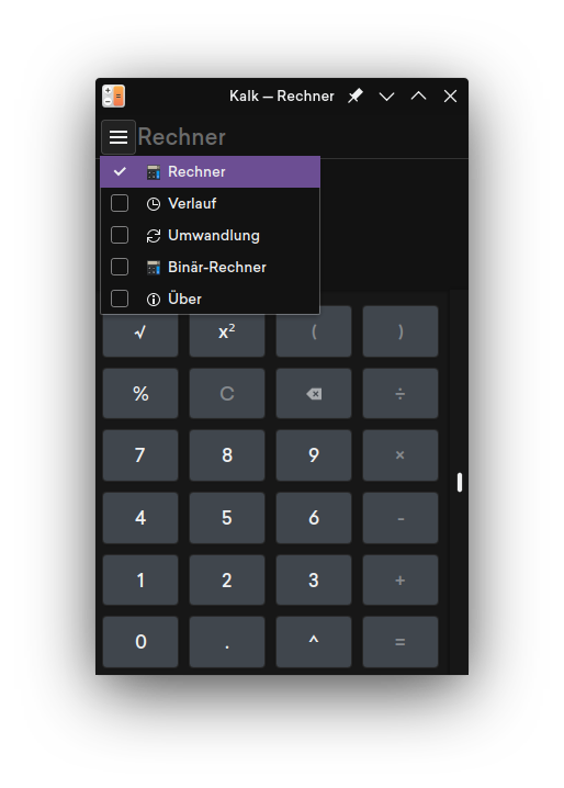
A few of our desktop apps have been moving to a hamburger menu for presenting UI, and a few of our mobile apps utilise a hamburger menu of some form.

While doing some research on the topic of hamburger menus, I noticed anything involving actual user testing unanimously (I could not find any sources with actual research on users that indicated that hamburger menus performed better than other UI elements that could be used instead of them) pointed out that hamburger menus provide worse usability in all sorts of scenarios: users perceived the UI as harder to use, users interacted with hamburger menus less, users took longer to accomplish tasks, among other shortcomings of hamburger menus compared to other UI elements.

The sources I found: (feel free to edit sources [with actual research/testing, not pure conjecture/opinion as many UX/UI articles on the internet tend to be] into this list)

With that in mind, I would like to propose that we reduce the already-low reliance of our UIs on hambuger menus. This is already not a very prevalent UI component in KDE, and we should work to remove it from the few apps that do use it.

Most of our apps using hamburger menus are surprisingly desktop apps, and not mobile apps. However, some of our mobile apps still use them.

Hamburger menus on mobile aren't an inevitability due to limited screen space as they would seem at first, and a few mobile platforms, most notably iOS, avoid the hamburger menu completely. In fact, Apple has explicitly denounced hamburger menus on iOS multiple times. A fun roast to read from Apple WWDC 2014 on hamburger menus: https://invent.kde.org/-/snippets/1747

I would like to use this thread to

  1. solidify our mobile design patterns so that we don't have developers & UI designers using hamburger menus because they don't know what else to do
  2. brainstorm ideas for apps that have hamburger menus to port them away from hamburger menus
cblack created this task.Jul 11 2021, 2:58 AM
cblack updated the task description. (Show Details)

Neochat

NeoChat's hamburger menu is fairly brief on items.

A quit item doesn't really make sense in a mobile context, so we can simply not have that on its mobile design.

A floating action button with a big plus sign in the bottom right corner of the chat list could be utilised for both "start a chat" and "create a room".

That leaves us with three items: explore rooms, settings, and log out.

Let's tackle logging out: logging out isn't a particularly common action in a chat app for most users, so there's not a need to feature it with prominence. Placing it in settings can work, and is typically where logging out is found in chat apps anwyays.

Now we have just "explore rooms" and "settings". We have room in the toolbar to add settings and explore rooms buttons, so we can simply place them there and be done with it.

This yields us a UI without a hamburger menu, where all options are

  1. more discoverable
  2. faster or equivalent amount of time to access

In the case of mobile, moving creating chats to a FAB makes it much more reachable than the old hamburger menu located in the top left of the screen.

cblack updated the task description. (Show Details)Jul 11 2021, 3:09 AM

Tok

Tok's hamburger menu is even simpler to simplify than NeoChat's: just move everything into a settings page and replace the hamburger menu in the toolbar with a settings button.

Tok already uses a floating action button to create new chats.

cblack added a comment.EditedJul 11 2021, 3:16 AM

KClock

KClock's UI is entirely burgerless and can be considered a model of a good app design: everything is discoverable and fast to access at the bottom of the screen, without the need for a hamburger menu to hide items in.

On desktop, this becomes a sidebar.

System Settings

Frankly, the hamburger menu here is completely useless. None of the items here offer anything that users would actually want to interact with in System Settings. We completely lack a menu of this sort in Plasma Settings (our mobile settings app).

Once we finalize getting rid of the icon view, it'll be possible to completely drop this menu. For now, we could move the configure item out of the hamburger menu and have it replace the hamburger menu's button.

cblack updated the task description. (Show Details)Jul 11 2021, 3:20 AM
cblack renamed this task from Reevaluate the hamburger menu to Reevaluate the use of a hamburger menu.Jul 11 2021, 3:27 AM
cblack updated the task description. (Show Details)

Plasma Weather

The hamburger "menu" here is trivial to replace with a bottom switcher in the style of KClock, as it simply provides switching between three pages.

cblack renamed this task from Reevaluate the use of a hamburger menu to Keeping UIs hamburger-free.Jul 11 2021, 3:29 AM

Kalk

Like most of KDE's mobile applications, this would be better suited as a bottom navigation bar instead of a hamburger menu, like KClock.

manueljlin added a subscriber: manueljlin.
fhek added a subscriber: fhek.Jul 11 2021, 11:46 AM

Let's not confuse different things. In some ways you are misinterpreting your own sources.

https://www.nngroup.com/articles/hamburger-menus/
Hamburger Menus and Hidden Navigation Hurt UX Metrics

Summary: Discoverability is cut almost in half by hiding a website’s main navigation. Also, task time is longer and perceived task difficulty increases.

https://www.diva-portal.org/smash/get/diva2:922114/FULLTEXT01.pdf&lang=en
Comparison of hamburger and bottom bar menu on mobile devices for three level navigation

Both of these studies are about hiding the *main navigation* behind a hamburger menu. Of course that is a terrible idea because obviously actions that are hidden behind any kind of user interaction are less likely to be found than if they were immediately visible. Everyone here should already be aware of that. This is the same reason why we try not to rely on mouse right-clicks.

Neochat might be an example where the hamburger menu contains actions that should probably be directly visible but I can't really comment on this because I am not using it yet (will switch soon probably).

https://web.archive.org/web/20150315043320/http://exisweb.net/mobile-menu-abtest
https://web.archive.org/web/20150314233342/http://exisweb.net/menu-eats-hamburger

Both of these articles are about comparing a button that contains the hamburger icon to a button that is labeled "Menu". The subject of these articles is therefore not about the hamburger menu as a pattern in general. These articles are about how many users recognise the hamburger icon as a symbol that represents a general menu. The conclusion is that more people understand that the word "Menu" hides a ... menu than that a hamburger icon hides a menu.

This is why we are trying to be consistent in KDE. If a user learnt what's behind a button that shows a hamburger icon they can transfer this knowledge onto other applications. In any case these articles have no relation at all to what you are trying to conclude from this.

To sum it up: None of these sources point us towards avoiding hamburger menus in general or that the way we approach the use of hamburger menus in KDE is fundamentally flawed.

I am kind of worried that many people here seem to believe your claims blindly. I mean I understand that reading scientific papers isn't everyone's cup of tea but the two articles don't even have any relation to the task description.

Alright, while I disagree with the way this task was presented and its conclusion I don't really disagree with all the examples given:

KClock

I agree that KClock shouldn't be porting to a hamburger menu for the main navigation.

Plasma Weather

The hamburger "menu" here is trivial to replace with a bottom switcher in the style of KClock, as it simply provides switching between three pages.

The picture doesn't really show what's in the menu but from your description this sounds like it is another case of hiding the main navigation behind user interaction so I probably agree.

Kalk

Like most of KDE's mobile applications, this would be better suited as a bottom navigation bar instead of a hamburger menu, like KClock.

This one is a bit less clear cut because the other pages are all a lot less important than the main calculator page. "History" might be the exception among them.

Tok

Tok's hamburger menu is even simpler to simplify than NeoChat's: just move everything into a settings page and replace the hamburger menu in the toolbar with a settings button.

All of the actions here are settings so I agree that a settings icon would be a better choice. There isn't a fundamental difference between presenting these actions in a menu or in a separate page but using a separate page might be nicer overall.

System Settings

Frankly, the hamburger menu here is completely useless. None of the items here offer anything that users would actually want to interact with in System Settings. We completely lack a menu of this sort in Plasma Settings (our mobile settings app).

Once we finalize getting rid of the icon view, it'll be possible to completely drop this menu. For now, we could move the configure item out of the hamburger menu and have it replace the hamburger menu's button.

I completely disagree with your judgement of the usefulness of the actions you want to get rid of.

ndavis added a subscriber: ndavis.Jul 12 2021, 4:58 PM

I think @felixernst has a good point. In all of these studies, the conclusion is that hamburger menus are bad for navigation, especially multi-level navigation. I agree with that, but hamburger menus are not always used for navigation.

Arguably, any time you're moving through a UI, it's navigation. However, I think it's important to make a distinction between switching between modes/sections of an app and searching for smaller actions in a menu though. Different modes/sections of an app typically display different sets of important content/indicators/actions. This can make it necessary to switch modes/sections often, so it makes sense to keep the options to switch modes/sections readily available.

  • To use Neochat and Telegram as an example, the most important part of navigation is in the sidebar that contains the list of rooms. It's good that this isn't hidden in a hamburger menu because people will commonly need to switch rooms. Contrast this with the websites and apps in the usability studies that hide all of their important sections in a hamburger menu.

The exceptions we commonly make are hiding the Settings and and About pages in a hamburger menu. The About page is not that important and not all settings pages are equally important, but perhaps we should be more conscious of whether or not the settings page should be hidden in a menu? If it is important enough to keep out of a menu, maybe it's because we've inappropriately put a commonly used option in a settings page instead of making it readily available?

Lots of articles on the usability of hamburger menus admit that they are a convenient way to keep options out of the way, right before they criticize hamburger menus for hiding options that are important (rightfully). In a way, this is reminiscent of advanced vs basic mode. In this case, it's not as bad because the extra options/actions are not hidden behind a toggleable option that is also hidden in a menu or a subsection of the app.

ngraham added a subscriber: ngraham.EditedJul 23 2021, 10:34 PM

Indeed, those articles almost entirely concern hamburger menus used to display navigation links. We generally don't use hamburger menus for that, so I think we're in the clear, and the situation is not as dire as this task description would seem to indicate. :) I don't think we need to redesign our apps that use hamburger menus, except maybe to remove any residual navigation-based UIs from them.

The other major conclusion in those articles is that users are more like to recognize something as a button and interact with it if it visually looks like a button and has text. Yeah, I've been saying that for years. :) So I'm glad to be in agreement with the usability studies!

Side note: I used to be quite anti-hamburger-menu for a long time, but eventually I came to appreciate the value of a well-designed hamburger menu with well-chosen contextually-aware actions (not navigation) for small-to-medium sized apps. My feelings are outlined at https://pointieststick.com/2021/04/03/how-i-learned-to-stop-worrying-and-love-the-hamburger-menu/ and I think that @felixernst's KHamburgerMenu control used in some of our QWidgets-based apps is pretty much perfect.

Recently we migrated Koko away from hamburger menu, opting instead for a custom page.
This is an example of an advanced use case where we can't fit all actions in a nav bar.