I'd like to suggest to display the modified date more concisely.
Unless I make the info panel really wide it often looks like this:
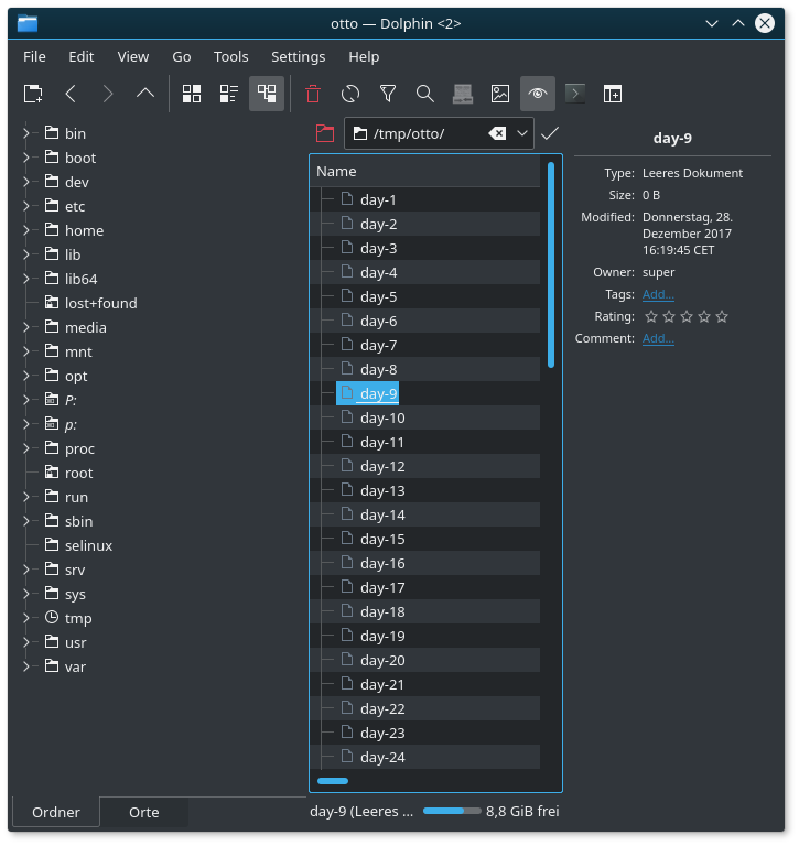
Usabilty issues:
- I have to *read* those 3 lines to extract the info
- The tags-row tends to jump up and down while hovering over the files.
- Timezone info is useless for me
- Weekday info is useless for me for files older than a few days
It's a matter of personal preference but I find this
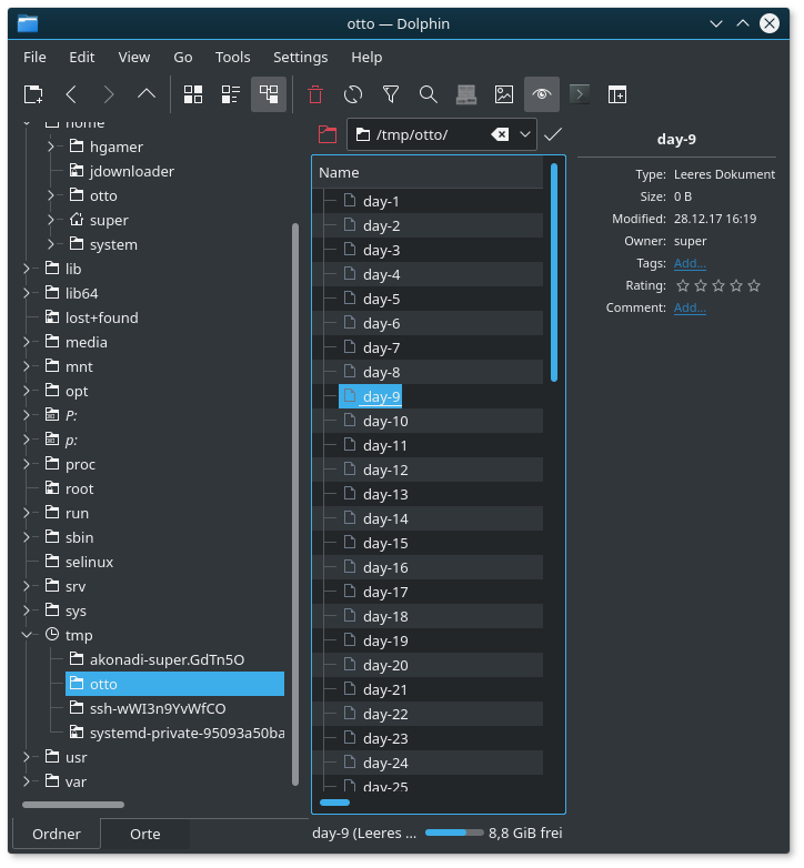
and this

much more pleasing.