Make current item in ThumbnailView visible
ClosedPublic

Authored by valeriymalov on Nov 27 2017, 11:36 PM.

Details

Summary

Render a dark border over current item
Render items that are being mouse hovered with a different palette

This isn't solving any bugs but hopefully should clear up some confusion
with currently existing split handling of selection and current items
Diff Detail

Repository
R260 Gwenview
Lint
Automatic diff as part of commit; lint not applicable.
Unit
Automatic diff as part of commit; unit tests not applicable.
valeriymalov requested review of this revision.Nov 27 2017, 11:36 PM
valeriymalov created this revision.
rkflx requested changes to this revision.Nov 28 2017, 10:38 PM

Excellent, this improves keyboard navigation a lot, thanks for the patch!

However, I feel the current visual representation might lead to confusion for less advanced users who are only comfortable with a mouse. There are three problems:

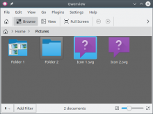
  1. Handling folders or transparent/non-rectangular images. Here is what I mean, i.e. it is not really obvious that only one item is selected (and the statusbar reading "2 documents" does not help either…):
  1. I also consider it very likely that some users will try to clear the selection by clicking on an empty area and then get annoyed that "it does not work", because the focus indicator still looks like a selection to them.
  1. Selecting and deselecting a folder which has focus is now visually broken, i.e. instead of getting less pronounced we get a stronger colour (white), so it appears your are actually selecting "even harder" instead of deselecting:

I think the three visual states (hover/focus/select) are visually too similar, i.e. mainly differentiated by color currently. In particular for focus we need an additional distinguishing feature, e.g. a different "form".

Ideas:

  • Dolphin indicates focus with a small line. We could do that too, but this would break focus indication when switching off EditThumbnail DetailsFilename. Not ideal, but no deal-breaker either.
  • Do not fiddle with the background and only use a different outline colour and/or width.

Thoughts?


No condition for acceptance of this patch, but you might also want to look at the Thumbnail Bar, where the selection vs. focus problem is present, too.

This revision now requires changes to proceed.Nov 28 2017, 10:38 PM

I've fiddled around a bit:

  • removed change of bg color for items under mouse
  • left current item on selected items as is (darker border)
  • current item on non-selected items displayed with underline like on the picture. Once selected it's going to look like normal selection with darker border.

Better/worse? I can update patch for further testing

What bothers me a bit about using border or underline like this is that it probably won't be visible at all on HiDPI screens? I don't have one so I can only guess.

rkflx added a comment.Dec 8 2017, 10:35 PM

Great work, I like the direction you are going and how it apparently works without filenames too. As it looks a lot like in Dolphin now, I wonder how going fully the Dolphin route would look like, i.e. straight instead of dotted line and color instead of black (or is this just the theme you are using?).

Just upload the current state of the patch (no need to clean it up yet) and I'll play around with the code a bit to see what I like and where we might introduce problems. Judging from just a screenshot and the textual description only is always a bit difficult ;)

Regarding HiDPI, running QT_SCALE_FACTOR=2 dolphin and then pixeltool-qt5 shows Dolphin is scaling the underline too (note it does not get blurry even for fractional scaling like 1.4x). You might want to look at their implementation. As for not having the hardware (I have it neither), try the good old "make the pixels smaller by standing further away" trick, or view a 2x screenshot @100% zoom on a HiDPI smartphone?

updated patch with underline selection

rkflx added a comment.Dec 8 2017, 10:38 PM

Thanks, will test tomorrow.

ngraham added a subscriber: ngraham.Dec 9 2017, 1:49 PM
ngraham requested changes to this revision.Dec 9 2017, 2:07 PM

Nice patch. Generally works well for me. Running with scale factors of 2 and 1.4 result in the line being correctly scaled. Additional inline comment below:

lib/thumbnailview/previewitemdelegate.cpp
763

I will echo @rkflx's suggestion to follow Dolphin's lead about the underline: make it a thin line that follows the theme color scheme, not a black dotted line.

This revision now requires changes to proceed.Dec 9 2017, 2:07 PM

Variant with themed underline for non-selected current items

ngraham added a comment.EditedDec 9 2017, 8:34 PM

Hmm, with the latest diff, now I can no longer reliably get the line to show up when items are de-selected.

I did see it once, and it appeared as a solid line gray line (when using the standard Breeze theme). It should be the standard bluish-turquoise color--the same color that Dolphin uses. You probably want the "Focus Decoration" color.

Maybe apply Focus Decoration color to border of non-selected, non-transparent items as well? Right now it gets a slightly darker border.

Line appears only under current items with transparent thumbnails (e.g. folders or images with alpha-channel). Current item can be selected by moving around with Ctrl + keys.

rkflx added a comment.Dec 9 2017, 10:17 PM

I like it very much now :)

Just for fun I looked at Dolphin, which uses drawPrimitive(QStyle::PE_FrameFocusRect, ...). I don't think we can use that, because for some styles this gives the typical dotted outline, which won't work for us when filenames are disabled. Meaning your code is totally fine.

Still some things left:

  • Colors: I'd say Nate is right, we should be consistent with other places here, e.g. Gwenview's file dialog. Maybe something like this (this gave me correct behaviour for all sorts of colour schemes:
KColorScheme scheme(option.palette.currentColorGroup(), KColorScheme::Selection);
painter->setPen(scheme.decoration(KColorScheme::FocusColor).color());
  • When the window loses focus, the focus indicator hides completely. Instead, it should stay and only get a little bit lighter (just as in Dolphin).
  • In Fullscreen mode, the underline works fine, but the focus indication for opaque images does not really work yet.
lib/thumbnailview/previewitemdelegate.cpp
83

FOCUS_BORDER_DARKNESS?

(I know in some parts of the code it is called "current", but here "focus" would be easier to understand and more consistent, wouldn't it?)

765

I love your attention to detail ;)

rkflx added a comment.Dec 9 2017, 10:21 PM

Maybe apply Focus Decoration color to border of non-selected, non-transparent items as well? Right now it gets a slightly darker border.

Try it, maybe it helps for Fullscreen too? You could also look at the KColorScheme API docs, there are a lot of options.

Line appears only under current items with transparent thumbnails (e.g. folders or images with alpha-channel).

Yep, that's how it should be.

rkflx added a comment.Dec 9 2017, 10:28 PM
In D9025#177984, @rkflx wrote:

Maybe apply Focus Decoration color to border of non-selected, non-transparent items as well? Right now it gets a slightly darker border.

Hmm, tried it. Does not help for fullscreen, and I think it is too colorful. I think the current state of the patch is just fine for non-fullscreen mode.

valeriymalov added a comment.EditedDec 10 2017, 12:27 PM

Hmm, tried it. Does not help for fullscreen, and I think it is too colorful. I think the current state of the patch is just fine for non-fullscreen mode.

Well without using hue to make focused opaque item more visible I can only think of using fgColor for border (which is pure white for darker than gray bg colors and pure black for light bg color)

When the window loses focus, the focus indicator hides completely. Instead, it should stay and only get a little bit lighter (just as in Dolphin).

Once window is no longer focused, item doesn't have the State_HasFocus flag. Seems that Dolphin doesn't rely on QStyle states at all and manually handles states from KItemListView::slotCurrentChanged or something like that.

more fiddling with colors:

use fgColor for non-selected opaque focused items
use highlight color for non-selected non-opaque focused items

Getting there! For folders and other icons with an alpha channel, the underline is now the right color and appears when I would expect it to. A few more suggestions:

  1. Let's use this style for image icons, too, rather than a subtle white border. I don't see a compelling reason not to be consistent with the unhighlighted selection style.
  2. Let's follow Dolphin's lead and place the highlight line underneath the text (if present), not between the icon and the text)
rkflx added a comment.Dec 10 2017, 9:08 PM
  1. Let's use this style for image icons, too, rather than a subtle white border. I don't see a compelling reason not to be consistent with the unhighlighted selection style.

I tried this already, it does not work because it would be too close to the image, making it hard to see.

  1. Let's follow Dolphin's lead and place the highlight line underneath the text (if present), not between the icon and the text)

Having it below the filename does not work (see above). Let's avoid special casing. In general Gwenview shows images, so less visual noise is desirable. Not having the line underneath for the majority of images (I expect most of them to be opaque) is in line with that.

The problem for me is that the white outline effect for images looks almost invisible. I can barely detect a difference even when I'm looking at it, and I imagine that if I wasn't involved here, I would never make the connection.

Besides, there's an existing visual language used for "selection would be here if it were selected". It seems a bit odd to re-use that for one view, but not another.

rkflx added a comment.Dec 10 2017, 9:32 PM

The problem for me is that the white outline effect for images looks almost invisible. I can barely detect a difference even when I'm looking at it, and I imagine that if I wasn't involved here, I would never make the connection.

I tried the old version with light and dark images (which have different borders, if I'm not mistaken), which was fine given that focus is very subtle compared to selection in general anyway. Nevertheless, the concern is not invalid. Let me think about this some more after I had a chance to try the current iteration in the next couple of days.

Besides, there's an existing visual language used for "selection would be here if it were selected". It seems a bit odd to re-use that for one view, but not another.

I hear you, but this would be a lot of work. If you can convince Valeriy to do the following, I'd be all for it, but I would also be fine with the easier version in this case. Done properly, this would need:

  • Drawing via QStyle::PE_FrameFocusRect (so we have consistency with Dolphin for every style, because some still use the dotted surrounding line).
  • QStyle::PE_FrameFocusRect would need to work well with the multiple additional things Gwenview can display below the thumbnail.
  • We'd need a fallback for the no-filename case anyway, and it working for every style, too.
rkflx added a comment.Dec 15 2017, 8:56 PM
In D9025#178224, @rkflx wrote:

Let me think about this some more after I had a chance to try the current iteration in the next couple of days.

Did not get around to this yet, sorry! Please bear with me…

Okay, played around a bit and thought about our options. In general it works good enough for me in normal and (since the latest Diff) in fullscreen mode and for opaque / non-opaque as well as for fully white / fully black images.

We might be able to come up with something more akin to Dolphin's visuals, but in addition to my points from above my prototyping showed this would probably need:

  • Adding highlighting of the filename as in Dolphin, because otherwise the focus stands out too much for selected items.
  • Clicking on an item shoud move the focus to that item like in Dolphin to prevent confusion.
  • Rework of the vertical margins between items and between the elements comprising each item.
  • Careful testing with all styles.

Here's what I'd like to propose: As this is a change in behaviour / more of a new feature, it is material for the master branch, meaning we've got some time left until the 18.04 release. We can try to implement the drawPrimitive solution, and if we fail we'll just use what we have here.

@valeriymalov Let me know if you'd like to work on this, otherwise I might give it a try in the next weeks (but no promises).

@ngraham Could you live with the current patch or were your comments blocking issues? Note: Try locating the focus indicator after pressing Ctrl+A in Dolphin, you'll find that's only possible by moving around. Having this subtle "visible only when moving" visual element is certainly better than lacking a focus indicator like now, IMO. Of course you could also try to come up with something better ;)

lib/thumbnailview/previewitemdelegate.cpp
748

If I'm not mistaken, we don't need this anymore and it makes the hover effect too strong for my taste. If so, please revert and also update the summary accordingly.

847

When the window loses focus, the focus indicator hides completely. Instead, it should stay and only get a little bit lighter (just as in Dolphin)

Once window is no longer focused, item doesn't have the State_HasFocus flag.

The line above might just do what we need, so the flag could be used differentiate between window focus states.

ngraham accepted this revision.Dec 18 2017, 9:07 PM

I'm satisfied enough with the current state of the patch. While I would prefer a horizontal line indicator underneath images as well--not just folders--I won't block on that. This is already a nice improvement over what we've already got.

rkflx accepted this revision.Mar 3 2018, 7:05 AM
rkflx added a project: Gwenview.

@valeriymalov Thanks for your patience so far ;) With the looming feature freeze for 18.04, it seems unlikely someone will still find time to implement a more widget style compliant patch. I'd say let's land your version.

Based on my testing today, the patch applies on top of current master, and also works with the recent colour scheme fixes. There is a small change which should be quick to fix, see inline comment. Otherwise you are good to go.

Idea for a follow-up patch: Clicking on an item should move the focus to that item like in Dolphin to prevent confusion.

lib/thumbnailview/previewitemdelegate.cpp
748

Please change this back to 0.2. In Dolphin the hover effect is also not that strong.

This revision is now accepted and ready to land.Mar 3 2018, 7:05 AM
valeriymalov marked 2 inline comments as done.

Toned down underMouse opacity back to how it was

Sorry, I kind of forgot about this patch :V I'll test it a bit on latest master and land it today then.

This revision was automatically updated to reflect the committed changes.