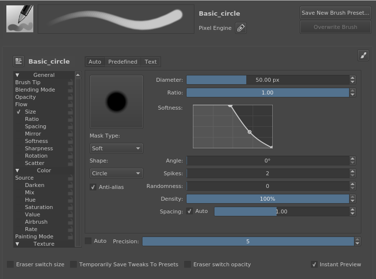
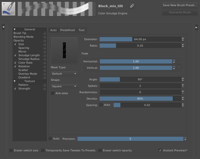
This is kind of a follow-up after adding the live preview area. This is mostly a UI/UX update to the brush editor to use the space better.
Reference: https://phabricator.kde.org/T7059
These are the changes I have done:
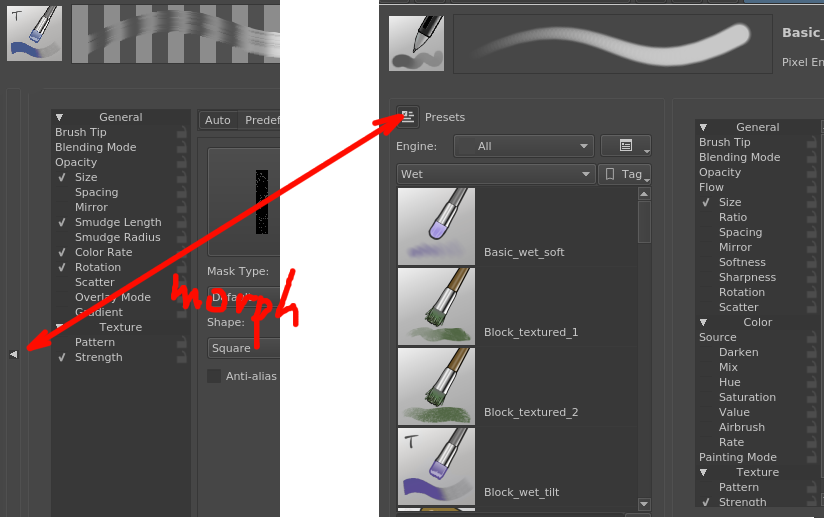
- Re-arrange the editor in general to have the presets and scratchpad areas to the left and right. When they are expanded, they have a label by them to better explain what those areas are called.
- Condensed and moved all the saving and renaming functionality to the top area
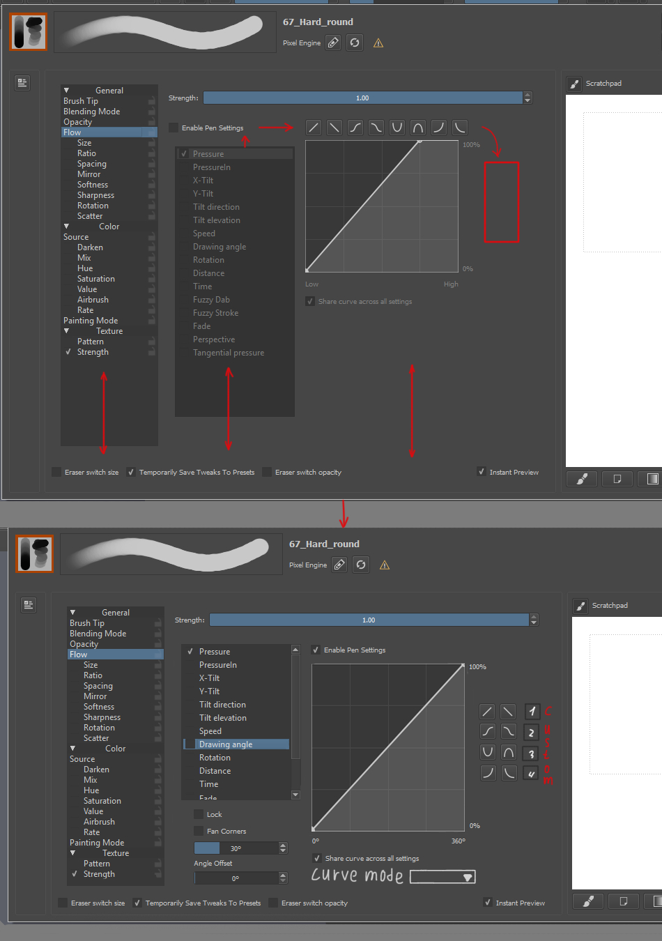
- Converted the Texture option (pixel brush) to a UI file
- Changed the Texture option UI to use tabs to avoid running out of space
- Reduced the entire height of the brush editor by about 20-30 pixels
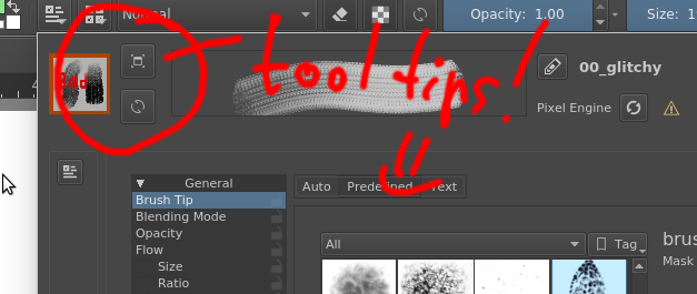
- Updated text brush tip area to be more compact
- Removed a couple functions (hideScratchpad() and showScratchpad()) in favor of the new show/hide logic
- Moved the "load default engine preset" to the presets area. Loading it now also loads the thumbnail and name in the top area
I think that is it. All these changes are in my "petrovic/brush-editor-ux" branch. Checking that out will also get you this code.There is a new UI file, so you might need to rebuild to get that to load correctly.