The current ones aren't really descriptive and vastly different from what Dolphin uses.
BUG: 376321
The current ones aren't really descriptive and vastly different from what Dolphin uses.
BUG: 376321
Needs D4915 for hover/pressed state to work properly


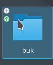
action-overlays.svgz for plasma-framework/src/desktoptheme/breeze/widgets
| Automatic diff as part of commit; lint not applicable. |
| Automatic diff as part of commit; unit tests not applicable. |
I wouldn't have veto'd it, but FWIW I think those icons don't work - their stem strength is much wider than Breeze lineart icons, they feel very out of place in our UX.
The icons are copied from the Breeze icon set. Granted, it's an "emblem" icon and not one from "actions" which is arguably wrong but I wanted to be consistent with Dolphin here… also, I expressed my frustration with our current visual design workflow numerous times, so I won't put anymore effort than that into it. (I already wasted too much time in Inkscape (and a text editor) on this)
only a draft based on the old design with the new semantic.
The graphic is missing some states (add-hover, add-pressed, open-normal, open-hovered, remove-hover, remove-pressed). Not a fan of having a blue remove icon. Also, I was told the arrow isn't a particular good icon for the idea of opening the folder in a popup, maybe there's a better icon for it.