[Pager] Improve label legibility
ClosedPublic

Authored by ngraham on Apr 26 2019, 6:13 PM.

Details

Summary

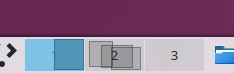
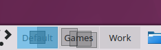
Currently, when displaying pager labels (either number or name), text legibility is
often poor or even non-existent, because the label is drawn below things that can
and frequently do obscure it.

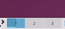
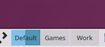
This patch puts the label on top, so it's always legible.

Test Plan

Before, displaying VD/Activity number:

After, displaying VD/Activity number:

Before, displaying VD/Activity name:

After, displaying VD/Activity name:

Diff Detail

Repository
R119 Plasma Desktop
Lint
Automatic diff as part of commit; lint not applicable.
Unit
Automatic diff as part of commit; unit tests not applicable.
ngraham created this revision.Apr 26 2019, 6:13 PM
Restricted Application added a project: Plasma. · View Herald TranscriptApr 26 2019, 6:13 PM
Restricted Application added a subscriber: plasma-devel. · View Herald Transcript
ngraham requested review of this revision.Apr 26 2019, 6:13 PM
ndavis added a subscriber: ndavis.EditedApr 26 2019, 7:08 PM

To me, the white text with the shadows doesn't really improve legibility and just looks "off". For some reason, shadow behind small text messes with my eyes and makes it harder to focus on the actual text.

abetts added a subscriber: abetts.Apr 26 2019, 7:10 PM

To me, the white text with the shadows doesn't really improve legibility and just looks "off". For some reason, shadow behind small text messes with my eyes and makes it harder to focus on the actual text.

I agree.

Well, I find it almost impossible to read the text with the status quo version when there are a bunch of window outlines. In the first screenshot you can see that the number "1" is actually almost invisible. I'm open to suggestions for alternative ways to improve this.

Well, I find it almost impossible to read the text with the status quo version when there are a bunch of window outlines. In the first screenshot you can see that the number "1" is actually almost invisible. I'm open to suggestions for alternative ways to improve this.

I agree with this too. Do you think it would be too weird of other methods are used? For example:

  • Use a more legible font that is independent from system font
  • Use current system font 1 or 2 points bigger

I agree with this too. Do you think it would be too weird of other methods are used? For example:

  • Use a more legible font that is independent from system font
  • Use current system font 1 or 2 points bigger

I don't think those would help. A part of the problem is that the label isn't on top; other things are on top of it. Just moving it to the top would help, The other part of the problem is that we need some way to ensure that the text has contrast with its background. It's a variant of the exact same problem we always have when we have text or icons floating on top of an arbitrary background. Every time we encounter this, the only feasible solution we have ever found is to give the text a background or a shadow.

Can we try a non-blurred shadow instead? One that is offset by 1 px? that might help too. I think when we use blurred, it gets messy at those sizes.

filipf added a subscriber: filipf.Apr 26 2019, 8:55 PM

An outline could work, but maybe not at 100% opacity.

[...] In the first screenshot you can see that the number "1" is actually almost invisible. I'm open to suggestions for alternative ways to improve this.

Yes, but this is because the text is under the blue highlight. I bet if the text was on top, then it would be much easier to read.

ngraham updated this revision to Diff 57219.Apr 29 2019, 9:45 PM

Yeah it's way better without any visual changes except just moving the label to the top

ngraham edited the test plan for this revision. (Show Details)Apr 29 2019, 9:47 PM
ngraham edited the summary of this revision. (Show Details)
ngraham updated this revision to Diff 57220.Apr 29 2019, 9:48 PM

Revert unnecessary change

hein accepted this revision.Apr 30 2019, 5:28 AM
This revision is now accepted and ready to land.Apr 30 2019, 5:28 AM
This revision was automatically updated to reflect the committed changes.