- Move the modified label from far right to far left This way have it a more prominent position
- Don't gray out modified label
- Don't use labels as buttons
- Add word count info to line "label"
- Change to new signal/slot style
- Avoid Q_FOREACH
- Avoid unneeded stuff
Details
Details
- Reviewers
cullmann - Group Reviewers
KTextEditor - Commits
- R39:dce48b397818: Review KateStatusBar
R39:3b874e56b8dc: Review KateStatusBar
Diff Detail
Diff Detail
- Lint
Lint Skipped - Unit
Unit Tests Skipped
Comment Actions
Oops, have now the first commit omitted in this update. Perhaps not too bad this way(?)
Comment Actions
How about to change the "action-labels" to buttons? Thisway would it be less "quirky" and we would have a feedback that there is an action available when hovered by mouse
Comment Actions
- KateStatusBar: Move the modified-label from far right to far left
Once again without all other patches
Comment Actions
My main intent is to add somehow a spell check button/hint
Here a snapshot how it looks currently
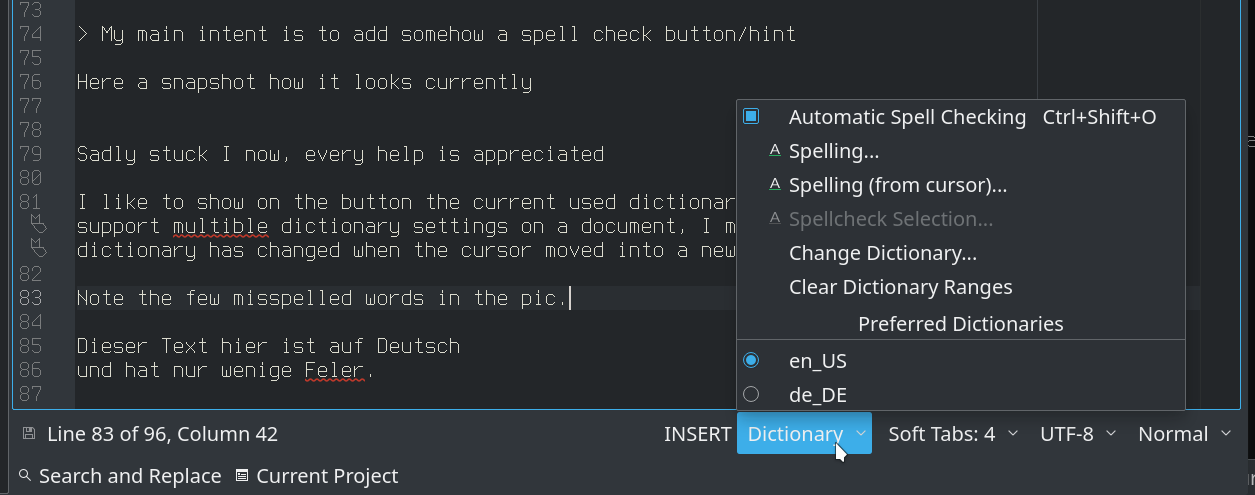
Sadly stuck I now, every help is appreciated
I like to show on the button the current used dictionary (code), like "en_US". Because Kate support multible dictionary settings on a document, I miss a signal that the current dictionary has changed when the cursor moved into a new range. Note the few misspelled words in the pic.
Is there a way to achieve this without to add new signal to somewhere, probably KTextEditor::DocumentPrivate ?
Merry Christmas everybody!
Comment Actions
Hmm, not sure about that ;=) No idea how the spell-checking code handles that.
Merry Christmas everybody!
Same here!
Happy holidays!
;=)
For the added stuff: I think it is useful, but now the statusbar is very full.
Could we make that configurable via context menu? Like we have "Show line count", ... there?
Comment Actions
I don't know if it should be done in this revision but... I find it annoying that the status bar imposes a limit on the minimum width of the window.
Let's say that I want a really small (20 chars width) instance of kwrite for note taking always on top - it cannot be done unless I hide the status bar. I would like the status bar to get cut (if the status bar is scrollable or not, I personally dont care)
I could open a new bug on it, but since you are already working on the status bar... will it be hard to implement?
Best regards
Comment Actions
- Only show lineColLabel context menu when click on it and not somewhere on the bar
As "usual" without all other patches.
No idea how the spell-checking code handles that.
I have a working solution in the meantime. I may open a new Diff for that.
I think it is useful, but now the statusbar is very full.
Could we make that configurable via context menu? Like we have "Show line count", ... there?
Should be possible. Will look at it. Your comment to the next question?
I would like the status bar to get cut (if the status bar is scrollable or not, I personally dont care)
About "cut" I have ATM no idea how to do that, and I guess nobody would like that. A Scrollbar may possible and a somehow
"auto-wrap" behaviour too
will it be hard to implement?
Hard to say ;-) The auto-wrap should be the most tricky
@cullmann Let me know how much stuff I can add here or have remove. There are many possibilities left, e.g.
How about to change the "action-labels" to buttons? Thisway would it be less "quirky" and we would have a feedback that there is an action available when hovered by mouse
I will upload a "all in one" diff for a better overview
Comment Actions
- All in one diff
- Rebased on master
- Removed test plan
- Will update Summary/Title before you commit
Comment Actions
I am a bit confused which questions still need answers ;=)
What I think about the current state of the patch:
I am fine with it, beside that I think having the dictionary picker per default there takes to much space and one should have some "show XXX" in the context menu for it.
I am fine with doing it all in one patch and I have no issues with the other changes.
For the "should we use buttons": I think I tried that in the past and it did look horrible in many styles, but perhaps I am wrong ;)
Comment Actions
For the "should we use buttons": I think I tried that in the past and it did look horrible in many styles, but perhaps I am wrong ;)
I see. May it in the meantime not an issue anymore, due to new designs elsewhere? And what's up with the existing buttons, they should look also ugly there.
I am a bit confused which questions still need answers ;=)
- Most of them have an answer now ;-) Will add more stuff here
- Your comment to @zetazeta request ? I have tried to add a QScrollArea but without success :-/ Ideas? Perhaps is a second level of layout/widget needed(?)
     updateStatus();
     wordCountChanged(0, 0, 0, 0);
+
+    QScrollArea *scrollArea = new QScrollArea; // No status bar
+//     QScrollArea *scrollArea = new QScrollArea(this); // No status bar
+//     QScrollArea *scrollArea = new QScrollArea(centralWidget());// No Kate window appears!
+    scrollArea->setWidget(centralWidget());
 }
I think having the dictionary picker per default there takes to much space
Why do you think so? My status bar is almost empty, but I did not show "word count" and such. The extra space is hardly worth mentioning. Add an new pic with my typical window size. The "German version" need some more space but is also hardly worth mentioning.
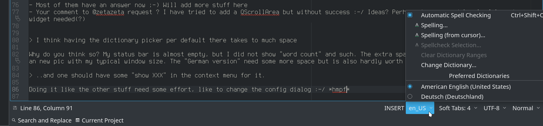
..and one should have some "show XXX" in the context menu for it.
Doing it like the other stuff need some effort, like to change the config dialog :-/ *hmpf*
Comment Actions
- Most of them have an answer now ;-) Will add more stuff here
- Your comment to @zetazeta request ? I have tried to add a QScrollArea but without success :-/ Ideas? Perhaps is a second level of layout/widget needed(?)
` updateStatus(); wordCountChanged(0, 0, 0, 0); + + QScrollArea *scrollArea = new QScrollArea; No status bar + QScrollArea *scrollArea = new QScrollArea(this); No status bar + QScrollArea *scrollArea = new QScrollArea(centralWidget());// No Kate window appears! + scrollArea->setWidget(centralWidget()); } `
I would not take care of that now but think about that in a separate request.
If we want that, perhaps one needs to think about having it scroll with the view, I don't think one wants a second scrollview.
I think having the dictionary picker per default there takes to much space
Why do you think so? My status bar is almost empty, but I did not show "word count" and such. The extra space is hardly worth mentioning. Add an new pic with my typical window size. The "German version" need some more space but is also hardly worth mentioning.
..and one should have some "show XXX" in the context menu for it.
Doing it like the other stuff need some effort, like to change the config dialog :-/ *hmpf*
> I agree that without split views, there is more than enough space, but as soon as you split (and as the statusbar dictates the minimum size), you will get in trouble.
Comment Actions
..as soon as you split (and as the statusbar dictates the minimum size), you will get in trouble.
My first thought was, "Oops, right!"
But while I verifying this I notice that the status bar has the full width of the window, not only the split view.
Furthermore shrink here the status bar without to fore a minimum width. But perhaps I understood you wrong :-)
However, I'm not against your request, will try to do it, but somehow I think it may better in an extra patch.
You said nothing (new) to the button issue. Can you remember in which cases they looked ugly?
Comment Actions
Ah, you are right :=) Since we handle that differently the status bar has already full length.
For the button issue: if you convert it and it looks the same as now with the normal breeze style, one could give it a try, thought I think that the labels are ok, given it is not that common you want to switch the insert mode that way (or the goto action), normally the shortcuts are nicer anyways and you get no distracting hover effect for the status bar ;)
Comment Actions
- Introduce StatusBarButton
- Don't gray out m_modifiedLabel, Rename to m_modified to fit other naming
- Revert 'Only show lineColLabel context menu when click on it'
- Change m_lineColLabel to new StatusBarButton, Rename to m_cursorPosition to fit other naming
- Change m_insertModeLabel to new StatusBarButton, Rename to m_inputMode to fit other naming
- Update Summary/Title
The shown dictionary button is still not included in this patch

Comment Actions
connect(m_view->doc(), &KTextEditor::DocumentPrivate::modifiedOnDisk, this, &KateStatusBar::modifiedChanged);
connect(m_view->doc(), &KTextEditor::DocumentPrivate::configChanged, this, &KateStatusBar::documentConfigChanged);
should do the trick, as doc() has the right internal type
Comment Actions
Beside that, I tried the patch, the status bar looks nice ;=)
Your idea to replace the labels with buttons is a good one.
I would have no issues to merge this as is (perhaps after you cleanup the 2 connects and have additional stuff like "configurable: show XXX" in an extra patch.
Comment Actions
- Fix remaining signal/slot, Thanks for the hint! :-)
Beside that, I tried the patch, the status bar looks nice ;=)
:-)
I would have no issues to merge this as is (perhaps after you .. have additional stuff like "configurable: show XXX" in an extra patch.
Not sure how quickly I look at these config stuff, but I will. And I will remove the WIP tag when I think I'm done here. Maybe I find something more to tweak
Comment Actions
- Remove seemingly unneeded spacing. Well, there is a change but tiny and perhaps to the better
- Avoid ugly casting in custom menu
- Remove obviously unneded default stretch values
- Avoid obviously unneded KLocalizedString members
- Avoid Q_FOREACH
- Group some lines more logical
I hope you still like it. Dictionary button will come in extra patch.
Comment Actions
Hmm, this seems to break the unit tests :/
running command "llllljgjr." on text "stickyhelper\n XXXXXXXXXXXXXXXXXXXXXXXXXXXXXXXXXXXXXXXXXXXXXXXXXXXX LINE3"
QDEBUG : ViewTest::visualLineUpDownTests() org.kde.ktexteditor: Invalid position: ( 0 , -1 )
FAIL! : ViewTest::visualLineUpDownTests() Compared values are not the same
Actual   (kate_document->text()): "stickyhelper\n     .XXXXXXXXXXXXXXXXXXXXXXXXXXXXXXXXXXXXXXXXXXXXXXXXXXX LINE3"
Expected (expected_text)        : "stickyhelper\n     XXXXXXXXXXXXXXXXXXXXXXXXXXXXXXXXXXXXXXXXXXXXXXXXXXXX .INE3"
Loc: [/home/jenkins/workspace/Frameworks/ktexteditor/kf5-qt5 SUSEQt5.9/autotests/src/vimode/view.cpp(222)]
QDEBUG : ViewTest::visualLineUpDownTests()
running command "llllljgjgkr." on text "stickyhelper\n XXXXXXXXXXXXXXXXXXXXXXXXXXXXXXXXXXXXXXXXXXXXXXXXXXXX LINE3"
QDEBUG : ViewTest::visualLineUpDownTests() org.kde.ktexteditor: Invalid position: ( 0 , -1 )
FAIL! : ViewTest::visualLineUpDownTests() Compared values are not the same
Actual   (kate_document->text()): "stick.helper\n     XXXXXXXXXXXXXXXXXXXXXXXXXXXXXXXXXXXXXXXXXXXXXXXXXXXX LINE3"
Expected (expected_text)        : "stickyhelper\n     .XXXXXXXXXXXXXXXXXXXXXXXXXXXXXXXXXXXXXXXXXXXXXXXXXXX LINE3"
Loc: [/home/jenkins/workspace/Frameworks/ktexteditor/kf5-qt5 SUSEQt5.9/autotests/src/vimode/view.cpp(227)]
QDEBUG : ViewTest::visualLineUpDownTests()
Comment Actions
I'm pretty baffled. What does the status bar which may break some input (mode) ? These report says nothing to me.
Well, ok, the vi-mode can enabled/disabled :-/
Comment Actions
One idea: Now you have only to click once to change some setting, not twice (double-click). So if these test simulate clicks...
Comment Actions
Harr, one more issue :-/
Idea how to fix this? I had in the past often such trouble, but so far I remember no solution. So my fix would be to remove the emphasis.
Is it OK to update this diff here?
Comment Actions
@cullmann I remember that you fiddled around with the status bar quite a lot to make it pixel perfect in height, i.e. that the height of the statusbar matches the hight of e.g. the search bar. Do we loose this property by using real buttons instead of labels as this patch proposes?
PS: I did not look at the patch in detail.
Comment Actions
Do we loose this property by using real buttons instead of labels as this patch proposes?
I don't think so. The buttons are not entire new, only some labels are now ALSO buttons.
Comment Actions
@loh.tar I think this test uses dynamic word wrap, and therefore requires a specific width of the view. Maybe with this patch, the status bar grows and forces a different width, so that the dynamic word wrap changes and the test fails?
Comment Actions
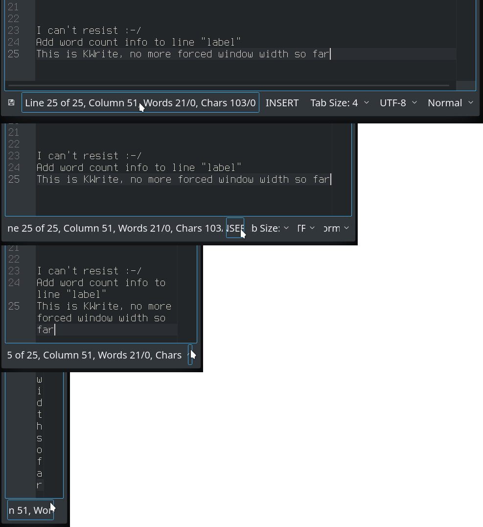
That can I not really imagine :-/ Wouldn't that not somehow to be notice in normal use?
Let's try this. Shot without bar, Now choose "Show bar", The window didn't change. (Sorry, no tool at hand to paste pics together)
The bar can shrink almost endless.
Comment Actions
Howdy ho, great guys and gals.
I have opened a wishlist for this in https://bugs.kde.org/show_bug.cgi?id=402904
If you have discovered anything useful while reworking the status bar, please share it there, so life will be easier to the one that takes on the wish.
Best regards and thanks for taking care of the status bar.
Comment Actions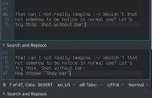
As you see some labels are crunched and the window width is the same. If you need I can post a pic where the limit is only given by the minimap and the line number column.
@zetazeta wrote
I find it annoying that the status bar imposes a limit on the minimum width of the window
@dhaumann wrote
Maybe with this patch, the status bar grows and forces a different width
me wrote
The bar can shrink almost endless
Um...it is here as I said. I can remember to read @zetazeta post, but so far I remember was I a little bit confused about that statement. But who knows... A scroll able bar would had make sense anyway, too small buttons/labels are useless.
I'm on X, no Wayland if that is somehow important, with no special stuff.
Here the pic I had in mind to post earlier.

As you see some labels are crunched and the window width is the same. If you need I can post a pic where the limit is only given by the minimap and the line number column.
Comment Actions
The problem I talk about happens on kwrite, no kate. I get the crunch as well on kate. Cheers :)
Comment Actions
I had didn't touch it in the past because I was thinking it may better to add these text to the line column label (now button), but that need some more thought how to do it.
Allow StatusBarButton to shrink
Ah! Strange! :-/ But somehow the more usual behavior, these "crunching" is unlikely. Couldn't find a hint where it is done in Kate, but after some digging around I have some solution which seems to work. These pics are from KWrite, the only not shrinking stuff is the last plain QLabel with the word count.

I had didn't touch it in the past because I was thinking it may better to add these text to the line column label (now button), but that need some more thought how to do it.
Let me know how to progress further, and if that test now pass.
Comment Actions
Hm, what is the current state of this patch?
It was stated that it broke tests, should this be addressed now?
Btw, I added a detailed comment to https://bugs.kde.org/show_bug.cgi?id=402904 that explains a proper solution to shrinking the statusbar:
- by allowing compact notations (e.g. "Line 1, Column 1" would shrink to "L 1, C 1")
- by allowing to hide widgets that are less important
Comment Actions
It was stated that it broke tests, should this be addressed now?
As shown in the pic, the bar forces no width anymore (at least it seems so)
Your comments at the bug report are interesting, but I'm not sure to do it. I had Christoph promised to add options to customize what is shown, so that was on my mental list.
Comment Actions
I think the current state can go in.
Here with and without this patch two tests fail:
The following tests FAILED:
24 - kateindenttest_testCppstyle (Failed)
67 - vimode_emulatedcommandbar (Failed)
(perhaps due to Qt 5.12)
Comment Actions
Btw., I can resize both Kate and KWrite like I want, like in the screenshots visible above.
Comment Actions
@loh.tar: I like the new status bar.
Move the modified label from far right to far left This way have it a more prominent position
Now, the "modified label" behaves like a button but with no visible action when it is clicked. Two general observations:
- In "unedited" state the purpose is (still) hard to guess from the icon (and there is the convention of not having tooltips for the status bar which requires a creative solution).
- In "modified" state it would be cool to be able to click to save the document
Comment Actions
I like the new status bar.
Thanks :-)
In "modified" state it would be cool to be able to click to save the document
Yes, that was also my idea. IIRC I had somewhere asked but got no response. Will do it soon.
Move the modified label from far right to far left
Sadly is now the Close button e.g. of the goto bar at the same position. So closing the goto bar may then unintended save the document when you have some mouse trouble
In "unedited" state the purpose is (still) hard to guess from the icon (and there is the convention of not having tooltips for the status bar which requires a creative solution).
I agree, I'm also not so happy with that. My idea was to show a tool-tip on click. Sadly is that not a "one-liner" in Qt, need some quirks.