This patch implements one of the ideas we came up with in D15011: a subtle line separating tab bars from their content areas. This gives layouts that use them a bit more structure, while trying not to overwhelm the visual design.
Details
Details
Diff Detail
Diff Detail
- Repository
- R242 Plasma Framework (Library)
- Branch
- tabbar-separator-line (branched from master)
- Lint
No Linters Available - Unit
No Unit Test Coverage - Build Status
Buildable 3440 Build 3458: arc lint + arc unit
Comment Actions
I implemented this with the horizontal-line/vertical-line SVG items to follow the general pattern that I noticed, but I'm not super thrilled with the resulting legibility; it seems a bit too light, and was almost invisible at 1px tall. I also tried a 1px tall Rectangle which looked crisper, but I couldn't find a theme color that was light enough. Comments and suggestions welcome.
Comment Actions
Also, if it's preferable to position the item with anchors rather than specifying with x and y, I can do that too:
anchors {
    left:   tabPosition == Qt.LeftEdge   ? undefined : buttonCutter.left
    right:  tabPosition == Qt.RightEdge  ? undefined : buttonCutter.right
    top:    tabPosition == Qt.TopEdge    ? undefined : buttonCutter.top
    bottom: tabPosition == Qt.BottomEdge ? undefined : buttonCutter.bottom
}Comment Actions
If there are more items than space available in the list a line is drawn already now to indicate that there are more items to come by scrolling down. Does this not conflict with the new line?
Comment Actions
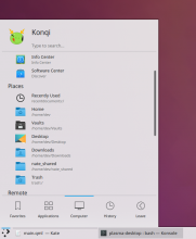

I'll move the lines a pixel or two so that they touch the ones drawn by the ScrollView.
Comment Actions
Hm, two separator lines, even touching each other sounds like a hack. Is there no better way?
Comment Actions
Not needed; we can and arguably should do all of this only in Kickoff since this style isn't guaranteed to look good everywhere. We'll do everything in D15206.