Design tweaks for the PlayerBar
ClosedPublic

Authored by januz on May 5 2018, 11:39 PM.

Details

Summary

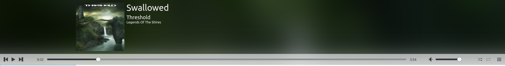
Design changes for the elisa player bar according to the mockups in the ML

Included in this patch

  • Move menu button to the bar
  • Make volume slider a bit smaller
  • Move repeat and shuffle to the bar
  • Fix the seek's handle so it doesn't show the radius of the elapsed rect
  • Make player bar slightly thinner
  • Make background of the seek/volume sliders darker so they are more visible
  • Make volume button closer to slider
  • Tweak length of seek bar and spacing between elements to make the design feel more balanced
  • Align "remaining tracks" text and imported notification with the hamburger menu

Notes

  • I haven't tested this with a RTL layout. I follow the LayoutMirroring pattern so it should be mostly ok (plz test!)
  • I'm pretty sure I broke something when I moved the shuffle and repeat buttons to the bar because their state isn't being saved when I restart Elisa, but I can't figure out what it is.
  • Do we have another choice of next/prev track icons? The vertical bars on these are super huge and make them feel way too heavy. Specially compared to the shuffle/repeat icons

Diff Detail

Repository
R255 Elisa
Lint
Automatic diff as part of commit; lint not applicable.
Unit
Automatic diff as part of commit; unit tests not applicable.
januz requested review of this revision.May 5 2018, 11:39 PM
januz created this revision.
januz edited the summary of this revision. (Show Details)May 5 2018, 11:46 PM
januz added a project: Elisa.

Haven't tested yet, so only comments from reading the code and the screenshots.

Please bump the frameworks version to 5.45, otherwise the icons look totally different.

I just wondered about the border around the repeat and shuffle buttons. Since borders are removed everywhere else, I think it may be better not to add them there again. Also one comment inline

Regarding the icons, unless we start bundling our own icons, we're settled with these. You could try making the next and prev icons a little bit smaller like before.

src/qml/ContentView.qml
29–30

this line should be deleted now, it was only there for the repeat and shuffle checkboxes

src/qml/ElisaMainWindow.qml
318

Can you try putting these two lines above the switch statement like before and see if it fixes the shuffle/repeat?

src/qml/MediaPlayerControl.qml
565

something looks wrong here with the indentation
also, the way I planned this was to use toggle buttons (like the mute button), but that is only my personal preference.
There are media-repeat-all, media-repeat-none, and media-playlist-shuffle, media-playlist-normal icons in case you want to try

The way random and continue buttons work is very nice. It is very easy to understand in which state they are. I think that even though they mostly indicate a state, they are easy for the user.

januz updated this revision to Diff 33734.May 6 2018, 10:52 PM
januz marked 3 inline comments as done.
januz edited the summary of this revision. (Show Details)
  • Remove unused line
  • Move shuffle/repeat bindings back to where they were in master
  • Fix indent for border
  • Bump required KF to 5.45
januz added a comment.May 6 2018, 11:02 PM

I just wondered about the border around the repeat and shuffle buttons. Since borders are removed everywhere else, I think it may be better not to add them there again. Also one comment inline

The border groups the shuffle/repeat buttons and helps separate them from the burger/volume. Here's a screen without the border for comparison:

We could also try using a slightly darker background instead of a border (open to suggestions tho).

The way random and continue buttons work is very nice. It is very easy to understand in which state they are. I think that even though they mostly indicate a state, they are easy for the user.

I like this way too but Alexander's suggestion has an interesting benefit: if we have more repeat / shuffle styles in the future (repeat-album, repeat-once, etc.) we can cycle through icons. We wouldn't be tied to only those two states.

src/qml/ElisaMainWindow.qml
318

Tried this but it doesn't fix it. I noticed there are some new lines here in current master, maybe it works when applied. I'll give that a test later

The repeat/shuffle issue is an example of the problem of not having a proper segmented control style widget. See https://bugs.kde.org/show_bug.cgi?id=384514

I remembered why I wanted to implement them as toggle button: For the play controls on the left, the reduced opacity of the icon indicate a disabled button, e.g. non-clickable button. Contrary, the repeat and shuffle buttons are always enabled. I think it would help explaining the behavior more clearly.

Another idea: the repeat and shuffle buttons can be moved to the left of the volume slider and mute icon. The menu button would then be separated clearly. If the shuffle/repeat buttons are then implemented as toggle buttons, we would also have three of such buttons nicely grouped together.

I just wondered about the border around the repeat and shuffle buttons. Since borders are removed everywhere else, I think it may be better not to add them there again. Also one comment inline

The border groups the shuffle/repeat buttons and helps separate them from the burger/volume. Here's a screen without the border for comparison:

We could also try using a slightly darker background instead of a border (open to suggestions tho).

The way random and continue buttons work is very nice. It is very easy to understand in which state they are. I think that even though they mostly indicate a state, they are easy for the user.

I like this way too but Alexander's suggestion has an interesting benefit: if we have more repeat / shuffle styles in the future (repeat-album, repeat-once, etc.) we can cycle through icons. We wouldn't be tied to only those two states.

I must admit that I have a strong preference for the version with borders around the shuffle and continue buttons.

I tried with reversed layout (RTL support) and the margins are wrong.
You can test by starting elisa with the -reverse option :
elisa -reverse

januz added a comment.May 8 2018, 6:39 PM

I tried with reversed layout (RTL support) and the margins are wrong.
You can test by starting elisa with the -reverse option :
elisa -reverse

Ah thanks! I was missing that trick, I'll get it fixed then

januz updated this revision to Diff 34008.May 12 2018, 1:54 AM
  • Shuffle/repeat settings are now saved (added them to persistent settings)
  • Fixed margins in RTL
  • Made icons 22px to avoid blurring in some cases
  • Made icons cycle instead of fading. I used desaturation to get rid of the red in the repeat-none button which was pretty distracting, not sure it's the best idea though.
  • I ended up removing the border. Getting it to keep the buttons centered while adding a bit of padding and separation in both LTL/RTL was near impossible. I reworked the margins to make everything more evenly grouped.
januz updated this revision to Diff 34009.May 12 2018, 1:56 AM

I forgot to fix the indentation again :)

In my opinion the read cross is fine, and we kind of have the same situation already with the mute icon.
Using desaturate may also cause issues with other icon themes.

Otherwise looking really good.

mgallien accepted this revision.May 12 2018, 6:02 PM
mgallien removed a reviewer: Elisa.

Thanks for your work. We have to investigate if we can support other icons themes. This will help adoption outside our own little bubble. We may have to remove the effect when doing that.

This revision is now accepted and ready to land.May 12 2018, 6:02 PM
januz updated this revision to Diff 34041.May 13 2018, 12:04 AM

Yep, you're right. That desaturate will be a problem for other icon themes.

This revision was automatically updated to reflect the committed changes.